

詳解怎麼使用純CSS實作多行文字的漸隱動畫

 <p>【學習影片分享:css影片教學、web前端】
單行與多行文字的漸隱
<p>首先,我們來看這樣一個例子,我們要實作這樣一個單行文字的漸隱: <p>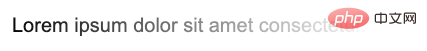 <p>#使用
mask,可以輕鬆實現這樣的效果,只需要:
<p>Lorem ipsum dolor sit amet consectetur.</p>
p {
    mask: linear-gradient(90deg, #fff, transparent);
} <p>#這個就會稍微複雜一點點,但是也是有多種方式可以實現的。
<p>首先我們來看看使用
<p>#這個就會稍微複雜一點點,但是也是有多種方式可以實現的。
<p>首先我們來看看使用 background 的方式。
使用<span style="font-size: 18px;">background</span># 實作
<p>這裡會運用到一個技巧,就是display: inline 內嵌元素的background 展現形式與display: block 區塊級元素(或inline-block、 flex、grid)不一致。
<p>簡單看個例子:
<p>Lorem .....</p>
<a>Lorem .....</a>
<p> 元素是區塊級元素,而< a> 是內嵌元素。
<p>我們給它們統一添加上一個從綠色到藍色的漸變背景色:
p, a {
  background: linear-gradient(90deg, blue, green);
}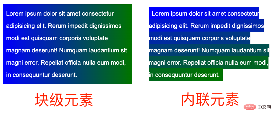 <p>什麼意思呢?差異很明顯,區塊級元素的背景整體是一個漸變整體,而內聯元素的每一行都是會有不一樣的效果,整體連起來串成一個整體。
<p>基於這個特性,我們可以建構這樣一種佈局:
<p>什麼意思呢?差異很明顯,區塊級元素的背景整體是一個漸變整體,而內聯元素的每一行都是會有不一樣的效果,整體連起來串成一個整體。
<p>基於這個特性,我們可以建構這樣一種佈局:
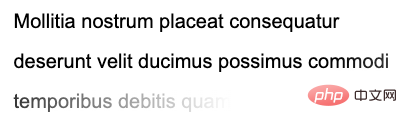
<p><a>Mollitia nostrum placeat consequatur deserunt velit ducimus possimus commodi temporibus debitis quam</a></p>
p {
    position: relative;
    width: 400px;
}

a {
    background: linear-gradient(90deg, transparent, transparent 70%, #fff);
    background-repeat: no-repeat;
    cursor: pointer;
    color: transparent;

    &::before {
        content: "Mollitia nostrum placeat consequatur deserunt velit ducimus possimus commodi temporibus debitis quam";
        position: absolute;
        top: 0;
        left: 0;
        color: #000;
        z-index: -1;
    }
}- <p>為了利用到實際的內聯元素的
background的特性,我們需要將實際的文本包裹在內聯元素<a>內 - ##實際的文本,利用了<p>opacity: 0
進行隱藏,實際展示的文字使用了<a>元素的偽元素,並且將它的層級設定為-1,目的是讓父元素的背景可以蓋過它 - <p><a>
元素的漸變為從透明到白色,利用它去遮住下面的實際用偽元素展示的文字,實作文字的漸隱
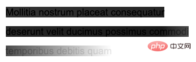
 #這裡,<p><a>
 元素的漸層為從透明到白色,利用後面的白色逐漸遮住文字。 如果我將漸層改為從黑色到白色(為了方便理解,漸變的黑色和白色都帶上了一些透明),你能很快的明白這是怎麼回事:<p>
a {
    background: linear-gradient(90deg, rgba(0,0,0, .8), rgba(0,0,0, .9) 70%, rgba(255, 255, 255, .9));
} 完整的程式碼,你可以戳這裡:<p>CodePen Demo -- Text fades away當然,這個方案有很多問題,譬如利用了<p>z-index: -1
,如果父容器設定了背景色,則會失效,同時不容易準確定位最後一行。因此,更好的方式是使用 mask 來解決。
使用mask<span style="font-size: 18px;"></span># 實作
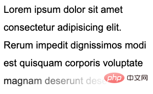
那麼,如果使用<p>mask 的話,問題,就會變得簡單一些,我們只需要在一個mask 中,實現兩塊mask 區域,一塊用於準確控制最後一行,一塊用來控制剩餘部分的透明。 也不需要特殊建構 HTML:<p>
<p>Lorem ipsum dolor sit amet ....</p>
p {
    width: 300px;
    padding: 10px;
    line-height: 36px;
    mask:
        linear-gradient(270deg, transparent, transparent 30%, #000),
        linear-gradient(270deg, #000, #000);
    mask-size: 100% 46px, 100% calc(100% - 46px);
    mask-position: bottom, top;
    mask-repeat: no-repeat;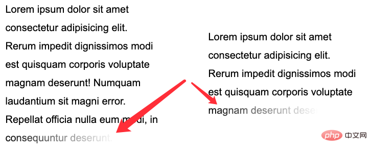
} <p>核心在于整个
 mask 相关的代码,正如上面而言的,mask 将整个区域分成了两块进行控制:
<p>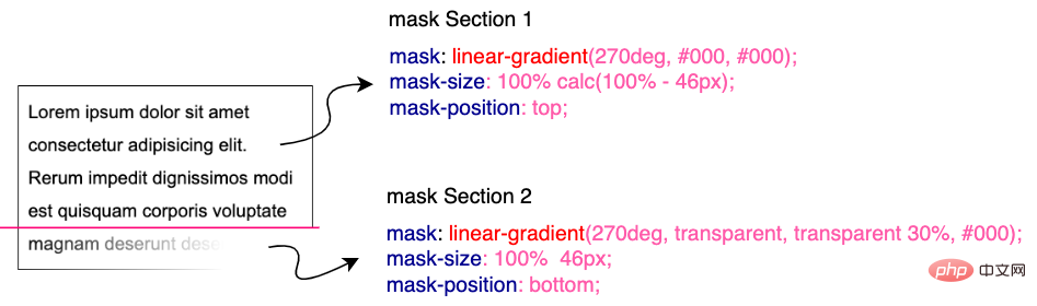 <p>在下部分这块,我们利用
 mask 做了从右向左的渐隐效果。并且利用了 mask-position 定位,以及 calc 的计算,无论文本都多少行,都是适用的!需要说明的是,这里的 46px 的意思是单行文本的行高加上 padding-bottom 的距离。可以适配任意行数的文本:
<p>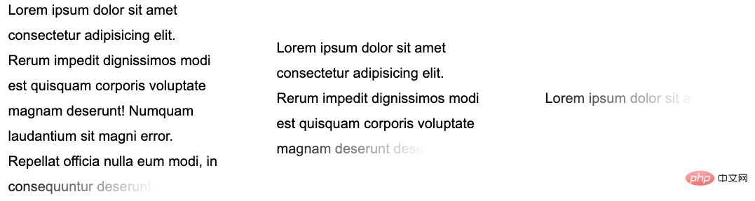 <p>完整的代码,你可以戳这里:CodePen Demo -- Text fades away 2
添加动画效果
<p>好,看完静态的,我们再来实现一种**动态的文字渐隐消失。 <p>整体的效果是当鼠标 Hover 到文字的时候,整个文本逐行逐渐消失。像是这样: <p>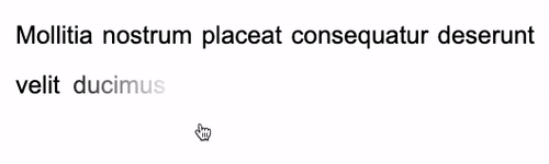 <p>这里的核心在于,需要去适配不同的行数,不同的宽度,而且文字是一行一行的进行消失。
<p>这里核心还是会运用上内联元素
<p>这里的核心在于,需要去适配不同的行数,不同的宽度,而且文字是一行一行的进行消失。
<p>这里核心还是会运用上内联元素 background 的特性。在 妙用 background 实现花式文字效果 这篇文章中,我们介绍了这样一种技巧。
<p>实现整段文字的渐现,从一种颜色到另外一种颜色:
<div class="button">Button</div>
<p><a>Lorem ipsum dolor sit amet consectetur adipisicing elit. Mollitia nostrum placeat consequatur deserunt velit ducimus possimus commodi temporibus debitis quam, molestiae laboriosam sit repellendus sed sapiente quidem quod accusantium vero.</a></p>
a {
    background:
        linear-gradient(90deg, #999, #999),
        linear-gradient(90deg, #fc0, #fc0);
    background-size: 100% 100%, 0 100px;
    background-repeat: no-repeat;
    background-position: 100% 100%, 0 100%;
    color: transparent;
    background-clip: text;
}
.button:hover ~ p a {
    transition: .8s all linear;
    background-size: 0 100px, 100% 100%;
}color: transparent,但是文字默认还是有颜色的,默认的文字颜色,是由第一层渐变赋予的 background: linear-gradient(90deg, #999, #999), linear-gradient(90deg, #fc0, #fc0),也就是这一层:linear-gradient(90deg, #999, #999)。
<p>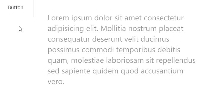 <p>当 hover 触发时,
linear-gradient(90deg, #999, #999) 这一层渐变逐渐消失,而另外一层 linear-gradient(90deg, #fc0, #fc0)` 逐渐出现,借此实现上述效果。
<p>CodePen -- background-clip 文字渐现效果
<p>好,我们可以借鉴这个技巧,去实现文字的渐隐消失。一层为实际的文本,而另外一层是进行动画的遮罩,进行动画的这一层,本身的文字设置为 color: transparent,这样,我们就只能看到背景颜色的变化。
<p>大致的代码如下:
<p>
    <a class="word">Mollitia nostrum placeat consequatur deserunt.</a>
    <a class="pesudo">Mollitia nostrum placeat consequatur deserunt.</a>
</p>
p {
    width: 500px;
}
.word {
    position: absolute;
    top: 0;
    left: 0;
    color: transparent;
    color: #000;
}
.pesudo {
    position: relative;
    background: linear-gradient(90deg, transparent, #fff 20%, #fff);
    background-size: 0 100%;
    background-repeat: no-repeat;
    background-position: 100% 100%;
    transition: all 3s linear;
    color: transparent;
}
p:hover .pesudo,
p:active .pesudo{
    background-size: 500% 100%;
}.word 为实际在底部,展示的文字层,而 pesudo 为叠在上方的背景层,hover 的时候,触发上方元素的背景变化,逐渐遮挡住下方的文字,并且,能适用于不同长度的文本。
<p>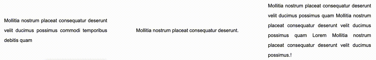 <p>当然,上述方案会有一点瑕疵,我们无法让不同长度的文本整体的动画时间一致。当文案数量相差不大时,整体可以接受,文案相差数量较大时,需要分别设定下
 transition-duration 的时长。
<p>完整的 DEMO,你可以戳:CodePen -- Text fades away Animation
<p>原文地址:https://www.cnblogs.com/coco1s/p/16590809.html <p>作者:ChokCoco<p>更多编程相关知识,请访问:编程视频!!
以上是詳解怎麼使用純CSS實作多行文字的漸隱動畫的詳細內容。更多資訊請關注PHP中文網其他相關文章!

熱AI工具

Undresser.AI Undress
人工智慧驅動的應用程序,用於創建逼真的裸體照片

AI Clothes Remover
用於從照片中去除衣服的線上人工智慧工具。

Undress AI Tool
免費脫衣圖片

Clothoff.io
AI脫衣器

AI Hentai Generator
免費產生 AI 無盡。

熱門文章
熱工具

記事本++7.3.1
好用且免費的程式碼編輯器

SublimeText3漢化版
中文版,非常好用

禪工作室 13.0.1
強大的PHP整合開發環境

Dreamweaver CS6
視覺化網頁開發工具

SublimeText3 Mac版
神級程式碼編輯軟體(SublimeText3)
熱門話題


 vue中怎麼用bootstrap
Apr 07, 2025 pm 11:33 PM
vue中怎麼用bootstrap
Apr 07, 2025 pm 11:33 PM
在 Vue.js 中使用 Bootstrap 分為五個步驟:安裝 Bootstrap。在 main.js 中導入 Bootstrap。直接在模板中使用 Bootstrap 組件。可選:自定義樣式。可選:使用插件。
 HTML,CSS和JavaScript的角色:核心職責
Apr 08, 2025 pm 07:05 PM
HTML,CSS和JavaScript的角色:核心職責
Apr 08, 2025 pm 07:05 PM
HTML定義網頁結構,CSS負責樣式和佈局,JavaScript賦予動態交互。三者在網頁開發中各司其職,共同構建豐富多彩的網站。
 bootstrap怎麼寫分割線
Apr 07, 2025 pm 03:12 PM
bootstrap怎麼寫分割線
Apr 07, 2025 pm 03:12 PM
創建 Bootstrap 分割線有兩種方法:使用 標籤,可創建水平分割線。使用 CSS border 屬性,可創建自定義樣式的分割線。
 bootstrap怎麼調整大小
Apr 07, 2025 pm 03:18 PM
bootstrap怎麼調整大小
Apr 07, 2025 pm 03:18 PM
要調整 Bootstrap 中元素大小,可以使用尺寸類,具體包括:調整寬度:.col-、.w-、.mw-調整高度:.h-、.min-h-、.max-h-
 bootstrap怎麼插入圖片
Apr 07, 2025 pm 03:30 PM
bootstrap怎麼插入圖片
Apr 07, 2025 pm 03:30 PM
在 Bootstrap 中插入圖片有以下幾種方法:直接插入圖片,使用 HTML 的 img 標籤。使用 Bootstrap 圖像組件,可以提供響應式圖片和更多樣式。設置圖片大小,使用 img-fluid 類可以使圖片自適應。設置邊框,使用 img-bordered 類。設置圓角,使用 img-rounded 類。設置陰影,使用 shadow 類。調整圖片大小和位置,使用 CSS 樣式。使用背景圖片,使用 background-image CSS 屬性。
 bootstrap怎麼設置框架
Apr 07, 2025 pm 03:27 PM
bootstrap怎麼設置框架
Apr 07, 2025 pm 03:27 PM
要設置 Bootstrap 框架,需要按照以下步驟:1. 通過 CDN 引用 Bootstrap 文件;2. 下載文件並將其託管在自己的服務器上;3. 在 HTML 中包含 Bootstrap 文件;4. 根據需要編譯 Sass/Less;5. 導入定製文件(可選)。設置完成後,即可使用 Bootstrap 的網格系統、組件和样式創建響應式網站和應用程序。
 bootstrap怎麼看日期
Apr 07, 2025 pm 03:03 PM
bootstrap怎麼看日期
Apr 07, 2025 pm 03:03 PM
答案:可以使用 Bootstrap 的日期選擇器組件在頁面中查看日期。步驟:引入 Bootstrap 框架。在 HTML 中創建日期選擇器輸入框。 Bootstrap 將自動為選擇器添加樣式。使用 JavaScript 獲取選定的日期。
 bootstrap按鈕怎麼用
Apr 07, 2025 pm 03:09 PM
bootstrap按鈕怎麼用
Apr 07, 2025 pm 03:09 PM
如何使用 Bootstrap 按鈕?引入 Bootstrap CSS創建按鈕元素並添加 Bootstrap 按鈕類添加按鈕文本
