

【整理總結】這些高階CSS技巧,你會幾種?

本篇文章帶你玩CSS,分享一些高級CSS技巧,快來看看你是否都會呀!
學習目標
- #能夠使用精靈圖
- 能夠使用字體圖示
- #能夠寫出CSS 三角形
- 能夠寫出常見的CSS 使用者介面樣式
- 能夠說出常見的佈局技巧
精靈圖
1. 為什麼需要精靈圖?
客戶端要存取一個網頁時,瀏覽器會向伺服器發送請求,伺服器接收到請求後,會返回請求頁面給客戶端
一個網頁中往往會應用許多小的背景圖像作為修飾,當網頁中的圖像過多時,伺服器就會頻繁地接收和發送請求圖片,造成伺服器請求壓力過大,這將大大降低頁面的載入速度
因此,為了有效地減少伺服器接收和發送請求的次數,提高頁面的載入速度,出現了CSS 精靈技術(也稱為CSS Sprites、CSS 雪碧)。 【學習影片分享:css影片教學、web前端】
#核心原理:將網頁中的一些小背景圖片整合到一張大圖中,這樣伺服器只需要一次請求就可以了
2. 精靈圖的使用
使用精靈圖核心:
精靈技術主要針對背景圖片使用,就是把多個小背景圖片整合到一張大圖片中
#這張大圖片也稱為sprites 精靈圖或雪碧圖
#移動背景圖片位置,此時可以使用background-position
移動的距離就是這個目標圖片的x 和y 座標,注意網頁中的座標有所不同
因為一般情況下都是往上往左移動,所以數值是負值
#使用精靈圖的時候需要精確測量,每個小背景圖片的大小和位置
在王者榮耀的官網,我們可以找到這樣的一張精靈圖
怎麼顯示這張精靈圖中的特定部分呢
<!DOCTYPE html>
<html>

<head>
    <meta charset="UTF-8">
    <meta http-equiv="X-UA-Compatible" content="IE=edge">
    <meta name="viewport" content="width=device-width, initial-scale=1.0">
    <title>精灵图的使用</title>
    <style>
        .box1 {
            width: 60px;
            height: 60px;
            margin: 100px auto;
            background: url(images/index.png) no-repeat -182px 0;
        }

        .box2 {
            width: 27px;
            height: 25px;
            margin: 200px;
            background: url(images/index.png) no-repeat -155px -106px;
        }
    </style>
</head>

<body>
    <div></div>
    <div></div>
</body>

</html>運行結果:
#3. 精靈圖應用案例
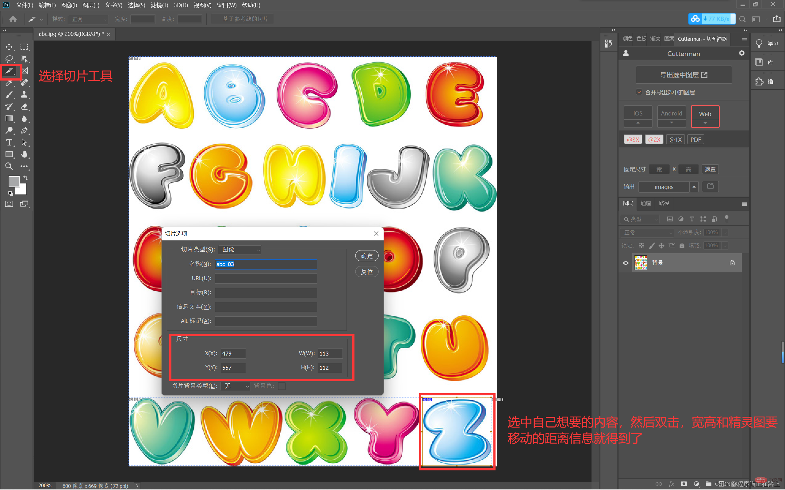
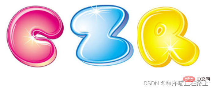
#素材在此
程式碼實作:<!DOCTYPE html>
<html>
<head>
<meta charset="UTF-8">
<meta http-equiv="X-UA-Compatible" content="IE=edge">
<meta name="viewport" content="width=device-width, initial-scale=1.0">
<title>利用精灵图拼出自己的名字</title>
<style>
span {
display: inline-block;
background: url(images/abcd.jpg) no-repeat;
}
.c {
width: 109px;
height: 110px;
background-position: -237px -8px;
}
.z {
width: 113px;
height: 112px;
background-position: -479px -557px;
}
.r {
width: 110px;
height: 109px;
background-position: -139px -415px;
}
</style>
</head>
<body>
<span></span>
<span></span>
<span></span>
</body>
</html>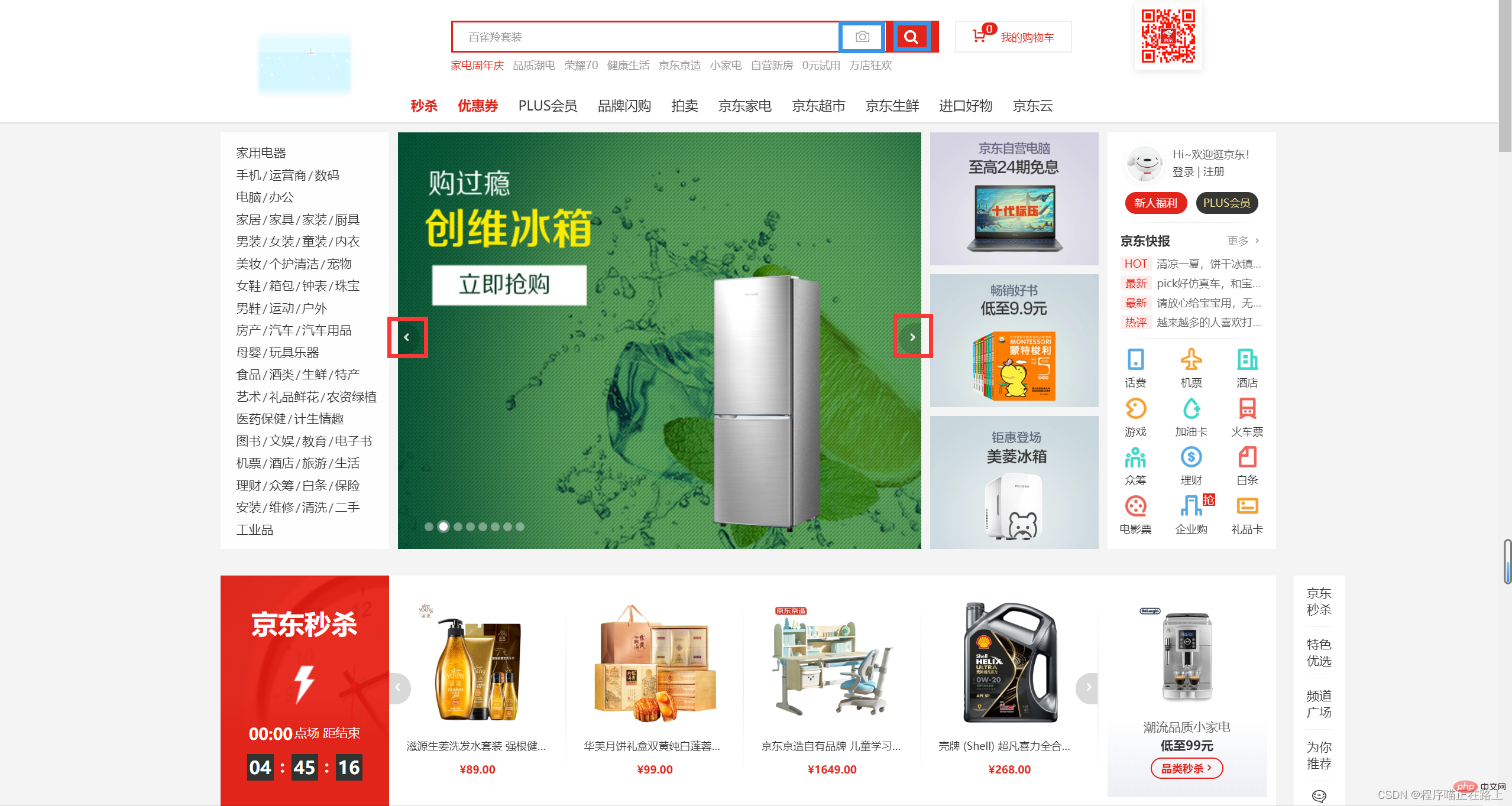 執行結果:#怎麼樣,快去試試看吧
字體圖示
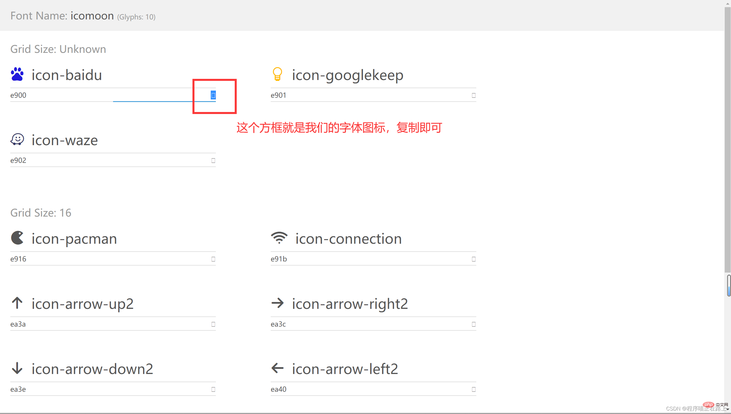
- #1. 字型圖示的產生
- 下圖中圈起來的就是字體圖標,不是圖片哦
#字體圖標的使用場景:主要用於顯示網頁中通用、常用的一些小圖示
精靈圖是有很多優點的,但是缺點也很明顯
#圖片檔案佔用空間還是比較大的#圖片本身放大和縮小會失真
- 一旦圖片製作完畢想要更換非常複雜於是,一種技術出現了,就是字體圖標
字體圖示可以為前端工程師提供一種方便高效的圖標使用方式,
展示的是圖標,本質屬於字體#### ###########2. 字體圖示的優點################輕量級:一個字體圖示要比一系列的圖片要小,一旦字體載入了,圖示就會馬上渲染出來,減少了伺服器請求######靈活性:本質其實是文字,可以很隨意地改變顏色、產生陰影、透明效果、旋轉等等#######相容性:幾乎支援所有的瀏覽器,請放心使用#########注意:字體圖示不能取代精靈技術,只是工作中圖示部分技術的提升和優化######總結: ###如果遇到一些结构和样式比较简单的小图标,就用字体图标
如果遇到一些结构和样式复杂一点的小图片,就用精灵图
3. 下载字体图标
字体图标是一些网页常见的小图标,我们直接从网上下载即可,使用可以分为:
字体图标的下载
字体图标的引入(引入到我们 html 页面中)
字体图标的追加(以后添加新的小图标)
推荐的下载网站:
- icomoon 字库
IcoMoon 成立于 2011 年,推出了第一个自定义图标字体生成器,它允许用户选择所需要的图标,使它们呈一字型。该字库内容种类繁多,非常全面,唯一的遗憾是国外服务器,打开网速较慢 - iconfont 字库
这个是阿里巴巴 M2UX 的一个 iconfont 字体图标字库,包含了淘宝图标库和阿里巴巴图标库,可以使用 AI 制作图表上传生成,重点是 —— 免费
拿 icomoon 字库 来说,基本操作如下
4. 引入字体图标
下载完毕之后,注意原先的文件不要删,后面会用
- 把下载包里面的 fonts 文件夹放入页面根目录下

- 在 CSS 样式中全局声明字体:简单理解为将这些字体文件通过 css 引入到我们页面中
一定要注意文件路径的问题
我们用下面这一系列代码来声明字体,这段代码也可以在 style.css 中找到
@font-face {
  font-family: 'icomoon';
  src:  url('fonts/icomoon.eot?q42srk');
  src:  url('fonts/icomoon.eot?q42srk#iefix') format('embedded-opentype'),
    url('fonts/icomoon.ttf?q42srk') format('truetype'),
    url('fonts/icomoon.woff?q42srk') format('woff'),
    url('fonts/icomoon.svg?q42srk#icomoon') format('svg');
  font-weight: normal;
  font-style: normal;
  font-display: block;
}打开 demo.html 我们可以复制下载的图标
<!DOCTYPE html>
<html>
<head>
<meta charset="UTF-8">
<meta http-equiv="X-UA-Compatible" content="IE=edge">
<meta name="viewport" content="width=device-width, initial-scale=1.0">
<title>字体图标的使用</title>
<style>
/* 字体声明 */
@font-face {
font-family: 'icomoon';
src: url('fonts/icomoon.eot?q42srk');
src: url('fonts/icomoon.eot?q42srk#iefix') format('embedded-opentype'),
url('fonts/icomoon.ttf?q42srk') format('truetype'),
url('fonts/icomoon.woff?q42srk') format('woff'),
url('fonts/icomoon.svg?q42srk#icomoon') format('svg');
font-weight: normal;
font-style: normal;
font-display: block;
}
span {
/* 指定字体,和字体声明中一致 */
font-family: 'icomoon';
font-size: 100px;
color: cyan;
}
</style>
</head>
<body>
<span></span>
<span></span>
<span></span>
</body>
</html>
5. 字体图标的追加
如果工作中,原来的字体图标不够用了,我们需要添加新的字体图标到原来的字体文件
把压缩包里面的 selection.json 重新上传,然后选中自己想要新的图标,重新下载压缩包,并替换原来的文件即可
CSS 三角
1. CSS三角制作
网页中常见一些三角形,使用 CSS 直接画出来就可以,不必做成图片或者字体图标
<!DOCTYPE html>
<html>

<head>
    <meta charset="UTF-8">
    <meta http-equiv="X-UA-Compatible" content="IE=edge">
    <meta name="viewport" content="width=device-width, initial-scale=1.0">
    <title>CSS三角制作</title>
    <style>
        .box1 {
            width: 0;
            height: 0;
            border: 10px solid;
            border-top-color: cyan;
            border-right-color: red;
            border-bottom-color: green;
            border-left-color: blue;
        }

        .box2 {
            width: 0;
            height: 0;
            border: 10px solid transparent;
            /* 要显示的一边改变颜色,其他边透明  */
            border-bottom-color: cyan;
        }
    </style>
</head>

<body>
    <div></div>
    <div></div>
</body>

</html>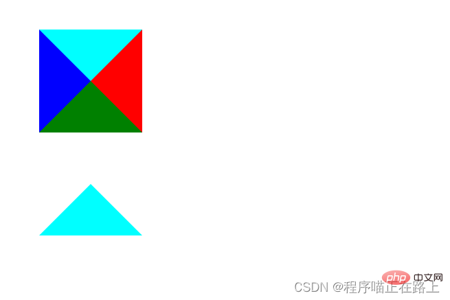
2. CSS三角应用-京东效果
<!DOCTYPE html>
<html>

<head>
    <meta charset="UTF-8">
    <meta http-equiv="X-UA-Compatible" content="IE=edge">
    <meta name="viewport" content="width=device-width, initial-scale=1.0">
    <title>CSS三角应用</title>
    <style>
        .jd {
            position: relative;
            width: 120px;
            height: 249px;
            background-color: pink;
        }

        .jd span {
            position: absolute;
            right: 15px;
            top: -10px;
            width: 0;
            height: 0;
            /* 兼容低版本浏览器 */
            line-height: 0;
            font-size: 0;
            border: 5px solid transparent;
            border-bottom-color: pink;
        }
    </style>
</head>

<body>
    <div>
        <span></span>
    </div>
</body>

</html>
CSS 用户界面样式
1. 什么是界面样式
所谓的界面样式,就是更改一些用户操作样式,以便提供更好的用户体验
- 更改用户的鼠标样式
- 表单轮廓
- 防止表单域拖拽
2. 更换用户鼠标样式
li { cursor: pointer; }设置或检索在对象上移动的鼠标指针采用何种系统预定义的光标形状
| 属性值 | 描述 |
|---|---|
| default | 小白,默认 |
| pointer | 小手 |
| move | 移动 |
| text | 文本 |
| not-allowed | 禁止 |
<!DOCTYPE html>
<html>

<head>
    <meta charset="UTF-8">
    <meta http-equiv="X-UA-Compatible" content="IE=edge">
    <meta name="viewport" content="width=device-width, initial-scale=1.0">
    <title>鼠标样式</title>
</head>

<body>
    <ul>
        <li style="cursor: default;">我是鼠标默认样式</li>
        <li style="cursor: pointer;">我是鼠标小手样式</li>
        <li style="cursor: move;">我是鼠标移动样式</li>
        <li style="cursor: text;">我是鼠标文本样式</li>
        <li style="cursor: not-allowed;">我是鼠标禁止样式</li>
    </ul>
</body>

</html>3. 表单轮廓线
给表单添加 outline: 0; 或者 outline: none; 样式之后,就可以去掉默认的蓝色边框
4. 防止表单域拖拽
实际开发中,我们文本域右下角是不可以拖拽的
给文本域添加 resize: none; 样式之后,就可以防止被拖拽
<!DOCTYPE html>
<html>

<head>
    <meta charset="UTF-8">
    <meta http-equiv="X-UA-Compatible" content="IE=edge">
    <meta name="viewport" content="width=device-width, initial-scale=1.0">
    <title>去掉表单轮廓线和防止文本域拖拽</title>
    <style>
        input,
        textarea {
            outline: none;
        }

        textarea {
            resize: none;
        }
    </style>
</head>

<body>
    <input type="text">
    <textarea name="" id="" cols="30" rows="10"></textarea>
</body>

</html>
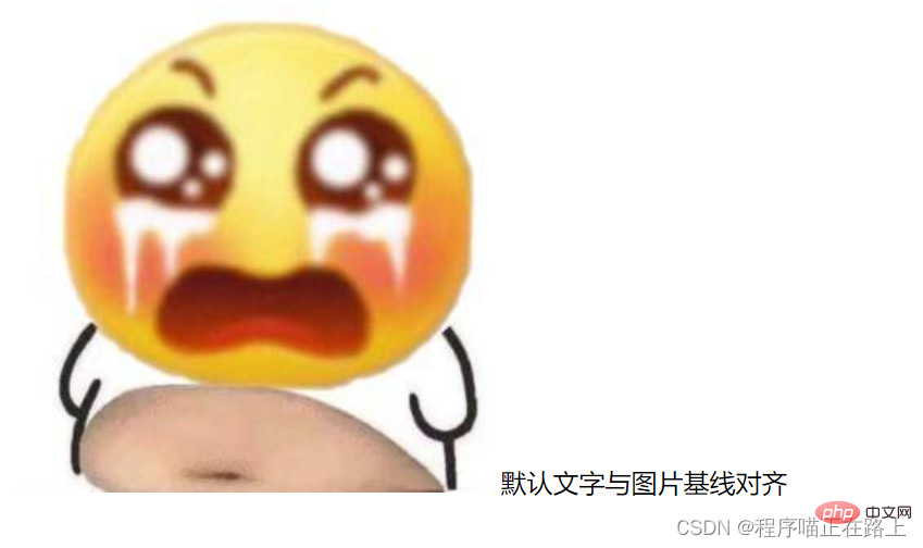
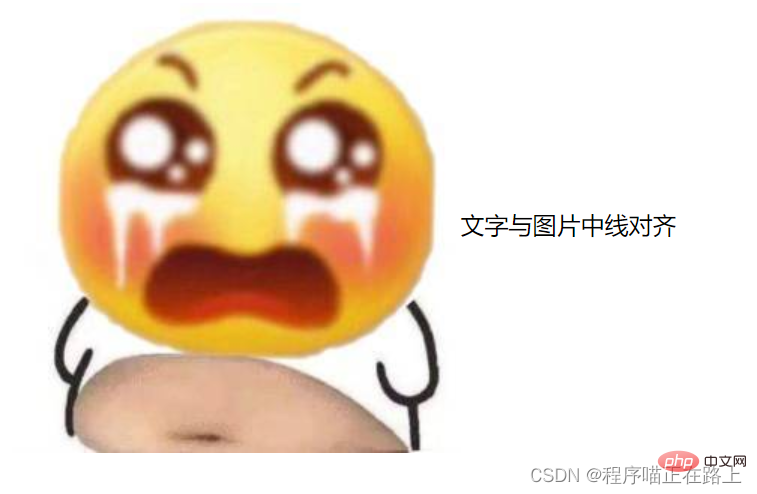
vertical-align 属性应用
CSS 的 vertical-align 属性使用场景:经常用于设置图片或者表单(行内块元素)和文字垂直对齐
功能:用于设置一个元素的垂直对齐方式,但是它只针对于行内元素或者行内块元素有效
语法:
vertical-align: baseline | top | middle | bottom
| 值 | 描述 |
|---|---|
| baseline | 默认,元素放置在父元素的基线上 |
| top | 把元素的顶端于行中最高元素的顶端对齐 |
| middle | 把此元素放置在父元素的中部 |
| bottom | 把元素的顶端与行中最低的元素的顶端对齐 |
<!DOCTYPE html>
<html>

<head>
    <meta charset="UTF-8">
    <meta http-equiv="X-UA-Compatible" content="IE=edge">
    <meta name="viewport" content="width=device-width, initial-scale=1.0">
    <title>vertical-align</title>
    <style>
        img {
            vertical-align: middle;
        }
    </style>
</head>

<body>
    <img src="/static/imghw/default1.png"  data-src="images/math.png"  class="lazy"   alt="">一生之敌
</body>

</html>
1. 图片、表单和文字对齐
图片、表单都属于行内块元素,默认的 vertical-align 是基线对齐
此时可以给图片、表单这些行内块元素的 vertical-align 属性设置为 middle 就可以让文字和图片垂直居中对齐了
2. 解决图片底部默认白色间隙问题
bug:图片底侧会有一个空白间隙,原因是行内块元素会和文字的基线对齐
主要解决方法有两种:
给图片添加
vertical-align: middle | top | bottom;等 (推荐)把图片转换为块级元素
display: block;
<!DOCTYPE html>
<html>

<head>
    <meta charset="UTF-8">
    <meta http-equiv="X-UA-Compatible" content="IE=edge">
    <meta name="viewport" content="width=device-width, initial-scale=1.0">
    <title>解决图片底部空白间隙</title>
    <style>
        div {
            border: 2px solid red;
        }

        img {
            vertical-align: bottom;
        }
    </style>
</head>

<body>
    <div>
        <img src="/static/imghw/default1.png"  data-src="images/smile.jpg"  class="lazy"   alt="">
    </div>
</body>

</html>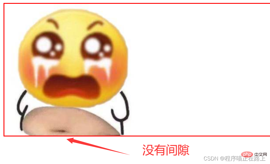
溢出的文字省略号显示
1. 单行文本溢出显示省略号——必须满足三个条件
/* 1.文字显示不开时强制显示 */
white-space: nowrap;
/* 2. 超出部分隐藏 */
overflow: hidden;
/* 3. 文字用省略号替代超出的部分 */
text-overflow: ellipsis;
<!DOCTYPE html>
<html>

<head>
    <meta charset="UTF-8">
    <meta http-equiv="X-UA-Compatible" content="IE=edge">
    <meta name="viewport" content="width=device-width, initial-scale=1.0">
    <title>单行文字溢出</title>
    <style>
        div {
            width: 150px;
            height: 80px;
            background-color: cyan;
            margin: 100px auto;
            /* 1.文字显示不开时强制显示 */
            white-space: nowrap;
            /* 2. 超出部分隐藏 */
            overflow: hidden;
            /* 3. 文字用省略号替代超出的部分 */
            text-overflow: ellipsis;
        }
    </style>
</head>

<body>
    <div>
        衣带渐宽终不悔,为伊消得人憔悴
    </div>
</body>

</html>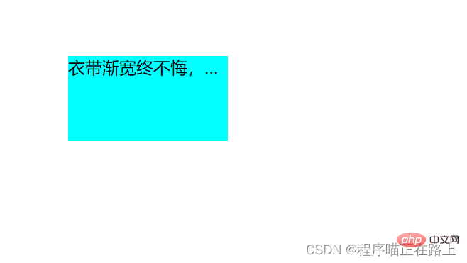
2. 多行文本溢出显示省略号
多行文本溢出显示省略号,有较大兼容性问题,适合于 webKit 浏览器或者移动端(移动端大部分是 webKit 内核)
/* 弹性伸缩盒子模型显示 */
display: -webkit-box;
/* 限制在一个块元素显示的文本的行数 */
-webkit-line-clamp: 3;
/* 设置或检索伸缩盒子对象的子元素的排列方式 */
-webkit-box-orient: vertical;
<!DOCTYPE html>
<html>

<head>
    <meta charset="UTF-8">
    <meta http-equiv="X-UA-Compatible" content="IE=edge">
    <meta name="viewport" content="width=device-width, initial-scale=1.0">
    <title>多行文字溢出</title>
    <style>
        div {
            width: 150px;
            height: 65px;
            background-color: cyan;
            margin: 100px auto;
            overflow: hidden;
            text-overflow: ellipsis;
            /* 弹性伸缩盒子模型显示 */
            display: -webkit-box;
            /* 限制在一个块元素显示的文本的行数 */
            -webkit-line-clamp: 3;
            /* 设置或检索伸缩盒子对象的子元素的排列方式 */
            -webkit-box-orient: vertical;
        }
    </style>
</head>

<body>
    <div>
        衣带渐宽终不悔,为伊消得人憔悴.衣带渐宽终不悔,为伊消得人憔悴
    </div>
</body>

</html>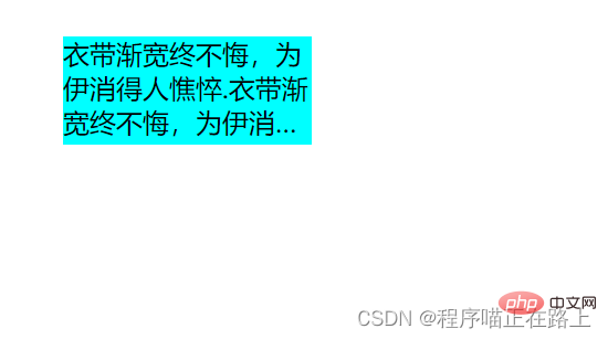
更推荐让后台人员来做这个效果,因为后台人员可以设置显示多少个字,操作更简单
常见布局技巧
1. margin负值的运用一
让每个盒子 margin 往左侧移动 -1px 正好压住相邻盒子边框
<!DOCTYPE html>
<html>

<head>
    <meta charset="UTF-8">
    <meta http-equiv="X-UA-Compatible" content="IE=edge">
    <meta name="viewport" content="width=device-width, initial-scale=1.0">
    <title>margin负值的巧妙运用</title>
    <style>
        ul li {
            float: left;
            list-style: none;
            width: 150px;
            height: 200px;
            border: 1px solid cyan;
            margin-left: -1px;
        }
    </style>
</head>

<body>
    <ul>
        <li>1</li>
        <li>2</li>
        <li>3</li>
        <li>4</li>
        <li>5</li>
    </ul>
</body>

</html>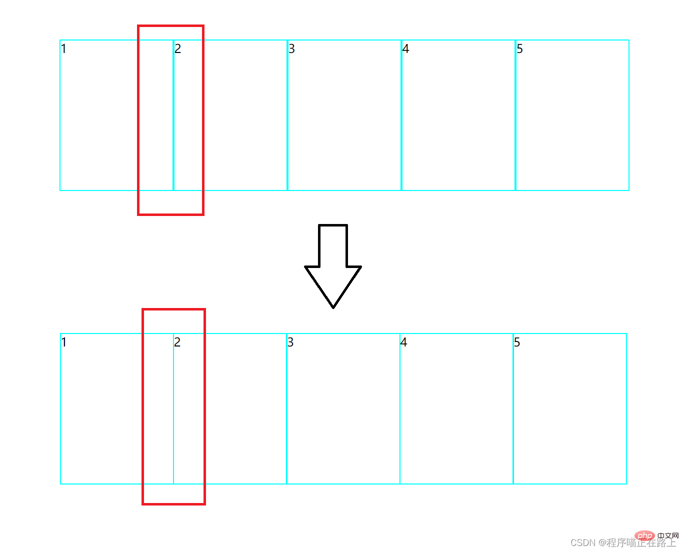
2. margin负值的运用二
鼠标经过某个盒子的时候,提高当前盒子的层级即可(如果没有定位,则加相对定位(保留位置),如果有定位,则加 z-index)
<!DOCTYPE html>
<html>

<head>
    <meta charset="UTF-8">
    <meta http-equiv="X-UA-Compatible" content="IE=edge">
    <meta name="viewport" content="width=device-width, initial-scale=1.0">
    <title>margin负值的巧妙运用</title>
    <style>
        ul li {
            float: left;
            list-style: none;
            width: 150px;
            height: 200px;
            border: 1px solid cyan;
            margin-left: -1px;
        }

        ul li:hover {
            /* 盒子没有定位时,加相对定位 */
            position: relative;
            /* 盒子有定位时,由于子绝父相无法添加相对定位 */
            z-index: 1;
            border: 1px solid red;
        }
    </style>
</head>

<body>
    <ul>
        <li>1</li>
        <li>2</li>
        <li>3</li>
        <li>4</li>
        <li>5</li>
    </ul>
</body>

</html>
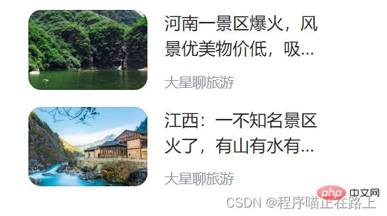
3. 文字围绕浮动元素
类似于下图这样的效果,该怎么实现呢?
<!DOCTYPE html>
<html>

<head>
    <meta charset="UTF-8">
    <meta http-equiv="X-UA-Compatible" content="IE=edge">
    <meta name="viewport" content="width=device-width, initial-scale=1.0">
    <title>文字围绕浮动元素</title>
    <style>
        .box {
            width: 280px;
            height: 70px;
            margin: 100px auto;
        }

        .pic {
            float: left;
            width: 120px;
            height: 60px;
            margin-right: 10px;
        }

        .pic img {
            width: 100%;
            border-radius: 15px;
        }

        .box p {
            overflow: hidden;
            text-overflow: ellipsis;
            /* 弹性伸缩盒子模型显示 */
            display: -webkit-box;
            /* 限制在一个块元素显示的文本的行数 */
            -webkit-line-clamp: 2;
            /* 设置或检索伸缩盒子对象的子元素的排列方式 */
            -webkit-box-orient: vertical;
        }
    </style>
</head>

<body>
    <div>
        <div>
            <img src="/static/imghw/default1.png"  data-src="images/img.jpg"  class="lazy"   alt="">
        </div>
        <p>河南一景区爆火,风景优美物价低,吸引许多游客前来打卡</p>
    </div>
</body>

</html>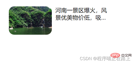
4. 行内块的巧妙运用
<!DOCTYPE html>
<html>

<head>
    <meta charset="UTF-8">
    <meta http-equiv="X-UA-Compatible" content="IE=edge">
    <meta name="viewport" content="width=device-width, initial-scale=1.0">
    <title>行内块的巧妙运用</title>
    <style>
        * {
            margin: 0;
            padding: 0;
        }

        .box {
            text-align: center;
        }

        .box a {
            display: inline-block;
            width: 36px;
            height: 36px;
            background-color: #f7f7f7;
            border: 1px solid #ccc;
            text-align: center;
            line-height: 36px;
            text-decoration: none;
            color: #333;
        }

        .box .prev,
        .box .next {
            width: 85px;
        }

        .box .current,
        .box .elp {
            background-color: #fff;
            border: none;
        }

        .box input {
            width: 45px;
            height: 36px;
            border: 1px solid #ccc;
            outline: none;
        }

        .box button {
            width: 60px;
            height: 36px;
            background-color: #f7f7f7;
            border: 1px solid #ccc;
        }
    </style>
</head>

<body>
    <div>
        <a href="#"><<上一页</a>
        <a href="#">2</a>
        <a href="#">3</a>
        <a href="#">4</a>
        <a href="#">5</a>
        <a href="#">6</a>
        <a href="#">...</a>
        <a href="#">>>下一页</a>
        到第
        <input type="text">
        页
        <button>确定</button>
    </div>
</body>

</html>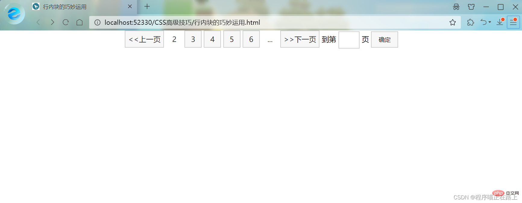
5. CSS三角强化
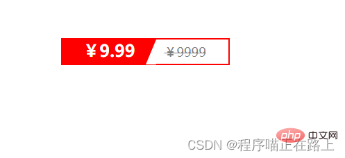
<!DOCTYPE html>
<html>

<head>
    <meta charset="UTF-8">
    <meta http-equiv="X-UA-Compatible" content="IE=edge">
    <meta name="viewport" content="width=device-width, initial-scale=1.0">
    <title>CSS三角巧妙运用</title>
    <style>
        .price {
            width: 160px;
            height: 24px;
            border: 1px solid red;
            margin: 100px auto;
        }

        .miaosha {
            position: relative;
            float: left;
            width: 90px;
            height: 100%;
            background-color: red;
            text-align: center;
            color: #fff;
            font-weight: 700;
            margin-right: 8px;
        }

        .miaosha i {
            position: absolute;
            top: 0;
            right: 0;
            width: 0;
            height: 0;
            /* 1. 只保留右边的边框有颜色 */
            border-color: transparent #fff transparent transparent;
            /* 2. 样式都是solid */
            border-style: solid;
            /* 3. 上边框宽度要大,右边框宽度稍小,其余边框为0 */
            border-width: 24px 10px 0 0;
        }

        .origin {
            font-size: 12px;
            color: gray;
            text-decoration: line-through;
        }
    </style>
</head>

<body>
    <div>
        <span>
            ¥9.99
            <i></i>
        </span>
        <span>¥9999</span>
    </div>
</body>

</html>效果图:
CSS初始化
不同浏览器对有些标签的默认值是不同的,为了消除不同浏览器对 HTML 文本呈现的差异,照顾浏览器的兼容,我们需要对 CSS 进行初始化
简单理解:CSS 初始化是指重设浏览器的样式,也称为 CSS reset
每个网页都必须首先进行 CSS 初始化
这里我们以京东 CSS 初始化代码为例,打开京东商城源代码,找到其 CSS 代码
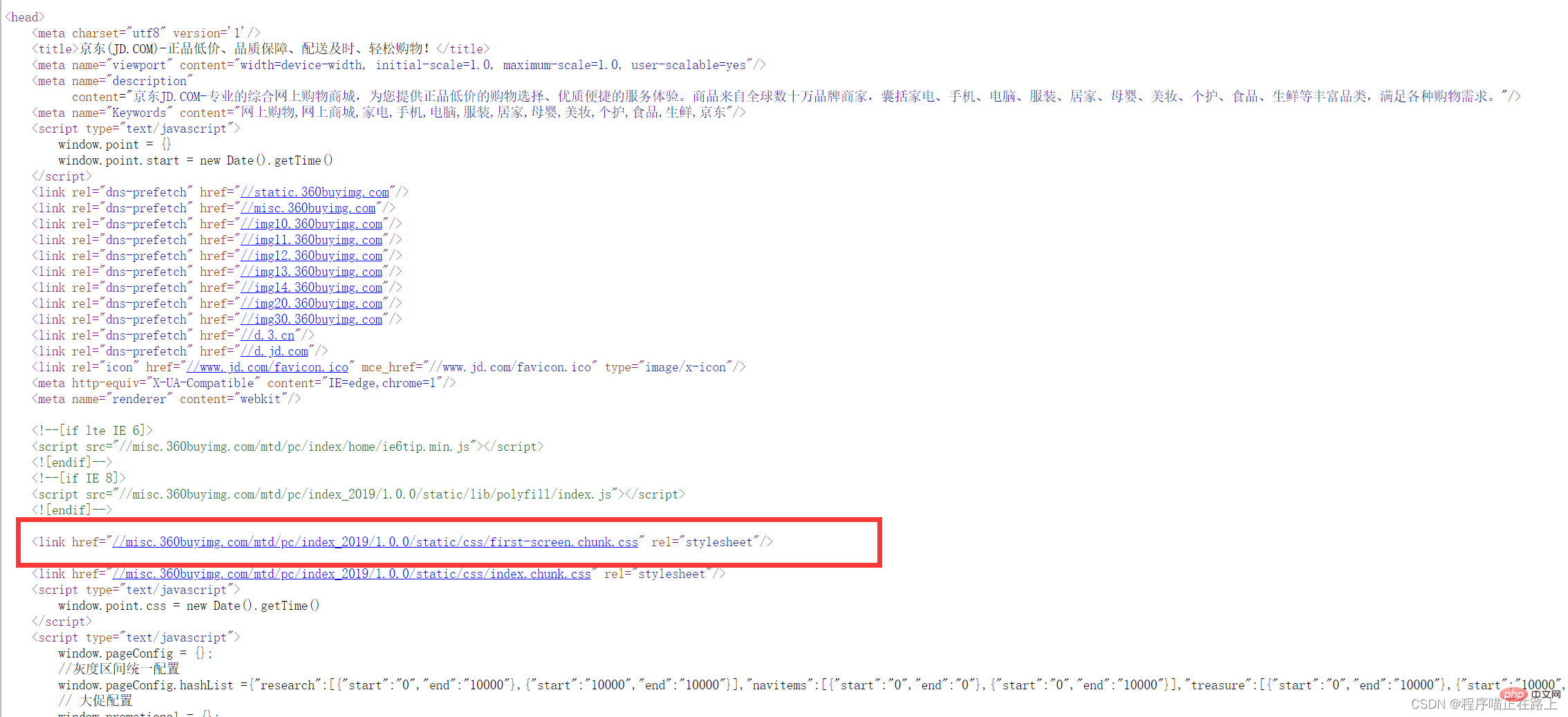
再找到初始化代码
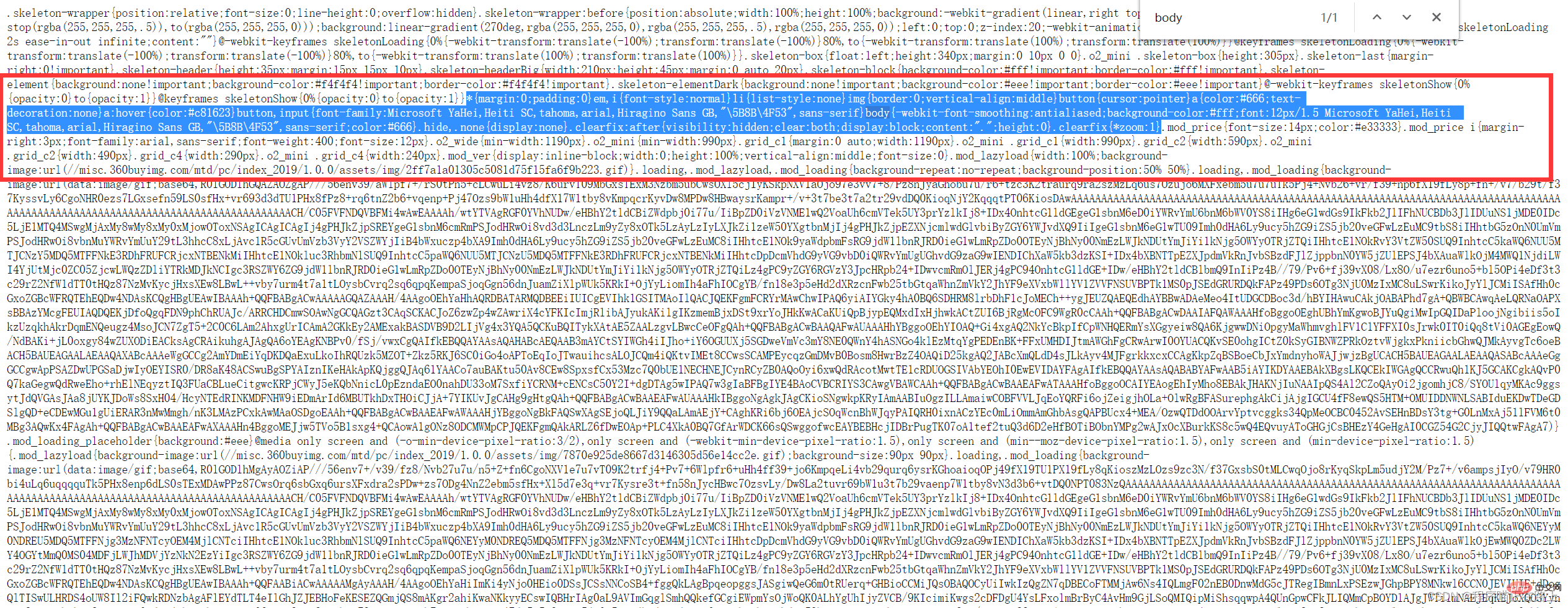
我们来看一下它都做了些什么工作
/* 把所有标签的内外边距清零 */
* {
    margin: 0;
    padding: 0
}

/* em 和 i 斜体的文字不倾斜 */
em,
i {
    font-style: normal
}

/* 去掉 li 的小圆点 */
li {
    list-style: none
}


img {
    /* border: 0 照顾低版本浏览器,如果图片外面包含了链接会有边框的问题 */
    border: 0;
    /* 取消图片底侧有空白缝隙的问题 */
    vertical-align: middle
}

button {
    /* 当我们鼠标经过button按钮的时候,鼠标变成小手 */
    cursor: pointer
}

a {
    color: #666;
    text-decoration: none
}

a:hover {
    color: #c81623
}

button,
input {
	/* "\5B8B\4F53" 就是宋体的意思 */
    font-family: Microsoft YaHei, Heiti SC, tahoma, arial, Hiragino Sans GB, "\5B8B\4F53", sans-serif
}

body {
    /* 抗锯齿性,让文字显示得更加清晰 */
    -webkit-font-smoothing: antialiased;
    background-color: #fff;
    font: 12px/1.5 Microsoft YaHei, Heiti SC, tahoma, arial, Hiragino Sans GB, "\5B8B\4F53", sans-serif;
    color: #666
}

.hide,
.none {
    display: none
}

.clearfix:after {
    visibility: hidden;
    clear: both;
    display: block;
    content: ".";
    height: 0
}

.clearfix {
    *zoom: 1
}Unicode 编码字体:
把中文字体的名称用相应的 Unicode 编码来代替,这样就可以有效地避免浏览器解释 CSS 代码时候出现乱码
比如:
- 黑体 \9ED1\4F53
- 宋体 \5B8B\4F53
- 微软雅黑 \5FAF\8F6F\96C5\9ED1
更多编程相关知识,请访问:编程视频!!
以上是【整理總結】這些高階CSS技巧,你會幾種?的詳細內容。更多資訊請關注PHP中文網其他相關文章!

熱AI工具

Undresser.AI Undress
人工智慧驅動的應用程序,用於創建逼真的裸體照片

AI Clothes Remover
用於從照片中去除衣服的線上人工智慧工具。

Undress AI Tool
免費脫衣圖片

Clothoff.io
AI脫衣器

AI Hentai Generator
免費產生 AI 無盡。

熱門文章
熱工具

記事本++7.3.1
好用且免費的程式碼編輯器

SublimeText3漢化版
中文版,非常好用

禪工作室 13.0.1
強大的PHP整合開發環境

Dreamweaver CS6
視覺化網頁開發工具

SublimeText3 Mac版
神級程式碼編輯軟體(SublimeText3)
熱門話題


 HTML,CSS和JavaScript的角色:核心職責
Apr 08, 2025 pm 07:05 PM
HTML,CSS和JavaScript的角色:核心職責
Apr 08, 2025 pm 07:05 PM
HTML定義網頁結構,CSS負責樣式和佈局,JavaScript賦予動態交互。三者在網頁開發中各司其職,共同構建豐富多彩的網站。
 vue中怎麼用bootstrap
Apr 07, 2025 pm 11:33 PM
vue中怎麼用bootstrap
Apr 07, 2025 pm 11:33 PM
在 Vue.js 中使用 Bootstrap 分為五個步驟:安裝 Bootstrap。在 main.js 中導入 Bootstrap。直接在模板中使用 Bootstrap 組件。可選:自定義樣式。可選:使用插件。
 bootstrap怎麼寫分割線
Apr 07, 2025 pm 03:12 PM
bootstrap怎麼寫分割線
Apr 07, 2025 pm 03:12 PM
創建 Bootstrap 分割線有兩種方法:使用 標籤,可創建水平分割線。使用 CSS border 屬性,可創建自定義樣式的分割線。
 bootstrap怎麼調整大小
Apr 07, 2025 pm 03:18 PM
bootstrap怎麼調整大小
Apr 07, 2025 pm 03:18 PM
要調整 Bootstrap 中元素大小,可以使用尺寸類,具體包括:調整寬度:.col-、.w-、.mw-調整高度:.h-、.min-h-、.max-h-
 bootstrap怎麼設置框架
Apr 07, 2025 pm 03:27 PM
bootstrap怎麼設置框架
Apr 07, 2025 pm 03:27 PM
要設置 Bootstrap 框架,需要按照以下步驟:1. 通過 CDN 引用 Bootstrap 文件;2. 下載文件並將其託管在自己的服務器上;3. 在 HTML 中包含 Bootstrap 文件;4. 根據需要編譯 Sass/Less;5. 導入定製文件(可選)。設置完成後,即可使用 Bootstrap 的網格系統、組件和样式創建響應式網站和應用程序。
 bootstrap怎麼插入圖片
Apr 07, 2025 pm 03:30 PM
bootstrap怎麼插入圖片
Apr 07, 2025 pm 03:30 PM
在 Bootstrap 中插入圖片有以下幾種方法:直接插入圖片,使用 HTML 的 img 標籤。使用 Bootstrap 圖像組件,可以提供響應式圖片和更多樣式。設置圖片大小,使用 img-fluid 類可以使圖片自適應。設置邊框,使用 img-bordered 類。設置圓角,使用 img-rounded 類。設置陰影,使用 shadow 類。調整圖片大小和位置,使用 CSS 樣式。使用背景圖片,使用 background-image CSS 屬性。
 了解HTML,CSS和JavaScript:初學者指南
Apr 12, 2025 am 12:02 AM
了解HTML,CSS和JavaScript:初學者指南
Apr 12, 2025 am 12:02 AM
WebDevelovermentReliesonHtml,CSS和JavaScript:1)HTMLStructuresContent,2)CSSStyleSIT和3)JavaScriptAddSstractivity,形成thebasisofmodernWebemodernWebExexperiences。
 bootstrap按鈕怎麼用
Apr 07, 2025 pm 03:09 PM
bootstrap按鈕怎麼用
Apr 07, 2025 pm 03:09 PM
如何使用 Bootstrap 按鈕?引入 Bootstrap CSS創建按鈕元素並添加 Bootstrap 按鈕類添加按鈕文本
