

Pandas+Pyecharts | 醫院藥品銷售資料視覺化

##Pandas — 資料處理
# #Pyecharts
— 資料視覺化
collections
### — 資料統計##################### ########視覺化部分:### #######Line# — 折線圖 ##Bar — 長條圖 Calendar— 日曆圖 stylecloud
#####################################stylecloud## ############# — 詞雲圖######################進入正題~~##################################################################################
import jieba
import stylecloud
import pandas as pd
from PIL import Image
from collections import Counter
from pyecharts.charts import Geo
from pyecharts.charts import Bar
from pyecharts.charts import Line
from pyecharts.charts import Pie
from pyecharts.charts import Calendar
from pyecharts.charts import WordCloud
from pyecharts import options as opts
from pyecharts.commons.utils import JsCode
from pyecharts.globals import ThemeType,SymbolType,ChartType
#2.1 讀取資料
df = pd.read_excel("医院药品销售数据.xlsx")#結果:
##### ###2.2 資料大小 ############
df.shape
(6578, 7)
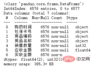
2.3 查看索引、数据类型和内存信息
df.info()
部分列存在数据缺失。
2.4 统计空值数据
df.isnull().sum()

2.5 输出空行
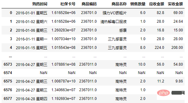
df[df.isnull().T.any()]
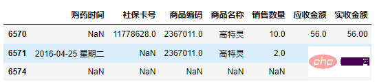
df1 = df.copy()
df1 = df1.dropna(subset=['购药时间'])
df1[df1.isnull().T.any()]
df1['社保卡号'].fillna('0000', inplace=True)
df1['社保卡号'] = df1['社保卡号'].astype(str)
df1['商品编码'] = df1['商品编码'].astype(str)
df1['销售数量'] = df1['销售数量'].astype(int)
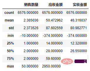
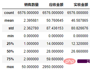
2.6 销售数量,应收金额,实收金额三列的统计情况
df1[['销售数量','应收金额','实收金额']].describe()
df2 = df1.copy()
df2['销售数量'] = df2['销售数量'].abs()
df2['应收金额'] = df2['应收金额'].abs()
df2['实收金额'] = df2['实收金额'].abs()
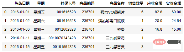
2.7 列拆分(购药时间列拆分为两列)
df3 = df2.copy()
df3[['购药日期', '星期']] = df3['购药时间'].str.split(' ', 2, expand = True)
df3 = df3[['购药日期', '星期','社保卡号','商品编码', '商品名称', '销售数量', '应收金额', '实收金额' ]]
代码:
color_js = """new echarts.graphic.LinearGradient(0, 1, 0, 0,
    [{offset: 0, color: '#FFFFFF'}, {offset: 1, color: '#ed1941'}], false)"""

g1 = df3.groupby('星期').sum()
x_data = list(g1.index)
y_data = g1['销售数量'].values.tolist()
b1 = (
        Bar()
        .add_xaxis(x_data)
        .add_yaxis('',y_data ,itemstyle_opts=opts.ItemStyleOpts(color=JsCode(color_js)))
        .set_global_opts(title_opts=opts.TitleOpts(title='一周各天药品销量',pos_top='2%',pos_left = 'center'),
            legend_opts=opts.LegendOpts(is_show=False),
            xaxis_opts=opts.AxisOpts(axislabel_opts=opts.LabelOpts(rotate=-15)),
            yaxis_opts=opts.AxisOpts(name="销量",name_location='middle',name_gap=50,name_textstyle_opts=opts.TextStyleOpts(font_size=16)))

    )
b1.render_notebook()
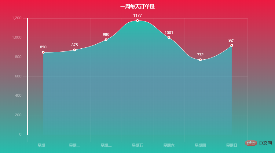
每天销量整理相差不大,周五、周六偏于购药高峰。
代码:
color_js = """new echarts.graphic.LinearGradient(0, 1, 0, 0,
    [{offset: 0, color: '#FFFFFF'}, {offset: 1, color: '#08519c'}], false)"""

g2 = df3.groupby('商品名称').sum().sort_values(by='销售数量', ascending=False)
x_data = list(g2.index)[:10]
y_data = g2['销售数量'].values.tolist()[:10]
b2 = (
        Bar()
        .add_xaxis(x_data)
        .add_yaxis('',y_data ,itemstyle_opts=opts.ItemStyleOpts(color=JsCode(color_js)))
        .set_global_opts(title_opts=opts.TitleOpts(title='药品销量前十',pos_top='2%',pos_left = 'center'),
            legend_opts=opts.LegendOpts(is_show=False),
            xaxis_opts=opts.AxisOpts(axislabel_opts=opts.LabelOpts(rotate=-15)),
            yaxis_opts=opts.AxisOpts(name="销量",name_location='middle',name_gap=50,name_textstyle_opts=opts.TextStyleOpts(font_size=16)))

    )
b2.render_notebook()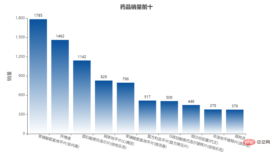
可以看出:苯磺 酸氨氯地平片(安内真)、开博通、酒石酸美托洛尔片(倍他乐克)等治疗高血压、心绞痛药物购买量比较多。。
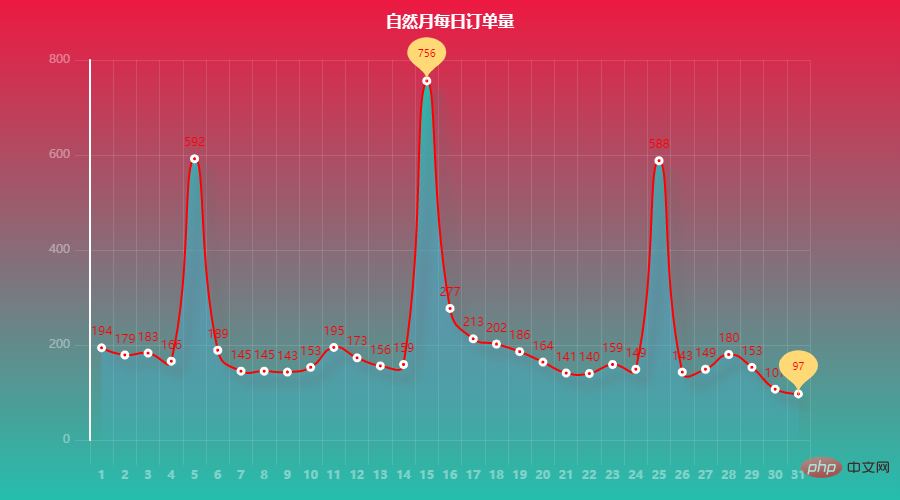

可以看出:5日、15日、25日是藥品銷售高峰期,尤其是每月15日。

篇幅原因,部分程式碼未完全展示,如果需要可在下方獲取,也 可線上運行(含全部程式碼資料檔案):
https:/ /www.heywhale.com/mw/project/61b83bd9c63c620017c629bc
以上是Pandas+Pyecharts | 醫院藥品銷售資料視覺化的詳細內容。更多資訊請關注PHP中文網其他相關文章!

熱AI工具

Undresser.AI Undress
人工智慧驅動的應用程序,用於創建逼真的裸體照片

AI Clothes Remover
用於從照片中去除衣服的線上人工智慧工具。

Undress AI Tool
免費脫衣圖片

Clothoff.io
AI脫衣器

AI Hentai Generator
免費產生 AI 無盡。

熱門文章
熱工具

記事本++7.3.1
好用且免費的程式碼編輯器

SublimeText3漢化版
中文版,非常好用

禪工作室 13.0.1
強大的PHP整合開發環境

Dreamweaver CS6
視覺化網頁開發工具

SublimeText3 Mac版
神級程式碼編輯軟體(SublimeText3)
熱門話題


 PHP和Python:代碼示例和比較
Apr 15, 2025 am 12:07 AM
PHP和Python:代碼示例和比較
Apr 15, 2025 am 12:07 AM
PHP和Python各有優劣,選擇取決於項目需求和個人偏好。 1.PHP適合快速開發和維護大型Web應用。 2.Python在數據科學和機器學習領域佔據主導地位。
 CentOS上如何進行PyTorch模型訓練
Apr 14, 2025 pm 03:03 PM
CentOS上如何進行PyTorch模型訓練
Apr 14, 2025 pm 03:03 PM
在CentOS系統上高效訓練PyTorch模型,需要分步驟進行,本文將提供詳細指南。一、環境準備:Python及依賴項安裝:CentOS系統通常預裝Python,但版本可能較舊。建議使用yum或dnf安裝Python3併升級pip:sudoyumupdatepython3(或sudodnfupdatepython3),pip3install--upgradepip。 CUDA與cuDNN(GPU加速):如果使用NVIDIAGPU,需安裝CUDATool
 CentOS上PyTorch的GPU支持情況如何
Apr 14, 2025 pm 06:48 PM
CentOS上PyTorch的GPU支持情況如何
Apr 14, 2025 pm 06:48 PM
在CentOS系統上啟用PyTorchGPU加速,需要安裝CUDA、cuDNN以及PyTorch的GPU版本。以下步驟將引導您完成這一過程:CUDA和cuDNN安裝確定CUDA版本兼容性:使用nvidia-smi命令查看您的NVIDIA顯卡支持的CUDA版本。例如,您的MX450顯卡可能支持CUDA11.1或更高版本。下載並安裝CUDAToolkit:訪問NVIDIACUDAToolkit官網,根據您顯卡支持的最高CUDA版本下載並安裝相應的版本。安裝cuDNN庫:前
 docker原理詳解
Apr 14, 2025 pm 11:57 PM
docker原理詳解
Apr 14, 2025 pm 11:57 PM
Docker利用Linux內核特性,提供高效、隔離的應用運行環境。其工作原理如下:1. 鏡像作為只讀模板,包含運行應用所需的一切;2. 聯合文件系統(UnionFS)層疊多個文件系統,只存儲差異部分,節省空間並加快速度;3. 守護進程管理鏡像和容器,客戶端用於交互;4. Namespaces和cgroups實現容器隔離和資源限制;5. 多種網絡模式支持容器互聯。理解這些核心概念,才能更好地利用Docker。
 Python vs. JavaScript:社區,圖書館和資源
Apr 15, 2025 am 12:16 AM
Python vs. JavaScript:社區,圖書館和資源
Apr 15, 2025 am 12:16 AM
Python和JavaScript在社區、庫和資源方面的對比各有優劣。 1)Python社區友好,適合初學者,但前端開發資源不如JavaScript豐富。 2)Python在數據科學和機器學習庫方面強大,JavaScript則在前端開發庫和框架上更勝一籌。 3)兩者的學習資源都豐富,但Python適合從官方文檔開始,JavaScript則以MDNWebDocs為佳。選擇應基於項目需求和個人興趣。
 CentOS下PyTorch版本怎麼選
Apr 14, 2025 pm 02:51 PM
CentOS下PyTorch版本怎麼選
Apr 14, 2025 pm 02:51 PM
在CentOS下選擇PyTorch版本時,需要考慮以下幾個關鍵因素:1.CUDA版本兼容性GPU支持:如果你有NVIDIAGPU並且希望利用GPU加速,需要選擇支持相應CUDA版本的PyTorch。可以通過運行nvidia-smi命令查看你的顯卡支持的CUDA版本。 CPU版本:如果沒有GPU或不想使用GPU,可以選擇CPU版本的PyTorch。 2.Python版本PyTorch
 minio安裝centos兼容性
Apr 14, 2025 pm 05:45 PM
minio安裝centos兼容性
Apr 14, 2025 pm 05:45 PM
MinIO對象存儲:CentOS系統下的高性能部署MinIO是一款基於Go語言開發的高性能、分佈式對象存儲系統,與AmazonS3兼容。它支持多種客戶端語言,包括Java、Python、JavaScript和Go。本文將簡要介紹MinIO在CentOS系統上的安裝和兼容性。 CentOS版本兼容性MinIO已在多個CentOS版本上得到驗證,包括但不限於:CentOS7.9:提供完整的安裝指南,涵蓋集群配置、環境準備、配置文件設置、磁盤分區以及MinI
 centos如何安裝nginx
Apr 14, 2025 pm 08:06 PM
centos如何安裝nginx
Apr 14, 2025 pm 08:06 PM
CentOS 安裝 Nginx 需要遵循以下步驟:安裝依賴包,如開發工具、pcre-devel 和 openssl-devel。下載 Nginx 源碼包,解壓後編譯安裝,並指定安裝路徑為 /usr/local/nginx。創建 Nginx 用戶和用戶組,並設置權限。修改配置文件 nginx.conf,配置監聽端口和域名/IP 地址。啟動 Nginx 服務。需要注意常見的錯誤,如依賴問題、端口衝突和配置文件錯誤。性能優化需要根據具體情況調整,如開啟緩存和調整 worker 進程數量。
