Bokeh is a powerful data visualization library in Python that helps to create interactive and unique visualizations for the web. Bokeh supports various rendering techniques and provides a wplex range of built-inal tos for ating-sek stted 3h. guide you through the process of creating a plot with multiple glyphs using Bokeh. This plot combines different glyphs to display multiple data series in a single plot that provides a more efficient way to shipstand the reliffations v.
什麼是字形(Glyphs),它們的主要優點是什麼?使用字形的一些關鍵優勢包括−
− 字形可以設計得非常易讀,使讀者能夠更快速、準確地理解文本。
− 字形可以用來為文字添加視覺趣味和吸引力,使其更具視覺吸引力和互動性。
− 字形可以設計成大小、形狀和風格一致,確保文字易於閱讀和視覺上連貫。
− Glyphs can be scaled and modified easily, making it possible to use them in a wide range of contexts and applications.
− 字形可以用來表示各種語言和書寫系統的字元和符號,使其在國際化和本地化方面非常有用。
Statistical Significance of these
Therefore, while glyphs themselves are not subject to statistical significance tests, they may be used in the context of experiments or studies that are subject to statistical analysis to determine or studany observed.
Prerequisites
Before we dive into the task few things should is expected to be installed onto your system −
pip install pandas, bokeh
#It is expected that the user will have access to any standalone IDE such as VS-Code, PyCharm, Atom or Sublime text.
#Even online Python compilers can also be used such as Kaggle.com, Google Cloud platform or any other will do.
#Updated version of Python. At the time of writing the article I have used 3.10.9 version.
使用Jupyter notebook的知識。
了解和應用虛擬環境將會有益,但不是必要的。
同時,預期該人員對統計學和數學有很好的理解。
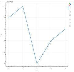
建立基本圖表
from bokeh.plotting import figure, output_file, show
output_file("line.html")
p = figure(title="Line Plot", x_axis_label="X", y_axis_label="Y")

x = [1, 2, 3, 4, 5]
y = [6, 7, 2, 4, 5]

p.line(x, y, line_width=2)

show(p)
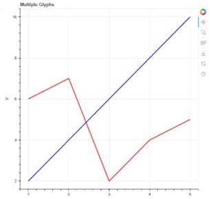
 To add multiple glyphs to the plot, we need to use the `Figure` object's `multi_line()` function. The `multi_line()` function takes multiple sequences of x and y values and ? them. Here's an example code snippet to create a line plot with multiple glyphs −
#
from bokeh.plotting import figure, output_file, show
from bokeh.models import ColumnDataSource

output_file("multi_line.html")

p = figure(title="Multiple Glyphs", x_axis_label="X", y_axis_label="Y")

x1 = [1, 2, 3, 4, 5]
y1 = [6, 7, 2, 4, 5]

x2 = [1, 2, 3, 4, 5]
y2 = [2, 4, 6, 8, 10]

source = ColumnDataSource(data=dict(x1=x1, y1=y1, x2=x2, y2=y2))
p.multi_line(xs=[source.data["x1"], source.data["x2"]],
   ys=[source.data["y1"], source.data["y2"]],
   line_color=["red", "blue"], line_width=[2, 2])
show(p)

Here, we created two sets of x and y values and stored them in a `ColumnDataSource` object. We then passed the two sequences of x and y values to the `multi_line()` function, along with the colors and line widths of the two glyphs. This will create a line plot with two glyphs, one in red color and one in blue color, each with their corresponding x and y values.
# Basic plot

from bokeh.plotting import figure, output_file, show
output_file("line.html")

p = figure(title="Line Plot", x_axis_label="X", y_axis_label="Y")

x = [1, 2, 3, 4, 5]
y = [6, 7, 2, 4, 5]

p.line(x, y, line_width=2)

show(p)

# Multiple graphs

from bokeh.plotting import figure, output_file, show
from bokeh.models import ColumnDataSource

output_file("multi_line.html")

p = figure(title="Multiple Glyphs", x_axis_label="X", y_axis_label="Y")

x1 = [1, 2, 3, 4, 5]
y1 = [6, 7, 2, 4, 5]

x2 = [1, 2, 3, 4, 5]
y2 = [2, 4, 6, 8, 10]

source = ColumnDataSource(data=dict(x1=x1, y1=y1, x2=x2, y2=y2))

p.multi_line(xs=[source.data["x1"], source.data["x2"]],
   ys=[source.data["y1"], source.data["y2"]],
   line_color=["red", "blue"], line_width=[2, 2])

show(p)
在本文档中,我们学习了如何使用Bokeh创建具有多个图元的图表。我们首先介绍了图元,然后使用单个图元创建了一个基本的折线图。然后,我们使用`Figure`对象的`multi_line()`函数向图表中添加了多个图元。使用Bokeh,可以轻松创建交互式可视化,帮助理解不同数据点之间的关系。Bokeh允许您以最小的努力创建美观的可视化,让您专注于分析数据,而不必担心可视化。
以上是使用 Python Bokeh 建立具有多個字形的繪圖的詳細內容。更多資訊請關注PHP中文網其他相關文章!


