

PHP學習筆記:資料視覺化與報表生成


PHP學習筆記:資料視覺化與報表產生
導語:
隨著網路的發展,資料量的爆炸性成長以及資料分析的需求日益迫切,數據視覺化和報表產生成為了各行各業都需要面對的問題。在PHP學習的過程中,了解常用的資料視覺化技術和報表產生方法是非常重要的。本文將透過具體的程式碼範例,介紹PHP中資料視覺化和報表產生的相關知識點。
一、資料視覺化
- 圖表庫的選擇
在PHP中,我們可以使用各種圖表函式庫來實現資料的視覺化。以下介紹幾個常用的圖表庫及其使用方法:
(1) Highcharts:Highcharts是一個強大且靈活的JavaScript圖表庫。它支援多種類型的圖表,包括折線圖、長條圖、餅圖等。
<!DOCTYPE html>
<html>
<head>
    <script src="https://code.highcharts.com/highcharts.js"></script>
</head>
<body>
    <div id="container" style="width: 600px; height: 400px;"></div>
    <script>
    var data = [1, 3, 2, 4, 5];
    Highcharts.chart('container', {
        chart: {
            type: 'bar'
        },
        title: {
            text: '柱状图示例'
        },
        xAxis: {
            categories: ['A', 'B', 'C', 'D', 'E']
        },
        yAxis: {
            title: {
                text: '值'
            }
        },
        series: [{
            name: '数据',
            data: data
        }]
    });
    </script>
</body>
</html>(2) ECharts:ECharts是一款由百度開發的資料視覺化函式庫,具有強大的互動能力和豐富的圖表類型。使用ECharts可以快速建立各種圖表,包括線圖、散佈圖、雷達圖等。
<!DOCTYPE html>
<html>
<head>
    <script src="https://cdn.jsdelivr.net/npm/echarts@5/dist/echarts.min.js"></script>
</head>
<body>
    <div id="container" style="width: 600px; height: 400px;"></div>
    <script>
    var data = [1, 3, 2, 4, 5];
    var myChart = echarts.init(document.getElementById('container'));
    var option = {
        title: {
            text: '折线图示例'
        },
        xAxis: {
            type: 'category',
            data: ['A', 'B', 'C', 'D', 'E']
        },
        yAxis: {
            type: 'value'
        },
        series: [{
            data: data,
            type: 'line'
        }]
    };
    myChart.setOption(option);
    </script>
</body>
</html>(3) Google Charts:Google Charts是由Google提供的一套強大的圖表工具。它可以繪製各種類型的圖表,如餅圖、地圖、熱力圖等。
<!DOCTYPE html>
<html>
<head>
    <script type="text/javascript" src="https://www.gstatic.com/charts/loader.js"></script>
    <script type="text/javascript">
        google.charts.load('current', {'packages':['corechart']});
        google.charts.setOnLoadCallback(drawChart);
        function drawChart() {
            var data = google.visualization.arrayToDataTable([
                ['Item', 'Value'],
                ['A', 1],
                ['B', 3],
                ['C', 2],
                ['D', 4],
                ['E', 5]
            ]);
            var options = {
                title: '饼图示例'
            };
            var chart = new google.visualization.PieChart(document.getElementById('chart'));
            chart.draw(data, options);
        }
    </script>
</head>
<body>
    <div id="chart" style="width: 600px; height: 400px;"></div>
</body>
</html>- 資料視覺化實例
除了使用第三方圖表庫,我們還可以自己利用PHP的圖形處理庫進行資料視覺化。以下是使用GD函式庫產生長條圖的範例程式碼:
<?php
$data = [1, 3, 2, 4, 5];
$width = 600;
$height = 400;
$padding = 10;
$font_file = 'font.ttf';
$image = imagecreatetruecolor($width, $height);
$background_color = imagecolorallocate($image, 255, 255, 255);
$bar_color = imagecolorallocate($image, 0, 0, 255);
$text_color = imagecolorallocate($image, 0, 0, 0);
imagefill($image, 0, 0, $background_color);
$bar_width = ($width - 2 * $padding) / count($data);
foreach ($data as $key => $value) {
    $x = $padding + $key * $bar_width;
    $bar_height = ($value / max($data)) * ($height - 2 * $padding);
    $y = $height - $padding - $bar_height;
    imagefilledrectangle($image, $x, $y, $x + $bar_width, $height - $padding, $bar_color);
    imagettftext($image, 12, 0, $x, $height - $padding + 15, $text_color, $font_file, $value);
}
header('Content-Type: image/png');
imagepng($image);
imagedestroy($image);
?>二、報表產生
- Excel報表產生
對於需要產生Excel報表的情況,我們可以使用PHPExcel函式庫來實作。以下是一個簡單的範例程式碼,用於產生一個包含資料的Excel檔案:
<?php
require_once 'PHPExcel.php';
$excel = new PHPExcel();
$sheet = $excel->getActiveSheet();
$sheet->setCellValue('A1', '姓名');
$sheet->setCellValue('B1', '年龄');
$sheet->setCellValue('A2', '张三');
$sheet->setCellValue('B2', '25');
$sheet->setCellValue('A3', '李四');
$sheet->setCellValue('B3', '30');
header('Content-Type: application/vnd.openxmlformats-officedocument.spreadsheetml.sheet');
header('Content-Disposition: attachment;filename="report.xlsx"');
header('Cache-Control: max-age=0');
$writer = PHPExcel_IOFactory::createWriter($excel, 'Excel2007');
$writer->save('php://output');- PDF報表產生
如果需要產生PDF格式的報表,我們可以使用FPDF庫來實現。以下是一個產生PDF報表的範例程式碼:
<?php
require('fpdf/fpdf.php');
$pdf = new FPDF();
$pdf->AddPage();
$pdf->SetFont('Arial', 'B', 16);
$pdf->Cell(40, 10, '姓名');
$pdf->Cell(40, 10, '年龄');
$pdf->Ln();
$pdf->SetFont('Arial', '', 12);
$pdf->Cell(40, 10, '张三');
$pdf->Cell(40, 10, '25');
$pdf->Ln();
$pdf->Cell(40, 10, '李四');
$pdf->Cell(40, 10, '30');
$pdf->Output();
?>結語:
本文介紹了PHP中資料視覺化和報表產生的相關知識點,並提供了具體的程式碼範例。透過掌握這些知識,你可以在PHP專案中實現各種類型的資料視覺化和報表產生功能。希望對你的學習和實踐有所幫助!
以上是PHP學習筆記:資料視覺化與報表生成的詳細內容。更多資訊請關注PHP中文網其他相關文章!

熱AI工具

Undresser.AI Undress
人工智慧驅動的應用程序,用於創建逼真的裸體照片

AI Clothes Remover
用於從照片中去除衣服的線上人工智慧工具。

Undress AI Tool
免費脫衣圖片

Clothoff.io
AI脫衣器

AI Hentai Generator
免費產生 AI 無盡。

熱門文章
熱工具

記事本++7.3.1
好用且免費的程式碼編輯器

SublimeText3漢化版
中文版,非常好用

禪工作室 13.0.1
強大的PHP整合開發環境

Dreamweaver CS6
視覺化網頁開發工具

SublimeText3 Mac版
神級程式碼編輯軟體(SublimeText3)
熱門話題


 適用於 Ubuntu 和 Debian 的 PHP 8.4 安裝和升級指南
Dec 24, 2024 pm 04:42 PM
適用於 Ubuntu 和 Debian 的 PHP 8.4 安裝和升級指南
Dec 24, 2024 pm 04:42 PM
PHP 8.4 帶來了多項新功能、安全性改進和效能改進,同時棄用和刪除了大量功能。 本指南介紹如何在 Ubuntu、Debian 或其衍生版本上安裝 PHP 8.4 或升級到 PHP 8.4
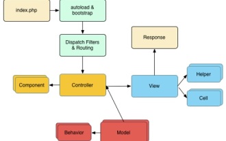
 討論 CakePHP
Sep 10, 2024 pm 05:28 PM
討論 CakePHP
Sep 10, 2024 pm 05:28 PM
CakePHP 是 PHP 的開源框架。它旨在使應用程式的開發、部署和維護變得更加容易。 CakePHP 基於類似 MVC 的架構,功能強大且易於掌握。模型、視圖和控制器 gu
 如何設定 Visual Studio Code (VS Code) 進行 PHP 開發
Dec 20, 2024 am 11:31 AM
如何設定 Visual Studio Code (VS Code) 進行 PHP 開發
Dec 20, 2024 am 11:31 AM
Visual Studio Code,也稱為 VS Code,是一個免費的原始碼編輯器 - 或整合開發環境 (IDE) - 可用於所有主要作業系統。 VS Code 擁有大量針對多種程式語言的擴展,可以輕鬆編寫
 CakePHP 快速指南
Sep 10, 2024 pm 05:27 PM
CakePHP 快速指南
Sep 10, 2024 pm 05:27 PM
CakePHP 是一個開源MVC 框架。它使應用程式的開發、部署和維護變得更加容易。 CakePHP 有許多函式庫可以減少大多數常見任務的過載。
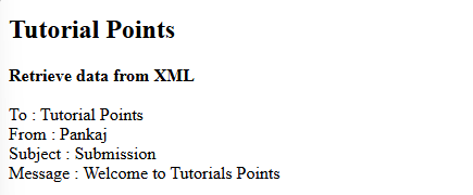 您如何在PHP中解析和處理HTML/XML?
Feb 07, 2025 am 11:57 AM
您如何在PHP中解析和處理HTML/XML?
Feb 07, 2025 am 11:57 AM
本教程演示瞭如何使用PHP有效地處理XML文檔。 XML(可擴展的標記語言)是一種用於人類可讀性和機器解析的多功能文本標記語言。它通常用於數據存儲
 php程序在字符串中計數元音
Feb 07, 2025 pm 12:12 PM
php程序在字符串中計數元音
Feb 07, 2025 pm 12:12 PM
字符串是由字符組成的序列,包括字母、數字和符號。本教程將學習如何使用不同的方法在PHP中計算給定字符串中元音的數量。英語中的元音是a、e、i、o、u,它們可以是大寫或小寫。 什麼是元音? 元音是代表特定語音的字母字符。英語中共有五個元音,包括大寫和小寫: a, e, i, o, u 示例 1 輸入:字符串 = "Tutorialspoint" 輸出:6 解釋 字符串 "Tutorialspoint" 中的元音是 u、o、i、a、o、i。總共有 6 個元
 在PHP API中說明JSON Web令牌(JWT)及其用例。
Apr 05, 2025 am 12:04 AM
在PHP API中說明JSON Web令牌(JWT)及其用例。
Apr 05, 2025 am 12:04 AM
JWT是一種基於JSON的開放標準,用於在各方之間安全地傳輸信息,主要用於身份驗證和信息交換。 1.JWT由Header、Payload和Signature三部分組成。 2.JWT的工作原理包括生成JWT、驗證JWT和解析Payload三個步驟。 3.在PHP中使用JWT進行身份驗證時,可以生成和驗證JWT,並在高級用法中包含用戶角色和權限信息。 4.常見錯誤包括簽名驗證失敗、令牌過期和Payload過大,調試技巧包括使用調試工具和日誌記錄。 5.性能優化和最佳實踐包括使用合適的簽名算法、合理設置有效期、
