

使用css3 屬性如何豐富圖片樣式(圓角 陰影 漸層)_html5教學技巧

在css3中,直接在圖片上使用box-shadow 和 border-radius,瀏覽器並不能很好的渲染。但如果把圖片當作background-image,新增的樣式瀏覽器可以很好的渲染。我將會介紹如何使用box-shadow, border-radius 和 transition建立不同圖片樣式效果。
問題
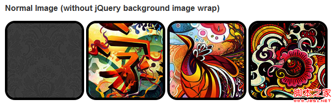
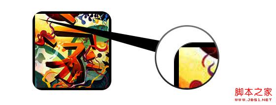
透過查看demo能注意到,我們為第一行圖片設定了border-radius 和 內嵌box-shadow。 firefox渲染了圖片的border-radius,但是沒有渲染內嵌box-shadow。 chrome和Safari兩種效果都沒有渲染。
.normal img {order -webkit-border-radius: 20px;
-moz-border-radius: 20px;
border-radius: 20px;
-webkit-box-shadow inset 0dow 1px 5px rgba(0,0,0,.5);
-moz-box-shadow: inset 0 1px 5px rgba(0,0,0,.5);
box-shadow: inset 0 1px 5px rgba(0,0,0,.5);
}
firefox效果:
 chrome/s>:
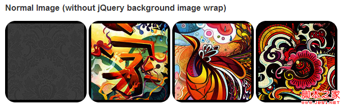
變通方案
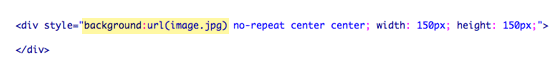
為了讓border-radius 和內嵌box-shadow能夠正常運作,我們需要把圖片轉換成background-image的方式。
動態方式
為了動態完成這項工作,我們需要藉助jquery為每個圖片添加背景圖片的包裝。下面的js程式碼為每個圖片增加了一個span的包裝,span的背景圖片路徑就是圖片的路徑。
程式碼比較簡單,我想就沒有講解的必要了。不清楚了可以直接去查jquery的api。
輸出
上面的程式碼會輸出以下結果:

圓圖
加入我們使用border-radius來達到圓形圖片的效果。
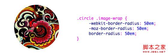
.circle .image-wrap {
-webkit-border-radius: 50em;
-moz-border-radius: 50em;
css:
複製程式碼
程式碼
.card .image-wrap {
-webkit-box-shadow: inset 0 0 1px rgba(0,0,0,.8), inset 0 2px 0 rgba(255,255,255,.5) , inset 0 -1px 0 rgba(0,0,0,.4);
-moz-box-shadow: inset 0 0 1px rgba(0,0,0,.8), inset 0 2px 0 rgba( 255,255,255,.5), inset 0 -1px 0 rgba(0,0,0,.4);
box-shadow: inset 0 0 1px rgba(0,0,0,.8), inset 0 2px 0 rgba(255,255,255,.5), inset 0 -1px 0 rgba(0,0,0,.4);
-webkit-border-radius: 20px;
-moz-border-radius: 20px
border-radius: 20px;
}
浮雕風格
下面是浮雕效果。
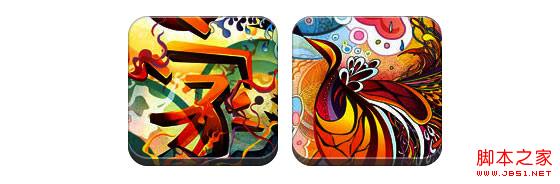
css:
碼🎜>.embossed .image-wrap {
-webkit-box-shadow: inset 0 0 2px rgba(0,0,0,.8), inset 0 2px 0 rgba(255,255,255,.5), inset 0 - 7px 0 rgba(0,0,0,.6), inset 0 -9px 0 rgba(255,255,255,.3);
-moz-box-shadow: inset 0 0 2px rgba(0,0,0,. 8), inset 0 2px 0 rgba(255,255,255,.5), inset 0 -7px 0 rgba(0,0,0,.6), inset 0 -9px 0 rgba(255,255,255,.3)
; shadow: inset 0 0 2px rgba(0,0,0,.8), inset 0 2px 0 rgba(255,255,255,.5), inset 0 -7px 0 rgba(0,0,0,.6), inset 0 - 9px 0 rgba(255,255,255,.3);
-webkit-border-radius: 20px;
-moz-border-radius: 20px;
border-radius: 20px;
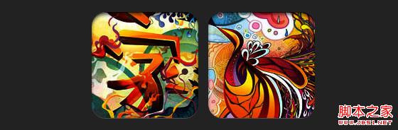
柔性浮雕風格
相對於浮雕樣式,新樣式增加了1px blur屬性。
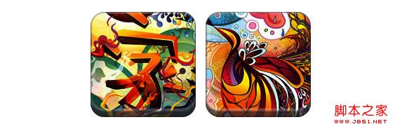
css:
碼🎜>.soft-embossed .image-wrap {
-webkit-box-shadow: inset 0 0 4px rgba(0,0,0,1), inset 0 2px 1px rgba(255,255,255,.5), inset 05), inset 0 -9px 2px rgba(0,0,0,.6), inset 0 -12px 2px rgba(255,255,255,.3);
-moz-box-shadow: inset 0 0 4px rgba(0,0,0, 1), inset 0 2px 1px rgba(255,255,255,.5), inset 0 -9px 2px rgba(0,0,0,.6), inset 0 -12px 2px rgba(255,255,255,.33); shadow: inset 0 0 4px rgba(0,0,0,1), inset 0 2px 1px rgba(255,255,255,.5), inset 0 -9px 2px rgba(0,0,0,.6), inset 0 -112px 2px rgba(255,255,255,.3);
-webkit-border-radius: 20px;
-moz-border-radius: 20px;
border-radius: 20px; 🎜>
摳圖風格
使用內嵌box-shadow就可以實現摳圖效果。
css:
-moz-box-shadow: 0 1px 0 rgba(255,255,255,.2), inset 0 4px 5px rgba(0,0,0,.6) , inset 0 1px 0 rgba(0,0,0,.6);
box-shadow: 0 1px 0 rgba(255,255,255,.2), inset 0 4px 5px rgba(0,0,0,.6) , inset 0 1px 0 rgba(0,0,0,.6);
-webkit-border-radius: 20px;
-moz-border-radius: 20px;
border-radius: 20px;
}
在這個例子中我們為圖片包裝添加transition屬性,滑鼠滑過的時候,他會從圓角變為圓形。然後我們使用多個box-shadow實現發光效果。
css:
-webkit-transition: 1s;
-moz-transition: 1s;
transition: 1s;
-webkit-border-radius: 20px;
-moz-border-radius: 20px;
border-radius: 20px;
}
.morphing-glowing .image-wrap:hover {
-webkit-box-shadow: 0 0 20px rgba(255,255,255,.6), inset 0 0 20px rgba(255,255,255,1);
-moz-box-shadow: 0 0 20px rgba(255,255,5025,005, 506p ,255, 1);
box-shadow: 0 0 20px rgba(255,255,255,.6), inset 0 0 20px rgba(255,255,255,1);
-webkit-border-radius: 60em> border-radius: 60em;
border-radius: 60em;
}
高光效果
高光的效果是透過為元素添加 :after 偽類來實現的。
css:
碼🎜>.glossy .image-wrap {
-webkit-box-shadow: inset 0 -1px 0 rgba(0,0,0,.5);
-moz-box-shadow: inset 0 -1px 0 rgba(0,0,0,.5);
box-shadow: inset 0 -1px 0 rgba(0,0,0,.5);
-webkit-border-radius: 20px;
-moz-border-radius: 20px;
border-radius: 20px;
}
.glossy .image-wrap:after {
position: absolute
content: ' ;
width: 100%;
height: 50%;
top: 0;
left: 0;
-webkit-border-radius: 20px;
-moz-border -radius: 20px;
border-radius: 20px;
background: -moz-linear-gradient(top, rgba(255,255,255,0.7) 0%, rgba(255,255,25,0%); >background: -webkit-gradient(linear, left top, left bottom, color-stop(0%,rgba(255,255,255,0.7)), color-stop(100%,rgba(255,255,255,.1)); >background: linear-gradient(top, rgba(255,255,255,0.7) 0%,rgba(255,255,255,.1) 100%);
}
 在這個例子中,我們將高光效果移到底部就達到倒影效果。
 css:
複製程式碼
碼🎜>.reflection .image-wrap:after {
position: absolute;
content: ' ';
width: 100%;
height: 30px;
bottom: -31px; 🎜>left: 0;
-webkit-border-top-left-radius: 20px;
-webkit-border-top-right-radius: 20px;
-moz-border-radius-topleft: 20px;
-moz-border-radius-topright: 20px;
border-top-left-radius: 20px;
border-top-right-radius: 20px;
background: -moz-background: -moz-background: -moz-background: -moz-background linear-gradient(top, rgba(0,0,0,.3) 0%, rgba(255,255,255,0) 100%);
background: -webkit-gradient(linear, left top, left bottom, color- stop(0%,rgba(0,0,0,.3)), color-stop(100%,rgba(255,255,255,0)));
background: linear-gradient(top, rgba(0,0 ,0,.3) 0%,rgba(255,255,255,0) 100%);
}
.reflection .image-wrap:hover {
position: relative;
top: -8px;
高光和倒影
 本例我們使用:before 和:after 將高光和倒影效果組合起來。
 css:
複製程式碼
碼🎜>.glossy-reflection .image-wrap {
-webkit-box-shadow: inset 0 -1px 0 rgba(0,0,0,.5), inset 0 1px 0 rgba(255,255,255,.6);
-moz-box-shadow: inset 0 -1px 0 rgba(0,0,0,.5), inset 0 1px 0 rgba(255,255,255,.6);
box-shadow: inset 0 -1px 0 rgba(0,0,0,.5), inset 0 1px 0 rgba(255,255,255,.6);
-webkit-transition: 1s;
-moz-transition: 1s;
transition: 1s;
-webkit-border-radius: 20px;
-moz-border-radius: 20px;
border-radius: 20px;
}
.glossy-reflection .glossy-reflection . :before {
position: absolute;
content: ' ';
width: 100%;
height: 50%;
top: 0;
left: 0; >-webkit-border-radius: 20px;
-moz-border-radius: 20px;
border-radius: 20px;
background: -moz-linear-gradient(top, rgba(255,255,755,75,255,25,255,255,2555,75,2555,752 ) 0%, rgba(255,255,255,.1) 100%);
background: -webkit-gradient(linear, left top, left bottom, color-stop(0%,rgba(255,255,25,00%, color. stop(100%,rgba(255,255,255,.1)));
background: linear-gradient(top, rgba(255,255,255,0.7) 0%,rgba(255,255,25,0%);
.glossy-reflection .image-wrap:after {
position: absolute;
content: ' ';
width: 100%;
height: 30px;
bot; 31px;
left: 0;
-webkit-border-top-left-radius: 20px;
-webkit-border-top-right-radius: 20px;
-moz-border-top-right-radius: 20px;
-moz-border-radius -topleft: 20px;
-moz-border-radius-topright: 20px;
border-top-left-radius: 20px;
border-top-right-radius: 20px
background: -moz-linear-gradient(top, rgba(230,230,230,.3) 0%, rgba(230,230,230,0) 100%);
background: -webkit-gradient(linear, left topcolor, left 顏色>background: -webkit-gradient(linear, left topcolor, left 顏色(0%,rgba(230,230,230,.3)), color-stop(100%,rgba(230,230,230,0)));
background: linear-gradient(top, rgba(230,230,230%,. rgba(230,230,230,0) 100%);
Gaya pita
Dalam contoh ini, kami menggunakan :selepas untuk mencapai kesan pita.
css:
.tape .image-wrap {
-webkit-box-shadow: inset 0 0 2px rgba(0,0,0,.7), inset 0 2px 0 rgba(255,255,255,.3), sisipan 0 - 1px 0 rgba(0,0,0,.5), 0 1px 3px rgba(0,0,0,.4); 0,0 ,.7), inset 0 2px 0 rgba(255,255,255,.3), inset 0 -1px 0 rgba(0,0,0,.5), 0 1px 3px rgba(0,0,0,.4 );
bayang kotak: inset 0 0 2px rgba(0,0,0,.7), inset 0 2px 0 rgba(255,255,255,.3), inset 0 -1px 0 rgba(0,0,0, .5) , 0 1px 3px rgba(0,0,0,.4);
lebar: 60px;
tinggi: 25px;
atas: -10px;
kiri: 50%; ,48, .2);
latar belakang: -moz-linear-gradient(atas, rgba(254,243,127,.6) 0%, rgba(240,224,.6) 100%); webkit-gradient (linear, kiri atas, kiri bawah, color-stop(0%,rgba(254,243,127,.6)), color-stop(100%,rgba(240,224,54,.6))); latar belakang: linear -gradient(atas, rgba(254,243,127,.6) 0%,rgba(240,224,54,.6) 100%); 3), 0 1px 0 rgba(0,0,0,.2);
}
Transform and Colorize
Dalam contoh ini kita gunakan :after , mencapai kesan kecerunan jejarian apabila tetikus melepasi.
css:
Salin kod
 Kodnya adalah seperti berikut:
.morphing-tinting .image-wrap {
atas: 0;
-webkit-border-radius: 30em;
-moz-border-radius: 30em; 30em;
}
.morphing-tinting .image-wrap:hover:after {
background : -webkit-gradient(radial, 50% 50%, 40, 50% 50%, 80, from( rgba(0,0,0,0)), to(rgba(0,0,0,1))) ;
latar belakang: -moz-radial-gradient(50% 50%, bulatan, rgba(0, 0,0,0) 40px, rgba(0,0,0,1) 80px
}
Bulatan tepi bulu
Kita juga boleh Menggunakan kecerunan jejari untuk mencipta topeng untuk mencapai kesan bulu.
css:
Salin kod
Kod adalah seperti berikut:
.feather .image-wrap {
kedudukan: relatif;
-webkit-border-radius: 30em;-moz-border-radius: 30em; 30em;
}
.feather .image-wrap: selepas {
kandungan: ' '; lebar: 100%; 🎜>atas : 0; kiri: 0;
latar belakang: -webkit-gradient(radial, 50% 50%, 50, 50% 50%, 70, from(rgba(255,255,255,0)), to (rgba( 255,255,255,1)));

Keserasian Pelayar

熱AI工具

Undresser.AI Undress
人工智慧驅動的應用程序,用於創建逼真的裸體照片

AI Clothes Remover
用於從照片中去除衣服的線上人工智慧工具。

Undress AI Tool
免費脫衣圖片

Clothoff.io
AI脫衣器

Video Face Swap
使用我們完全免費的人工智慧換臉工具,輕鬆在任何影片中換臉!

熱門文章
熱工具

記事本++7.3.1
好用且免費的程式碼編輯器

SublimeText3漢化版
中文版,非常好用

禪工作室 13.0.1
強大的PHP整合開發環境

Dreamweaver CS6
視覺化網頁開發工具

SublimeText3 Mac版
神級程式碼編輯軟體(SublimeText3)


 小紅書發布自動儲存圖片怎麼解決?發布自動保存圖片在哪裡?
Mar 22, 2024 am 08:06 AM
小紅書發布自動儲存圖片怎麼解決?發布自動保存圖片在哪裡?
Mar 22, 2024 am 08:06 AM
隨著社群媒體的不斷發展,小紅書已經成為越來越多年輕人分享生活、發現美好事物的平台。許多用戶在發布圖片時遇到了自動儲存的問題,這讓他們感到十分困擾。那麼,如何解決這個問題呢?一、小紅書發布自動儲存圖片怎麼解決? 1.清除快取首先,我們可以嘗試清除小紅書的快取資料。步驟如下:(1)開啟小紅書,點選右下角的「我的」按鈕;(2)在個人中心頁面,找到「設定」並點選;(3)向下捲動,找到「清除快取」選項,點擊確認。清除快取後,重新進入小紅書,嘗試發布圖片看是否解決了自動儲存的問題。 2.更新小紅書版本確保你的小
 抖音評論裡怎麼發圖片?評論區圖片入口在哪裡?
Mar 21, 2024 pm 09:12 PM
抖音評論裡怎麼發圖片?評論區圖片入口在哪裡?
Mar 21, 2024 pm 09:12 PM
隨著抖音短影片的火爆,用戶們在留言區互動變得更加豐富多彩。有些用戶希望在評論中分享圖片,以便更好地表達自己的觀點或情感。那麼,抖音評論裡怎麼發圖片呢?本文將為你詳細解答這個問題,並為你提供一些相關的技巧和注意事項。一、抖音評論裡怎麼發圖片? 1.開啟抖音:首先,你需要開啟抖音APP,並登入你的帳號。 2.找到評論區:瀏覽或發布短影片時,找到想要評論的地方,點擊「評論」按鈕。 3.輸入評論內容:在留言區輸入你的評論內容。 4.選擇傳送圖片:在輸入評論內容的介面,你會看到一個「圖片」按鈕或「+」號按鈕,點
 ppt怎麼讓圖片一張一張出來
Mar 25, 2024 pm 04:00 PM
ppt怎麼讓圖片一張一張出來
Mar 25, 2024 pm 04:00 PM
在PowerPoint中,讓圖片逐一顯示是常用的技巧,可以透過設定動畫效果來實現。本指南詳細介紹了實現此技巧的步驟,包括基本設定、圖片插入、新增動畫、調整動畫順序和時間。此外,還提供了進階設定和調整,例如使用觸發器、調整動畫速度和順序,以及預覽動畫效果。透過遵循這些步驟和技巧,使用者可以輕鬆地在PowerPoint中設定圖片逐一出現,從而提升簡報的視覺效果並吸引觀眾的注意力。
 在 iPhone 上讓圖片更清晰的 6 種方法
Mar 04, 2024 pm 06:25 PM
在 iPhone 上讓圖片更清晰的 6 種方法
Mar 04, 2024 pm 06:25 PM
Apple最近的iPhone可以透過清晰的細節、飽和度和亮度來捕捉回憶。但有時,您可能會遇到一些問題,這些問題可能會導致影像看起來不那麼清晰。儘管iPhone相機上的自動對焦已經取得了長足的進步,可以讓您快速拍照,但相機在某些情況下可能會錯誤地對焦錯誤的拍攝對象,從而使照片在不需要的區域更加模糊。如果iPhone上的照片看起來失焦或整體缺乏清晰度,以下貼文應該可以幫助您使它們更清晰。如何在iPhone上讓圖片更清晰[6種方法]您可以嘗試使用本機的「照片」應用程式來清理照片。如果您需要更多功能和選項
 網頁圖片載入不出來怎麼辦? 6種解決辦法
Mar 15, 2024 am 10:30 AM
網頁圖片載入不出來怎麼辦? 6種解決辦法
Mar 15, 2024 am 10:30 AM
有網友發現打開瀏覽器網頁,網頁上的圖片遲遲加載不出來,是怎麼回事?檢查過網路是正常的,那是哪裡出現了問題呢?下面小編就來跟大家介紹一下網頁圖片載入不出來的六種解決方法。網頁圖片載入不出來: 1、網速問題網頁顯示不出圖片有可能是因為電腦的網路速度比較慢,電腦中開啟的軟體比較多, 而我們造訪的圖片比較大,這就可能因為載入逾時,導致圖片顯示不出來, 可以將比較佔網速的軟體將關掉,可以去任務管理器查看一下。 2、造訪人數過多 網頁顯示不出圖片還有可能是因為我們造訪的網頁,在同時段造訪的
 wps文檔中兩張圖片怎麼並排
Mar 20, 2024 pm 04:00 PM
wps文檔中兩張圖片怎麼並排
Mar 20, 2024 pm 04:00 PM
在使用wps辦公室軟體時,我們發現不單單只用一種形式,文字裡會加入表格和圖片,表格裡也可以加入圖片等等,這些都是合併使用的,讓整個文件的內容看起來更豐富,如果需要在文件中插入兩張圖片,而且需要並排排列。我們接下來的課程就可以解決這個問題:wps文件中兩張圖片怎麼並排。 1.首先要開啟WPS軟體,找到你想要調整的圖片。左鍵點擊圖片會彈出一個選單欄,選擇「頁面佈局」。 2、在文字環繞中選擇「緊密型環繞」。 3.當需要的圖片都確認設定為「緊密型文字環繞」之後,便可以把圖片隨意拖動到合適的位置,點擊第一張圖片
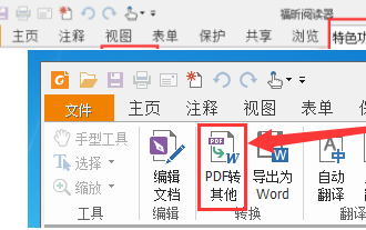 福昕PDF閱讀器如何將pdf文件轉成jpg圖片-福昕PDF閱讀器將pdf文件轉成jpg圖片的方法
Mar 04, 2024 pm 05:49 PM
福昕PDF閱讀器如何將pdf文件轉成jpg圖片-福昕PDF閱讀器將pdf文件轉成jpg圖片的方法
Mar 04, 2024 pm 05:49 PM
你們是不是也在使用福昕PDF閱讀器軟體呢?那麼你們知道福昕PDF閱讀器如何將pdf文檔轉成jpg圖片嗎?下面這篇文章就為大夥帶來了福昕PDF閱讀器將pdf文檔轉成jpg圖片的方法,有興趣的夥伴們快來下文看看吧。先啟動福昕PDF閱讀器,接著在頂部工具列找到“特色功能”,然後選擇“PDF轉其他”功能。在接下來,開啟一個名為「福昕pdf線上轉換」的網頁。在頁面上方右側點選「登入」按鈕進行登錄,然後開啟「PDF轉圖片」功能。之後點擊上傳按鈕並將想要轉換成圖片的pdf檔加入進來,加入完畢後點擊「開始轉
 如何讓Win11在啟動時自動顯示一張圖片
Dec 31, 2023 pm 10:54 PM
如何讓Win11在啟動時自動顯示一張圖片
Dec 31, 2023 pm 10:54 PM
有一些用戶想要在不更改桌面桌布的情況下,在開機時自動打開一張圖片來看,我們可以使用這個功能欣賞圖片或是提示備忘錄等,其實設定方法非常簡單,只要將圖片放到對應的啟動資料夾中就可以了,下面一起來看看吧。 win11開機怎麼自動開啟一張圖片:1、首先我們需要雙擊開啟桌面上「此電腦」2、進入此電腦後,雙擊進入系統「c盤」3、然後定位到如下位置「C:\Users\Administrator \AppData\Roaming\Microsoft\Windows\StartMenu\Programs\Start
