加了<meta name="viewport" content="width=device-width,initial-scale=1">
<table class="features">
            <tbody>
                <tr>
                    <th style="width: 15%;">
                        Features
                    </th>
                    <th style="width: 15%;">
                        Express<br>
                        Windows VPS
                    </th>
                    <th style="width: 15%;">
                        Basic<br>
                        Windows VPS
                    </th>
                    <th style="width: 15%;">
                        Professional<br>
                        Windows VPS
                    </th>
                    <th style="width: 15%;">
                        Advanced<br>
                        Windows VPS
                    </th>
                    <th>
                        Remarks on Features
                    </th>
                </tr>
            </tbody>
        </table>
.features {
width: 80%;
margin: 0 auto;
}
.features tbody{
width: 100%;
}
.features th{
background-color: #373d41;
color: #fff;
font-weight: 400;
}
@media screen and (max-width: 768px) {
.features {
width: 100%;
margin: 0;
}
}Pc上没问题:
手机上就超出了: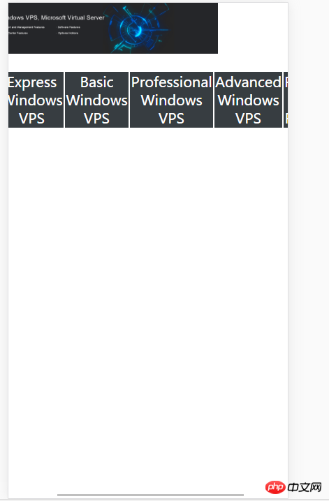
表格上面那张图片是设置为宽度100%的,而且底部出现了横向的滚动条。
要怎么才能让表格全部出现在屏幕里,不要滚动条。


table裡的元素會被內容撐開,不能小於內容大小,所以設定的width會失效。

為table加上這個樣式table-layout:fixed;
但是會出現一個問題,就是table裡的文字重疊到一起了。
或是你配合多媒體查詢再修改一下字體的尺寸吧。或搭配其他樣式,改下內部文字的顯示格式。
加視口 meta了麼?
百分比只是相對父元素,vw才是你想的那種「相對寬度」。