在本教程中,我们将学习如何使用 Plotly 创建交互式可视化。我们的项目重点是分析掷骰子的结果。当滚动单个六面骰子时,从 1 到 6 的任何数字都有相同的出现机会。然而,当您掷多个骰子时,某些数字变得比其他数字更有可能出现。我们的目标是通过模拟掷骰子并创建数据集来确定这些概率。之后,我们将直观地呈现多次掷骰的结果,以显示哪些结果在统计上更有可能。
Plotly 是一个开源图形库,可让用户创建交互式、基于 Web 的可视化效果。它支持多种图表类型,包括线图、散点图、条形图等。 Plotly 对于创建可嵌入 Web 应用程序的可视化效果特别有用,因为它提供缩放、平移和悬停信息等交互功能。
我们将使用 pip 安装 Plotly。我们还需要安装 pandas,一个用于高效处理数据的库,因为 Plotly Express 依赖于它。
$ python -m pip install --user plotly
$ python -m pip install --user pandas
访问 Plotly 网站上的图表类型库,查看可以使用 Plotly 创建的不同可视化效果。
首先,我们将创建以下 Die 类来模拟骰子的滚动。我们将文件命名为 Die.py。
from random import randint

class Die:
    """A class representing a single die."""

    def __init__(self, num_sides = 6):
        """Assume a six-sided die"""
        self.num_sides = num_sides


    def roll(self):
        """Return a random value between 1 and number of sides."""
        return randint(1, self.num_sides)
__ init __ 方法采用一个可选参数。创建 Die 实例时,如果未提供参数,边数将为 6。如果给出一个参数,它将设置骰子的面数。
roll() 方法使用 randint() 函数返回 1 到边数之间的随机数。此函数可以返回起始值 (1)、结束值 (num_sides) 或两者之间的任何整数。骰子根据其面数命名:六面骰子称为 D6,十面骰子称为 D10,依此类推。
我们首先使用别名 px 导入 Plotly Express 模块,以避免重复输入plotly.express。我们将创建一个骰子实例来模拟掷两个 D8 骰子。我们将此文件命名为 dice_visual.py。
import plotly.express as px

from die import Die

# Create two D8.
die_1 = Die(8)
die_2 = Die(8)

# Make some rolls, and store results in a list.
results = []
for roll_num in range(500_000):
    result = die_1.roll() + die_2.roll()
    results.append(result)
最小的可能结果是每个骰子上最小数字的总和 (2)。最大可能结果是分配给 max_results 的每个骰子上最大数字 (16) 的总和。变量 max_result 提高了生成 poss_results 的代码的可读性。我们可以编写范围 (2,16),但这仅适用于两个 D8 骰子。在模拟现实环境时,最好开发能够轻松处理各种场景的代码。
# Analyze the result.
frequencies = []
max_results = die_1.num_sides + die_2.num_sides
poss_results = range(2, max_results + 1)
for value in poss_results:
    frequency = results.count(value)
    frequencies.append(frequency)
我们定义了标题并将其分配给“title”。我们创建了一个字典来指定轴标签。字典的键代表我们想要自定义的标签,而值代表我们想要使用的自定义标签。我们将 x 轴命名为“结果”,将 y 轴命名为“结果频率”。为了构建条形图,我们使用 px.bar() 函数并传入可选变量“title”和“labels”。
# Visualize the results.
title = "Results of Rolling Two D8 Dice 500,000 Times"
labels = {'x': 'Result', 'y': 'Frequency of Result'}
fig = px.bar(x = poss_results, y = frequencies, title = title,
 labels = labels)
fig.show()
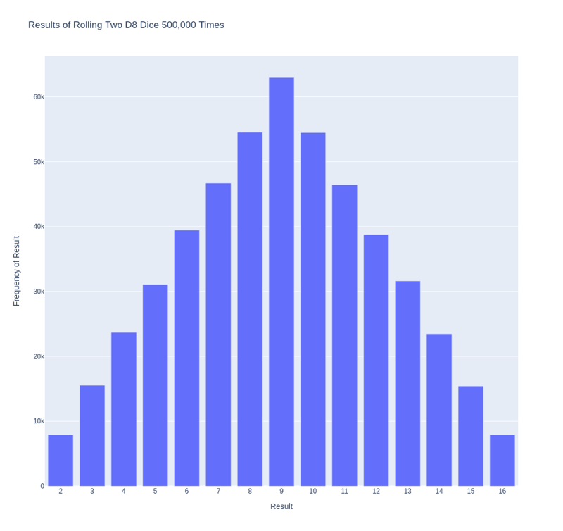
生成的图具有适当的标题和每个轴的标签,如下图所示。

我们需要解决刚刚创建的绘图的一个问题。由于有 11 个条形图,默认的 x 轴布局设置使某些条形图未标记。虽然默认设置足以满足大多数可视化效果,但如果所有条形图均已标记,此图表会显得更好。
Plotly 提供了 update_layout() 方法,可让您在创建图形后对其进行各种更改。以下是如何指示 Plotly 为每个条形图赋予自己的标签。
# Further customize chart.
fig.update_layout(xaxis_dtick = 1)
fig.show()
#fig.write_html('dice_visual_d6d10.xhtml')
update_layout()方法适用于fig对象,它代表整个图表。我们使用 xaxis_dtick 选项来设置 x 轴上刻度线之间的距离。我们将间距设置为 1,以便对每个条形进行标记。当您再次运行 dice_visual.py 时,您应该在每个条形上看到标签。
可以轻松自定义此代码以模拟滚动不同大小的骰子。要创建 D6 和 D10,请在创建两个 die 实例时传递参数 6 和 10。将第一个循环更改为所需的卷数,并相应地更改图表的标题。
We can get our program to save the chart as an HTML file automatically by replacing the call to fig.show() with a call to fig.write_html().
The write_html() method requires one argument: the name of the file to write to. If you only provide a filename, the file will be saved in the same directory as the .py file. You can also call write_html() with a Path object to save the output file anywhere on your system.
Here is the complete code:
import plotly.express as px

from die import Die

# Create two D8.
die_1 = Die(8)
die_2 = Die(8)

# Make some rolls, and store results in a list.
results = []
for roll_num in range(500_000):
    result = die_1.roll() + die_2.roll()
    results.append(result)

# Analyze the result.
frequencies = []
max_results = die_1.num_sides + die_2.num_sides
poss_results = range(2, max_results + 1)
for value in poss_results:
    frequency = results.count(value)
    frequencies.append(frequency)

# Visualize the results.
title = "Results of Rolling Two D8 Dice 500,000 Times"
labels = {'x': 'Result', 'y': 'Frequency of Result'}
fig = px.bar(x = poss_results, y = frequencies, title = title, labels = labels)

# Further customize chart.
fig.update_layout(xaxis_dtick = 1)
fig.write_html('dice_visual.xhtml')
For clarity, the listings in this section use the long form of for loops. We can refactor the code by using list comprehensions for one or both of the loops. Here is the code using list comprehension:
import plotly.express as px

from die import Die

# Create two D8.
die_1 = Die(8)
die_2 = Die(8)

# Make some rolls, and store results in a list.
results = [die_1.roll() + die_2.roll() for roll_num in range(500_000) ]

# Analyze the result.
max_results = die_1.num_sides + die_2.num_sides
poss_results = range(2, max_results + 1)
frequencies = [results.count(value) for value in poss_results]

# Visualize the results.
title = "Results of Rolling Two D8 Dice 500,000 Times"
labels = {'x': 'Result', 'y': 'Frequency of Result'}
fig = px.bar(x = poss_results, y = frequencies, title = title, labels = labels)

# Further customize chart.
fig.update_layout(xaxis_dtick = 1)

fig.write_html('dice_visual_list_comprehension.xhtml')
In conclusion, analyzing and presenting statistical data becomes powerful and engaging with Plotly for interactive dice roll data visualization. By simulating dice rolls and visualizing the outcomes, we can better understand the probabilities of different results. Plotly's interactive features, such as hover information, panning, and zooming, enhance the user experience and make data more accessible. Additionally, the ability to customize and save visualizations as HTML files makes it easy to share and integrate them into web applications. This article demonstrates how to use Plotly's features to create informative and attractive charts. Plotly is an excellent tool for data analysis and presentation.
以上是使用 Plotly 进行交互式掷骰子数据可视化的详细内容。更多信息请关注PHP中文网其他相关文章!