

在 CSS 中创建效果

作者:Oscar Jite-Orimiono✏️
作为前端开发人员,您很可能听说过用于描述 HTML、CSS 和 JavaScript 的房子比喻。 HTML 是结构(墙壁、房间、门等),CSS 是装饰器(绘画、布局和家具),而 JavaScript 则带来电力和管道的功能。
让我们单独看一下 CSS,首先是因为它很神奇,其次 CSS 本身就很强大,并且可以带来某种程度的功能,而在某些情况下不需要 JavaScript。使用CSS,你唯一的限制就是你的想象力,但最好不要让它疯狂,因为你必须保持高水平的功能。
在这篇文章中,您将学习如何使用 CSS 创建 3D 效果,通过使用控制虚拟 3D 空间中元素的相关属性和操作,此外我们还将介绍阴影和光线的视觉错觉。
你怎么知道某个东西是 3D 的?
3D 空间中的物体具有三个维度:长度、宽度——技术上与“长度”相同,但通常被认为是较短的边,以及高度(或深度)。当您查看屏幕时,您只能看到 2D 效果,因此您需要像 Transform 这样的 CSS 属性来创建 3D 效果。
transform 属性有几个控制元素的 3D 尺寸和位置的操作。您可以使用translateX() 控制水平位置,使用translateY() 控制垂直位置,并使用translateZ() 控制高度和深度。
考虑这个例子。我们有两个矩形元素——一个小,另一个大。小元素是子元素,它嵌套在较大的父元素中: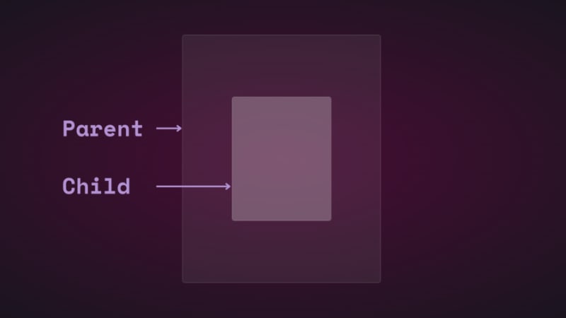
如果使用平移更改子元素的垂直和水平位置,您会看到它移动: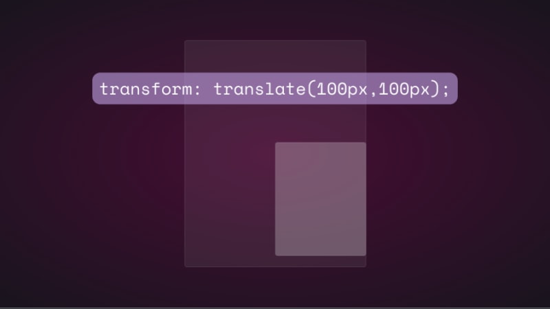
如果您尝试通过添加 translateZ() 来更改子元素在 z 轴上的位置,则不会发生任何情况。 z 轴垂直于视口,因此子元素在远离屏幕时应该显得更小,而在靠近屏幕时则应该显得更大,对吧?这就是现实世界中从上方观察物体时的运作方式。然而,实际上事情的运作方式并不一样,因为没有视角。
在CSS中,perspective属性和perspective()运算符对于3D变换的工作方式非常重要。透视是你的观点,它创造了深度和高度的错觉。
透视属性适用于父元素,而perspective()则适用于子元素的变换属性。他们大多数时候都做同样的事情。
让我们看看透视属性如何影响translateZ()。我们将使用一个简单的动画来演示。
以下是父元素和子元素的 HTML 和 CSS:
<div class="parent">
    <div class="child">
    </div>
  </div>

.parent {
  display: flex;
  justify-content: center;
  align-items: center;
  background: rgba(255, 255, 255, 0.07);
  width: 400px;
  height: 500px;
  border: 0.5px solid rgba(255, 255, 255, 0.15);
  border-radius: 5px;
  z-index: 0;
}
.child {
  background: rgba(255, 255, 255, 0.25);
  width: 200px;
  height: 250px;
  border: 1px solid rgba(255, 255, 255, 0.15);
  border-radius: 5px;
  z-index: 1;
}
首先,为父元素添加透视,然后为子元素添加变换动画:
.parent{
  perspective: 1000px;
}
.child{
   animation: transform 5s infinite ease-in-out alternate-reverse;
}
@keyframes transform{
  0%{
    transform: translateZ(-200px)
  }
  100%{
    transform: translateZ(200px)
  }
}
结果如下:
如果使用perspective() 运算符,您将得到相同的结果。不过,当与rotate()一起使用时,情况就不同了。
让我们沿着 x 轴旋转孩子,看看会发生什么:
.child{
  transform: perspective(10px) rotateX(2deg);
}
这是屏幕截图: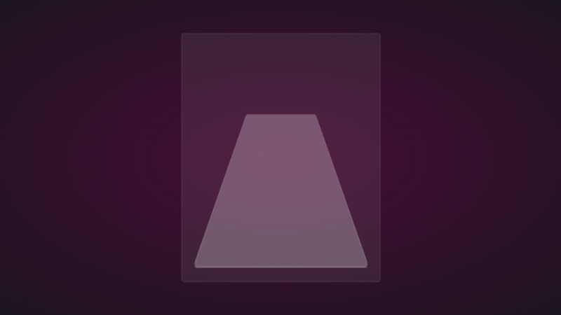
如果我们在 z 轴上添加少量平移,您将得到以下结果: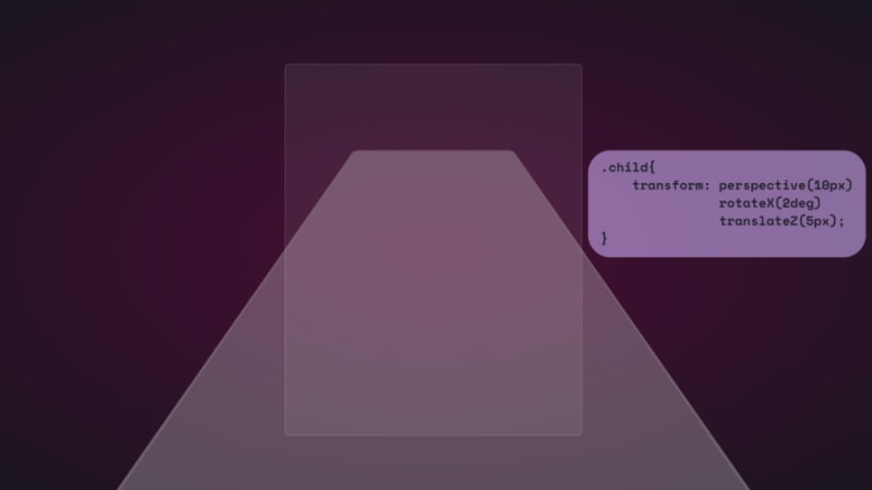
为了好玩,以下是它的延伸距离:
就像您在元素的表面一样。如果你能通过 VR 耳机观看这一点,那就太好了。
我们还可以使用独立属性:
.parent {
  perspective: 10px;
}
.child {
  transform: rotateX(2deg) translateZ(5px);
}
结果是一样的,但不会溢出到视口之外。它们都有各自的用例,随着我们的进展,我们将看到它们以及其余的转换操作正在发挥作用。
请注意,上例中使用的小透视值是为了夸大 3D 效果,以便您可以看到它是如何工作的。您主要希望从上方查看元素,因此最大 1000px 的更大值就足够了。小的透视值使元素显得更加 3D。
这是带有 3D 变换动画的 CodePen。
是时候进入有趣的部分并使用 CSS 创建一些 3D 效果了!
Reflection and shadow
How objects interact with light is another way to tell they’re in 3D space. We can use the perspective() operator to create reflections and shadows in CSS to generate the illusion that an element is floating in 3D space.
3D text reflection
This example will feature text, but you can use other HTML elements:
<div class="content">
    <h1>Text in space</h1>
  </div>
We’re creating a reflection, so we need light. You’ll need the text-shadow property to create this light effect:
.content h1 {
  position: relative;
  font-size: 5rem;
  font-weight: 600;
  color: #fff;
  margin: 3px;
  text-shadow: 0px 0px 10px #b393d350, 0px 0px 20px #b393d350;
  text-transform: uppercase;
}
You should have glowing text at this point: 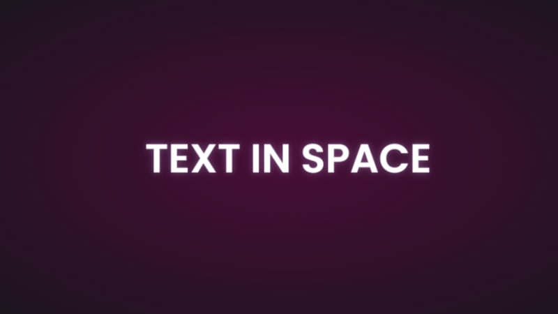
It’s time to add the reflection using a pseudo-element:
  .content h1::before {
    content: "";
    position: absolute;
    top: 80%;
    left: 0;
    height: 100%;
    width: 100%;
    background: #b393d3;
    transform: perspective(10px) rotateX(10deg) scale(1,0.2);
    filter: blur(1em);
    opacity: 0.5;
  }
First, we give the pseudo-element the same dimensions as the text. Then we add a background with the same color as the text-shadow. Next, we add the transform property with three operations.
We’ve already seen how the first two work, so let’s talk about scale(). Remember how the child element stretches beyond the viewport? This prevents that by resizing the element along the x and y directions.
In this example, the reflection we created with the pseudo-element keeps its original size on the x-axis but is reduced to less than half on the y-axis. The opacity and filter make it look like the light fades the further it moves from the text: 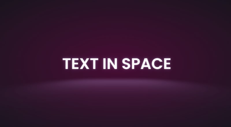
The text looks like it’s floating and reflecting light off the floor.
3D shadow
We can also create shadows using a similar method to the light. Let’s work with an image this time.
Here’s the image we’ll work with for this example: 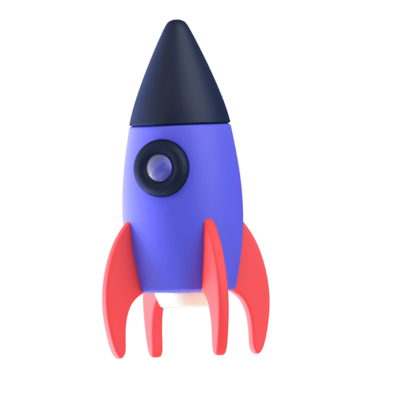
It’s nice to have the shadow match the shape and size of the element. In this case, we have a rocket, and this means our shadow should be round. Consequently, there’s no need for the perspective() operator.
Here’s the HTML:
<div class="content">
    <div class="rocket">
      <img src="rocket.png" alt="">
    </div>
  </div>
In CSS, go ahead and give the image any dimensions you want, then add a pseudo-element below it:
.rocket::before {
  content: "";
  position: absolute;
  bottom: -10%;
  left: 0;
  height: 50px;
  width: 100%;
  border-radius: 50%;
  background: radial-gradient(rgba(0, 0, 0, 0.8), transparent, transparent);
  transition: 0.5s;
}
The border-radius of 50 percent gives it an oval shape. You can add more height or a more specific width if you'd like. Shadows are black most of the time, so the background is a blurry radial-gradient fading from black to transparent.
Here’s a screenshot of how it should look at this point: 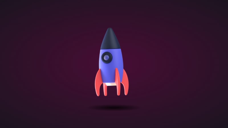
Finally, let’s add some animation:
.rocket:hover img{
  transform: translateY(-40px);
}
.rocket:hover::before {
  opacity: 0.8;
  transform: scale(0.8);
}
This will move the rocket up and down, and the shadow will change as it moves. Hover on the rocket in the CodePen to see this 3D effect.
3D text animation
You can create 3D text with the CSS box-shadow property. You’ll need multiple shadow layers to create this effect.
Here’s the HTML:
<div class="content">
    <h1>3D text in 3D space</h1>
  </div>
Next, we need CSS to turn it into 3D text. We’ll use perspective and transform to tilt the text at an angle:
.content {
  position: relative;
  transform: translate(-50%, -50%);
  display: flex;
  align-items: center;
  justify-content: center;
  text-align: center;
  perspective: 1500px;
  transform-style: preserve-3d;
}
.content h1 {
  font-size: 5rem;
  font-weight: 600;
  color: #b393d3;
  text-shadow: 1px 4px 1px #480d35,
               1px 5px 1px #480d35,
               1px 6px 1px #480d35,/* to create the sides*/
               1px 10px 5px rgba(16, 16, 16, 0.5),
               1px 15px 10px rgba(16, 16, 16, 0.4),
               1px 20px 30px rgba(16, 16, 16, 0.3); /* real shadow */
  margin: 3px;
  transform: rotateX(15deg) rotateY(-20deg) rotateZ(10deg);
  text-transform: uppercase;
Here’s how the text should look at this point: 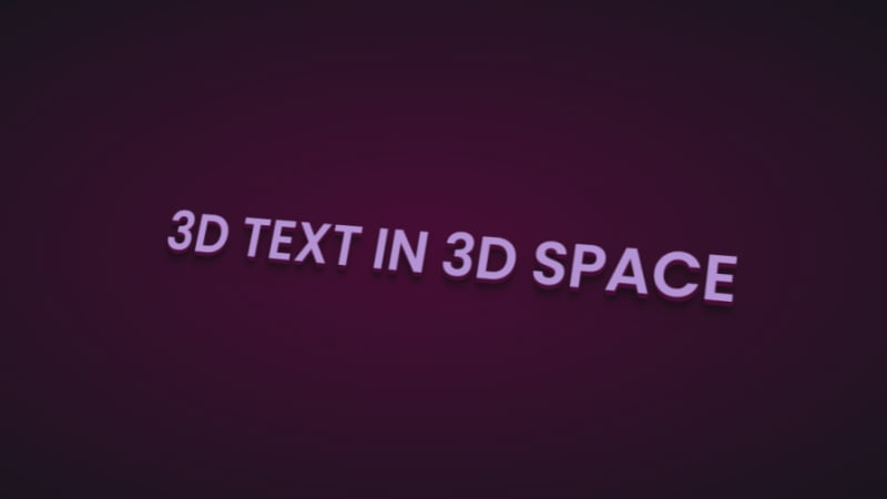
Now let’s add some animation:
.content:hover h1{
  transform: rotateX(2deg) rotateY(0deg) rotateZ(0deg);
  font-size: 4rem;
  transition: 500ms ease-in-out;
}
Here’s the 3D text plus tilt on hover effect on CodePen.
3D tilt effect
Let’s work with an image this time, and we’ll use the one below: 
Here’s the HTML:
<div class="text">
      <h2>Hover on the image</h2>
      <p>It uses a combination of all the rotate operators</p>
      <div class="tilt-img">
        <img src="7.jpg" alt="">
      </div>
    </div>
You could use a background image, but what’s important is that there’s a clear parent and child element.
In the CSS, use the transform property tilt the image at an angle, then reset it on hover:
.tilt-img {
  width: 600px;
  height: auto;
  margin-top: 20px;
  perspective: 1000px;
}
.tilt-img img {
  width: 100%;
  height: 100%;
  object-fit: contain;
  border-radius: 10px;
 transform: rotateX(15deg) rotateY(-5deg) rotateZ(1deg);
  box-shadow: 5px 5px 2px rgba(0, 0, 0, 0.5);
  transition: 2s;
}
.tilt-img:hover img{
  transform: none;
  box-shadow: 0px 2px 3px rgba(0, 0, 0, 0.5);
}
You can reverse it and add the tilt on hover, or change the transform values:
See the 3D image tilt with CSS on CodePen.
Tilt and mouse tracking
Here, we’re going to make an element tilt and follow the movement of the mouse when you hover over it. We’re going to work with vanilla-tilt.js, a JavaScript library.
Here’s what we’re aiming for: 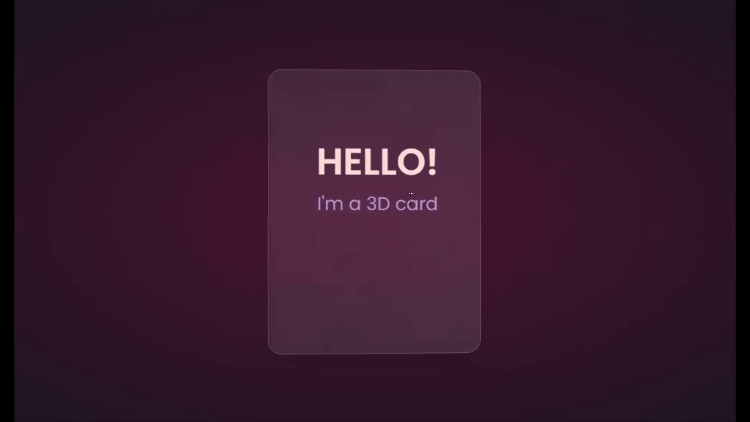
We’ll start with HTML, creating a card and some text:
<div class="box">
    <div class="elements">
      <h2>Hello!</h2>
      <p>I'm a 3D card</p>
    </div>
    <div class="card">
    </div>
  </div>
Next, we’ll style with CSS:
.box {
  position: relative;
  border-radius: 20px;
  transform-style: preserve-3d;
}
.box .card {
  position: relative;
  background: rgba(255, 255, 255, 0.07);
  width: 300px;
  min-height: 400px;
  backdrop-filter: blur(10px);
  border: 0.5px solid rgba(255, 255, 255, 0.15);
  border-radius: 20px;
  box-shadow: 0 25px 45px rgba(0,0,0,0.05);
}
.elements{
  position: absolute;
  top: 100px;
  left: 50px;
  width: 200px;
  height: auto;
  text-align: center;
  background: transparent;
  transform: translateZ(80px);
}
.elements h2{
  font-size: 3rem;
  font-weight: 600;
  color: #f6d8d5;
  text-transform: uppercase;
}
.elements p{
  font-size: 1.5rem;
  color: #b393d3;
}
The two CSS properties directly responsible for creating the 3D effect on the card are transform and transform-style.
First, we have the transform-style, set to preserve-3d, applied to the box. This means the card and any nested element are now in a 3D space. The transform property is applied to the text’s parent element, with the class name .elements. Here, translateZ(80px) moves the text toward the viewer.
These two properties combined create the illusion of depth, and the text will appear to be floating above the card.
Head to cdnjs.com to grab the Vanilla-tilt CDN and link it to your HTML document. Next, go to the main site and copy the VanillaTilt.init JavaScript function that controls the tilt. Add it just before the closing body tag:
<script type="text/javascript">
        VanillaTilt.init(document.querySelector(".your-element"), {
                max: 25,
                speed: 400
        });
</script>
Now all you have to do is replace .your-element with the class name of your element getting the 3D tilt effect, and you’re in business.
By default, the maximum tilt rotation and transition speed are defined by max and speed respectively. You can also add a glare, easing, or tilt direction and angle.
Here’s how to get the exact effect shown in the “HELLO” example above:
<script>
    VanillaTilt.init(document.querySelector(".box"), {
      max: 10,
      speed: 200,
      easing: "cubic-bezier(.03,.98,.52,.99)",
      reverse: true,
      glare: true,
      "max-glare": 0.1,
    });
  </script>
More functions and effects are listed on the main site.
Here’s a CodePen showing the 3D tilt effect.
Just to show that the library isn’t doing all the work and how important the transform and transform-style properties are for this 3D effect, here’s what it would look like if they weren’t included: 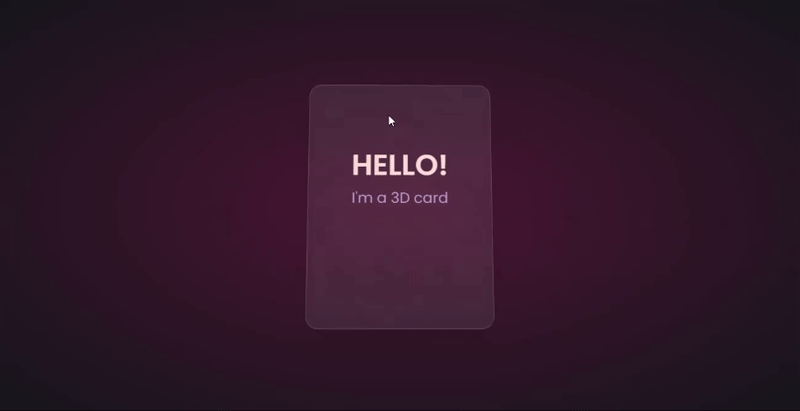
The text appears flush against the card and you’re left with only the tilting, which is nice, but not as nice as the 3D effect created when those properties are included.
Let’s explore another practical use case of this 3D effect.
Using the same card, we’ll add a background image and caption that’ll appear on hover:
.box .card {
  position: relative;
  background: url(/Captions/8.jpg) center;
  background-size: cover;
  background-repeat: no-repeat;
  width: 300px;
  min-height: 400px;
  border: 1px solid rgba(255, 255, 255, 0.15);
  border-radius: 10px;
  box-shadow: 0 25px 45px rgba(0,0,0,0.05);
  z-index: 0;
}
.elements{
  position: absolute;
  top: 60%;
  left: 30%;
  width: 250px;
  height: auto;
  padding: 10px;
  border-radius: 5px;
  text-align: center;
  background: rgba(255, 255, 255, 0.25);
  transform: translateZ(80px);
  z-index: 2;
  opacity: 0;
  transition: opacity 500ms;
}
.box:hover .elements{
  opacity: 1;
}
Here’s a CodePen with the result of the 3D image card with caption appearing on hover.
3D buttons
Buttons are common web components with many shapes, sizes, and purposes. No matter the button type, they all have one thing in common: you have to click on them to work. But how many times have you seen them actually “click”?
This will be a little micro-interaction that helps the user know they’ve done something. The main CSS property we’ll use for this 3D effect is the transform property.
Here’s how it should look: 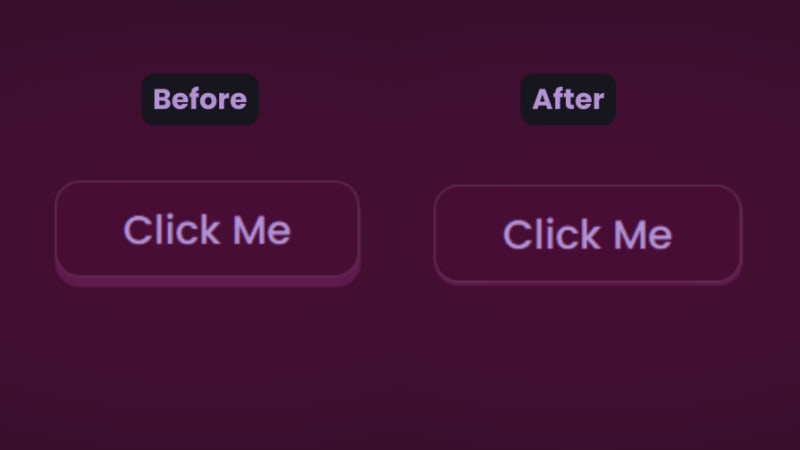
There are two distinct parts of this 3D button — the top with the "Click Me” text and the bottom and sides with a lighter color.
You’ll start with the HTML for the button:
<button class="btn"><span class="txt">Click Me</span></button>
In CSS, we’ll start with the bottom. That’s the button with the class name btn:
.btn {
  position: relative;
  background: #17151d;
  border-radius: 15px;
  border: none;
  cursor: pointer;
}
Next, we have the top of the button:
.text {
  display: block;
  padding: 10px 40px;
  border-radius: 15px;
  border: 1px solid rgba(255, 255, 255, 0.15);
  background: #480d35;
  font-size: 1.5rem;
  font-weight: 500;
  color: #b393d3;
  transform: translateY(-6px);
  transition: transform ease 0.1s;
}
The transform property is what creates the 3D effect of the button clicking. All that’s left is to reverse the transformation by a few pixels when you click on it:
.btn:active .text{
  transform: translateY(-2px);
}
And that’s how to create a 3D click button. Here’s a CodePen you can interact with.
Browser support for 3D transforms and final words
The transform property and its operators have excellent support across all the major browsers — unless you still use Internet Explorer. You can check it out yourself on CanIuse: 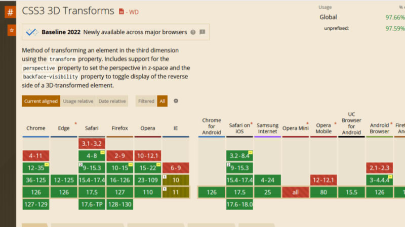
Unfortunately, the borders of the cards do not appear straight during animation on Firefox browsers, but it’s not clear why. Apart from that, the animation runs smoothly. Compare performance across browsers, and try different border thickness.
The web is your canvas, and CSS is your paintbrush. In this post, you’ve learned how to create 3D effects with the transform property. What other effects can you think of?
Is your frontend hogging your users' CPU?
As web frontends get increasingly complex, resource-greedy features demand more and more from the browser. If you’re interested in monitoring and tracking client-side CPU usage, memory usage, and more for all of your users in production, try LogRocket.
LogRocket is like a DVR for web and mobile apps, recording everything that happens in your web app, mobile app, or website. Instead of guessing why problems happen, you can aggregate and report on key frontend performance metrics, replay user sessions along with application state, log network requests, and automatically surface all errors.
Modernize how you debug web and mobile apps — start monitoring for free.
以上是在 CSS 中创建效果的详细内容。更多信息请关注PHP中文网其他相关文章!

热AI工具

Undresser.AI Undress
人工智能驱动的应用程序,用于创建逼真的裸体照片

AI Clothes Remover
用于从照片中去除衣服的在线人工智能工具。

Undress AI Tool
免费脱衣服图片

Clothoff.io
AI脱衣机

Video Face Swap
使用我们完全免费的人工智能换脸工具轻松在任何视频中换脸!

热门文章
热工具

记事本++7.3.1
好用且免费的代码编辑器

SublimeText3汉化版
中文版,非常好用

禅工作室 13.0.1
功能强大的PHP集成开发环境

Dreamweaver CS6
视觉化网页开发工具

SublimeText3 Mac版
神级代码编辑软件(SublimeText3)


 每周平台新闻:HTML加载属性,主要的ARIA规格以及从iframe转移到Shadow dom
Apr 17, 2025 am 10:55 AM
每周平台新闻:HTML加载属性,主要的ARIA规格以及从iframe转移到Shadow dom
Apr 17, 2025 am 10:55 AM
在本周的平台新闻综述中,Chrome引入了一个用于加载的新属性,Web开发人员的可访问性规范以及BBC Move


 托管您自己的非JavaScript分析的选项
Apr 15, 2025 am 11:09 AM
托管您自己的非JavaScript分析的选项
Apr 15, 2025 am 11:09 AM
有很多分析平台可帮助您跟踪网站上的访问者和使用数据。也许最著名的是Google Analytics(广泛使用)
