

生成最近 n 天的股票价格图表的 Python 代码。

以下是代码各部分功能的详细说明:
导入库:
matplotlib.pyplot 用于创建绘图。
yahooquery.Ticker 用于从雅虎财经获取历史股票数据。
datetime 和 timedelta 用于日期操作。
pandas 用于数据处理。
pytz 用于处理时区。
os 用于文件系统操作。
函数plot_stock_last_n_days:
函数参数:
符号:股票代码(例如“NVDA”)。
n_days:显示历史数据的天数。
filename:保存绘图的文件名。
timezone:显示数据的时区。
日期范围:
当前日期和周期开始日期是根据n_days计算的。
获取数据:
yahooquery 用于检索指定时间段内的历史股票数据。
检查数据可用性:
如果没有可用数据,则会打印一条消息,然后函数退出。
数据处理:
数据的索引转换为日期时间格式并设置时区。
周末(周六和周日)被过滤掉。
计算收盘价的百分比变化。
创建和配置绘图:
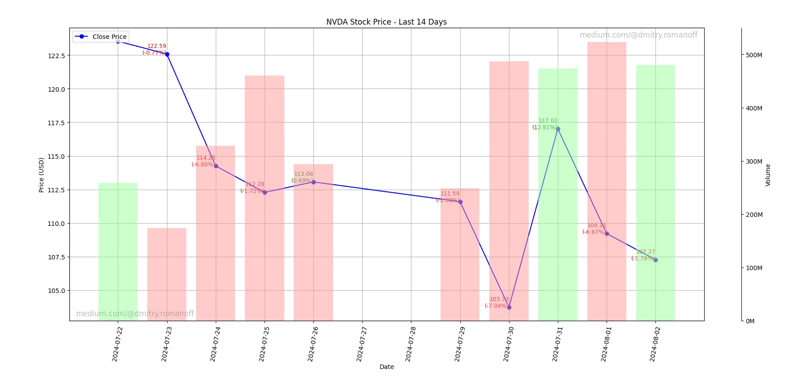
主要情节是根据收盘价创建的。
绘图中添加了注释,显示收盘价和百分比变化。
配置 X 轴和 Y 轴、设置日期格式并添加网格线。
添加了额外的交易量图,用不同的颜色表示收盘价的正向和负向变化。
添加水印:
水印添加到图的左下角和右上角。
保存并显示绘图:
绘图将保存为具有指定文件名的图像文件并显示。
用法示例:
使用代码“NVDA”(NVIDIA) 调用该函数,显示过去 14 天的数据,将绘图保存为“output.png”,并使用 GMT 时区。
总之,代码生成历史股票数据的可视化表示,包括收盘价和交易量,以及百分比变化和时区注意事项的注释。
import matplotlib.pyplot as plt
from yahooquery import Ticker
from datetime import datetime, timedelta
import matplotlib.dates as mdates
import os
import pandas as pd
import pytz

def plot_stock_last_n_days(symbol, n_days=30, filename='stock_plot.png', timezone='UTC'):
    # Define the date range
    end_date = datetime.now(pytz.timezone(timezone))
    start_date = end_date - timedelta(days=n_days)

    # Convert dates to the format expected by Yahoo Finance
    start_date_str = start_date.strftime('%Y-%m-%d')
    end_date_str = end_date.strftime('%Y-%m-%d')

    # Fetch historical data for the last n days
    ticker = Ticker(symbol)
    historical_data = ticker.history(start=start_date_str, end=end_date_str, interval='1d')

    # Check if the data is available
    if historical_data.empty:
        print("No data available.")
        return

    # Ensure the index is datetime for proper plotting and localize to the specified timezone
    historical_data.index = pd.to_datetime(historical_data.index.get_level_values('date')).tz_localize('UTC').tz_convert(timezone)

    # Filter out weekends
    historical_data = historical_data[historical_data.index.weekday < 5]

    # Calculate percentage changes
    historical_data['pct_change'] = historical_data['close'].pct_change() * 100

    # Ensure the output directory exists
    output_dir = 'output'
    if not os.path.exists(output_dir):
        os.makedirs(output_dir)

    # Adjust the filename to include the output directory
    filename = os.path.join(output_dir, filename)

    # Plotting the closing price
    fig, ax1 = plt.subplots(figsize=(10, 5))
    ax1.plot(historical_data.index, historical_data['close'], label='Close Price', color='blue', marker='o')

    # Annotate each point with its value and percentage change
    for i in range(1, len(historical_data)):
        date = historical_data.index[i]
        close = historical_data['close'].iloc[i]
        pct_change = historical_data['pct_change'].iloc[i]
        color = 'green' if pct_change > 0 else 'red'
        ax1.text(date, close, f'{close:.2f}\n({pct_change:.2f}%)', fontsize=9, ha='right', color=color)

    # Set up daily gridlines and print date for every day
    ax1.xaxis.set_major_locator(mdates.DayLocator(interval=1))
    ax1.xaxis.set_major_formatter(mdates.DateFormatter('%Y-%m-%d'))

    ax1.set_xlabel('Date')
    ax1.set_ylabel('Price (USD)')
    ax1.set_title(f'{symbol} Stock Price - Last {n_days} Days')
    ax1.legend(loc='upper left')
    ax1.grid(True)
    ax1.tick_params(axis='x', rotation=80)
    fig.tight_layout()

    # Adding the trading volume plot
    ax2 = ax1.twinx()
    calm_green = (0.6, 1, 0.6)  # Calm green color
    calm_red = (1, 0.6, 0.6)    # Calm red color
    colors = [calm_green if historical_data['close'].iloc[i] > historical_data['open'].iloc[i] else calm_red for i in range(len(historical_data))]
    ax2.bar(historical_data.index, historical_data['volume'], color=colors, alpha=0.5, width=0.8)
    ax2.set_ylabel('Volume')
    ax2.tick_params(axis='y')

    # Format y-axis for volume in millions
    def millions(x, pos):
        'The two args are the value and tick position'
        return '%1.0fM' % (x * 1e-6)

    ax2.yaxis.set_major_formatter(plt.FuncFormatter(millions))

    # Adjust the visibility and spacing of the volume axis
    fig.subplots_adjust(right=0.85)
    ax2.spines['right'].set_position(('outward', 60))
    ax2.yaxis.set_label_position('right')
    ax2.yaxis.set_ticks_position('right')

    # Add watermarks
    plt.text(0.01, 0.01, 'medium.com/@dmitry.romanoff', fontsize=12, color='grey', ha='left', va='bottom', alpha=0.5, transform=plt.gca().transAxes)
    plt.text(0.99, 0.99, 'medium.com/@dmitry.romanoff', fontsize=12, color='grey', ha='right', va='top', alpha=0.5, transform=plt.gca().transAxes)

    # Save the plot as an image file
    plt.savefig(filename)
    plt.show()

# Example usage
plot_stock_last_n_days('NVDA', n_days=14, filename='output.png', timezone='GMT')
以上是生成最近 n 天的股票价格图表的 Python 代码。的详细内容。更多信息请关注PHP中文网其他相关文章!

热AI工具

Undresser.AI Undress
人工智能驱动的应用程序,用于创建逼真的裸体照片

AI Clothes Remover
用于从照片中去除衣服的在线人工智能工具。

Undress AI Tool
免费脱衣服图片

Clothoff.io
AI脱衣机

Video Face Swap
使用我们完全免费的人工智能换脸工具轻松在任何视频中换脸!

热门文章
热工具

记事本++7.3.1
好用且免费的代码编辑器

SublimeText3汉化版
中文版,非常好用

禅工作室 13.0.1
功能强大的PHP集成开发环境

Dreamweaver CS6
视觉化网页开发工具

SublimeText3 Mac版
神级代码编辑软件(SublimeText3)


 Python vs.C:申请和用例
Apr 12, 2025 am 12:01 AM
Python vs.C:申请和用例
Apr 12, 2025 am 12:01 AM
Python适合数据科学、Web开发和自动化任务,而C 适用于系统编程、游戏开发和嵌入式系统。 Python以简洁和强大的生态系统着称,C 则以高性能和底层控制能力闻名。
 您可以在2小时内学到多少python?
Apr 09, 2025 pm 04:33 PM
您可以在2小时内学到多少python?
Apr 09, 2025 pm 04:33 PM
两小时内可以学到Python的基础知识。1.学习变量和数据类型,2.掌握控制结构如if语句和循环,3.了解函数的定义和使用。这些将帮助你开始编写简单的Python程序。
 Python:游戏,Guis等
Apr 13, 2025 am 12:14 AM
Python:游戏,Guis等
Apr 13, 2025 am 12:14 AM
Python在游戏和GUI开发中表现出色。1)游戏开发使用Pygame,提供绘图、音频等功能,适合创建2D游戏。2)GUI开发可选择Tkinter或PyQt,Tkinter简单易用,PyQt功能丰富,适合专业开发。
 2小时的Python计划:一种现实的方法
Apr 11, 2025 am 12:04 AM
2小时的Python计划:一种现实的方法
Apr 11, 2025 am 12:04 AM
2小时内可以学会Python的基本编程概念和技能。1.学习变量和数据类型,2.掌握控制流(条件语句和循环),3.理解函数的定义和使用,4.通过简单示例和代码片段快速上手Python编程。
 Python与C:学习曲线和易用性
Apr 19, 2025 am 12:20 AM
Python与C:学习曲线和易用性
Apr 19, 2025 am 12:20 AM
Python更易学且易用,C 则更强大但复杂。1.Python语法简洁,适合初学者,动态类型和自动内存管理使其易用,但可能导致运行时错误。2.C 提供低级控制和高级特性,适合高性能应用,但学习门槛高,需手动管理内存和类型安全。
 Python:探索其主要应用程序
Apr 10, 2025 am 09:41 AM
Python:探索其主要应用程序
Apr 10, 2025 am 09:41 AM
Python在web开发、数据科学、机器学习、自动化和脚本编写等领域有广泛应用。1)在web开发中,Django和Flask框架简化了开发过程。2)数据科学和机器学习领域,NumPy、Pandas、Scikit-learn和TensorFlow库提供了强大支持。3)自动化和脚本编写方面,Python适用于自动化测试和系统管理等任务。
 Python和时间:充分利用您的学习时间
Apr 14, 2025 am 12:02 AM
Python和时间:充分利用您的学习时间
Apr 14, 2025 am 12:02 AM
要在有限的时间内最大化学习Python的效率,可以使用Python的datetime、time和schedule模块。1.datetime模块用于记录和规划学习时间。2.time模块帮助设置学习和休息时间。3.schedule模块自动化安排每周学习任务。
 Python:多功能编程的力量
Apr 17, 2025 am 12:09 AM
Python:多功能编程的力量
Apr 17, 2025 am 12:09 AM
Python因其简洁与强大而备受青睐,适用于从初学者到高级开发者的各种需求。其多功能性体现在:1)易学易用,语法简单;2)丰富的库和框架,如NumPy、Pandas等;3)跨平台支持,可在多种操作系统上运行;4)适合脚本和自动化任务,提升工作效率。
