生产出版物就绪的图表对研究人员至关重要。 尽管存在各种工具,但是实现视觉吸引力的结果可能具有挑战性。 本教程演示了Python的matplotlib库如何简化此过程,并以最小的代码生成了高质量的数字。
>matplotlibmatplotlib网站所述:“
>
matplotlib本指南涵盖
matplotlib安装
pip安装很简单。 使用matplotlib(存在其他方法,请参见
curl -O https://bootstrap.pypa.io/get-pip.py
python get-pip.py
pip install matplotlib
基本绘图示例
我们将使用matplotlib.pyplot,提供类似MATLAB的接口。
1。线图
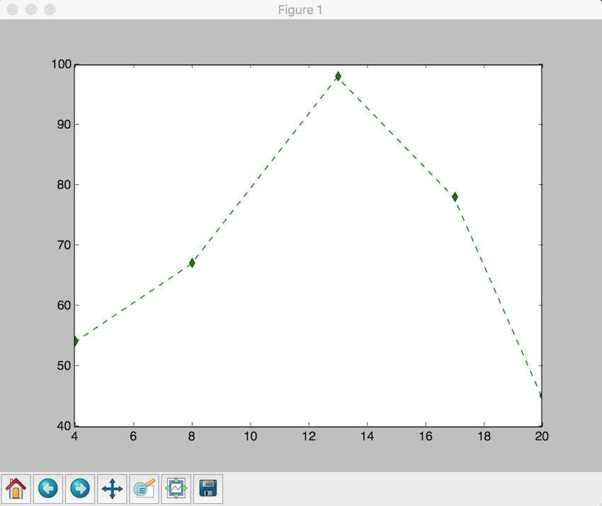
考虑绘制要点:,x = (4, 8, 13, 17, 20)。y = (54, 67, 98, 78, 45)>
import matplotlib.pyplot as plt
plt.plot([4, 8, 13, 17, 20], [54, 67, 98, 78, 45], 'g--d') # Green dashed line with diamond markers
plt.show()
month = ["Jan", "Feb", "Mar", "Apr", "May", "Jun", "Jul", "Aug", "Sep", "Oct", "Nov", "Dec"]
rainfall = [83, 81, 97, 104, 107, 91, 102, 102, 102, 79, 102, 91]
plt.plot(month, rainfall)
plt.xlabel("Month")
plt.ylabel("Rainfall (mm)")
plt.title("Average Rainfall in New York City")
plt.show() 
2。散点图
说明两个数据集之间的关系:
x = [2, 4, 6, 7, 9, 13, 19, 26, 29, 31, 36, 40, 48, 51, 57, 67, 69, 71, 78, 88]
y = [54, 72, 43, 2, 8, 98, 109, 5, 35, 28, 48, 83, 94, 84, 73, 11, 464, 75, 200, 54]
plt.xlabel('x-axis')
plt.ylabel('y-axis')
plt.title('Scatter Plot')
plt.grid(True)
plt.scatter(x, y, c='green')
plt.show() 
3。直方图 直方图可视化数据频率分布:
x = [2, 4, 6, 5, 42, 543, 5, 3, 73, 64, 42, 97, 63, 76, 63, 8, 73, 97, 23, 45, 56, 89, 45, 3, 23, 2, 5, 78, 23, 56, 67, 78, 8, 3, 78, 34, 67, 23, 324, 234, 43, 544, 54, 33, 223, 443, 444, 234, 76, 432, 233, 23, 232, 243, 222, 221, 254, 222, 276, 300, 353, 354, 387, 364, 309]
num_bins = 6
n, bins, patches = plt.hist(x, num_bins, facecolor='green')
plt.xlabel('X-Axis')
plt.ylabel('Y-Axis')
plt.title('Histogram')
plt.show()

赋予研究人员有效创建具有视觉吸引力和出版物的图表。它的易用性和广泛的自定义选项使其成为数据可视化的宝贵工具。 探索
文档和示例以获取进一步的功能。matplotlib
以上是引入Python' s Matplotlib库的详细内容。更多信息请关注PHP中文网其他相关文章!