

纯JAVASCRIPT图表动画插件Highcharts Examples_jquery

Highcharts is a charting library written in pure JavaScript, offering an easy way of adding interactive charts to your web site or web application. Highcharts currently supports line, spline, area, areaspline, column, bar, pie and scatter chart types.
Features

It works in all modern browsers including the iPhone/iPad and Internet Explorer from version 6. Standard browsers use SVG for the graphics rendering. In Internet Explorer graphics are drawn using VML.

.
Highcharts is solely based on native browser technologies and doesn't require client side plugins like Flash or Java. Furthermore you don't need to install anything on your server. No PHP or ASP.NET. Highcharts needs only two JS files to run: The highcharts.js core and either the jQuery or the MooTools framework. One of these frameworks is most likely already in use in your web page.
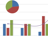
Highcharts supports line, spline, area, areaspline, column, bar, pie and scatter chart types. Any of these can be combined in one chart.
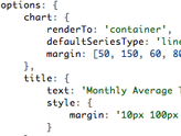
Setting the Highcharts configuration options requires no special programming skills. The options are given in a JavaScript object notation structure, which is basically a set of keys and values connected by colons, separated by commas and grouped by curly brackets.
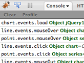
Through a full API you can add, remove and modify series, axes or points at any time after chart creation. Numerous events supply hooks for programming agains the chart. In combination with jQuery's or MooTools' Ajax API, this opens for solutions like live charts constantly updating with values from the server, user supplied data and more.
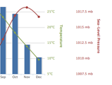
Sometimes you want to compare variables that are not the same scale - for example temperature versus rainfall and air pressure. Highcharts lets you assign an y axis for each series - or an x axis if you want to compare data sets of different categories. Each axis can be placed to the right or left, top or bottom of the chart. All options can be set individually, including reversing, styling and position.
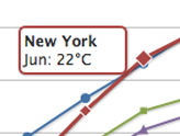
On hovering the chart Highcharts can display a tooltip text with information on each point and series. The tooltip follows as the user moves the mouse over the graph, and great efforts have been taken to make it stick to the nearest point as well as making it easy to read a point that is below another point.
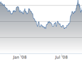
75% of all charts with an X and Y axis have a date-time X axis. Therefore Highchart is very intelligent about time values. With milliseconds axis units, Highcharts determines where to place the ticks so that they always mark the start of the month or the week, midnight and midday, the full hour etc.
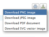
With the exporting module enabled, your users can export the chart to PNG, JPG, PDF or SVG format at the click of a button, or print the chart directly from the web page.
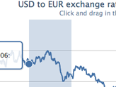
By zooming in on a chart you can examine an especially interesting part of the data more closely. Zooming can be in the X or Y dimension, or both.

Highcharts takes the data in a JavaScript array, which can be defined in the local configuration object, in a separate file or even on a different site. Furthermore, the data can be handled over to Highcharts in any form, and a callback function used to parse the data into an array.
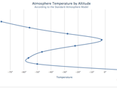
Sometimes you need to flip over your chart and make the X axis appear vertical, like for example in a bar chart. Reversing the axis, with the highest values appearing closest to origo, is also supported.
Do you want to use Highcharts for a personal website, a school site or a non-profit organisation? Then you don't need the author's permission, just go on and use Highcharts. For commercial websites and projects, see

热AI工具

Undresser.AI Undress
人工智能驱动的应用程序,用于创建逼真的裸体照片

AI Clothes Remover
用于从照片中去除衣服的在线人工智能工具。

Undress AI Tool
免费脱衣服图片

Clothoff.io
AI脱衣机

Video Face Swap
使用我们完全免费的人工智能换脸工具轻松在任何视频中换脸!

热门文章
热工具

记事本++7.3.1
好用且免费的代码编辑器

SublimeText3汉化版
中文版,非常好用

禅工作室 13.0.1
功能强大的PHP集成开发环境

Dreamweaver CS6
视觉化网页开发工具

SublimeText3 Mac版
神级代码编辑软件(SublimeText3)
热门话题


 如何在Google Sheet中为图例添加标签
Feb 19, 2024 am 11:03 AM
如何在Google Sheet中为图例添加标签
Feb 19, 2024 am 11:03 AM
本文将演示如何在GoogleSheet中为图例添加标签,这些标签侧重于单个事物,提供名称或标识。图例解释了事物的系统或组,为您提供相关的上下文信息。如何在GoogleSheet中为图例添加标签有时候,在使用图表时,我们想要让图表更易于理解。通过添加恰当的标签和图例,可以实现这一目的。接下来,我们将介绍如何在Google表格中为图例添加标签,让您的数据更加清晰明了。创建图表编辑图例标签的文本我们开始吧。1]创建图表要标记图例,首先,我们必须创建一个图表:首先,在GoogleSheets的列或行中输
 如何使用PHP数组实现图表和统计图的生成和显示
Jul 15, 2023 pm 12:24 PM
如何使用PHP数组实现图表和统计图的生成和显示
Jul 15, 2023 pm 12:24 PM
如何使用PHP数组实现图表和统计图的生成和显示PHP是一种广泛使用的服务器端脚本语言,具有强大的数据处理和图形生成能力。在Web开发中,经常需要展示数据的图表和统计图,通过PHP数组,我们可以轻松实现这些功能。本文将介绍如何使用PHP数组生成和显示图表和统计图,并提供相关的代码示例。引入必要的库文件和样式表在开始之前,我们需要在PHP文件中引入一些必要的库文
 如何在Highcharts中使用桑基图来展示数据
Dec 17, 2023 pm 04:41 PM
如何在Highcharts中使用桑基图来展示数据
Dec 17, 2023 pm 04:41 PM
如何在Highcharts中使用桑基图来展示数据桑基图(SankeyDiagram)是一种用于可视化流量、能源、资金等复杂流程的图表类型。它能清晰展示各个节点之间的关系和流动情况,可以帮助我们更好地理解和分析数据。在本文中,我们将介绍如何使用Highcharts来创建和定制一个桑基图,并附上具体的代码示例。首先,我们需要加载Highcharts库和Sank
 如何在Highcharts中使用动态数据来展示实时数据
Dec 17, 2023 pm 06:57 PM
如何在Highcharts中使用动态数据来展示实时数据
Dec 17, 2023 pm 06:57 PM
如何在Highcharts中使用动态数据来展示实时数据随着大数据时代的到来,对于实时数据的展示变得越来越重要。Highcharts作为一种流行的图表库,提供了丰富的功能和可定制性,使得我们可以灵活地展示实时数据。本文将介绍如何在Highcharts中使用动态数据来展示实时数据,并给出具体的代码示例。首先,我们需要准备一个能够提供实时数据的数据源。在本文中,我
 Vue统计图表的线性、饼状图功能实现
Aug 19, 2023 pm 06:13 PM
Vue统计图表的线性、饼状图功能实现
Aug 19, 2023 pm 06:13 PM
Vue统计图表的线性、饼状图功能实现在数据分析和可视化领域,统计图表是一种非常常用的工具。Vue作为一种流行的JavaScript框架,提供了便捷的方法来实现各种功能,包括统计图表的展示和交互。本文将介绍如何使用Vue来实现线性和饼状图功能,并提供相应的代码示例。线性图功能实现线性图是一种用于展示数据趋势和变化的图表类型。在Vue中,我们可以使用一些优秀的第
 如何使用Highcharts创建甘特图表
Dec 17, 2023 pm 07:23 PM
如何使用Highcharts创建甘特图表
Dec 17, 2023 pm 07:23 PM
如何使用Highcharts创建甘特图表,需要具体代码示例引言:甘特图是一种常用于展示项目进度和时间管理的图表形式,能够直观地展示任务的开始时间、结束时间和进度。Highcharts是一款功能强大的JavaScript图表库,提供了丰富的图表类型和灵活的配置选项。本文将介绍如何使用Highcharts创建甘特图表,并给出具体的代码示例。一、Highchart
 如何在Highcharts中使用堆叠图表来展示数据
Dec 18, 2023 pm 05:56 PM
如何在Highcharts中使用堆叠图表来展示数据
Dec 18, 2023 pm 05:56 PM
如何在Highcharts中使用堆叠图表来展示数据堆叠图表是一种常见的数据可视化方式,它可以同时展示多个数据系列的总和,并以柱状图的形式显示每个数据系列的贡献。Highcharts是一款功能强大的JavaScript库,提供了丰富的图表种类和灵活的配置选项,可以满足各种数据可视化的需求。在本文中,我们将介绍如何使用Highcharts来创建一个堆叠图表,并提
 Vue框架下,如何快速搭建统计图表系统
Aug 21, 2023 pm 05:48 PM
Vue框架下,如何快速搭建统计图表系统
Aug 21, 2023 pm 05:48 PM
Vue框架下,如何快速搭建统计图表系统在现代网页应用中,统计图表是必不可少的组成部分。Vue.js作为一款流行的前端框架,提供了很多便捷的工具和组件,能够帮助我们快速搭建统计图表系统。本文将介绍如何利用Vue框架以及一些插件来搭建一个简单的统计图表系统。首先,我们需要准备一个Vue.js的开发环境,包括安装Vue脚手架以及一些相关的插件。在命令行中执行以下命
