

页面强制横屏

最近公司要开发一个移动端的养成类网页游戏(就是用手点各种按钮最后你会找到一个女朋友=。=),要求横屏显示,不能竖屏。
有经验的你肯定知道,当用户竖屏打开时,提示说你要把手机转过来是在是件很傻×的事情。这时如果用户没开启手机里的横屏模式,还要逼用户去开启。这时候用户早就不耐烦的把你的游戏关掉了。
我先进行了调研,想看有没有现成的api。参考过screen的api以及manifest方法 ,实验结果当然是不行。
那么现在我唯一能想到的解决办法,就是在竖屏模式下,写一个横屏的p,然后把它转过来。
好了我的测试页面结构如下:
<body class="webpBack">
  <p id="print">
      <p>lol</p>
   </p>
</body>
很简单对不对,最终的理想状态是,把lol非常和谐的横过来。
好了来看看区分横屏竖屏的css:
@media screen and (orientation: portrait) {
      html{
         width : 100% ;
         height : 100% ;
          background-color: white ;
          overflow : hidden;
      }
      body{
          width : 100% ;
         height : 100% ;
         background-color: red ;
          overflow : hidden;
      }
      #print{
         position : absolute ;
         background-color: yellow ;
      }
}
@media screen and (orientation: landscape) {
       html{
         width : 100% ;
         height : 100% ;
         background-color: white ;
      }
       body{
          width : 100% ;
         height : 100% ;
         background-color: white ;
      }
           #print{
            position : absolute ;
            top : 0 ;
            left : 0 ;
            width : 100% ;
            height : 100% ;
            background-color: yellow ;
         }
}
#print p{
        margin: auto ;
        margin-top : 20px ;
        text-align: center;
}说白了,是要把print这个p在竖屏模式下横过来,横屏状态下不变。所以在portrait下,没定义它的宽高。会通过下面的js来补。
var width = document.documentElement.clientWidth;
var height = document.documentElement.clientHeight;
if( width < height ){
console.log(width + " " + height);
$print = $('#print');
$print.width(height);
$print.height(width);
$print.css('top', (height-width)/2 );
$print.css('left', 0-(height-width)/2 );
$print.css('transform' , 'rotate(90deg)');
$print.css('transform-origin' , '50% 50%');
}在这里我们先取得了屏幕内可用区域的宽高,然后根据宽高的关系来判断是横屏还是竖屏。如果是竖屏,就把print这个p的宽高设置下,对齐,然后旋转。
最终效果如下:
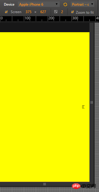
竖屏
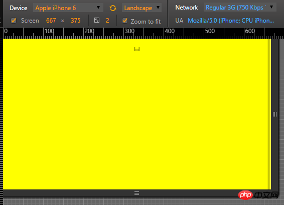
横屏
最后,这么做带来的后果是,如果用户手机的旋转屏幕按钮开着,那么当手机横过来之后,会造成一定的悲剧。解决办法如下:
 var evt = "onorientationchange" in window ? "orientationchange" : "resize";

    window.addEventListener(evt, function() {
        console.log(evt);
        var width = document.documentElement.clientWidth;
         var height =  document.documentElement.clientHeight;
          $print =  $('#print');
         if( width > height ){

            $print.width(width);
            $print.height(height);
            $print.css('top',  0 );
            $print.css('left',  0 );
            $print.css('transform' , 'none');
            $print.css('transform-origin' , '50% 50%');
         }
         else{
            $print.width(height);
            $print.height(width);
            $print.css('top',  (height-width)/2 );
            $print.css('left',  0-(height-width)/2 );
            $print.css('transform' , 'rotate(90deg)');
            $print.css('transform-origin' , '50% 50%');
         }

    }, false);
以上是页面强制横屏的详细内容。更多信息请关注PHP中文网其他相关文章!

热AI工具

Undresser.AI Undress
人工智能驱动的应用程序,用于创建逼真的裸体照片

AI Clothes Remover
用于从照片中去除衣服的在线人工智能工具。

Undress AI Tool
免费脱衣服图片

Clothoff.io
AI脱衣机

Video Face Swap
使用我们完全免费的人工智能换脸工具轻松在任何视频中换脸!

热门文章
热工具

记事本++7.3.1
好用且免费的代码编辑器

SublimeText3汉化版
中文版,非常好用

禅工作室 13.0.1
功能强大的PHP集成开发环境

Dreamweaver CS6
视觉化网页开发工具

SublimeText3 Mac版
神级代码编辑软件(SublimeText3)
热门话题


 为什么Flex布局中的紫色斜线区域会被误认为是'溢出空间”?
Apr 05, 2025 pm 05:51 PM
为什么Flex布局中的紫色斜线区域会被误认为是'溢出空间”?
Apr 05, 2025 pm 05:51 PM
关于Flex布局中紫色斜线区域的疑问在使用Flex布局时,你可能会遇到一些令人困惑的现象,比如在开发者工具(d...
