

用Shape做动画实例代码

相对于WPF/Silverlight,UWP的动画系统可以说有大幅提高,不过本文无意深入讨论这些动画API,本文将介绍使用Shape做一些进度、等待方面的动画,除此之外也会介绍一些相关技巧。
1. 使用StrokeDashOffset做等待提示动画
圆形的等待提示动画十分容易做,只要让它旋转就可以了:
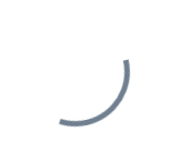
但是圆形以外的形状就不容易做了,例如三角形,总不能让它单纯地旋转吧:
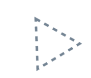
要解决这个问题可以使用StrokeDashOffset。StrokeDashOffset用于控制虚线边框的第一个短线相对于Shape开始点的位移,使用动画控制这个数值可以做出边框滚动的效果:
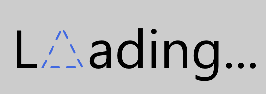
<Page.Resources><Storyboard x:Name="ProgressStoryboard"><DoubleAnimationUsingKeyFrames EnableDependentAnimation="True"
Storyboard.TargetProperty="(Shape.StrokeDashOffset)"
Storyboard.TargetName="triangle"><EasingDoubleKeyFrame KeyTime="0:1:0"
Value="-500" /></DoubleAnimationUsingKeyFrames></Storyboard></Page.Resources><Grid Background="#FFCCCCCC"><Grid Height="100"
HorizontalAlignment="Center"><StackPanel Orientation="Horizontal"
VerticalAlignment="Center"><TextBlock Text="L"
FontSize="55"
Margin="0,0,5,4" /><local:Triangle x:Name="triangle"
Height="40"
Width="40"
StrokeThickness="2"
Stroke="RoyalBlue"
StrokeDashArray="4.045 4.045"
StrokeDashOffset="0.05"
StrokeDashCap="Round" /><TextBlock Text="ading..."
FontSize="55"
Margin="5,0,0,4" /></StackPanel></Grid></Grid>
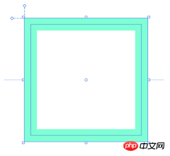
需要注意的是Shape的边长要正好能被StrokeDashArray中短线和缺口的和整除,即 满足边长 / StrokeThickness % Sum( StrokeDashArray ) = 0,这是因为在StrokeDashOffset=0的地方会截断短线,如下图所示:
另外注意的是边长的计算,如Rectangle,边长并不是(Height + Width) * 2,而是(Height - StrokeThickness) * 2 + (Width- StrokeThickness) * 2,如下图所示,边长应该从边框正中间开始计算:
有一些Shape的边长计算还会受到Stretch影响,如上一篇中自定义的Triangle:
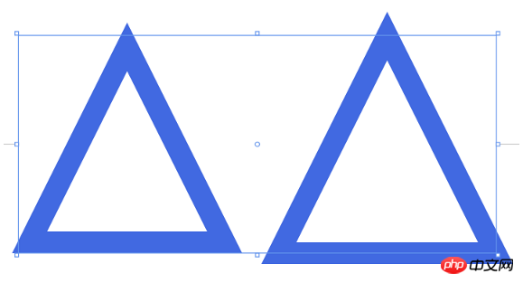
<StackPanel Orientation="Horizontal" HorizontalAlignment="Center"><Grid Height="50"
Width="50"><local:Triangle Stretch="Fill"
StrokeThickness="5"
Stroke="RoyalBlue" /></Grid><Grid Height="50"
Width="50"
Margin="10,0,0,0"><local:Triangle Stretch="None"
StrokeThickness="5"
Stroke="RoyalBlue" /></Grid></StackPanel>
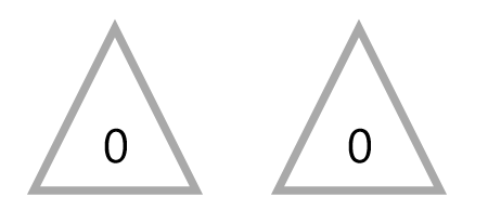
2. 使用StrokeDashArray做进度提示动画
StrokeDashArray用于将Shape的边框变成虚线,StrokeDashArray的值是一个double类型的有序集合,里面的数值指定虚线中每一段以StrokeThickness为单位的长度。用StrokeDashArray做进度提示的基本做法就是将进度Progress通过Converter转换为分成两段的StrokeDashArray,第一段为实线,表示当前进度,第二段为空白。假设一个Shape的边长是100,当前进度为50,则将StrokeDashArray设置成{50,double.MaxValue}两段。
做成动画如下图所示:
<Page.Resources><Style TargetType="TextBlock"><Setter Property="FontSize"
Value="12" /></Style><local:ProgressToStrokeDashArrayConverter x:Key="ProgressToStrokeDashArrayConverter"
TargetPath="{Binding ElementName=Triangle}" /><local:ProgressToStrokeDashArrayConverter2 x:Key="ProgressToStrokeDashArrayConverter2"
TargetPath="{Binding ElementName=Triangle}" />
<toolkit:StringFormatConverter x:Key="StringFormatConverter" /><local:ProgressWrapper x:Name="ProgressWrapper" /><Storyboard x:Name="Storyboard1"><DoubleAnimation Duration="0:0:5"
To="100"
Storyboard.TargetProperty="Progress"
Storyboard.TargetName="ProgressWrapper"
EnableDependentAnimation="True" /></Storyboard></Page.Resources><Grid Background="{ThemeResource ApplicationPageBackgroundThemeBrush}"><Viewbox Height="150"><StackPanel Orientation="Horizontal"><Grid><local:Triangle Height="40"
Width="40"
StrokeThickness="2"
Stroke="DarkGray" /><local:Triangle x:Name="Triangle"
Height="40"
Width="40"
StrokeThickness="2"
Stroke="RoyalBlue"
StrokeDashArray="{Binding Progress,Source={StaticResource ProgressWrapper},Converter={StaticResource ProgressToStrokeDashArrayConverter}}" /><TextBlock Text="{Binding Progress,Source={StaticResource ProgressWrapper},Converter={StaticResource StringFormatConverter},ConverterParameter='{}{0:0}'}"
HorizontalAlignment="Center"
VerticalAlignment="Center"
Margin="0,15,0,0" /></Grid><Grid Margin="20,0,0,0"><local:Triangle Height="40"
Width="40"
StrokeThickness="2"
Stroke="DarkGray" /><local:Triangle x:Name="Triangle2"
Height="40"
Width="40"
StrokeThickness="2"
Stroke="RoyalBlue"
StrokeDashArray="{Binding Progress,Source={StaticResource ProgressWrapper},Converter={StaticResource ProgressToStrokeDashArrayConverter2}}" /><TextBlock Text="{Binding Progress,Source={StaticResource ProgressWrapper},Converter={StaticResource StringFormatConverter},ConverterParameter='{}{0:0}'}"
HorizontalAlignment="Center"
VerticalAlignment="Center"
Margin="0,15,0,0" /></Grid></StackPanel></Viewbox></Grid>其中ProgressToStrokeDashArrayConverter和ProgressToStrokeDashArrayConverter2的代码如下:
public class ProgressToStrokeDashArrayConverter : DependencyObject, IValueConverter
{/// <summary>/// 获取或设置TargetPath的值/// </summary>  public Path TargetPath
    {
    get { return (Path)GetValue(TargetPathProperty);
     }
    set {
     SetValue(TargetPathProperty, value);
    }
    }/// <summary>/// 标识 TargetPath 依赖属性。///
    </summary>public static readonly DependencyProperty TargetPathProperty =
        DependencyProperty.Register("TargetPath", typeof(Path), typeof(ProgressToStrokeDashArrayConverter), new PropertyMetadata(null));public virtual object Convert(object value, Type targetType, object parameter, string language)
    {
    if (value is double == false)return null;

        var progress = (double)value;if (TargetPath == null)return null;var totalLength = GetTotalLength();
        var firstSection = progress * totalLength / 100 / TargetPath.StrokeThickness;if (progress == 100)
            firstSection = Math.Ceiling(firstSection);var result = new DoubleCollection {
            firstSection, double.MaxValue };return result;
    }public object ConvertBack(object value, Type targetType, object parameter, string language)
    {throw new NotImplementedException();
    }protected double GetTotalLength()
    {var geometry = TargetPath.Data as PathGeometry;
    if (geometry == null)
    return 0;
    if (geometry.Figures.Any() == false)return 0;
    var figure = geometry.Figures.FirstOrDefault();
    if (figure == null)
    return 0;
    var totalLength = 0d;
    var point = figure.StartPoint;
    foreach (var item in figure.Segments)
        {
        var segment = item as LineSegment;
        if (segment == null)
        return 0;

            totalLength += Math.Sqrt(Math.Pow(point.X - segment.Point.X, 2) + Math.Pow(point.Y - segment.Point.Y, 2));
            point = segment.Point;
        }

        totalLength += Math.Sqrt(Math.Pow(point.X - figure.StartPoint.X, 2) + Math.Pow(point.Y - figure.StartPoint.Y, 2));
        return totalLength;
    }
}
public class ProgressToStrokeDashArrayConverter2 : ProgressToStrokeDashArrayConverter
{
public override object Convert(object value, Type targetType, object parameter, string language)
    {
    if (value is double == false)return null;

        var progress = (double)value;
        if (TargetPath == null)
        return null;
        var totalLength = GetTotalLength();
        totalLength = totalLength / TargetPath.StrokeThickness;
        var thirdSection = progress * totalLength / 100;
        if (progress == 100)
            thirdSection = Math.Ceiling(thirdSection);

        var secondSection = (totalLength - thirdSection) / 2;
        var result = new DoubleCollection { 0, secondSection, thirdSection, double.MaxValue };
        return result;
    }
}由于代码只是用于演示,protected double GetTotalLength()写得比较将就。可以看到这两个Converter继承自DependencyObject,这是因为这里需要通过绑定为TargetPath赋值。
这里还有另一个类ProgressWrapper:
public class ProgressWrapper : DependencyObject
{/// <summary>/// 获取或设置Progress的值/// </summary>  public double Progress
    {get { return (double)GetValue(ProgressProperty); }set { SetValue(ProgressProperty, value); }
    }/// <summary>/// 标识 Progress 依赖属性。///
    </summary>public static readonly DependencyProperty ProgressProperty =
        DependencyProperty.Register("Progress", typeof(double), typeof(ProgressWrapper), new PropertyMetadata(0d));
}因为这里没有可供Storyboard操作的double属性,所以用这个类充当Storyboard和StrokeDashArray的桥梁。UWPCommunityToolkit中也有一个差不多用法的类BindableValueHolder,这个类通用性比较强,可以参考它的用法。
3. 使用Behavior改进进度提示动画代码
只是做个动画而已,又是Converter,又是Wrapper,又是Binding,看起来十分复杂,如果Shape上面有Progress属性就方便多了。这时候首先会考虑附加属性,在XAML用法如下:
<UserControl.Resources>
  <Storyboard x:Name="Storyboard1"><DoubleAnimation Duration="0:0:5"
  To="100"
  Storyboard.TargetProperty="(local:PathExtention.Progress)"
  Storyboard.TargetName="Triangle" />
  </Storyboard></UserControl.Resources><Grid x:Name="LayoutRoot"
  Background="White"><local:Triangle x:Name="Triangle"
  Height="40"
  local:PathExtention.Progress="0"
  Width="40"
  StrokeThickness="2"
  Stroke="RoyalBlue" ></local:Triangle></Grid>
但其实这是行不通的,XAML有一个存在了很久的限制:However, an existing limitation of the Windows Runtime XAML implementation is that you cannot animate a custom attached property.。这个限制决定了XAML不能对自定义附加属性做动画。不过,这个限制只限制了不能对自定义附加属性本身做动画,但对附加属性中的类的属性则可以,例如以下这种写法应该是行得通的:
<UserControl.Resources>
  <Storyboard x:Name="Storyboard1"><DoubleAnimation Duration="0:0:5"
  To="100"
  Storyboard.TargetProperty="(local:PathExtention.Progress)"
  Storyboard.TargetName="TrianglePathExtention" />
  </Storyboard></UserControl.Resources><Grid x:Name="LayoutRoot"
  Background="White"><local:Triangle x:Name="Triangle"
  Height="40"
  Width="40"
  StrokeThickness="2"
  Stroke="RoyalBlue" >  <local:PathHelper><local:PathExtention x:Name="TrianglePathExtention"
  Progress="0" />  </local:PathHelper></local:Triangle></Grid>
更优雅的写法是利用XamlBehaviors,这篇文章很好地解释了XamlBehaviors的作用:
XAML Behaviors非常重要,因为它们提供了一种方法,让开发人员能够以一种简洁、可重复的方式轻松地向UI对象添加功能。
他们无需创建控件的子类或重复编写逻辑代码,只要简单地增加一个XAML代码片段。
要使用Behavior改进现有代码,只需实现一个PathProgressBehavior:
public class PathProgressBehavior : Behavior<UIElement>
{protected override void OnAttached()
    {base.OnAttached();UpdateStrokeDashArray();
    }/// <summary>/// 获取或设置Progress的值/// </summary>  public double Progress
    {get { return (double)GetValue(ProgressProperty); }set { SetValue(ProgressProperty, value); }
    }/*Progress DependencyProperty*/protected virtual void OnProgressChanged(double oldValue, double newValue)
    {UpdateStrokeDashArray();
    }protected virtual double GetTotalLength(Path path)
    {/*some code*/}private void UpdateStrokeDashArray()
    {
    var target = AssociatedObject as Path;if (target == null)return;double progress = Progress;
    //if (target.ActualHeight == 0 || target.ActualWidth == 0)//
    return;
    if (target.StrokeThickness == 0)
    return;
    var totalLength = GetTotalLength(target);
    var firstSection = progress * totalLength / 100 / target.StrokeThickness;
    if (progress == 100)
            firstSection = Math.Ceiling(firstSection);
            var result = new DoubleCollection {
             firstSection, double.MaxValue
             };
        target.StrokeDashArray = result;
    }
}XAML中如下使用:
<UserControl.Resources>
  <Storyboard x:Name="Storyboard1"><DoubleAnimation Duration="0:0:5"
  To="100"
  Storyboard.TargetProperty="Progress"
  Storyboard.TargetName="PathProgressBehavior"
  EnableDependentAnimation="True"/>
  </Storyboard></UserControl.Resources><Grid x:Name="LayoutRoot"
  Background="White">
  <local:Triangle x:Name="Triangle"
  Height="40"
  local:PathExtention.Progress="0"
  Width="40"
  StrokeThickness="2"
  Stroke="RoyalBlue" ><interactivity:Interaction.Behaviors>
  <local:PathProgressBehavior x:Name="PathProgressBehavior" /></interactivity:Interaction.Behaviors>
  </local:Triangle></Grid>
这样看起来就清爽多了。
4. 模仿背景填充动画
先看看效果:
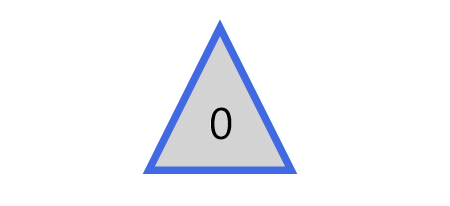
其实这篇文章里并不会讨论填充动画,不过首先声明做填充动画会更方便快捷,这一段只是深入学习过程中的产物,实用价值不高。
上图三角形的填充的效果只需要叠加两个同样大小的Shape,前面那个设置Stretch="Uniform",再通过DoubleAnimation改变它的高度就可以了。文字也是相同的原理,叠加两个相同的TextBlock,将前面那个放在一个无边框的ScrollViewer里再去改变ScrollViewer的高度。
<Page.Resources><Style TargetType="TextBlock"><Setter Property="FontSize"
Value="12" /></Style><local:ProgressToHeightConverter x:Key="ProgressToHeightConverter"
TargetContentControl="{Binding ElementName=ContentControl}" /><local:ReverseProgressToHeightConverter x:Key="ReverseProgressToHeightConverter"
TargetContentControl="{Binding ElementName=ContentControl2}" /><toolkit:StringFormatConverter x:Key="StringFormatConverter" /><local:ProgressWrapper x:Name="ProgressWrapper" /><Storyboard x:Name="Storyboard1"><DoubleAnimation Duration="0:0:5"
To="100"
Storyboard.TargetProperty="Progress"
Storyboard.TargetName="ProgressWrapper"
EnableDependentAnimation="True" /></Storyboard></Page.Resources><Grid Background="{ThemeResource ApplicationPageBackgroundThemeBrush}"><Grid><local:Triangle Height="40"
Width="40"
StrokeThickness="2"
Fill="LightGray" /><local:Triangle Height="40"
Width="40"
Stretch="Fill"
StrokeThickness="2"
Stroke="RoyalBlue" /><ContentControl x:Name="ContentControl"
VerticalAlignment="Bottom"
HorizontalAlignment="Center"
Height="{Binding Progress,Source={StaticResource ProgressWrapper},Converter={StaticResource ProgressToHeightConverter}}"><local:Triangle x:Name="Triangle3" Height="40"
Width="40"
StrokeThickness="2"
Fill="RoyalBlue"
Stretch="Uniform"
VerticalAlignment="Bottom" /></ContentControl><TextBlock Text="{Binding Progress,Source={StaticResource ProgressWrapper},Converter={StaticResource StringFormatConverter},ConverterParameter='{}{0:0}'}"
HorizontalAlignment="Center"
VerticalAlignment="Center"
Margin="0,12,0,0"
Foreground="White" /><ContentControl x:Name="ContentControl2"
Height="{Binding Progress,Source={StaticResource ProgressWrapper},Converter={StaticResource ReverseProgressToHeightConverter}}"
VerticalAlignment="Top"
HorizontalAlignment="Center"><ScrollViewer BorderThickness="0"
Padding="0,0,0,0"
VerticalScrollBarVisibility="Disabled"
HorizontalScrollBarVisibility="Disabled"
VerticalAlignment="Top"
Height="40"><Grid Height="40"><TextBlock Text="{Binding Progress,Source={StaticResource ProgressWrapper},Converter={StaticResource StringFormatConverter},ConverterParameter='{}{0:0}'}"
HorizontalAlignment="Center"
VerticalAlignment="Center"
Margin="0,12,0,0" /></Grid></ScrollViewer></ContentControl></Grid></Grid>ProgressToHeightConverter和ReverseProgressToHeightConverter的代码如下:
public class ProgressToHeightConverter : DependencyObject, IValueConverter
{/// <summary>/// 获取或设置TargetContentControl的值/// </summary>  public ContentControl TargetContentControl
    {
    get {
    return (ContentControl)GetValue(TargetContentControlProperty);
    }
    set {
    SetValue(TargetContentControlProperty, value);
    }
    }/// <summary>/// 标识 TargetContentControl 依赖属性。///
     </summary>public static readonly DependencyProperty TargetContentControlProperty =
        DependencyProperty.Register("TargetContentControl", typeof(ContentControl), typeof(ProgressToHeightConverter), new PropertyMetadata(null));
        public object Convert(object value, Type targetType, object parameter, string language)
    {
    if (value is double == false)
    return 0d;

        var progress = (double)value;
        if (TargetContentControl == null)
        return 0d;
        var element = TargetContentControl.Content as FrameworkElement;
        if (element == null)
        return 0d;return element.Height * progress / 100;
    }public object ConvertBack(object value, Type targetType, object parameter, string language)
    {throw new NotImplementedException();
    }


}public class ReverseProgressToHeightConverter : DependencyObject, IValueConverter
{/// <summary>/// 获取或设置TargetContentControl的值/// </summary>
public ContentControl TargetContentControl
    {
    get {
    return (ContentControl)GetValue(TargetContentControlProperty);
     }
    set {
    SetValue(TargetContentControlProperty, value);
    }
    }/// <summary>/// 标识 TargetContentControl 依赖属性。///
    </summary>public static readonly DependencyProperty TargetContentControlProperty =
        DependencyProperty.Register("TargetContentControl", typeof(ContentControl), typeof(ReverseProgressToHeightConverter), new PropertyMetadata(null));
        public object Convert(object value, Type targetType, object parameter, string language)
    {
    if (value is double == false)
    return double.NaN;

        var progress = (double)value;if (TargetContentControl == null)return double.NaN;
        var element = TargetContentControl.Content as FrameworkElement;
        if (element == null)return double.NaN;
        return element.Height * (100 - progress) / 100;
    }
    public object ConvertBack(object value, Type targetType, object parameter, string language)
    {
    throw new NotImplementedException();
    }
}再提醒一次,实际上老老实实做填充动画好像更方便些。
5. 将动画应用到Button的ControlTemplate
同样的技术,配合ControlTemplate可以制作很有趣的按钮:
PointerEntered时,按钮的边框从进入点向反方向延伸。PointerExited时,边框从反方向向移出点消退。要做到这点需要在PointerEntered时改变边框的方向,使用了ChangeAngleToEnterPointerBehavior:
public class ChangeAngleToEnterPointerBehavior : Behavior<Ellipse>
{protected override void OnAttached()
    {base.OnAttached();
        AssociatedObject.PointerEntered += OnAssociatedObjectPointerEntered;
        AssociatedObject.PointerExited += OnAssociatedObjectPointerExited;
    }protected override void OnDetaching()
    {base.OnDetaching();
        AssociatedObject.PointerEntered -= OnAssociatedObjectPointerEntered;
        AssociatedObject.PointerExited -= OnAssociatedObjectPointerExited;
    }private void OnAssociatedObjectPointerExited(object sender, PointerRoutedEventArgs e)
    {UpdateAngle(e);
    }private void OnAssociatedObjectPointerEntered(object sender, PointerRoutedEventArgs e)
    {UpdateAngle(e);
    }private void UpdateAngle(PointerRoutedEventArgs e)
    {if (AssociatedObject == null || AssociatedObject.StrokeThickness == 0)return;

        AssociatedObject.RenderTransformOrigin = new Point(0.5, 0.5);var rotateTransform = AssociatedObject.RenderTransform as RotateTransform;if (rotateTransform == null)
        {
            rotateTransform = new RotateTransform();
            AssociatedObject.RenderTransform = rotateTransform;
        }var point = e.GetCurrentPoint(AssociatedObject.Parent as UIElement).Position;var centerPoint = new Point(AssociatedObject.ActualWidth / 2, AssociatedObject.ActualHeight / 2);var angleOfLine = Math.Atan2(point.Y - centerPoint.Y, point.X - centerPoint.X) * 180 / Math.PI;
        rotateTransform.Angle = angleOfLine + 180;
    }
}这个类命名不是很好,不过将就一下吧。
为了做出边框延伸的效果,另外需要一个类EllipseProgressBehavior:
public class EllipseProgressBehavior : Behavior<Ellipse>
{/// <summary>/// 获取或设置Progress的值/// </summary>
public double Progress
    {
    get {
    return (double)GetValue(ProgressProperty);
    }
    set {
    SetValue(ProgressProperty, value);
    }
    }/// <summary>/// 标识 Progress 依赖属性。/// </summary>
    public static readonly DependencyProperty ProgressProperty =
        DependencyProperty.Register("Progress", typeof(double), typeof(EllipseProgressBehavior), new PropertyMetadata(0d, OnProgressChanged));
        private static void OnProgressChanged(DependencyObject obj, DependencyPropertyChangedEventArgs args)
    {
    var target = obj as EllipseProgressBehavior;
    double oldValue = (double)args.OldValue;
    double newValue = (double)args.NewValue;if (oldValue != newValue)
            target.OnProgressChanged(oldValue, newValue);
    }
    protected virtual void OnProgressChanged(double oldValue, double newValue)
    {UpdateStrokeDashArray();
    }protected virtual double GetTotalLength()
    {if (AssociatedObject == null)return 0;
    return (AssociatedObject.ActualHeight - AssociatedObject.StrokeThickness) * Math.PI;
    }private void UpdateStrokeDashArray()
    {if (AssociatedObject == null || AssociatedObject.StrokeThickness == 0)
    return;
    //if (target.ActualHeight == 0 || target.ActualWidth == 0)//
    return;var totalLength = GetTotalLength();
        totalLength = totalLength / AssociatedObject.StrokeThickness;
        var thirdSection = Progress * totalLength / 100;
        var secondSection = (totalLength - thirdSection) / 2;
        var result = new DoubleCollection { 0, secondSection, thirdSection, double.MaxValue };
        AssociatedObject.StrokeDashArray = result;
    }

}套用到ControlTemplate如下:
<ControlTemplate TargetType="Button"><Grid x:Name="RootGrid"><VisualStateManager.VisualStateGroups><VisualStateGroup x:Name="CommonStates"><VisualStateGroup.Transitions><VisualTransition GeneratedDuration="0:0:1"
To="Normal"><Storyboard><DoubleAnimationUsingKeyFrames EnableDependentAnimation="True"
Storyboard.TargetProperty="(local:EllipseProgressBehavior.Progress)"
Storyboard.TargetName="EllipseProgressBehavior"><EasingDoubleKeyFrame KeyTime="0:0:1"
Value="0"><EasingDoubleKeyFrame.EasingFunction><QuinticEase EasingMode="EaseOut" /></EasingDoubleKeyFrame.EasingFunction></EasingDoubleKeyFrame></DoubleAnimationUsingKeyFrames></Storyboard></VisualTransition><VisualTransition GeneratedDuration="0:0:1"
To="PointerOver"><Storyboard><DoubleAnimationUsingKeyFrames EnableDependentAnimation="True"
Storyboard.TargetProperty="(local:EllipseProgressBehavior.Progress)"
Storyboard.TargetName="EllipseProgressBehavior"><EasingDoubleKeyFrame KeyTime="0:0:1"
Value="100"><EasingDoubleKeyFrame.EasingFunction><QuinticEase EasingMode="EaseOut" /></EasingDoubleKeyFrame.EasingFunction></EasingDoubleKeyFrame></DoubleAnimationUsingKeyFrames></Storyboard></VisualTransition></VisualStateGroup.Transitions><VisualState x:Name="Normal"><Storyboard><PointerUpThemeAnimation Storyboard.TargetName="RootGrid" /></Storyboard></VisualState><VisualState x:Name="PointerOver"><Storyboard><PointerUpThemeAnimation Storyboard.TargetName="RootGrid" /></Storyboard><VisualState.Setters><Setter Target="EllipseProgressBehavior.(local:EllipseProgressBehavior.Progress)"
 Value="100" /></VisualState.Setters></VisualState><VisualState x:Name="Pressed"><Storyboard><PointerDownThemeAnimation Storyboard.TargetName="RootGrid" /></Storyboard></VisualState><VisualState x:Name="Disabled" /></VisualStateGroup></VisualStateManager.VisualStateGroups><ContentPresenter x:Name="ContentPresenter"
AutomationProperties.AccessibilityView="Raw"
ContentTemplate="{TemplateBinding ContentTemplate}"
ContentTransitions="{TemplateBinding ContentTransitions}"
Content="{TemplateBinding Content}"
HorizontalContentAlignment="{TemplateBinding HorizontalContentAlignment}"
Padding="{TemplateBinding Padding}"
VerticalContentAlignment="{TemplateBinding VerticalContentAlignment}" /><Ellipse Fill="Transparent" Stroke="{TemplateBinding BorderBrush}" StrokeThickness="2"><interactivity:Interaction.Behaviors><local:ChangeAngleToEnterPointerBehavior /><local:EllipseProgressBehavior x:Name="EllipseProgressBehavior" /></interactivity:Interaction.Behaviors></Ellipse></Grid></ControlTemplate>注意:我没有鼓励任何人自定义按钮外观的意思,能用系统自带的动画或样式就尽量用系统自带的,没有设计师的情况下 又想UI做得与众不同通常会做得很难看。想要UI好看,合理的布局、合理的颜色、合理的图片就足够了。
6. 结语
在学习Shape的过程中觉得好玩就做了很多尝试,因为以前工作中做过不少等待、进度的动画,所以这次就试着做出本文的动画。
XAML的传统动画并没有提供太多功能,主要是ColorAnimation、DoubleAnimation、PointAnimation三种,不过靠Binding和Converter可以弥补这方面的不足,实现很多需要的功能。
本文的一些动画效果参考了SVG的动画。话说回来,Windows 10 1703新增了SvgImageSource,不过看起来只是简单地将SVG翻译成对应的Shape,然后用Shape呈现,不少高级特性都不支持(如下图阴影的滤镜),用法如下:
<Image><Image.Source><SvgImageSource UriSource="feoffset_1.svg" /></Image.Source></Image>
SvgImageSource:
原本的Svg:
以上是用Shape做动画实例代码的详细内容。更多信息请关注PHP中文网其他相关文章!

热AI工具

Undresser.AI Undress
人工智能驱动的应用程序,用于创建逼真的裸体照片

AI Clothes Remover
用于从照片中去除衣服的在线人工智能工具。

Undress AI Tool
免费脱衣服图片

Clothoff.io
AI脱衣机

Video Face Swap
使用我们完全免费的人工智能换脸工具轻松在任何视频中换脸!

热门文章
热工具

记事本++7.3.1
好用且免费的代码编辑器

SublimeText3汉化版
中文版,非常好用

禅工作室 13.0.1
功能强大的PHP集成开发环境

Dreamweaver CS6
视觉化网页开发工具

SublimeText3 Mac版
神级代码编辑软件(SublimeText3)


 如何加速Windows 11中的动画效果:2种方法解析
Apr 24, 2023 pm 04:55 PM
如何加速Windows 11中的动画效果:2种方法解析
Apr 24, 2023 pm 04:55 PM
当微软推出Windows11时,它带来了许多变化。其中一项更改是增加了用户界面动画的数量。一些用户想要改变事物的出现方式,他们必须想办法去做。拥有动画让用户感觉更好、更友好。动画使用视觉效果使计算机看起来更具吸引力和响应能力。其中一些包括几秒钟或几分钟后的滑动菜单。计算机上有许多动画会影响PC性能、减慢速度并影响您的工作。在这种情况下,您必须关闭动画。本文将介绍用户可以提高其在PC上的动画速度的几种方法。您可以使用注册表编辑器或您运行的自定义文件来应用更改。如何提高Windows11动画的
![动画不工作在PowerPoint中[修复]](https://img.php.cn/upload/article/000/887/227/170831232982910.jpg?x-oss-process=image/resize,m_fill,h_207,w_330) 动画不工作在PowerPoint中[修复]
Feb 19, 2024 am 11:12 AM
动画不工作在PowerPoint中[修复]
Feb 19, 2024 am 11:12 AM
您是否正在尝试制作演示文稿,但无法添加动画?如果动画在你的WindowsPC上的PowerPoint中不起作用,那么这篇文章将会帮助你。这是一个常见的问题,许多人都在抱怨。例如,在Microsoft团队中演示或在屏幕录制期间,动画可能会停止工作。在本指南中,我们将探索各种故障排除技术,以帮助您修复在Windows上的PowerPoint中无法运行的动画。为什么我的PowerPoint动画不起作用?我们注意到可能导致Windows上PowerPoint中的动画无法工作问题的一些可能原因如下:由于个
 CSS动画:如何实现元素的闪光效果
Nov 21, 2023 am 10:56 AM
CSS动画:如何实现元素的闪光效果
Nov 21, 2023 am 10:56 AM
CSS动画:如何实现元素的闪光效果,需要具体代码示例在网页设计中,动画效果有时可以为页面带来很好的用户体验。而闪光效果是一种常见的动画效果,它可以使元素更加引人注目。下面将介绍如何使用CSS实现元素的闪光效果。一、闪光的基本实现首先,我们需要使用CSS的animation属性来实现闪光效果。animation属性的值需要指定动画名称、动画执行时间、动画延迟时
 跳票 2 年,国产 3D 动画电影《二郎神之深海蛟龙》定档 7 月 13 日
Jan 26, 2024 am 09:42 AM
跳票 2 年,国产 3D 动画电影《二郎神之深海蛟龙》定档 7 月 13 日
Jan 26, 2024 am 09:42 AM
本站1月26日消息,国产3D动画电影《二郎神之深海蛟龙》发布一组最新剧照,正式宣布将于7月13日上映。据了解,《二郎神之深海蛟龙》是由迷狐星(北京)动漫有限公司、霍尔果斯众合千澄影业有限公司、浙江横店影业有限公司、浙江共赢影业有限公司、成都天火科技有限公司、华文映像(北京)影业有限公司出品,王君执导的动画电影,原定2022年7月22日在中国大陆上映。本站剧情简介:封神之战后,姜子牙携“封神榜”分封诸神,而后封神榜被天庭密封于九州秘境深海之下。事实上,除了分封神位,封神榜中还封缄着众多强大的妖邪元
 如何使用Vue实现打字机动画特效
Sep 19, 2023 am 09:33 AM
如何使用Vue实现打字机动画特效
Sep 19, 2023 am 09:33 AM
如何使用Vue实现打字机动画特效打字机动画是一种常见且引人注目的特效,常用于网站的标题、标语等文字展示上。在Vue中,我们可以通过使用Vue自定义指令来实现打字机动画效果。本文将详细介绍如何使用Vue来实现这一特效,并提供具体的代码示例。步骤1:创建Vue项目首先,我们需要创建一个Vue项目。可以使用VueCLI来快速创建一个新的Vue项目,或者手动在HT
 主线动画《明日方舟:冬隐归路》定档 PV 公布,10 月 7 日上线
Sep 23, 2023 am 11:37 AM
主线动画《明日方舟:冬隐归路》定档 PV 公布,10 月 7 日上线
Sep 23, 2023 am 11:37 AM
本站需要重新写作的内容是:9需要重新写作的内容是:月需要重新写作的内容是:23需要重新写作的内容是:日消息,动画剧集《明日方舟》的第二季主线剧《明日方舟:冬隐归路》公布定档需要重新写作的内容是:PV,将于需要重新写作的内容是:10需要重新写作的内容是:月需要重新写作的内容是:7需要重新写作的内容是:日需要重新写作的内容是:00:23需要重新写作的内容是:正式上线,点此进入主题官网。需要重新写作的内容是:本站注意到,《明日方舟:冬隐归路》是《明日方舟:黎明前奏》的续作,剧情简介如下:为阻止感染者组
 ppt动画如何设置先进入再退出
Mar 20, 2024 am 09:30 AM
ppt动画如何设置先进入再退出
Mar 20, 2024 am 09:30 AM
我们在日常的办公中经常会使用到ppt,那么你是否对ppt里边的每个操作功能都很了解呢?例如:ppt中怎么设置动画效果、怎么设置切换效果、每个动画的效果时长是多少?每个幻灯片能不能自动播放、ppt动画先进入再退出等等,那么今天这期我就先跟大家分享ppt动画先进入再退出的具体操作步骤,就在下方,小伙伴们快来看一看吧!1.首先,我们在电脑中打开ppt,单击文本框外侧选中文本框,(如下图红色圈出部分所示)。2.然后,单击菜单栏中的【动画】,选中【擦除】的效果,(如图红色圈出部分所示)。3.接下来,单击【
 Netflix 黏土动画电影《小鸡快跑 2》终极预告公布,12 月 15 日上线
Nov 20, 2023 pm 01:21 PM
Netflix 黏土动画电影《小鸡快跑 2》终极预告公布,12 月 15 日上线
Nov 20, 2023 pm 01:21 PM
Netflix的黏土动画电影《小鸡快跑2》的最终预告已经公布,该影片预计将于12月15日上线本站注意到,《小鸡快跑2》预告片展示了小鸡洛基和金杰为了寻找女儿莫莉开展行动。莫莉被FunLand农场的一辆卡车带走,洛基和金杰冒着危险找回女儿。该片由萨姆・菲尔执导,并由桑迪韦・牛顿、扎克瑞・莱维、贝拉・拉姆齐、伊梅尔达・斯汤顿和大卫・布拉德利主演。据了解,《小鸡快跑2》是继《小鸡快跑》之后时隔20多年推出的续集。第一部作品于2001年1月2日在中国上映,讲述了一群小鸡们在养鸡厂面临被做成鸡肉馅饼的命运
