

css3 中最出色的功能--flex 布局

flex 布局是 css3 中使用最频繁也是最出色的功能,有点复杂,分为应用在容器上的属性和项目上的属性,即父元素上的与子元素上的属性。
父元素上的属性
-
display: flex
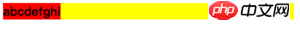
<style>div{display: flex; background-color: yellow;}b{background-color: red;}</style><body> <div> <b>a</b><b>b</b><b>c</b><b>d</b><b>e</b><b>f</b><b>g</b><b>h</b><b>i</b> </div></body>登录后复制当父元素设置为
flex后,其父元素自身会表现成块级元素,如果想表现为行内元素,可以使用inline-flex。 所有子元素不管是块级的还是行内的,会立即变成行内布局,这是其他属性的默认值所致的,后面可以修改。
flex-direction
<style>div{display: flex; background-color: yellow; margin: 5px;}div.row{ flex-direction: row;}div.row-reverse{ flex-direction: row-reverse;}div.column{ flex-direction: column;}div.column-reverse{ flex-direction: column-reverse;}b{background-color: red;}</style><body> <div class="row"> <b>a</b><b>b</b><b>c</b><b>d</b> </div> <div class="row-reverse"> <b>a</b><b>b</b><b>c</b><b>d</b> </div> <div class="column"> <b>a</b><b>b</b><b>c</b><b>d</b> </div> <div class="column-reverse"> <b>a</b><b>b</b><b>c</b><b>d</b> </div></body>登录后复制flex-direction决定子元素的排列方向,默认值row。flex-wrap
<style>div{display: flex; background-color: yellow; margin: 5px; }div.nowrap{ flex-wrap: nowrap;}div.wrap{ flex-wrap: wrap;}div.wrap-reverse{ flex-wrap: wrap-reverse;}b{background-color: red; width: 100px;}</style><body> <div class="nowrap"> <b>a</b><b>b</b><b>c</b><b>d</b> </div> <div class="wrap"> <b>a</b><b>b</b><b>c</b><b>d</b> </div> <div class="wrap-reverse"> <b>a</b><b>b</b><b>c</b><b>d</b> </div></body>登录后复制flex-wrap决定子元素超出一行时应该如何处理,默认值nowrap会压缩子元素的宽度,wrap是换行,wrap-reverse则是向上增加新一行。注意:这是在主轴为X轴的前提下讨论的。justify-content
<style>b{background-color: red; }div{display: flex; background-color: yellow; margin: 5px; }div.start{ justify-content: flex-start;}div.end{justify-content: flex-end;}div.center{ justify-content: center;}div.space-between{ justify-content: space-between;}div.space-around{ justify-content: space-around;}</style><body> <div class="start"> <b>a</b><b>b</b><b>c</b><b>d</b> </div> <div class="end"> <b>a</b><b>b</b><b>c</b><b>d</b> </div> <div class="center"> <b>a</b><b>b</b><b>c</b><b>d</b> </div> <div class="space-between"> <b>a</b><b>b</b><b>c</b><b>d</b> </div> <div class="space-around"> <b>a</b><b>b</b><b>c</b><b>d</b> </div></body>登录后复制justify-content决定子元素在主轴(当前是X轴)上的位置,默认值flex-start。space-between与space-around的间隔是多余空间平分出来的,但后者会为左右端也计入空间。align-items
<style>b{background-color: red; width: 40px;}b:nth-child(1){}b:nth-child(2){font-size: 30px; height: 40px;}b:nth-child(3){height: 50px;}b:nth-child(4){height: 60px;}div{display: flex; flex-wrap: wrap; background-color: yellow; margin: 5px; }div.start{ align-items: flex-start;}div.end{ align-items: flex-end;}div.center{ align-items: center;}div.baseline{ align-items: baseline;}div.stretch{ align-items: stretch;}</style><body> <div class="start"> <b>a</b><b>b</b><b>c</b><b>d</b> </div> <div class="end"> <b>a</b><b>b</b><b>c</b><b>d</b> </div> <div class="center"> <b>a</b><b>b</b><b>c</b><b>d</b> </div> <div class="baseline"> <b>a</b><b>b</b><b>c</b><b>d</b> </div> <div class="stretch"> <b>a</b><b>b</b><b>c</b><b>d</b> </div></body>登录后复制align-items决定副轴(当前为Y轴)上元素的对其方式。默认值stretch,表示当子元素不设置高度时,充满父类高度。align-content
<style>b{background-color: red; width: 100px;}div{display: flex; flex-wrap: wrap; background-color: yellow; margin: 5px; height: 70px;}div.start{ align-content: flex-start;}div.end{ align-content: flex-end;}div.center{ align-content: center;}div.space-between{ align-content: space-between;}div.space-around{ align-content: space-around;}div.stretch{ align-content: stretch;}</style><body> <div class="start"> <b>a</b><b>b</b><b>c</b><b>d</b> </div> <div class="end"> <b>a</b><b>b</b><b>c</b><b>d</b> </div> <div class="center"> <b>a</b><b>b</b><b>c</b><b>d</b> </div> <div class="space-between"> <b>a</b><b>b</b><b>c</b><b>d</b> </div> <div class="space-around"> <b>a</b><b>b</b><b>c</b><b>d</b> </div> <div class="stretch"> <b>a</b><b>b</b><b>c</b><b>d</b> </div></body>登录后复制align-content表示子元素有多行时,每行在副轴(当前为Y轴)上的位置。默认值stretch,表示变动子元素每行的高度,直到充满父元素。


子元素上的属性
order
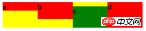
<style>div{display: flex; background-color: yellow; margin: 5px;}b{background-color: red; }b.test{order: -1;}</style><body> <div class="start"> <b>a</b><b>b</b><b class="test">c</b><b>d</b> </div></body>登录后复制order表示从小到大排列同级元素,默认值0。flex-grow
<style>div{display: flex; background-color: yellow; margin: 5px;}b{background-color: red; }b.test{flex-grow: 1; background-color: green;}</style><body> <div class="start"> <b>a</b><b>b</b><b class="test">c</b><b>d</b> </div></body>登录后复制flex-grow表示当主轴(当前为X轴)上有剩余空间时,平分空间时所占的比例。默认值0,表示不占空间。当前空间平分比例为0 : 0 : 1 : 0,所以 c 占据所有剩余空间。flex-shrink
<style>div{display: flex; background-color: yellow; margin: 5px;}b{background-color: red; width: 100px; flex-shrink: 0;}b.test{flex-shrink: 1; background-color: green;}</style><body> <div class="start"> <b>a</b><b>b</b><b class="test">c</b><b>d</b> </div></body>登录后复制flex-shrink表示当主轴(当前为X轴)空间不足以填充所有子元素时,应该如何压缩子元素,默认值1,表示1 : 1 : 1 : 1,即等比压缩,当前比例为0 : 0 : 1 : 0,表示所有空间由 c 来压缩。flex-basis
<style>div{display: flex; background-color: yellow; margin: 5px;}b{background-color: red; flex-grow: 1;}b.test{flex-basis: 100px; background-color: green;}</style><body> <div class="start"> <b>a</b><b>b</b><b class="test">c</b><b>d</b> </div></body>登录后复制flex-basis表示当主轴(当前为X轴)上平分空间前,先占据的位置,当主轴为X轴,与设置width是等效的,当主轴为Y轴,与设置height是等效的。默认值auto,表示与width或height相等。align-self
<style>div{display: flex; background-color: yellow; margin: 5px;}b{background-color: red; flex-grow: 1;}b:nth-child(1){height: 20px;}b:nth-child(2){height: 40px;}b:nth-child(3){height: 50px;}b:nth-child(4){height: 60px;}b.test{align-self: flex-end; background-color: green;}</style><body> <div class="start"> <b>a</b><b>b</b><b class="test">c</b><b>d</b> </div></body>登录后复制align-self表示当前元素可以覆盖父元素align-items所决定的副轴(当前为Y轴)上的方向。默认auto,即不设置。可选择与align-items一致,auto | flex-start | flex-end | center | baseline | stretch。


特别注意,为简化布局理解,上面事例都使用了默认的 flex-direction:row 作为子元素排序方向为基础。如果改为 flex-direction:column ,主轴将为变成 Y 轴,而副轴将变成 X 轴,所有属性的效果将会改变,这个留给读者自行实践。
学习过程中遇到什么问题或者想获取学习资源的话,欢迎加入学习交流群
以上是css3 中最出色的功能--flex 布局的详细内容。更多信息请关注PHP中文网其他相关文章!

热AI工具

Undresser.AI Undress
人工智能驱动的应用程序,用于创建逼真的裸体照片

AI Clothes Remover
用于从照片中去除衣服的在线人工智能工具。

Undress AI Tool
免费脱衣服图片

Clothoff.io
AI脱衣机

AI Hentai Generator
免费生成ai无尽的。

热门文章
热工具

记事本++7.3.1
好用且免费的代码编辑器

SublimeText3汉化版
中文版,非常好用

禅工作室 13.0.1
功能强大的PHP集成开发环境

Dreamweaver CS6
视觉化网页开发工具

SublimeText3 Mac版
神级代码编辑软件(SublimeText3)
热门话题


 bootstrap怎么写分割线
Apr 07, 2025 pm 03:12 PM
bootstrap怎么写分割线
Apr 07, 2025 pm 03:12 PM
创建 Bootstrap 分割线有两种方法:使用 标签,可创建水平分割线。使用 CSS border 属性,可创建自定义样式的分割线。
 bootstrap怎么插入图片
Apr 07, 2025 pm 03:30 PM
bootstrap怎么插入图片
Apr 07, 2025 pm 03:30 PM
在 Bootstrap 中插入图片有以下几种方法:直接插入图片,使用 HTML 的 img 标签。使用 Bootstrap 图像组件,可以提供响应式图片和更多样式。设置图片大小,使用 img-fluid 类可以使图片自适应。设置边框,使用 img-bordered 类。设置圆角,使用 img-rounded 类。设置阴影,使用 shadow 类。调整图片大小和位置,使用 CSS 样式。使用背景图片,使用 background-image CSS 属性。
 bootstrap怎么调整大小
Apr 07, 2025 pm 03:18 PM
bootstrap怎么调整大小
Apr 07, 2025 pm 03:18 PM
要调整 Bootstrap 中元素大小,可以使用尺寸类,具体包括:调整宽度:.col-、.w-、.mw-调整高度:.h-、.min-h-、.max-h-
 bootstrap怎么设置框架
Apr 07, 2025 pm 03:27 PM
bootstrap怎么设置框架
Apr 07, 2025 pm 03:27 PM
要设置 Bootstrap 框架,需要按照以下步骤:1. 通过 CDN 引用 Bootstrap 文件;2. 下载文件并将其托管在自己的服务器上;3. 在 HTML 中包含 Bootstrap 文件;4. 根据需要编译 Sass/Less;5. 导入定制文件(可选)。设置完成后,即可使用 Bootstrap 的网格系统、组件和样式创建响应式网站和应用程序。
 HTML,CSS和JavaScript的角色:核心职责
Apr 08, 2025 pm 07:05 PM
HTML,CSS和JavaScript的角色:核心职责
Apr 08, 2025 pm 07:05 PM
HTML定义网页结构,CSS负责样式和布局,JavaScript赋予动态交互。三者在网页开发中各司其职,共同构建丰富多彩的网站。
 bootstrap按钮怎么用
Apr 07, 2025 pm 03:09 PM
bootstrap按钮怎么用
Apr 07, 2025 pm 03:09 PM
如何使用 Bootstrap 按钮?引入 Bootstrap CSS创建按钮元素并添加 Bootstrap 按钮类添加按钮文本
 vue中怎么用bootstrap
Apr 07, 2025 pm 11:33 PM
vue中怎么用bootstrap
Apr 07, 2025 pm 11:33 PM
在 Vue.js 中使用 Bootstrap 分为五个步骤:安装 Bootstrap。在 main.js 中导入 Bootstrap。直接在模板中使用 Bootstrap 组件。可选:自定义样式。可选:使用插件。
 bootstrap怎么看日期
Apr 07, 2025 pm 03:03 PM
bootstrap怎么看日期
Apr 07, 2025 pm 03:03 PM
答案:可以使用 Bootstrap 的日期选择器组件在页面中查看日期。步骤:引入 Bootstrap 框架。在 HTML 中创建日期选择器输入框。Bootstrap 将自动为选择器添加样式。使用 JavaScript 获取选定的日期。
