首先是水平居中,最简单的办法当然就是
也就是将margin-left和margin-right属性设置为auto,从而达到水平居中的效果。
那么其他的办法呢?
line-height
首先介绍文字的水平居中方法:
利用line-height设为height的一样即可:
1 2 3 4 5 6 7 | .wrap{
line-height: 200px;
text-align:center;
height: 200px;
font-size: 36px;
background-color: #ccc;
}
|
登录后复制
效果如下:

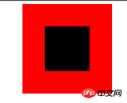
padding填充
利用padding和background-clip配合实现p的水平垂直居中:
1 2 3 4 | <p class="parent">
<p class="children">
</p>
</p>
|
登录后复制
通过backgroun-clip设置为content-box,将背景裁剪到内容区外沿,再利用padding设为外p减去内p的差的一半,来实现:
1 2 3 4 5 6 7 8 9 10 11 12 | .parent{
margin:0 auto;
width:200px;
height:200px;
background-color:red;
}
.children {
width: 100px;
height: 100px;
padding: 50px;
background-color: black;
background-clip:content-box;
|
登录后复制
效果如下:
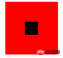
margin填充
接下来介绍margin填充的方式来实现水平垂直居中。
首先我们还是定义父子p:
1 2 3 | <p class="parent">
<p class="children"></p>
</p>
|
登录后复制
登录后复制
这里我们利用将子p的margin-top设置为父p高度减去子p高度的一半,然后再通过overflow设置为hidden来触发父p的BFC,LESS代码如下:
1 2 3 4 5 6 7 8 9 10 11 12 13 14 15 16 17 | @parentWidth:200px;
@childrenWidth:50px;
.parent {
margin:0 auto;
height:@parentWidth;
width:@parentWidth;
background: red;
overflow:hidden;
}
.children {
height:@childrenWidth;
width:@childrenWidth;
margin-left:auto;
margin-right:auto;
margin-top: (@parentWidth - @childrenWidth) / 2;
background:black;
}
|
登录后复制
最后得到居中效果如下:
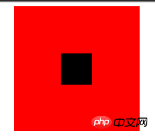
absolute定位
利用position:absolute搭配top,left 50%,再将margin设为负值也可以对p进行水平垂直居中,首先还是需要定义父子p:
1 2 3 | <p class="parent">
<p class="children"></p>
</p>
|
登录后复制
登录后复制
然后设置相应的css:
1 2 3 4 5 6 7 8 9 10 11 12 13 14 15 16 | .parent {
position:relative;
margin:0 auto;
width:200px;
height:200px;
background-color:red;
}
.children {
position:absolute;
left:50%;
top:50%;
margin:-25px 0 0 -25px ;
height:50px;
width:50px;
background-color: black;
}
|
登录后复制
其中的margin中的值为该p宽度的一半,最后效果图:
text-align居中
众所周知,text-align可以使得一个p中的内容水平居中。但是如果是要将该p中的子p居中呢?可以将子p的display设为inline-block。
1 2 3 4 5 6 7 8 9 10 11 12 13 14 15 | .parent {
text-align:center;
margin:0 auto;
width:200px;
height:200px;
background:red;
}
.children {
positiona;absolute;
margin-top:75px;
width:50px;
height:50px;
background: black;
display:inline-block;
}
|
登录后复制
flex居中
最后来介绍一下CSS3中的display:flex来实现的水平垂直居中的方法。
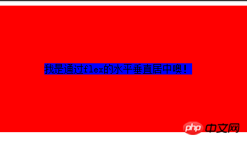
1 2 3 | <p class="parent">
<p class="children">我是通过flex的水平垂直居中噢!</p>
</p>
|
登录后复制
1 2 3 4 5 6 7 8 9 10 11 12 13 14 15 | html,body{
width: 100%;
height: 200px;
}
.parent {
display:flex;
align-items: center;
justify-content: center;
width:100%;
height:100%;
background-color:red;
}
.children {
background-color:blue;
}
|
登录后复制
效果如下:
以上是如何css属性实现各种居中填充方式代码详解的详细内容。更多信息请关注PHP中文网其他相关文章!


