

asp.net core封装layui组件的示例详解

本篇文章主要介绍了详解asp.net core封装layui组件示例分享,小编觉得挺不错的,现在分享给大家,也给大家做个参考。一起跟随小编过来看看吧
用什么封装?这里只是用了TagHelper,是啥?自己瞅文档去
在学习使用TagHelper的时候,最希望的就是能有个Demo能够让自己作为参考
怎么去封装一个组件?
不同的情况怎么去实现?
有没有更好更高效的方法?
找啊找啊找,最后跑去看了看mvc中的TagHelpers,再好好瞅了瞅TagHelper的文档
勉强折腾了几个组件出来,本来想一个组件一个组件写文章的,但是发现国庆已经结束了~
Demo下载
效果预览
代码仅供参考,有不同的意见也忘不吝赐教
Checkbox复选框组件封装
标签名称:cl-checkbox
标签属性: asp-for:绑定的字段,必须指定
asp-items:绑定单选项 类型为:IEnumerable
asp-skin:layui的皮肤样式,默认or原始
asp-title:若只是一个复选框时显示的文字,且未指定items,默认Checkbox的值为true
其中在封装的时候看源代码发现两段非常有用的代码
1.判断是否可以多选:
复制代码 代码如下:
var realModelType = For.ModelExplorer.ModelType; //通过类型判断是否为多选
var _allowMultiple = typeof(string) != realModelType && typeof(IEnumerable).IsAssignableFrom(realModelType);
2.获取模型绑定的列表值(多选的情况)
复制代码 代码如下:
var currentValues = Generator.GetCurrentValues(ViewContext,For.ModelExplorer,expression: For.Name,allowMultiple: true);
这3句代码是在mvc自带的SelectTagHelper中发现的.
因为core其实已经提供了非常多的TagHelper,比如常用的select就是很好的参考对象,封装遇到问题的时候去找找看指不定就又意外的收获.
CheckboxTagHelper代码
using System.Collections.Generic;
using Microsoft.AspNetCore.Mvc.Rendering;
using Microsoft.AspNetCore.Mvc.ViewFeatures;
using Microsoft.AspNetCore.Razor.TagHelpers;

namespace LayuiTagHelper.TagHelpers
{
 /// <summary>
 /// 复选框
 /// </summary>
 /// <remarks>
 /// 当Items为空时显示单个,且选择后值为true
 /// </remarks>
 [HtmlTargetElement(CheckboxTagName)]
 public class CheckboxTagHelper : TagHelper
 {
  private const string CheckboxTagName = "cl-checkbox";
  private const string ForAttributeName = "asp-for";
  private const string ItemsAttributeName = "asp-items";
  private const string SkinAttributeName = "asp-skin";
  private const string SignleTitleAttributeName = "asp-title";
  protected IHtmlGenerator Generator { get; }
  public CheckboxTagHelper(IHtmlGenerator generator)
  {
   Generator = generator;
  }

  [ViewContext]
  public ViewContext ViewContext { get; set; }

  [HtmlAttributeName(ForAttributeName)]
  public ModelExpression For { get; set; }

  [HtmlAttributeName(ItemsAttributeName)]
  public IEnumerable<SelectListItem> Items { get; set; }

  [HtmlAttributeName(SkinAttributeName)]
  public CheckboxSkin Skin { get; set; } = CheckboxSkin.默认;

  [HtmlAttributeName(SignleTitleAttributeName)]
  public string SignleTitle { get; set; }

  public override void Process(TagHelperContext context, TagHelperOutput output)
  {
   //获取绑定的生成的Name属性
   string inputName = ViewContext.ViewData.TemplateInfo.GetFullHtmlFieldName(For?.Name);
   string skin = string.Empty;
   #region 风格
   switch (Skin)
   {
    case CheckboxSkin.默认:
     skin = "";
     break;
    case CheckboxSkin.原始:
     skin = "primary";
     break;
   }
   #endregion
   #region 单个复选框
   if (Items == null)
   {
    output.TagName = "input";
    output.TagMode = TagMode.SelfClosing;
    output.Attributes.Add("type", "checkbox");
    output.Attributes.Add("id", inputName);
    output.Attributes.Add("name", inputName);
    output.Attributes.Add("lay-skin", skin);
    output.Attributes.Add("title", SignleTitle);
    output.Attributes.Add("value", "true");
    if (For?.Model?.ToString().ToLower() == "true")
    {
     output.Attributes.Add("checked", "checked");
    }
    return;
   }
   #endregion
   #region 复选框组
   var currentValues = Generator.GetCurrentValues(ViewContext,For.ModelExplorer,expression: For.Name,allowMultiple: true);
   foreach (var item in Items)
   {
    var checkbox = new TagBuilder("input");
    checkbox.TagRenderMode = TagRenderMode.SelfClosing;
    checkbox.Attributes["type"] = "checkbox";
    checkbox.Attributes["id"] = inputName;
    checkbox.Attributes["name"] = inputName;
    checkbox.Attributes["lay-skin"] = skin;
    checkbox.Attributes["title"] = item.Text;
    checkbox.Attributes["value"] = item.Value;
    if (item.Disabled)
    {
     checkbox.Attributes.Add("disabled", "disabled");
    }
    if (item.Selected || (currentValues != null && currentValues.Contains(item.Value)))
    {
     checkbox.Attributes.Add("checked", "checked");
    }

    output.Content.AppendHtml(checkbox);
   }
   output.TagName = "";
   #endregion
  }
 }
 public enum CheckboxSkin
 {
  默认,
  原始
 }
}使用示例
@{
string sex="男";
var Items=new List<SelectListItem>()
   {
    new SelectListItem() { Text = "男", Value = "男" },
    new SelectListItem() { Text = "女", Value = "女"},
    new SelectListItem() { Text = "不详", Value = "不详",Disabled=true }
   };
}
<cl-checkbox asp-items="Model.Items" asp-for="Hobby1" asp-skin="默认"></cl-checkbox>
<cl-checkbox asp-for="Hobby3" asp-title="单个复选框"></cl-checkbox>Radio单选框组件封装
标签名称:cl-radio
标签属性: asp-for:绑定的字段,必须指定
asp-items:绑定单选项 类型为:IEnumerable
太简单了,直接上代码了
RadioTagHelper代码
using System;
using System.Collections.Generic;
using Microsoft.AspNetCore.Mvc.Rendering;
using Microsoft.AspNetCore.Mvc.ViewFeatures;
using Microsoft.AspNetCore.Razor.TagHelpers;

namespace LayuiTagHelper.TagHelpers
{
 /// <summary>
 /// 单选框
 /// </summary>
 [HtmlTargetElement(RadioTagName)]
 public class RadioTagHelper : TagHelper
 {
  private const string RadioTagName = "cl-radio";
  private const string ForAttributeName = "asp-for";
  private const string ItemsAttributeName = "asp-items";

  [ViewContext]
  public ViewContext ViewContext { get; set; }

  [HtmlAttributeName(ForAttributeName)]
  public ModelExpression For { get; set; }

  [HtmlAttributeName(ItemsAttributeName)]
  public IEnumerable<SelectListItem> Items { get; set; }

  public override void Process(TagHelperContext context, TagHelperOutput output)
  {
   if (For == null)
   {
    throw new ArgumentException("必须绑定模型");
   }
   foreach (var item in Items)
   {
    var radio = new TagBuilder("input");
    radio.TagRenderMode = TagRenderMode.SelfClosing;
    radio.Attributes.Add("id", ViewContext.ViewData.TemplateInfo.GetFullHtmlFieldName(For.Name));
    radio.Attributes.Add("name", ViewContext.ViewData.TemplateInfo.GetFullHtmlFieldName(For.Name));
    radio.Attributes.Add("value", item.Value);
    radio.Attributes.Add("title", item.Text);
    radio.Attributes.Add("type", "radio");
    if (item.Disabled)
    {
     radio.Attributes.Add("disabled", "disabled");
    }
    if (item.Selected || item.Value == For.Model?.ToString())
    {
     radio.Attributes.Add("checked", "checked");
    }
    output.Content.AppendHtml(radio);
   }
   output.TagName = "";
  }
 }
}使用示例
@{
string sex="男";
var Items=new List<SelectListItem>()
   {
    new SelectListItem() { Text = "男", Value = "男" },
    new SelectListItem() { Text = "女", Value = "女"},
    new SelectListItem() { Text = "不详", Value = "不详",Disabled=true }
   };
}
<cl-radio asp-items="@Items" asp-for="sex"></cl-radio>最后再来一个开关组件
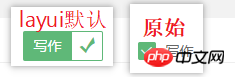
单个复选框其实可以直接用开关代替,恰巧layui中也有,于是也将开关单独的封装了一下,代码大同小异
就这个 
使用也简单: <cl-switch asp-for="Hobby4" asp-switch-text="开启|关闭"></cl-switch><br/>
namespace LayuiTagHelper.TagHelpers
{
 /// <summary>
 /// 开关
 /// </summary>
 [HtmlTargetElement(SwitchTagName)]
 public class SwitchTagHelper : TagHelper
 {
  private const string SwitchTagName = "cl-switch";
  private const string ForAttributeName = "asp-for";
  private const string SwitchTextAttributeName = "asp-switch-text";

  protected IHtmlGenerator Generator { get; }
  public SwitchTagHelper(IHtmlGenerator generator)
  {
   Generator = generator;
  }

  [ViewContext]
  public ViewContext ViewContext { get; set; }

  [HtmlAttributeName(ForAttributeName)]
  public ModelExpression For { get; set; }

  [HtmlAttributeName(SwitchTextAttributeName)]
  public string SwitchText { get; set; } = "ON|OFF";

  public override void Process(TagHelperContext context, TagHelperOutput output)
  {
   string inputName = ViewContext.ViewData.TemplateInfo.GetFullHtmlFieldName(For?.Name);
   output.TagName = "input";
   output.TagMode = TagMode.SelfClosing;
   if (For?.Model?.ToString().ToLower() == "true")
   {
    output.Attributes.Add("checked", "checked");
   }
   output.Attributes.Add("type", "checkbox");
   output.Attributes.Add("id", inputName);
   output.Attributes.Add("name", inputName);
   output.Attributes.Add("value", "true");
   output.Attributes.Add("lay-skin", "switch");
   output.Attributes.Add("lay-text", SwitchText);

  }
 }
}总结
封装的还很粗糙,正常的使用是没问题的,若发现问题,还望指出。
因为layui是直接在页面加载后渲染的表单标签,故没有多少和layui相关的样式。
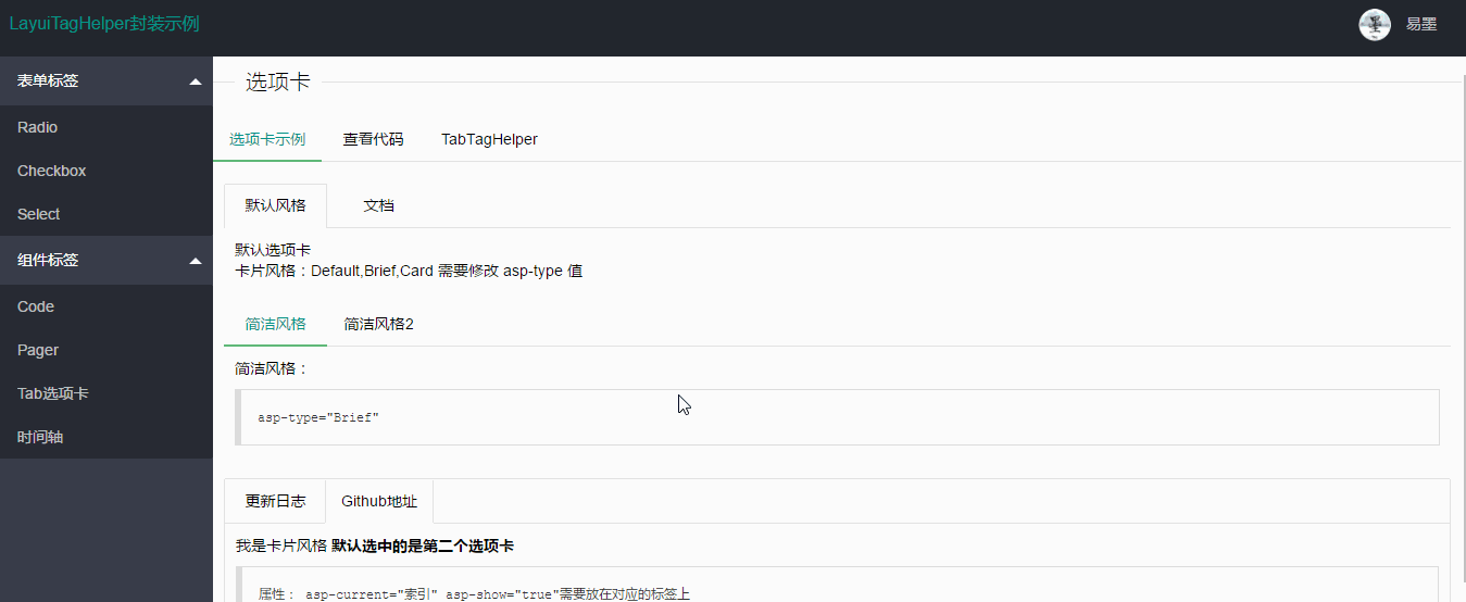
除了一些表单组件之外,其实还对选项卡,时间轴,分页,代码显示组件做了一些封装,这些后面再介绍了。
当然,有兴趣的朋友可以先去一睹为快看看都实现了哪些组件
以上是asp.net core封装layui组件的示例详解的详细内容。更多信息请关注PHP中文网其他相关文章!

热AI工具

Undresser.AI Undress
人工智能驱动的应用程序,用于创建逼真的裸体照片

AI Clothes Remover
用于从照片中去除衣服的在线人工智能工具。

Undress AI Tool
免费脱衣服图片

Clothoff.io
AI脱衣机

AI Hentai Generator
免费生成ai无尽的。

热门文章
热工具

记事本++7.3.1
好用且免费的代码编辑器

SublimeText3汉化版
中文版,非常好用

禅工作室 13.0.1
功能强大的PHP集成开发环境

Dreamweaver CS6
视觉化网页开发工具

SublimeText3 Mac版
神级代码编辑软件(SublimeText3)


 layui怎么获取表单数据
Apr 04, 2024 am 03:39 AM
layui怎么获取表单数据
Apr 04, 2024 am 03:39 AM
layui 提供了多种获取表单数据的方法,包括直接获取表单所有字段数据、获取单个表单元素值、使用 formAPI.getVal() 方法获取指定字段值、将表单数据序列化并作为 AJAX 请求参数,以及监听表单提交事件获取数据。
 layui登陆页面怎么设置跳转
Apr 04, 2024 am 03:12 AM
layui登陆页面怎么设置跳转
Apr 04, 2024 am 03:12 AM
layui 登录页面跳转设置步骤:添加跳转代码:在登录表单提交按钮点击事件中添加判断,成功登录后通过 window.location.href 跳转到指定页面。修改 form 配置:在 lay-filter="login" 的 form 元素中添加 hidden 输入字段,name 为 "redirect",value 为目标页面地址。
 layui如何实现自适应
Apr 26, 2024 am 03:00 AM
layui如何实现自适应
Apr 26, 2024 am 03:00 AM
通过使用layui框架的响应式布局功能,可以实现自适应布局。步骤包括:引用layui框架。定义自适应布局容器,设置layui-container类。使用响应式断点(xs/sm/md/lg)隐藏特定断点下的元素。利用网格系统(layui-col-)指定元素宽度。通过偏移量(layui-offset-)创建间距。使用响应式实用工具(layui-invisible/show/block/inline)控制元素的可见性和显示方式。
 layui跟vue有啥区别
Apr 04, 2024 am 03:54 AM
layui跟vue有啥区别
Apr 04, 2024 am 03:54 AM
layui与Vue的区别主要体现在功能和关注点上。layui专注于快速开发UI元素,提供预制组件简化页面构建;而Vue是一个全栈框架,注重数据绑定、组件化开发和状态管理,更适合构建复杂应用程序。 layui学习简单,适合快速构建页面;Vue学习曲线陡峭,但有助于构建可扩展和易维护的应用程序。根据项目需求和开发者技能水平,可以选择合适的框架。
 layui怎么运行
Apr 04, 2024 am 03:42 AM
layui怎么运行
Apr 04, 2024 am 03:42 AM
要运行 layui,请执行以下步骤:1. 导入 layui 脚本;2. 初始化 layui;3. 使用 layui 组件;4. 导入 layui 样式(可选);5. 确保脚本兼容并注意其他注意事项。通过这些步骤,您就可以使用 layui 的强大功能构建 web 应用程序。
 layui框架是什么语言
Apr 04, 2024 am 04:39 AM
layui框架是什么语言
Apr 04, 2024 am 04:39 AM
layui框架是一款基于JavaScript的前端框架,提供了一套易用的UI组件和工具,帮助开发者快速构建响应式Web应用。其特点包括:模块化、轻量级、响应式,并拥有完善的文档和社区支持。layui广泛应用于管理后台系统、电商网站和移动端应用等开发中。优点在于上手快、提高效率、维护方便,缺点是定制性较差、技术更新较慢。
 layui框架和vue框架的区别
Apr 26, 2024 am 01:27 AM
layui框架和vue框架的区别
Apr 26, 2024 am 01:27 AM
layui和vue是前端框架,layui是一种轻量级的库,提供UI组件和工具;vue是一个全面的框架,提供UI组件、状态管理、数据绑定和路由等功能。layui基于模块化的架构,vue基于组件化的架构。layui拥有较小的生态系统,vue拥有庞大且活跃的生态系统。layui学习曲线较低,vue学习曲线较陡。layui适用于小型项目和快速开发UI组件,vue适用于大型项目和需要丰富功能的场景。
 layui和elementui哪个好
Apr 04, 2024 am 04:15 AM
layui和elementui哪个好
Apr 04, 2024 am 04:15 AM
问题:layui和ElementUI哪个更胜一筹?回答:具体取决于项目需求。layui更全面、可定制和适合大型项目,而ElementUI更轻量、美观和易于使用。具体选择理由如下:选择layui:提供更广泛的功能和模块允许高度定制组件外观和行为适用于需要广泛功能和可扩展性的大型项目选择ElementUI:体积更小,加载速度更快组件遵循Material Design原则,美观性高提供大量现成组件,降低开发复杂性和时间
