

CSS制作立体导航栏的实现方法介绍

这篇文章主要介绍了使用CSS制作立体导航栏的相关资料,需要的朋友可以参考下
css制作的立体导航栏,具体实现代码如下所示:
<!doctype html>
<html lang="en">
<head>
<meta charset="UTF-8">
<title>CSS制作立体导航</title>
<link rel="stylesheet" href="http://www.w3cplus.com/demo/css3/base.css">
<style>
body{
background: #ebebeb;
}
.nav{
width:560px;
height: 50px;
font:bold 0/50px Arial;
text-align:center;
margin:40px auto 0;
background: #f65f57;
/*制作导航圆角*/
border-radius: 8px;
/*制作导航立体效果*/
box-shadow: 0 7px 0 #ba4a45;
}
.nav a{
display: inline-block;
/* a元素的过渡属性:1、设置所有a标签过渡;2、过渡时间;3、速度曲线:以慢速开始的过渡效果 */
-webkit-transition: all 0.2s ease-in;/* Safari 和 Chrome */
-moz-transition: all 0.2s ease-in;/* Firefox */
-o-transition: all 0.2s ease-in;/* Opera */
-ms-transition: all 0.2s ease-in;/* IE 9 */
transition: all 0.2s ease-in;
}
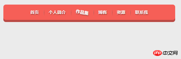
.nav a:hover{
/* 鼠标移上时的效果;定义2D旋转10度 */
-webkit-transform:rotate(10deg);
-moz-transform:rotate(10deg);
-o-transform:rotate(10deg);
-ms-transform:rotate(10deg);
transform:rotate(10deg);
}
.nav li{
position:relative;
display:inline-block;
padding:0 16px;
font-size: 14px;
text-shadow:1px 2px 4px rgba(0,0,0,.5);
list-style: none outside none;
}
/*制作导航分隔线效果*/
.nav li::before,
.nav li::after{
content:"";
position:absolute;
top:14px;
height: 25px;
width: 1px;
}
.nav li::after{
right: 0;
/* 线性渐变 */
background: -moz-linear-gradient(top, rgba(255,255,255,0), rgba(255,255,255,.2) 50%, rgba(255,255,255,0));
background: -webkit-linear-gradient(top, rgba(255,255,255,0), rgba(255,255,255,.2) 50%, rgba(255,255,255,0));
background: -o-linear-gradient(top, rgba(255,255,255,0), rgba(255,255,255,.2) 50%, rgba(255,255,255,0));
background: -ms-linear-gradient(top, rgba(255,255,255,0), rgba(255,255,255,.2) 50%, rgba(255,255,255,0));
background: linear-gradient(top, rgba(255,255,255,0), rgba(255,255,255,.2) 50%, rgba(255,255,255,0));
}
.nav li::before{
left: 0;
background: -moz-linear-gradient(top, #ff625a, #9e3e3a 50%, #ff625a);
background: -webkit-linear-gradient(top, #ff625a, #9e3e3a 50%, #ff625a);
background: -o-linear-gradient(top, #ff625a, #9e3e3a 50%, #ff625a);
background: -ms-linear-gradient(top, #ff625a, #9e3e3a 50%, #ff625a);
background: linear-gradient(top, #ff625a, #9e3e3a 50%, #ff625a);
}
/*删除导航第一个导航项左边的分隔线*/
.nav li:first-child::before{
background: none;
}
/*删除导航最后一个导航右边的分隔线*/
.nav li:last-child::after{
background: none;
}
.nav a,
.nav a:hover{
color:#fff;
text-decoration: none;
}
</style>
</head>
<body>
<ul class="nav">
<li><a href="">首页</a></li>
<li><a href="">个人简介</a></li>
<li><a href="">作品集</a></li>
<li><a href="">博客</a></li>
<li><a href="">资源</a></li>
<li><a href="">联系我</a></li>
</ul>
</body>
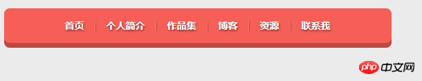
</html>效果图:
总结:
1、body部分用无序列表
2、(1)hover
鼠标移上时的效果。
(2)疑问::before和:before的区别
简单来说单冒号(:)用于CSS3伪类,双冒号(::)用于CSS3伪元素。
w3c关于css选择器的规范:
A pseudo-element is made of two colons (::) followed by the name of the pseudo-element.
This :: notation is introduced by the current document in order to establish a discrimination between pseudo-classes and pseudo-elements. For compatibility with existing style sheets, user agents must also accept the previous one-colon notation for pseudo-elements introduced in CSS levels 1 and 2 (namely, :first-line, :first-letter, :before and :after). This compatibility is not allowed for the new pseudo-elements introduced in CSS level 3.
简单翻译:伪元素由双冒号和伪元素名称组成。双冒号是在当前规范中引入的,用于区分伪类和伪元素。不过浏览器需要同时支持旧的已经存 在的伪元素写法,比如:first-line、:first-letter、:before、:after等,而新的在CSS3中引入的伪元素则不允许再支持旧的单冒号的写法。
那么现在就可以完整的回答标题中的问题了,对于CSS2之前已有的伪元素,比如:before,单冒号和双冒号的写法::before作用是一样的。
所以,如果你的网站只需要兼容webkit、firefox、opera等浏览器,建议对于伪元素采用双冒号的写法,如果不得不兼容IE浏览器,还是用CSS2的单冒号写法比较安全。
总结
以上是CSS制作立体导航栏的实现方法介绍的详细内容。更多信息请关注PHP中文网其他相关文章!

热AI工具

Undresser.AI Undress
人工智能驱动的应用程序,用于创建逼真的裸体照片

AI Clothes Remover
用于从照片中去除衣服的在线人工智能工具。

Undress AI Tool
免费脱衣服图片

Clothoff.io
AI脱衣机

Video Face Swap
使用我们完全免费的人工智能换脸工具轻松在任何视频中换脸!

热门文章
热工具

记事本++7.3.1
好用且免费的代码编辑器

SublimeText3汉化版
中文版,非常好用

禅工作室 13.0.1
功能强大的PHP集成开发环境

Dreamweaver CS6
视觉化网页开发工具

SublimeText3 Mac版
神级代码编辑软件(SublimeText3)
热门话题
 7652
7652
 15
1393
52
91
11
73
19
37
110
15
1393
52
91
11
73
19
37
110

 vue中怎么用bootstrap
Apr 07, 2025 pm 11:33 PM
vue中怎么用bootstrap
Apr 07, 2025 pm 11:33 PM
在 Vue.js 中使用 Bootstrap 分为五个步骤:安装 Bootstrap。在 main.js 中导入 Bootstrap。直接在模板中使用 Bootstrap 组件。可选:自定义样式。可选:使用插件。
 HTML,CSS和JavaScript的角色:核心职责
Apr 08, 2025 pm 07:05 PM
HTML,CSS和JavaScript的角色:核心职责
Apr 08, 2025 pm 07:05 PM
HTML定义网页结构,CSS负责样式和布局,JavaScript赋予动态交互。三者在网页开发中各司其职,共同构建丰富多彩的网站。
 bootstrap怎么写分割线
Apr 07, 2025 pm 03:12 PM
bootstrap怎么写分割线
Apr 07, 2025 pm 03:12 PM
创建 Bootstrap 分割线有两种方法:使用 标签,可创建水平分割线。使用 CSS border 属性,可创建自定义样式的分割线。
 了解HTML,CSS和JavaScript:初学者指南
Apr 12, 2025 am 12:02 AM
了解HTML,CSS和JavaScript:初学者指南
Apr 12, 2025 am 12:02 AM
WebDevelovermentReliesonHtml,CSS和JavaScript:1)HTMLStructuresContent,2)CSSStyleSIT和3)JavaScriptAddSstractivity,形成thebasisofmodernWebemodernWebExexperiences。
 bootstrap按钮怎么用
Apr 07, 2025 pm 03:09 PM
bootstrap按钮怎么用
Apr 07, 2025 pm 03:09 PM
如何使用 Bootstrap 按钮?引入 Bootstrap CSS创建按钮元素并添加 Bootstrap 按钮类添加按钮文本
 bootstrap怎么设置框架
Apr 07, 2025 pm 03:27 PM
bootstrap怎么设置框架
Apr 07, 2025 pm 03:27 PM
要设置 Bootstrap 框架,需要按照以下步骤:1. 通过 CDN 引用 Bootstrap 文件;2. 下载文件并将其托管在自己的服务器上;3. 在 HTML 中包含 Bootstrap 文件;4. 根据需要编译 Sass/Less;5. 导入定制文件(可选)。设置完成后,即可使用 Bootstrap 的网格系统、组件和样式创建响应式网站和应用程序。
 bootstrap怎么插入图片
Apr 07, 2025 pm 03:30 PM
bootstrap怎么插入图片
Apr 07, 2025 pm 03:30 PM
在 Bootstrap 中插入图片有以下几种方法:直接插入图片,使用 HTML 的 img 标签。使用 Bootstrap 图像组件,可以提供响应式图片和更多样式。设置图片大小,使用 img-fluid 类可以使图片自适应。设置边框,使用 img-bordered 类。设置圆角,使用 img-rounded 类。设置阴影,使用 shadow 类。调整图片大小和位置,使用 CSS 样式。使用背景图片,使用 background-image CSS 属性。
 bootstrap怎么调整大小
Apr 07, 2025 pm 03:18 PM
bootstrap怎么调整大小
Apr 07, 2025 pm 03:18 PM
要调整 Bootstrap 中元素大小,可以使用尺寸类,具体包括:调整宽度:.col-、.w-、.mw-调整高度:.h-、.min-h-、.max-h-
