

bootstrap之.nav与.navbar区别详解

导航栏是一个很好的功能,是 Bootstrap 网站的一个突出特点。导航栏在您的应用或网站中作为导航页头的响应式基础组件。导航栏在移动设备的视图中是折叠的,随着可用视口宽度的增加,导航栏也会水平展开。在 Bootstrap 导航栏的核心中,导航栏包括了站点名称和基本的导航定义样式。本文主要介绍了详解bootstrap导航栏.nav与.navbar区别,小编觉得挺不错的,现在分享给大家,也给大家做个参考希望能帮助到大家。
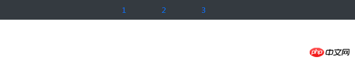
一、简单的ul,li组成的导航:
<ul class="nav nav-pills justify-content-center bg-dark nav-dark">
    <li class="nav-item">
      <a href="#" rel="external nofollow" rel="external nofollow" rel="external nofollow" rel="external nofollow" rel="external nofollow" rel="external nofollow" rel="external nofollow" rel="external nofollow" rel="external nofollow" rel="external nofollow" rel="external nofollow" rel="external nofollow" rel="external nofollow" rel="external nofollow" rel="external nofollow" rel="external nofollow" rel="external nofollow" rel="external nofollow" rel="external nofollow" rel="external nofollow" class="nav-link">1</a>
    </li>
    <li class="nav-item">
      <a href="#" rel="external nofollow" rel="external nofollow" rel="external nofollow" rel="external nofollow" rel="external nofollow" rel="external nofollow" rel="external nofollow" rel="external nofollow" rel="external nofollow" rel="external nofollow" rel="external nofollow" rel="external nofollow" rel="external nofollow" rel="external nofollow" rel="external nofollow" rel="external nofollow" rel="external nofollow" rel="external nofollow" rel="external nofollow" rel="external nofollow" class="nav-link">2</a>
    </li>
    <li class="nav-item">
      <a href="#" rel="external nofollow" rel="external nofollow" rel="external nofollow" rel="external nofollow" rel="external nofollow" rel="external nofollow" rel="external nofollow" rel="external nofollow" rel="external nofollow" rel="external nofollow" rel="external nofollow" rel="external nofollow" rel="external nofollow" rel="external nofollow" rel="external nofollow" rel="external nofollow" rel="external nofollow" rel="external nofollow" rel="external nofollow" rel="external nofollow" class="nav-link">3</a>
    </li>
  </ul>


//解析:.nav .nav-item .nav-link表示ul li是导航——.nav-pills表示胶囊状导航——.bg-dark/.nav-dark表示黑底白字——.justify-content-center表示导航栏在浏览器上居中显示
在浏览器上显示为:
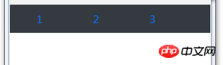
缩小浏览器窗口显示为:
二、导航栏——
代码为:
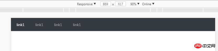
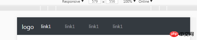
<nav class="navbar navbar-expand-sm bg-dark navbar-dark">
  <ul class="navbar-nav">
    <li class="nav-item active">
      <a href="#" rel="external nofollow" rel="external nofollow" rel="external nofollow" rel="external nofollow" rel="external nofollow" rel="external nofollow" rel="external nofollow" rel="external nofollow" rel="external nofollow" rel="external nofollow" rel="external nofollow" rel="external nofollow" rel="external nofollow" rel="external nofollow" rel="external nofollow" rel="external nofollow" rel="external nofollow" rel="external nofollow" rel="external nofollow" rel="external nofollow" class="nav-link">link1</a>
    </li>
    <li class="nav-item">
      <a href="#" rel="external nofollow" rel="external nofollow" rel="external nofollow" rel="external nofollow" rel="external nofollow" rel="external nofollow" rel="external nofollow" rel="external nofollow" rel="external nofollow" rel="external nofollow" rel="external nofollow" rel="external nofollow" rel="external nofollow" rel="external nofollow" rel="external nofollow" rel="external nofollow" rel="external nofollow" rel="external nofollow" rel="external nofollow" rel="external nofollow" class="nav-link">link1</a>
    </li>
  </ul>
</nav>
正常窗口显示为:
缩小窗口小于576px时:
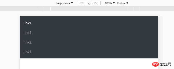
三、折叠导航栏
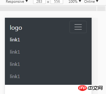
当窗口小于576px的时候,不仅仅是简单的编程垂直导航;显示为一个button按钮,导航链接隐藏,点击button显示;
代码为:
<nav class="navbar navbar-expand-sm bg-dark navbar-dark fixed-top">
  <a href="#" rel="external nofollow" rel="external nofollow" rel="external nofollow" rel="external nofollow" rel="external nofollow" rel="external nofollow" rel="external nofollow" rel="external nofollow" rel="external nofollow" rel="external nofollow" rel="external nofollow" rel="external nofollow" rel="external nofollow" rel="external nofollow" rel="external nofollow" rel="external nofollow" rel="external nofollow" rel="external nofollow" rel="external nofollow" rel="external nofollow" class="navbar-brand">
      <img src="" alt="logo" style="width:70px;height:30px;">
  </a>
  <button class="navbar-toggler" type="button" data-toggle="collapse" data-target="#collapsible">
    <span class="navbar-toggler-icon"></span>
  </button>
  <p class="collapse navbar-collapse" id="collapsible">
  <ul class="navbar-nav">
    <li class="nav-item active">
      <a href="#" rel="external nofollow" rel="external nofollow" rel="external nofollow" rel="external nofollow" rel="external nofollow" rel="external nofollow" rel="external nofollow" rel="external nofollow" rel="external nofollow" rel="external nofollow" rel="external nofollow" rel="external nofollow" rel="external nofollow" rel="external nofollow" rel="external nofollow" rel="external nofollow" rel="external nofollow" rel="external nofollow" rel="external nofollow" rel="external nofollow" class="nav-link">link1</a>
    </li>
    <li class="nav-item">
      <a href="#" rel="external nofollow" rel="external nofollow" rel="external nofollow" rel="external nofollow" rel="external nofollow" rel="external nofollow" rel="external nofollow" rel="external nofollow" rel="external nofollow" rel="external nofollow" rel="external nofollow" rel="external nofollow" rel="external nofollow" rel="external nofollow" rel="external nofollow" rel="external nofollow" rel="external nofollow" rel="external nofollow" rel="external nofollow" rel="external nofollow" class="nav-link">link1</a>
    </li>
    <li class="nav-item">
      <a href="#" rel="external nofollow" rel="external nofollow" rel="external nofollow" rel="external nofollow" rel="external nofollow" rel="external nofollow" rel="external nofollow" rel="external nofollow" rel="external nofollow" rel="external nofollow" rel="external nofollow" rel="external nofollow" rel="external nofollow" rel="external nofollow" rel="external nofollow" rel="external nofollow" rel="external nofollow" rel="external nofollow" rel="external nofollow" rel="external nofollow" class="nav-link">link1</a>
    </li>
    <li class="nav-item">
      <a href="#" rel="external nofollow" rel="external nofollow" rel="external nofollow" rel="external nofollow" rel="external nofollow" rel="external nofollow" rel="external nofollow" rel="external nofollow" rel="external nofollow" rel="external nofollow" rel="external nofollow" rel="external nofollow" rel="external nofollow" rel="external nofollow" rel="external nofollow" rel="external nofollow" rel="external nofollow" rel="external nofollow" rel="external nofollow" rel="external nofollow" class="nav-link">link1</a>
    </li>
  </ul>

</nav>
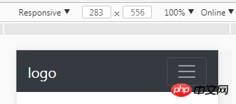
//注意:.navbar-brand是品牌logo;
窗口大于576的时候,显示为:
窗口小于576的时候,显示为:
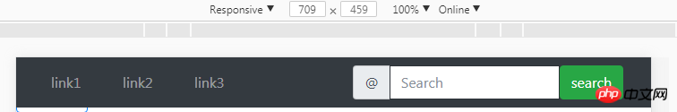
四、导航栏加上form表单表示搜索框:【?????】
代码如下:
<nav class="navbar navbar-expand-sm bg-dark navbar-dark fixed-top">
  <a href="#" rel="external nofollow" rel="external nofollow" rel="external nofollow" rel="external nofollow" rel="external nofollow" rel="external nofollow" rel="external nofollow" rel="external nofollow" rel="external nofollow" rel="external nofollow" rel="external nofollow" rel="external nofollow" rel="external nofollow" rel="external nofollow" rel="external nofollow" rel="external nofollow" rel="external nofollow" rel="external nofollow" rel="external nofollow" rel="external nofollow" class="navbar-brand">
      <img src="" alt="logo" style="width:70px;height:30px;">
  </a>
  <button class="navbar-toggler" type="button" data-toggle="collapse" data-target="#collapsible">
    <span class="navbar-toggler-icon"></span>
  </button>
  <p class="collapse navbar-collapse" id="collapsible">
  <ul class="navbar-nav">
    <li class="nav-item active">
      <a href="#" rel="external nofollow" rel="external nofollow" rel="external nofollow" rel="external nofollow" rel="external nofollow" rel="external nofollow" rel="external nofollow" rel="external nofollow" rel="external nofollow" rel="external nofollow" rel="external nofollow" rel="external nofollow" rel="external nofollow" rel="external nofollow" rel="external nofollow" rel="external nofollow" rel="external nofollow" rel="external nofollow" rel="external nofollow" rel="external nofollow" class="nav-link">link1</a>
    </li>
    <li class="nav-item">
      <a href="#" rel="external nofollow" rel="external nofollow" rel="external nofollow" rel="external nofollow" rel="external nofollow" rel="external nofollow" rel="external nofollow" rel="external nofollow" rel="external nofollow" rel="external nofollow" rel="external nofollow" rel="external nofollow" rel="external nofollow" rel="external nofollow" rel="external nofollow" rel="external nofollow" rel="external nofollow" rel="external nofollow" rel="external nofollow" rel="external nofollow" class="nav-link">link1</a>
    </li>
    <li class="nav-item">
      <a href="#" rel="external nofollow" rel="external nofollow" rel="external nofollow" rel="external nofollow" rel="external nofollow" rel="external nofollow" rel="external nofollow" rel="external nofollow" rel="external nofollow" rel="external nofollow" rel="external nofollow" rel="external nofollow" rel="external nofollow" rel="external nofollow" rel="external nofollow" rel="external nofollow" rel="external nofollow" rel="external nofollow" rel="external nofollow" rel="external nofollow" class="nav-link">link1</a>
    </li>
    <li class="nav-item">
      <a href="#" rel="external nofollow" rel="external nofollow" rel="external nofollow" rel="external nofollow" rel="external nofollow" rel="external nofollow" rel="external nofollow" rel="external nofollow" rel="external nofollow" rel="external nofollow" rel="external nofollow" rel="external nofollow" rel="external nofollow" rel="external nofollow" rel="external nofollow" rel="external nofollow" rel="external nofollow" rel="external nofollow" rel="external nofollow" rel="external nofollow" class="nav-link">link1</a>
    </li>
  </ul>
  <form class="form-inline">
        <p class="input-group">
          <span class="input-group-addon">@</span>
          <input list="dl" type="text" class="form-control" placeholder="Search"/>
          <datalist id="dl">
            <option value="IE"></option>
            <option value="Firefox"></option>
            <option value="chrome"></option>
            <option value="safari"></option>
          </datalist>
        </p>

        <button class="btn btn-success" type="submit">search</button>
      </form>
</nav>
如图所示,如何使得导航栏中的form表单右对齐,移到最右边?????float:eight应该也行吧。。
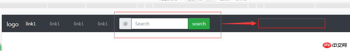
emmmm.....知道了上面的解决方法了:利用网格系统,将左边的ul,li和右边的form表单分别排列;.col-sm-6;然后再给form表单右浮动;
代码如下:
<p class="container-fluid">
  <p class="row">
    <!-- 导航栏 -->
    <nav class="navbar fixed-top navbar-expand-sm bg-dark navbar-dark">
      <p class="col-lg-4">
      <ul class="navbar-nav">
        <li class="nav-item">
          <a class="nav-link" href="#" rel="external nofollow" rel="external nofollow" rel="external nofollow" rel="external nofollow" rel="external nofollow" rel="external nofollow" rel="external nofollow" rel="external nofollow" rel="external nofollow" rel="external nofollow" rel="external nofollow" rel="external nofollow" rel="external nofollow" rel="external nofollow" rel="external nofollow" rel="external nofollow" rel="external nofollow" rel="external nofollow" rel="external nofollow" rel="external nofollow" >link1</a>
        </li>
        <li class="nav-item">
          <a class="nav-link" href="#" rel="external nofollow" rel="external nofollow" rel="external nofollow" rel="external nofollow" rel="external nofollow" rel="external nofollow" rel="external nofollow" rel="external nofollow" rel="external nofollow" rel="external nofollow" rel="external nofollow" rel="external nofollow" rel="external nofollow" rel="external nofollow" rel="external nofollow" rel="external nofollow" rel="external nofollow" rel="external nofollow" rel="external nofollow" rel="external nofollow" >link2</a>
        </li>
        <li class="nav-item">
          <a class="nav-link" href="#" rel="external nofollow" rel="external nofollow" rel="external nofollow" rel="external nofollow" rel="external nofollow" rel="external nofollow" rel="external nofollow" rel="external nofollow" rel="external nofollow" rel="external nofollow" rel="external nofollow" rel="external nofollow" rel="external nofollow" rel="external nofollow" rel="external nofollow" rel="external nofollow" rel="external nofollow" rel="external nofollow" rel="external nofollow" rel="external nofollow" >link3</a>
        </li>
      </ul>
      </p>
<!-- 导航栏表单与按钮 -->
    <p class="col-lg-8">
      <form class="form-inline" style="float:right;">
        <p class="input-group">
          <span class="input-group-addon">@</span>
          <input list="dl" type="text" class="form-control" placeholder="Search"/>
          <datalist id="dl">
            <option value="IE"></option>
            <option value="Firefox"></option>
            <option value="chrome"></option>
            <option value="safari"></option>
          </datalist>
          <button class="btn btn-success" type="submit">search</button>
        </p>
      </form>
      </p>
    </nav>
    </p>
      </p>
大家学会了吗?相信大家对Bootstrap 导航栏.nav与.navbar区别也有更近一步认识,觉得本文有用的话,赶紧收藏起来吧。
相关推荐:
Bootstrap导航栏各元素操作方法(表单、按钮、文本)_javascript技巧
以上是bootstrap之.nav与.navbar区别详解的详细内容。更多信息请关注PHP中文网其他相关文章!

热AI工具

Undresser.AI Undress
人工智能驱动的应用程序,用于创建逼真的裸体照片

AI Clothes Remover
用于从照片中去除衣服的在线人工智能工具。

Undress AI Tool
免费脱衣服图片

Clothoff.io
AI脱衣机

Video Face Swap
使用我们完全免费的人工智能换脸工具轻松在任何视频中换脸!

热门文章
热工具

记事本++7.3.1
好用且免费的代码编辑器

SublimeText3汉化版
中文版,非常好用

禅工作室 13.0.1
功能强大的PHP集成开发环境

Dreamweaver CS6
视觉化网页开发工具

SublimeText3 Mac版
神级代码编辑软件(SublimeText3)


 bootstrap搜索栏怎么获取
Apr 07, 2025 pm 03:33 PM
bootstrap搜索栏怎么获取
Apr 07, 2025 pm 03:33 PM
如何使用 Bootstrap 获取搜索栏的值:确定搜索栏的 ID 或名称。使用 JavaScript 获取 DOM 元素。获取元素的值。执行所需的操作。
 vue中怎么用bootstrap
Apr 07, 2025 pm 11:33 PM
vue中怎么用bootstrap
Apr 07, 2025 pm 11:33 PM
在 Vue.js 中使用 Bootstrap 分为五个步骤:安装 Bootstrap。在 main.js 中导入 Bootstrap。直接在模板中使用 Bootstrap 组件。可选:自定义样式。可选:使用插件。
 bootstrap垂直居中怎么弄
Apr 07, 2025 pm 03:21 PM
bootstrap垂直居中怎么弄
Apr 07, 2025 pm 03:21 PM
使用 Bootstrap 实现垂直居中:flexbox 法:使用 d-flex、justify-content-center 和 align-items-center 类,将元素置于 flexbox 容器内。align-items-center 类法:对于不支持 flexbox 的浏览器,使用 align-items-center 类,前提是父元素具有已定义的高度。
 bootstrap怎么写分割线
Apr 07, 2025 pm 03:12 PM
bootstrap怎么写分割线
Apr 07, 2025 pm 03:12 PM
创建 Bootstrap 分割线有两种方法:使用 标签,可创建水平分割线。使用 CSS border 属性,可创建自定义样式的分割线。
 bootstrap怎么插入图片
Apr 07, 2025 pm 03:30 PM
bootstrap怎么插入图片
Apr 07, 2025 pm 03:30 PM
在 Bootstrap 中插入图片有以下几种方法:直接插入图片,使用 HTML 的 img 标签。使用 Bootstrap 图像组件,可以提供响应式图片和更多样式。设置图片大小,使用 img-fluid 类可以使图片自适应。设置边框,使用 img-bordered 类。设置圆角,使用 img-rounded 类。设置阴影,使用 shadow 类。调整图片大小和位置,使用 CSS 样式。使用背景图片,使用 background-image CSS 属性。
 bootstrap按钮怎么用
Apr 07, 2025 pm 03:09 PM
bootstrap按钮怎么用
Apr 07, 2025 pm 03:09 PM
如何使用 Bootstrap 按钮?引入 Bootstrap CSS创建按钮元素并添加 Bootstrap 按钮类添加按钮文本
 bootstrap怎么设置框架
Apr 07, 2025 pm 03:27 PM
bootstrap怎么设置框架
Apr 07, 2025 pm 03:27 PM
要设置 Bootstrap 框架,需要按照以下步骤:1. 通过 CDN 引用 Bootstrap 文件;2. 下载文件并将其托管在自己的服务器上;3. 在 HTML 中包含 Bootstrap 文件;4. 根据需要编译 Sass/Less;5. 导入定制文件(可选)。设置完成后,即可使用 Bootstrap 的网格系统、组件和样式创建响应式网站和应用程序。
 bootstrap怎么调整大小
Apr 07, 2025 pm 03:18 PM
bootstrap怎么调整大小
Apr 07, 2025 pm 03:18 PM
要调整 Bootstrap 中元素大小,可以使用尺寸类,具体包括:调整宽度:.col-、.w-、.mw-调整高度:.h-、.min-h-、.max-h-
