

实例讲解响应式框架Bootstrap栅格系统

栅格系统栅格系统英文为"grid systems",也有人翻译为"网格系统",运用固定的格子设计版面布局,其风格工整简洁,在二战后大受欢迎,已成为今日出版物设计的主流风格之一。本文主要为大家分享一篇响应式框架Bootstrap栅格系统的实例,具有很好的参考价值,希望对大家有所帮助。一起跟随小编过来看看吧,希望能帮助到大家。
【相关视频推荐:Bootstrap教程】
实例如下:
<!DOCTYPE html>
<html>
<head lang="en">
<meta charset="UTF-8">
<title></title>
<meta name="viewport" content="width=device-width, initial-scale=1">
<link rel="stylesheet" href="css/bootstrap.min.css" rel="external nofollow" />
<script language="JavaScript" src="js/jquery-3.js"></script>
<style type="text/css">
*{
top: 0px;
padding: 0px;
text-decoration: none;
list-style-type: none;
}
.top-styl{
height: 50px;
border: 1px solid red;
background-color: #000000;
}
.img-styl{
width: 174px;
height: 50px;
background: url("imges/logo.png")no-repeat 0px 3px;
background-size: contain;
float: left;
}
.sousuo-styl{
width: 187px;
float: left;
}
.top-search-input{
width: 150px;
padding: 0 5px;
height: 30px;
border: 0;
background: #363636;
float: left;
color: #ccc;
}
.top-search-submit{
width: 30px;
height: 30px;
border: 0;
background: green url("imges/zoom.gif")center center no-repeat;
float: left;
cursor: pointer; //光标指针
}
.dao-styll{
float: left;
font-size: 16px;
width: 329px;
margin-left: 33px;
margin-top: 11px;
}
.dao-styll li{
float: left;
position: relative; //相对定位
text-align: center;
padding: 0 7px;
}
.dao-styll >li:hover{
background-color: #999;
}
.dao-styll >li >a{
color: #FFF;
width: 100%;
height: 34px;
text-decoration: none; //取消下划线
}
.dz-styl{
float: right;
margin: -19px -9px 6px 21px;
}
.imgs-styl{
padding: 11px 0px 0px 114px;
float: right;
margin: 0px -98px -3px 8px;
}
.green-styl{
color: green;
}
.zc-styl{
color: white;
}
a{
text-decoration: none;
}
</style>
</head>
<body>
<p class="container-fluid"> //fluid表示用 百分比
<p class="row"> //row 行
<p class="top-styl col-md-12"> //col-md-12 每行桌面占12列
<p class="row">
<p class=" col-md-offset-1 col-md-9"> //col-md-offset-1 列偏移1列
<p class="row">
<p class="col-md-3 col-xs-4">
<p class="img-styl"></p>
</p>
<p class="col-md-3 ">
<p class="sousuo-styl" style="padding-left: 7px; margin: 8px auto;">
<input class="top-search-input" value="" type="text"><input
class="top-search-submit" type="submit" value="" />
</p>
</p>
<p class="col-md-4 hidden-xs" style="padding: 0px">
<ul class="dao-styll">
<li class=""><a href="#" rel="external nofollow" rel="external nofollow" rel="external nofollow" rel="external nofollow" rel="external nofollow" rel="external nofollow" >风格</a>
</li>
<li class=""><a href="#" rel="external nofollow" rel="external nofollow" rel="external nofollow" rel="external nofollow" rel="external nofollow" rel="external nofollow" >造型师</a></li>
<li class=""><a href="#" rel="external nofollow" rel="external nofollow" rel="external nofollow" rel="external nofollow" rel="external nofollow" rel="external nofollow" >众分享</a>
</li>
<li class=""><a href="#" rel="external nofollow" rel="external nofollow" rel="external nofollow" rel="external nofollow" rel="external nofollow" rel="external nofollow" >我的美丽衣橱</a></li>
</ul>
</p>
<p class="col-md-2">
<p class="imgs-styl">
<img src="imges/sina.gif">
</p>
<p class="dz-styl">
<span><a href="#" rel="external nofollow" rel="external nofollow" rel="external nofollow" rel="external nofollow" rel="external nofollow" rel="external nofollow" class="green-styl">登录</a> | </span><span>
<a href="#" rel="external nofollow" rel="external nofollow" rel="external nofollow" rel="external nofollow" rel="external nofollow" rel="external nofollow" class="zc-styl">注册</a></span>
</p>
</p>
</p>
</p>
</p>
</p>
</p>
<p class="row">
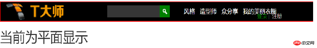
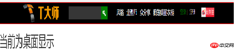
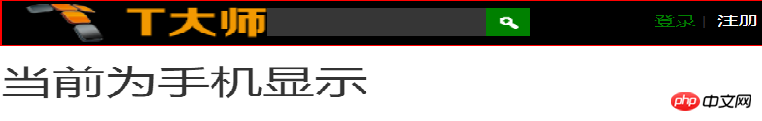
<p class="visible-md"><h1>当前为桌面显示</h1></p> //visible默认占满整行
<p class="visible-sm"><h1>当前为平面显示</h1></p>
<p class="visible-xs"><h1>当前为手机显示</h1></p>
</p>
</p>
</body>
</html>效果显示图:
相关推荐:
学习使用bootstrap3栅格系统_javascript技巧
以上是实例讲解响应式框架Bootstrap栅格系统的详细内容。更多信息请关注PHP中文网其他相关文章!

热AI工具

Undresser.AI Undress
人工智能驱动的应用程序,用于创建逼真的裸体照片

AI Clothes Remover
用于从照片中去除衣服的在线人工智能工具。

Undress AI Tool
免费脱衣服图片

Clothoff.io
AI脱衣机

AI Hentai Generator
免费生成ai无尽的。

热门文章
热工具

记事本++7.3.1
好用且免费的代码编辑器

SublimeText3汉化版
中文版,非常好用

禅工作室 13.0.1
功能强大的PHP集成开发环境

Dreamweaver CS6
视觉化网页开发工具

SublimeText3 Mac版
神级代码编辑软件(SublimeText3)
热门话题


 bootstrap搜索栏怎么获取
Apr 07, 2025 pm 03:33 PM
bootstrap搜索栏怎么获取
Apr 07, 2025 pm 03:33 PM
如何使用 Bootstrap 获取搜索栏的值:确定搜索栏的 ID 或名称。使用 JavaScript 获取 DOM 元素。获取元素的值。执行所需的操作。
 bootstrap垂直居中怎么弄
Apr 07, 2025 pm 03:21 PM
bootstrap垂直居中怎么弄
Apr 07, 2025 pm 03:21 PM
使用 Bootstrap 实现垂直居中:flexbox 法:使用 d-flex、justify-content-center 和 align-items-center 类,将元素置于 flexbox 容器内。align-items-center 类法:对于不支持 flexbox 的浏览器,使用 align-items-center 类,前提是父元素具有已定义的高度。
 bootstrap怎么写分割线
Apr 07, 2025 pm 03:12 PM
bootstrap怎么写分割线
Apr 07, 2025 pm 03:12 PM
创建 Bootstrap 分割线有两种方法:使用 标签,可创建水平分割线。使用 CSS border 属性,可创建自定义样式的分割线。
 bootstrap怎么插入图片
Apr 07, 2025 pm 03:30 PM
bootstrap怎么插入图片
Apr 07, 2025 pm 03:30 PM
在 Bootstrap 中插入图片有以下几种方法:直接插入图片,使用 HTML 的 img 标签。使用 Bootstrap 图像组件,可以提供响应式图片和更多样式。设置图片大小,使用 img-fluid 类可以使图片自适应。设置边框,使用 img-bordered 类。设置圆角,使用 img-rounded 类。设置阴影,使用 shadow 类。调整图片大小和位置,使用 CSS 样式。使用背景图片,使用 background-image CSS 属性。
 bootstrap怎么调整大小
Apr 07, 2025 pm 03:18 PM
bootstrap怎么调整大小
Apr 07, 2025 pm 03:18 PM
要调整 Bootstrap 中元素大小,可以使用尺寸类,具体包括:调整宽度:.col-、.w-、.mw-调整高度:.h-、.min-h-、.max-h-
 bootstrap怎么设置框架
Apr 07, 2025 pm 03:27 PM
bootstrap怎么设置框架
Apr 07, 2025 pm 03:27 PM
要设置 Bootstrap 框架,需要按照以下步骤:1. 通过 CDN 引用 Bootstrap 文件;2. 下载文件并将其托管在自己的服务器上;3. 在 HTML 中包含 Bootstrap 文件;4. 根据需要编译 Sass/Less;5. 导入定制文件(可选)。设置完成后,即可使用 Bootstrap 的网格系统、组件和样式创建响应式网站和应用程序。
 bootstrap按钮怎么用
Apr 07, 2025 pm 03:09 PM
bootstrap按钮怎么用
Apr 07, 2025 pm 03:09 PM
如何使用 Bootstrap 按钮?引入 Bootstrap CSS创建按钮元素并添加 Bootstrap 按钮类添加按钮文本
 bootstrap怎么看日期
Apr 07, 2025 pm 03:03 PM
bootstrap怎么看日期
Apr 07, 2025 pm 03:03 PM
答案:可以使用 Bootstrap 的日期选择器组件在页面中查看日期。步骤:引入 Bootstrap 框架。在 HTML 中创建日期选择器输入框。Bootstrap 将自动为选择器添加样式。使用 JavaScript 获取选定的日期。
