

两种Angular弹出模态框的方式

本文主要介绍了Angular弹出模态框的两种方式,非常不错,具有参考借鉴价值,需要的朋友可以参考下,希望能帮助到大家。
在开始我们的blog之前,我们要先安装ngx-bootstrap-modal
npm install ngx-bootstrap-modal --save
不然我们的模态框效果会难看到你想吐
一、弹出方式一(此方法来自https://github.com/cipchk/ngx-bootstrap-modal)
1.alert弹框
(1)demo目录
--------app.component.ts
--------app.component.html
--------app.module.ts
--------detail(文件夹)
------------detail.component.ts
------------detail.component.html
(2)demo代码
app.module.ts导入必要的BootstrapModalModule 和ModalModule ,再注册它们
//app.module.ts
import { BrowserModule } from '@angular/platform-browser';
import { NgModule } from '@angular/core';
//这种模态框只需要导入下面这两个
import { BootstrapModalModule } from 'ngx-bootstrap-modal';
import { ModalModule } from 'ngx-bootstrap/modal';
import { AppComponent } from './app.component';
import { DetailComponent } from './detail/detail.component';
@NgModule({
 declarations: [
 AppComponent,
 DetailComponent
 ],
 imports: [
 BrowserModule,
 BootstrapModalModule
 ],
 providers: [],
 entryComponents: [
 DetailComponent
 ],
 bootstrap: [AppComponent]
})
export class AppModule { }app.component.html创建一个可以弹出模态框的按钮
<p class="container">
 <p class="row">
 <button type="button" class="btn btn-primary" (click)="showAlert()">alert模态框</button>
 </p>
</p>
app.component.ts编写这个按钮的动作showAlert()
import { Component } from '@angular/core';
import { DialogService } from "ngx-bootstrap-modal";
import { DetailComponent } from './detail/detail.component'
@Component({
 selector: 'app-root',
 templateUrl: './app.component.html',
 styleUrls: ['./app.component.css']
})
export class AppComponent {
 title = 'app';
 constructor(public dialogService: DialogService) {
 }
 showAlert() {
  this.dialogService.addDialog(DetailComponent, { title: 'Alert title!', message: 'Alert message!!!' });
 }
}detail.component.html编写alert弹框的布局
<p class="modal-dialog">
 <p class="modal-content">
  <p class="modal-header">
   <button type="button" class="close" (click)="close()" >×</button>
   <h4 class="modal-title">{{title}}</h4>
  </p>
  <p class="modal-body">
   这是alert弹框
  </p>
  <p class="modal-footer">
   <button type="button" class="btn btn-primary" (click)="close()">取消</button>
   <button type="button" class="btn btn-default">确定</button>
  </p>
 </p>
</p>detail.component.ts创建模态框组件,我们需要创建一个组件,然后由 ngx-bootstrap-model 帮忙引导启动
对于这个组件需要继承 DialogComponent
T 外部传参给模态框的类型。
T1 模态框返回值类型。
因此,DialogService应该是DialogComponent的一个构造函数的参数。
import { Component } from '@angular/core';
import { DialogComponent, DialogService } from 'ngx-bootstrap-modal';
export interface AlertModel {
 title: string;
 message: string;
}
@Component({
 selector: 'alert',
 templateUrl: './detail.component.html',
 styleUrls: ['./detail.component.css']
})
export class DetailComponent extends DialogComponent<AlertModel, null> implements AlertModel {
 title: string;
 message: string;
 constructor(dialogService: DialogService) {
 super(dialogService);
 }
}2.confirm弹框
(1)demo目录
--------app.component.ts
--------app.component.html
--------app.module.ts
--------confirm(文件夹)
------------confirm.component.ts
------------confirm.component.html
(2)demo代码
app.module.ts导入必要的BootstrapModalModule 和ModalModule ,再注册它们,这些都跟alert弹框一样,因为这些都是方法一的弹出方式
//app.module.ts
import { BrowserModule } from '@angular/platform-browser';
import { NgModule } from '@angular/core';
//这种模态框只需要导入下面这两个
import { BootstrapModalModule } from 'ngx-bootstrap-modal';
import { ModalModule } from 'ngx-bootstrap/modal';
import { AppComponent } from './app.component';
import { DetailComponent } from './detail/detail.component';
@NgModule({
 declarations: [
 AppComponent,
 DetailComponent
 ],
 imports: [
 BrowserModule,
 BootstrapModalModule
 ],
 providers: [],
 entryComponents: [
 DetailComponent
 ],
 bootstrap: [AppComponent]
})
export class AppModule { }app.component.html创建一个可以弹出模态框的按钮
<p class="container">
 <p class="row">
 <button type="button" class="btn btn-primary" (click)="showConfirm()">modal模态框</button>
 </p>
</p>
app.component.ts编写这个按钮的动作showConfirm()
import { Component } from '@angular/core';
import { DialogService } from "ngx-bootstrap-modal";
import { ConfirmComponent } from './confirm/confirm.component'
@Component({
 selector: 'app-root',
 templateUrl: './app.component.html',
 styleUrls: ['./app.component.css']
})
export class AppComponent {
 title = 'app';
 constructor(public dialogService: DialogService,private modalService: BsModalService) {
 }
 showConfirm() {
  this.dialogService.addDialog(ConfirmComponent, {
   title: 'Confirmation',
   message: 'bla bla'
  })
   .subscribe((isConfirmed) => {
   });
 }
}confirm.component.html编写confirm弹框的布局
<p class="modal-dialog">
 <p class="modal-content">
  <p class="modal-header">
   <button type="button" class="close" (click)="close()" >×</button>
   <h4 class="modal-title">{{title}}</h4>
  </p>
  <p class="modal-body">
   这是confirm弹框
  </p>
  <p class="modal-footer">
   <button type="button" class="btn btn-primary" (click)="close()">取消</button>
   <button type="button" class="btn btn-default">确定</button>
  </p>
 </p>
</p>confirm.component.ts创建模态框组件
import { Component } from '@angular/core';
import { DialogComponent, DialogService } from 'ngx-bootstrap-modal';
export interface ConfirmModel {
 title:string;
 message:any;
}
@Component({
 selector: 'confirm',
 templateUrl: './confirm.component.html',
 styleUrls: ['./confirm.component.css']
})
export class ConfirmComponent extends DialogComponent<ConfirmModel, boolean> implements ConfirmModel {
 title: string;
 message: any;
 constructor(dialogService: DialogService) {
 super(dialogService);
 }
 confirm() {
 // on click on confirm button we set dialog result as true,
 // ten we can get dialog result from caller code
 this.close(true);
 }
 cancel() {
 this.close(false);
 }
}3.内置弹框
(1)demo目录
--------app.component.ts
--------app.component.html
--------app.module.ts
(2)demo代码
内置弹框也包括 alert confirm prompt 三种形态,都有一些内置的样式
app.module.ts
import { BrowserModule } from '@angular/platform-browser';
import { NgModule } from '@angular/core';
import { BootstrapModalModule } from 'ngx-bootstrap-modal';
import { ModalModule } from 'ngx-bootstrap/modal';
import { AppComponent } from './app.component';
@NgModule({
 declarations: [
 AppComponent
 ],
 imports: [
 BrowserModule,
 BootstrapModalModule,
 ModalModule.forRoot()
 ],
 providers: [],
 bootstrap: [AppComponent]
})
export class AppModule { }app.component.html很简单,就一个按钮
<p class="container">
 <p class="row">
 <button type="button" class="btn btn-default" (click)="show()">内置</button>
 </p>
</p>
app.component.ts很简单,连组件的布局都不用写,传入一些参数比如图标icon,大小size等
import { Component } from '@angular/core';
import { DialogService, BuiltInOptions } from "ngx-bootstrap-modal";
@Component({
 selector: 'app-root',
 templateUrl: './app.component.html',
 styleUrls: ['./app.component.css']
})
export class AppComponent {
 title = 'app';
 constructor(public dialogService: DialogService) {
 }
 show(){
  this.dialogService.show(<BuiltInOptions>{
   content: '保存成功',
   icon: 'success',
   size: 'sm',
   showCancelButton: false
  })
 }
}二、弹出方式二(此方法来自https://valor-software.com/ngx-bootstrap/#/modals)
还是跟上一种方法一样,先安装ngx-bootstrap-modal,然后导入bootstrap样式表
1.demo目录
--------app.component.ts
--------app.component.html
--------app.module.ts
2.demo代码
app.module.ts导入相应模块,并且注册它们
//app.module.ts
import { BrowserModule } from '@angular/platform-browser';
import { NgModule } from '@angular/core';
import { ModalModule } from 'ngx-bootstrap/modal';
import { AppComponent } from './app.component';
@NgModule({
 declarations: [
 AppComponent
 ],
 imports: [
 BrowserModule,
 ModalModule.forRoot()
 ],
 providers: [],
 entryComponents: [
 ],
 bootstrap: [AppComponent]
})
export class AppModule { }app.component.ts
import { Component,TemplateRef } from '@angular/core';
import { BsModalService } from 'ngx-bootstrap/modal';
import { BsModalRef } from 'ngx-bootstrap/modal/modal-options.class';
@Component({
 selector: 'app-root',
 templateUrl: './app.component.html',
 styleUrls: ['./app.component.css']
})
export class AppComponent {
 title = 'app';
 public modalRef: BsModalRef;
 constructor(private modalService: BsModalService) {
 }
 showSecond(template: TemplateRef<any>){//传入的是一个组件
  this.modalRef = this.modalService.show(template,{class: 'modal-lg'});//在这里通过BsModalService里面的show方法把它显示出来
 };
}app.component.html
<p class="container">
 <p class="row">
 <button type="button" class="btn btn-success" (click)="showSecond(Template)">第二种弹出方式</button>
 </p>
</p>
<!--第二种弹出方法的组件-->
<template #Template>
 <p class="modal-header tips-modal-header">
 <h4 class="modal-title pull-left">第二种模态框</h4>
 <button type="button" class="close pull-right" aria-label="Close" (click)="modalRef.hide()">
  <span aria-hidden="true">×</span>
 </button>
 </p>
 <p class="modal-body tips-modal-body">
 <p class="tips-contain"><span>第二种模态框弹出方式</span></p>
 </p>
 <p class="modal-footer">
  <button type="button" class="btn btn-default" (click)="modalRef.hide()">确定</button>
  <button type="button" class="btn btn-default" (click)="modalRef.hide()">取消</button>
 </p>
</template>
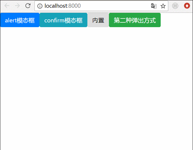
三、最终效果
我们将上面所有的弹框全部写在一起,然后效果就是这样的
相关推荐:
bootstrap模态框嵌套、tabindex属性、去除阴影的方法
详解bootstrap3-dialog-master模态框用法
以上是两种Angular弹出模态框的方式的详细内容。更多信息请关注PHP中文网其他相关文章!

热AI工具

Undresser.AI Undress
人工智能驱动的应用程序,用于创建逼真的裸体照片

AI Clothes Remover
用于从照片中去除衣服的在线人工智能工具。

Undress AI Tool
免费脱衣服图片

Clothoff.io
AI脱衣机

AI Hentai Generator
免费生成ai无尽的。

热门文章
热工具

记事本++7.3.1
好用且免费的代码编辑器

SublimeText3汉化版
中文版,非常好用

禅工作室 13.0.1
功能强大的PHP集成开发环境

Dreamweaver CS6
视觉化网页开发工具

SublimeText3 Mac版
神级代码编辑软件(SublimeText3)
热门话题


 如何在Ubuntu 24.04上安装Angular
Mar 23, 2024 pm 12:20 PM
如何在Ubuntu 24.04上安装Angular
Mar 23, 2024 pm 12:20 PM
Angular.js是一种可自由访问的JavaScript平台,用于创建动态应用程序。它允许您通过扩展HTML的语法作为模板语言,以快速、清晰地表示应用程序的各个方面。Angular.js提供了一系列工具,可帮助您编写、更新和测试代码。此外,它还提供了许多功能,如路由和表单管理。本指南将讨论在Ubuntu24上安装Angular的方法。首先,您需要安装Node.js。Node.js是一个基于ChromeV8引擎的JavaScript运行环境,可让您在服务器端运行JavaScript代码。要在Ub
 angular学习之详解状态管理器NgRx
May 25, 2022 am 11:01 AM
angular学习之详解状态管理器NgRx
May 25, 2022 am 11:01 AM
本篇文章带大家深入了解一下angular的状态管理器NgRx,介绍一下NgRx的使用方法,希望对大家有所帮助!
 浅析angular中怎么使用monaco-editor
Oct 17, 2022 pm 08:04 PM
浅析angular中怎么使用monaco-editor
Oct 17, 2022 pm 08:04 PM
angular中怎么使用monaco-editor?下面本篇文章记录下最近的一次业务中用到的 monaco-editor 在 angular 中的使用,希望对大家有所帮助!
 如何使用PHP和Angular进行前端开发
May 11, 2023 pm 04:04 PM
如何使用PHP和Angular进行前端开发
May 11, 2023 pm 04:04 PM
随着互联网的飞速发展,前端开发技术也在不断改进和迭代。PHP和Angular是两种广泛应用于前端开发的技术。PHP是一种服务器端脚本语言,可以处理表单、生成动态页面和管理访问权限等任务。而Angular是一种JavaScript的框架,可以用于开发单页面应用和构建组件化的Web应用程序。本篇文章将介绍如何使用PHP和Angular进行前端开发,以及如何将它们
 Angular组件及其显示属性:了解非block默认值
Mar 15, 2024 pm 04:51 PM
Angular组件及其显示属性:了解非block默认值
Mar 15, 2024 pm 04:51 PM
Angular框架中组件的默认显示行为不是块级元素。这种设计选择促进了组件样式的封装,并鼓励开发人员有意识地定义每个组件的显示方式。通过显式设置CSS属性 display,Angular组件的显示可以完全控制,从而实现所需的布局和响应能力。
 浅析Angular中的独立组件,看看怎么使用
Jun 23, 2022 pm 03:49 PM
浅析Angular中的独立组件,看看怎么使用
Jun 23, 2022 pm 03:49 PM
本篇文章带大家了解一下Angular中的独立组件,看看怎么在Angular中创建一个独立组件,怎么在独立组件中导入已有的模块,希望对大家有所帮助!
 项目过大怎么办?如何合理拆分Angular项目?
Jul 26, 2022 pm 07:18 PM
项目过大怎么办?如何合理拆分Angular项目?
Jul 26, 2022 pm 07:18 PM
Angular项目过大,怎么合理拆分它?下面本篇文章给大家介绍一下合理拆分Angular项目的方法,希望对大家有所帮助!
