

Bootstrap实现表格合并单元格示例

本文主要和大家介绍Bootstrap实现的表格合并单元格,涉及bootstrap界面布局相关操作技巧,需要的朋友可以参考下,希望能帮助到大家。
1、问题背景
利用Bootstrap设计表格,并且表格需要合并单元格
2、实现源码
<!DOCTYPE html>
<html>
  <head>
    <meta charset="utf-8">
    <meta http-equiv="X-UA-Compatible" content="IE=edge">
    <meta name="viewport" content="width=device-width, initial-scale=1">
    <meta name="description" content="">
    <meta name="author" content="">
    <title>Bootstrap-表格合并单元格</title>
    <link rel="stylesheet" href="https://cdn.bootcss.com/bootstrap/3.3.5/css/bootstrap.css" rel="external nofollow" />
    <script src="http://libs.baidu.com/jquery/2.0.0/jquery.min.js"></script>
    <script type="text/javascript" src="https://cdn.bootcss.com/bootstrap/3.3.5/js/bootstrap.js" ></script>
    <style>
      body,html{
        width: 99%;
        height: 98%;
        font-family: "微软雅黑";
        font-size: 14px;
      }
      table{
        width: 100%;
      }
    </style>
    <script>
    </script>
  </head>
  <body>
    <p class="row">
      <p class="col-xs-12">
        <table class="table table-striped">
          <tr>
            <td>
              <label for="stuNo">学号:</label>
              <input type="text" id="stuNo" />
              <p class="btn-group" style="width: 157px; height: 26px;">
                <button type="button" class="btn btn-default dropdown-toggle" data-toggle="dropdown" style="width: 157px; height: 26px;">
                  班级
                </button>
                <ul class="dropdown-menu" role="menu">
                 <li><a href="#" rel="external nofollow" rel="external nofollow" rel="external nofollow" rel="external nofollow" rel="external nofollow" >一班</a></li>
                 <li><a href="#" rel="external nofollow" rel="external nofollow" rel="external nofollow" rel="external nofollow" rel="external nofollow" >二班</a></li>
                 <li><a href="#" rel="external nofollow" rel="external nofollow" rel="external nofollow" rel="external nofollow" rel="external nofollow" >三班</a></li>
                 <li><a href="#" rel="external nofollow" rel="external nofollow" rel="external nofollow" rel="external nofollow" rel="external nofollow" >四班</a></li>
                 <li><a href="#" rel="external nofollow" rel="external nofollow" rel="external nofollow" rel="external nofollow" rel="external nofollow" >五班</a></li>
                </ul>
              </p>
              <button type="button" class="btn btn-primary">查询</button>
              <button type="button" class="btn">重置</button>
            </td>
          </tr>
        </table>
      </p>
      <p class="col-xs-12">
        <p class="col-xs-2">
          <table class="table table-striped table-bordered">
            <caption>学生表</caption>
            <thead>
              <tr>
                <th>学生</th>
                <th>学号</th>
              </tr>
            </thead>
            <tbody>
              <tr>
                <td>胡思</td>
                <td>2016010101</td>
              </tr>
              <tr>
                <td>赵四</td>
                <td>2016010102</td>
              </tr>
              <tr>
                <td>陈诚</td>
                <td>2016010103</td>
              </tr>
              <tr>
                <td>李磊</td>
                <td>2016010104</td>
              </tr>
              <tr>
                <td>孙杨</td>
                <td>2016010105</td>
              </tr>
              <tr>
                <td>李爽</td>
                <td>2016010106</td>
              </tr>
            </tbody>
          </table>
          <table class="table table-striped table-bordered">
            <caption>学生表</caption>
            <thead>
              <tr>
                <th>学生</th>
                <th>学号</th>
              </tr>
            </thead>
            <tbody>
              <tr>
                <td>胡思</td>
                <td>2016010101</td>
              </tr>
              <tr>
                <td>赵四</td>
                <td>2016010102</td>
              </tr>
              <tr>
                <td>陈诚</td>
                <td>2016010103</td>
              </tr>
              <tr>
                <td>李磊</td>
                <td>2016010104</td>
              </tr>
              <tr>
                <td>游豪</td>
                <td>2016010105</td>
              </tr>
            </tbody>
          </table>
        </p>
        <p class="col-xs-10">
          <table class="table table-striped">
            <tr style="text-align: center;">
              <td>到校</td>
              <td>回家</td>
              <td>距离</td>
            </tr>
            <tr style="text-align: center;">
              <td colspan="2" style="text-align: center;">222</td>
              <td rowspan="2" style="width: 200px;">
                <p class="col-xs-12">
                  <table class="table table-striped table-bordered">
                    <thead>
                      <tr>
                        <th>姓名</th>
                        <th>学号</th>
                      </tr>
                    </thead>
                    <tbody>
                      <tr>
                        <td>胡思</td>
                        <td>2016010101</td>
                      </tr>
                    </tbody>
                  </table>
                </p>
              </td>
            </tr>
            <tr>
              <td colspan="2" style="text-align: center;">333</td>
            </tr>
          </table>
        </p>
      </p>
    </p>
  </body>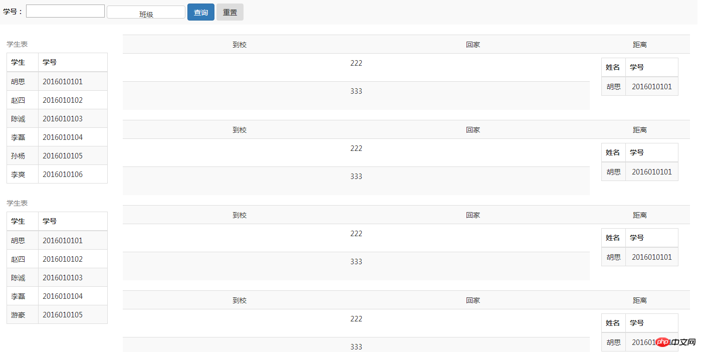
</html>3、实现结果
相关推荐:
table合并单元格与img图片铺满整个td的html的方法
以上是Bootstrap实现表格合并单元格示例的详细内容。更多信息请关注PHP中文网其他相关文章!

热AI工具

Undresser.AI Undress
人工智能驱动的应用程序,用于创建逼真的裸体照片

AI Clothes Remover
用于从照片中去除衣服的在线人工智能工具。

Undress AI Tool
免费脱衣服图片

Clothoff.io
AI脱衣机

Video Face Swap
使用我们完全免费的人工智能换脸工具轻松在任何视频中换脸!

热门文章
热工具

记事本++7.3.1
好用且免费的代码编辑器

SublimeText3汉化版
中文版,非常好用

禅工作室 13.0.1
功能强大的PHP集成开发环境

Dreamweaver CS6
视觉化网页开发工具

SublimeText3 Mac版
神级代码编辑软件(SublimeText3)
热门话题
 7658
7658
 15
1393
52
91
11
73
19
38
113
15
1393
52
91
11
73
19
38
113

 bootstrap搜索栏怎么获取
Apr 07, 2025 pm 03:33 PM
bootstrap搜索栏怎么获取
Apr 07, 2025 pm 03:33 PM
如何使用 Bootstrap 获取搜索栏的值:确定搜索栏的 ID 或名称。使用 JavaScript 获取 DOM 元素。获取元素的值。执行所需的操作。
 vue中怎么用bootstrap
Apr 07, 2025 pm 11:33 PM
vue中怎么用bootstrap
Apr 07, 2025 pm 11:33 PM
在 Vue.js 中使用 Bootstrap 分为五个步骤:安装 Bootstrap。在 main.js 中导入 Bootstrap。直接在模板中使用 Bootstrap 组件。可选:自定义样式。可选:使用插件。
 bootstrap怎么写分割线
Apr 07, 2025 pm 03:12 PM
bootstrap怎么写分割线
Apr 07, 2025 pm 03:12 PM
创建 Bootstrap 分割线有两种方法:使用 标签,可创建水平分割线。使用 CSS border 属性,可创建自定义样式的分割线。
 bootstrap垂直居中怎么弄
Apr 07, 2025 pm 03:21 PM
bootstrap垂直居中怎么弄
Apr 07, 2025 pm 03:21 PM
使用 Bootstrap 实现垂直居中:flexbox 法:使用 d-flex、justify-content-center 和 align-items-center 类,将元素置于 flexbox 容器内。align-items-center 类法:对于不支持 flexbox 的浏览器,使用 align-items-center 类,前提是父元素具有已定义的高度。
 bootstrap按钮怎么用
Apr 07, 2025 pm 03:09 PM
bootstrap按钮怎么用
Apr 07, 2025 pm 03:09 PM
如何使用 Bootstrap 按钮?引入 Bootstrap CSS创建按钮元素并添加 Bootstrap 按钮类添加按钮文本
 bootstrap怎么设置框架
Apr 07, 2025 pm 03:27 PM
bootstrap怎么设置框架
Apr 07, 2025 pm 03:27 PM
要设置 Bootstrap 框架,需要按照以下步骤:1. 通过 CDN 引用 Bootstrap 文件;2. 下载文件并将其托管在自己的服务器上;3. 在 HTML 中包含 Bootstrap 文件;4. 根据需要编译 Sass/Less;5. 导入定制文件(可选)。设置完成后,即可使用 Bootstrap 的网格系统、组件和样式创建响应式网站和应用程序。
 bootstrap怎么插入图片
Apr 07, 2025 pm 03:30 PM
bootstrap怎么插入图片
Apr 07, 2025 pm 03:30 PM
在 Bootstrap 中插入图片有以下几种方法:直接插入图片,使用 HTML 的 img 标签。使用 Bootstrap 图像组件,可以提供响应式图片和更多样式。设置图片大小,使用 img-fluid 类可以使图片自适应。设置边框,使用 img-bordered 类。设置圆角,使用 img-rounded 类。设置阴影,使用 shadow 类。调整图片大小和位置,使用 CSS 样式。使用背景图片,使用 background-image CSS 属性。
 bootstrap怎么调整大小
Apr 07, 2025 pm 03:18 PM
bootstrap怎么调整大小
Apr 07, 2025 pm 03:18 PM
要调整 Bootstrap 中元素大小,可以使用尺寸类,具体包括:调整宽度:.col-、.w-、.mw-调整高度:.h-、.min-h-、.max-h-
