这篇文章主要介绍了css3学习系列之移动属性详解,内容挺不错的,现在分享给大家,也给大家做个参考。
transform功能
放缩
使用sacle方法实现文字或图像的放缩处理,在参数中指定缩放倍率,比如sacle(0.5)表示缩小50%,例子如下:
1 2 3 4 5 6 7 8 9 10 11 12 13 14 15 16 17 18 19 20 21 | <!DOCTYPE html>
<html lang="en">
<head>
<meta charset="UTF-8">
<title>scale方法使用示例</title>
<style>
p {
width: 300px;
margin: 150px auto;
background-color: yellow;
text-align: center;
-webkit-transform: scale(0.5);
-moz-transform: scale(0.5);
-o-transform: scale(0.5);
}
</style>
</head>
<body>
<p>示例文字</p>
</body>
</html>
|
登录后复制
另外,可以分别指定元素水平方向的放大倍率与垂直方向的放大倍率,例子如下:
1 2 3 4 5 6 7 8 9 10 11 12 13 14 15 16 17 18 19 20 21 | <!DOCTYPE html>
<html lang="en">
<head>
<meta charset="UTF-8">
<title>scale方法使用示例</title>
<style>
p {
width: 300px;
margin: 150px auto;
background-color: yellow;
text-align: center;
-webkit-transform: scale(0.5,2);
-moz-transform: scale(0.5,2);
-o-transform: scale(0.5,2);
}
</style>
</head>
<body>
<p>示例文字</p>
</body>
</html>
|
登录后复制
倾斜
使用skew方法来实现文字或图像的倾斜处理,在参数中分别指定水平方向上的倾斜角度与垂直方向上的倾斜角度,例如”skew(30deg,30deg)”表示水平方向上倾斜30度,垂直方向倾斜30度,例子如下:
1 2 3 4 5 6 7 8 9 10 11 12 13 14 15 16 17 18 19 20 21 | <!DOCTYPE html>
<html lang="en">
<head>
<meta charset="UTF-8">
<title>skew方法使用示例</title>
<style>
p {
width: 300px;
margin: 150px auto;
background-color: yellow;
text-align: center;
-webkit-transform: skew(30deg, 30deg);
-moz-transform: skew(30deg,30deg);
-o-transform: skew(30deg,30deg);
}
</style>
</head>
<body>
<p>示例文字</p>
</body>
</html>
|
登录后复制
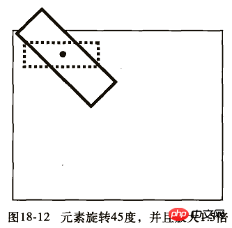
旋转
使用rotate方法将元素进行旋转,共一个参数“角度”,单位deg为度的意思,正数为顺时针旋转,负数为逆时针旋转。例子如下:
1 2 3 4 5 6 7 8 9 10 11 12 13 14 15 16 17 18 19 20 21 | <!DOCTYPE html>
<html lang="en">
<head>
<meta charset="UTF-8">
<title>对元素使用多重变形的示例</title>
<style>
p {
margin: 100px;
width: 300px;
background-color: yellow;
text-align: center;
-webkit-transform:rotate(30deg);
-moz-transform:rotate(30deg);
-o-transform:rotate(30deg);
}
</style>
</head>
<body>
<p>示例文字</p>
</body>
</html>
|
登录后复制
移动
使用translate方法来将文字或图像进行移动,在参数中分别指定水平方向上的移动距离与垂直方向上的移动距离。例如:
1 2 3 4 5 6 7 8 9 10 11 12 13 14 15 16 17 18 19 20 21 | <!DOCTYPE html>
<html lang="en">
<head>
<meta charset="UTF-8">
<title>translate方法使用示例</title>
<style>
p {
width: 300px;
margin: 150px auto;
background-color: yellow;
text-align: center;
-webkit-transform: translate(50px,50px);
-moz-transform: translate(50px,50px);
-o-transform: translate(50px,50px);
}
</style>
</head>
<body>
<p>示例文字</p>
</body>
</html>
|
登录后复制
变形示例
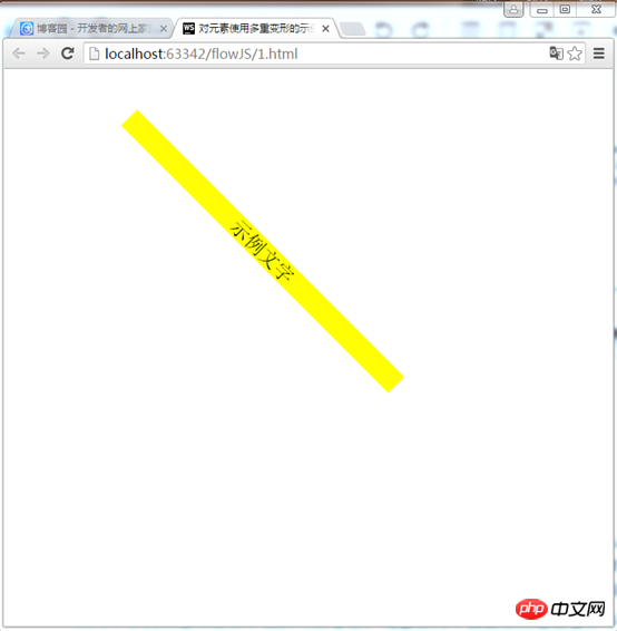
示例1:
1 2 3 4 5 6 7 8 9 10 11 12 13 14 15 16 17 18 19 20 | <!DOCTYPE html>
<html lang="en">
<head>
<meta charset="UTF-8">
<title>对元素使用多重变形的示例</title>
<style>
p {
width: 300px;
background-color: yellow;
text-align: center;
-webkit-transform: translate(150px,200px) rotate(45deg) scale(1.5);
-moz-transform: translate(50px,50px) rotate(45deg) scale(1.5);
-o-transform: translate(50px,50px) rotate(45deg) scale(1.5);
}
</style>
</head>
<body>
<p>示例文字</p>
</body>
</html>
|
登录后复制
这个例子是先移动,然后旋转,最后放缩
效果:

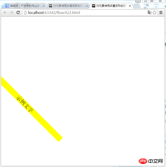
示例2:
1 2 3 4 5 6 7 8 9 10 11 12 13 14 15 16 17 18 19 20 | <!DOCTYPE html>
<html lang="en">
<head>
<meta charset="UTF-8">
<title>对元素使用多重变形的示例</title>
<style>
p {
width: 300px;
background-color: yellow;
text-align: center;
-webkit-transform:rotate(45deg) scale(1.5) translate(150px,200px);
-moz-transform:rotate(45deg) scale(1.5) translate(150px,200px);
-o-transform: rotate(45deg) scale(1.5) translate(150px,200px);
}
</style>
</head>
<body>
<p>示例文字</p>
</body>
</html>
|
登录后复制
先旋转,然后在放缩,最后移动
效果:
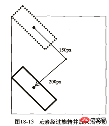
从两个示例的运行结果中我们可以看出,元素在两个页面上所处于位置并不相同。我们来看看他们的的详细步骤:
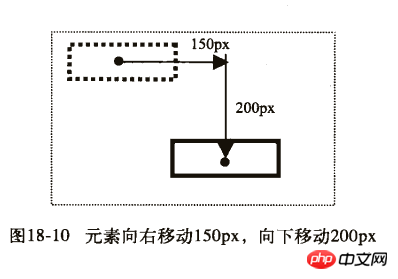
第一个示例:
1) 首先向右移动150px,向下移动200px。
2) 然后旋转45度,并且放大1.5倍。
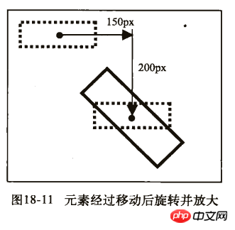
第二个示例:
1) 首先旋转45度,并且放大1.5倍。
2) 然后向右移动150px,向下移动200px。
以上就是本文的全部内容,希望对大家的学习有所帮助,更多相关内容请关注PHP中文网!
相关推荐:
CSS的table-layout属性的用法
关于css3的动画效果animate的使用说明及浏览器兼容的介绍
关于css的background-attachment属性的使用
以上是css3中移动属性的分析的详细内容。更多信息请关注PHP中文网其他相关文章!


