

Bootstrap每天必学之表单_javascript技巧

本文主要讲解的是表单,这个其实对于做过网站的人来说,并不陌生,而且可以说是最为常用的提交数据的Form表单。本文主要来讲解一下内容:
1.基本案例
2.内联表单
3.水平排列的表单
4.被支持的控件
5.静态控件
6.控件状态
7.控件尺寸
8.帮助文本
基本案例
单独的表单控件会被自动赋予一些全局样式。所有设置了.form-control的、
<form role="form">
 <div class="form-group">
 <label for="exampleInputEmail1">Email address</label>
 <input type="email" class="form-control" id="exampleInputEmail1" placeholder="Enter email">
 </div>
 <div class="form-group">
 <label for="exampleInputPassword1">Password</label>
 <input type="password" class="form-control" id="exampleInputPassword1" placeholder="Password">
 </div>
 <div class="form-group">
 <label for="exampleInputFile">File input</label>
 <input type="file" id="exampleInputFile">
 <p class="help-block">Example block-level help text here.</p>
 </div>
 <div class="checkbox">
 <label>
 <input type="checkbox"> Check me out
 </label>
 </div>
 <button type="submit" class="btn btn-default">Submit</button>
</form>
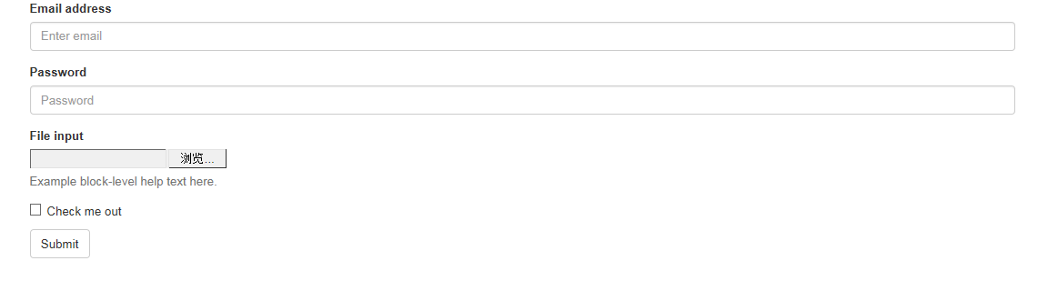
两个文本框的宽度的确为100%。并且有三个form-group。
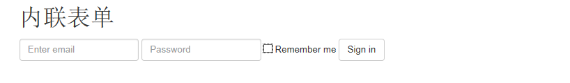
内联表单
为左对齐和inline-block级别的控件设置.form-inline,可以将其排布的更紧凑。
需要设置宽度:在Bootstrap中,input、select和textarea默认被设置为100%宽度。为了使用内联表单,你需要专门为使用到的表单控件设置宽度。
一定要设置label:如果你没有为每个输入控件设置label,屏幕阅读器将无法正确识读。对于这些内联表单,你可以通过为label设置.sr-only已将其隐藏。
<form class="form-inline" role="form">
 <div class="form-group">
 <label class="sr-only" for="exampleInputEmail2">Email address</label>
 <input type="email" class="form-control" id="exampleInputEmail2" placeholder="Enter email">
 </div>
 <div class="form-group">
 <label class="sr-only" for="exampleInputPassword2">Password</label>
 <input type="password" class="form-control" id="exampleInputPassword2" placeholder="Password">
 </div>
 <div class="checkbox">
 <label>
 <input type="checkbox"> Remember me
 </label>
 </div>
 <button type="submit" class="btn btn-default">Sign in</button>
</form>
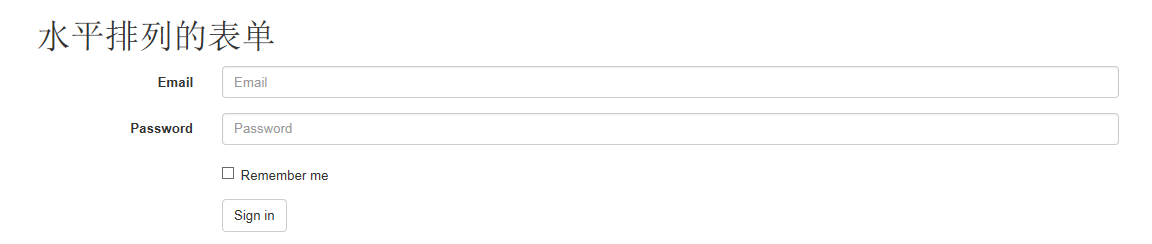
水平排列的表单
通过为表单添加.form-horizontal,并使用Bootstrap预置的栅格class可以将label和控件组水平并排布局。这样做将改变.form-group的行为,使其表现为栅格系统中的行(row),因此就无需再使用.row了。
<form class="form-horizontal" role="form">
 <div class="form-group">
 <label for="inputEmail3" class="col-sm-2 control-label">Email</label>
 <div class="col-sm-10">
 <input type="email" class="form-control" id="inputEmail3" placeholder="Email">
 </div>
 </div>
 <div class="form-group">
 <label for="inputPassword3" class="col-sm-2 control-label">Password</label>
 <div class="col-sm-10">
 <input type="password" class="form-control" id="inputPassword3" placeholder="Password">
 </div>
 </div>
 <div class="form-group">
 <div class="col-sm-offset-2 col-sm-10">
 <div class="checkbox">
 <label>
 <input type="checkbox"> Remember me
 </label>
 </div>
 </div>
 </div>
 <div class="form-group">
 <div class="col-sm-offset-2 col-sm-10">
 <button type="submit" class="btn btn-default">Sign in</button>
 </div>
 </div>
</form>
被支持的控件
在表单布局案例中展示了其所支持的标准表单控件。
Input
大部分表单控件、文本输入域控件。包括HTML5支持的所有类型:text、password、datetime、datetime-local、date、month、time、week、number、email、url、search、tel和color。
注意:有正确设置了type的input控件才能被赋予正确的样式。
文本框示例

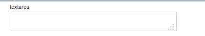
Textarea
支持多行文本的表单控件。可根据需要改变rows属性。
<h1 id="textarea">textarea</h1>
 <textarea class="form-control" rows="3"></textarea>
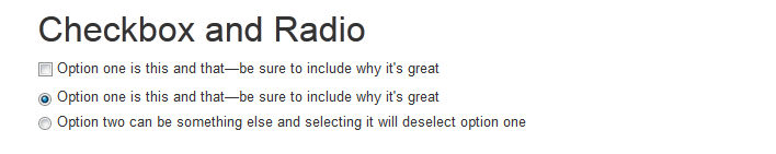
Checkbox 和 radio
Checkbox用于选择列表中的一个或多个选项,而radio用于从多个选项中只选择一个。
默认外观(堆叠在一起)
<div class="checkbox"> <label> <input type="checkbox" value=""> Option one is this and that—be sure to include why it's great </label> </div> <div class="radio"> <label> <input type="radio" name="optionsRadios" id="optionsRadios1" value="option1" checked> Option one is this and that—be sure to include why it's great </label> </div> <div class="radio"> <label> <input type="radio" name="optionsRadios" id="optionsRadios2" value="option2"> Option two can be something else and selecting it will deselect option one </label> </div>
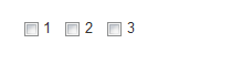
Inline checkboxes
通过将.checkbox-inline 或 .radio-inline应用到一系列的checkbox或radio控件上,可以使这些控件排列在一行。
<label class="checkbox-inline">
 <input type="checkbox" id="inlineCheckbox1" value="option1"> 1
</label>
<label class="checkbox-inline">
 <input type="checkbox" id="inlineCheckbox2" value="option2"> 2
</label>
<label class="checkbox-inline">
 <input type="checkbox" id="inlineCheckbox3" value="option3"> 3
</label>
同理Radio是一样的,只需要添加一下样式即可。
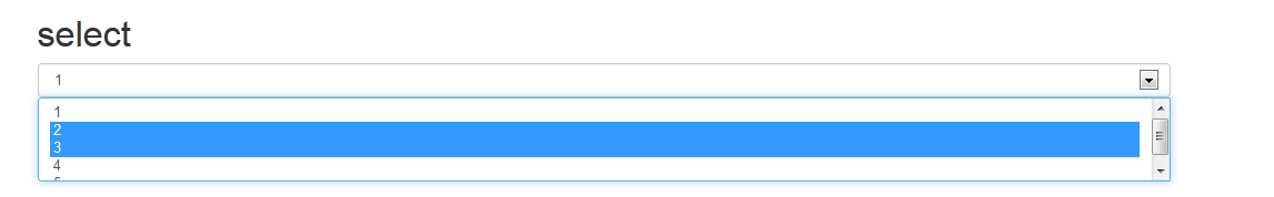
Select
<select class="form-control">
 <option>1</option>
 <option>2</option>
 <option>3</option>
 <option>4</option>
 <option>5</option>
</select>

<select multiple class="form-control">
 <option>1</option>
 <option>2</option>
 <option>3</option>
 <option>4</option>
 <option>5</option>
</select>
静态控件
在水平布局的表单中,如果需要将一行纯文本放置于label的同一行,为
元素添加.form-control-static即可。
<form class="form-horizontal" role="form">
 <div class="form-group">
 <label class="col-sm-2 control-label">Email</label>
 <div class="col-sm-10">
 <p class="form-control-static">email@example.com</p>
 </div>
 </div>
 <div class="form-group">
 <label for="inputPassword" class="col-sm-2 control-label">Password</label>
 <div class="col-sm-10">
 <input type="password" class="form-control" id="inputPassword" placeholder="Password">
 </div>
 </div>
</form>

控件状态
通过为控件和label设置一些基本状态,可以为用户提供回馈。
输入焦点
我们移除了某些表单控件的默认outline样式,并对其:focus状态赋予了box-shadow样式。
被禁用的输入框
为输入框设置disabled属性可以防止用户输入,并能改变一点外观,使其更直观。
被禁用的fieldset
为

热AI工具

Undresser.AI Undress
人工智能驱动的应用程序,用于创建逼真的裸体照片

AI Clothes Remover
用于从照片中去除衣服的在线人工智能工具。

Undress AI Tool
免费脱衣服图片

Clothoff.io
AI脱衣机

Video Face Swap
使用我们完全免费的人工智能换脸工具轻松在任何视频中换脸!

热门文章
热工具

记事本++7.3.1
好用且免费的代码编辑器

SublimeText3汉化版
中文版,非常好用

禅工作室 13.0.1
功能强大的PHP集成开发环境

Dreamweaver CS6
视觉化网页开发工具

SublimeText3 Mac版
神级代码编辑软件(SublimeText3)
热门话题


 bootstrap搜索栏怎么获取
Apr 07, 2025 pm 03:33 PM
bootstrap搜索栏怎么获取
Apr 07, 2025 pm 03:33 PM
如何使用 Bootstrap 获取搜索栏的值:确定搜索栏的 ID 或名称。使用 JavaScript 获取 DOM 元素。获取元素的值。执行所需的操作。
 vue中怎么用bootstrap
Apr 07, 2025 pm 11:33 PM
vue中怎么用bootstrap
Apr 07, 2025 pm 11:33 PM
在 Vue.js 中使用 Bootstrap 分为五个步骤:安装 Bootstrap。在 main.js 中导入 Bootstrap。直接在模板中使用 Bootstrap 组件。可选:自定义样式。可选:使用插件。
 bootstrap垂直居中怎么弄
Apr 07, 2025 pm 03:21 PM
bootstrap垂直居中怎么弄
Apr 07, 2025 pm 03:21 PM
使用 Bootstrap 实现垂直居中:flexbox 法:使用 d-flex、justify-content-center 和 align-items-center 类,将元素置于 flexbox 容器内。align-items-center 类法:对于不支持 flexbox 的浏览器,使用 align-items-center 类,前提是父元素具有已定义的高度。
 bootstrap怎么写分割线
Apr 07, 2025 pm 03:12 PM
bootstrap怎么写分割线
Apr 07, 2025 pm 03:12 PM
创建 Bootstrap 分割线有两种方法:使用 标签,可创建水平分割线。使用 CSS border 属性,可创建自定义样式的分割线。
 bootstrap按钮怎么用
Apr 07, 2025 pm 03:09 PM
bootstrap按钮怎么用
Apr 07, 2025 pm 03:09 PM
如何使用 Bootstrap 按钮?引入 Bootstrap CSS创建按钮元素并添加 Bootstrap 按钮类添加按钮文本
 bootstrap怎么调整大小
Apr 07, 2025 pm 03:18 PM
bootstrap怎么调整大小
Apr 07, 2025 pm 03:18 PM
要调整 Bootstrap 中元素大小,可以使用尺寸类,具体包括:调整宽度:.col-、.w-、.mw-调整高度:.h-、.min-h-、.max-h-
 bootstrap怎么设置框架
Apr 07, 2025 pm 03:27 PM
bootstrap怎么设置框架
Apr 07, 2025 pm 03:27 PM
要设置 Bootstrap 框架,需要按照以下步骤:1. 通过 CDN 引用 Bootstrap 文件;2. 下载文件并将其托管在自己的服务器上;3. 在 HTML 中包含 Bootstrap 文件;4. 根据需要编译 Sass/Less;5. 导入定制文件(可选)。设置完成后,即可使用 Bootstrap 的网格系统、组件和样式创建响应式网站和应用程序。
 bootstrap怎么插入图片
Apr 07, 2025 pm 03:30 PM
bootstrap怎么插入图片
Apr 07, 2025 pm 03:30 PM
在 Bootstrap 中插入图片有以下几种方法:直接插入图片,使用 HTML 的 img 标签。使用 Bootstrap 图像组件,可以提供响应式图片和更多样式。设置图片大小,使用 img-fluid 类可以使图片自适应。设置边框,使用 img-bordered 类。设置圆角,使用 img-rounded 类。设置阴影,使用 shadow 类。调整图片大小和位置,使用 CSS 样式。使用背景图片,使用 background-image CSS 属性。
