

css中怎么设置三角形

css中设置三角形的方法:首先创建一个HTML示例文件;然后设置一个span元素为块级元素,并分别设置border的四边都为不同的颜色;最后通过设置上边框和左右边框宽度实现三角形即可。
本教程操作环境:windows7系统、HTML5&&CSS3版、Dell G3电脑。
使用css设置三角形
1.在开发中,有时候会用到一些小三角形来强调或者标记元素,这样以便区分不同的项目,然后把三角形绘制成一个比较明显的颜色,就达到效果了,那怎么才能画出三角形呢,之前我也不清楚,最近看到了有些网页在使用,在进行标记的时候,都是使用的是背景图片进行标记,这样在网页显示的时候,感觉有点生硬,毕竟图片的加载没有css加载那么顺畅
下面看一段代码:这里设置了一个span 元素为块级元素,分别设置border的四边都为不同的颜色:
<!DOCTYPE html>
<html>
<head>
<meta charset="UTF-8">
<meta name="viewport" content="width=device-width, initial-scale=1.0">
<meta http-equiv="X-UA-Compatible" content="ie=edge">
<title>Document</title>
<style>
div {
width: 100%;
margin: 50px 0;
text-align: center;
}
span {
position: relative;
margin: 0 auto;
display: block;
width: 50px;
height: 50px;
border-style: solid;
border-width: 50px;
border-top-color: red;
border-left-color: blue;
border-bottom-color: yellow;
border-right-color: black;
}
</style>
</head>
<body>
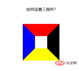
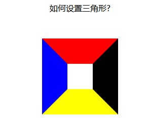
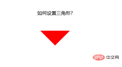
<div>如何设置三角形?</div>
<div>
<span>
</span>
</div>
</body>
</html>运行结果:发现四面的边框,居然是这种梯形的结构,如果把梯形上底变为0,不就是我们想要的三角形了么,而且这是使用html 和css做不来的,不存在使用静态页面就可以实行,不存在图片的不连续显示问题;
接下来就是把梯形的上底变为0 了【推荐:《css视频教程》】
上底变为0 很简单,只要把元素的高和宽设置为0就可以了
width:----->0 得到上下两种箭头
height:------->0 得到左右两种箭头
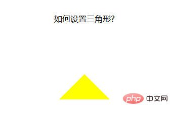
1.当我们想要上箭头的时候,就把元素的左右边框和下边框去掉
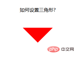
2.当我们想要下箭头的时候,就把元素的左右边框和上边框去掉
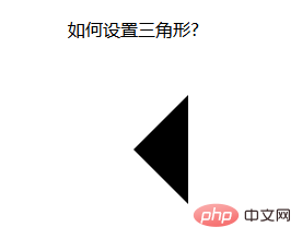
3.当我们想要左箭头的时候,就把上下边框和右边框去掉
4.当我们想要右箭头的时候,就把上下边框和左边框去掉
想法是好的,试了一下,想要上加箭头:设置css如下:
span {
            position: relative;
            margin: 0 auto;
            display: block;
            width: 0px;
            height: 0px;
            border-style: solid;
            border-width: 50px;

            /* 设置上边框和左右边框宽度为0 开始*/
            border-top-width: 0;
            border-left-width: 0;
            border-right-width: 0;
            /* 设置上边框和左右边框宽度为0 开始*/

            border-top-color: red;
            border-left-color: blue;
            border-bottom-color: yellow;
            border-right-color: black;
}运行结果:发现不行啊,什么都没有
那我们换个方法:既然设置宽度不行,那我们就设置颜色吧,只要把上,左,右边框的颜色设置为透明的,不就可以了么,css 中,刚好有一个设置颜色为透明的值
span {
            position: relative;
            margin: 0 auto;
            display: block;
            width: 0px;
            height: 0px;
            border-style: solid;
            border-width: 50px;

            /* 设置上边框和左右边框宽度为0 开始*/
            border-top-color: transparent;
            border-left-color: transparent;
            border-right-color: transparent;
            /* 设置上边框和左右边框宽度为0 开始*/

            /* border-top-color: red;
            border-left-color: blue; */
            border-bottom-color: yellow;
            /* border-right-color: black; */
}运行结果:OK,大功告成!!!
设置下箭头:
span {
            position: relative;
            margin: 0 auto;
            display: block;
            width: 0px;
            height: 0px;
            border-style: solid;
            border-width: 50px;

            /* 设置上边框和左右边框宽度为0 开始*/
            border-bottom-color: transparent;
            border-left-color: transparent;
            border-right-color: transparent;
            /* 设置上边框和左右边框宽度为0 开始*/

            border-top-color: red;
            /* border-left-color: blue;
            border-bottom-color: yellow;
            border-right-color: black; */
        }
设置左箭头:
span {
            position: relative;
            margin: 0 auto;
            display: block;
            width: 0px;
            height: 0px;
            border-style: solid;
            border-width: 50px;

            /* 设置上边框和左右边框宽度为0 开始*/
            border-top-color: transparent;
            border-bottom-color: transparent;
            /* border-left-color: transparent; */
            border-right-color: transparent;
            /* 设置上边框和左右边框宽度为0 开始*/

            /* border-top-color: red; */
            border-left-color: blue;
            /* border-bottom-color: yellow;
            border-right-color: black; */
        }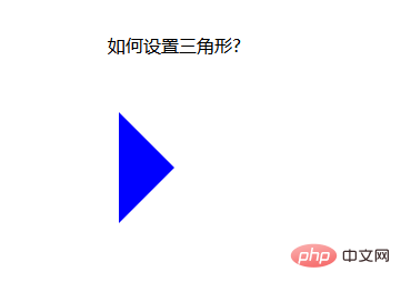
设置右箭头:
span {
            position: relative;
            margin: 0 auto;
            display: block;
            width: 0px;
            height: 0px;
            border-style: solid;
            border-width: 50px;

            border-top-color: transparent;
            border-bottom-color: transparent;
            border-left-color: transparent;
            /* border-right-color: transparent; */

            /* border-top-color: red;
            border-left-color: blue;
            border-bottom-color: yellow; */
            border-right-color: black;
        }
当然,css 还可写在一起,这样看起来要简单一些:
span {
            position: relative;
            margin: 0 auto;
            display: block;
            width: 0px;
            height: 0px;
            /* 先后设置上右下左的border-color属性都是一样的,需要哪个箭头,再设置哪个方向的颜色属性,这样,最后设置的属性覆盖了前面的属性,就变成箭头了 */
            border: 50px solid transparent;
            border-top-color: red;
        }
以上,是使用html和css两项综合起来设置的箭头,可以不可以再设置简单一点呢?
下面,我采用class 属性来设置箭头,当需要箭头的时候,直接加上这个class 属性就可以,当不想要箭头的时候,去除调这个类就好了
下面来看一个例子:
<!DOCTYPE html>
<html>

<head>
    <meta charset="UTF-8">
    <meta name="viewport" content="width=device-width, initial-scale=1.0">
    <meta http-equiv="X-UA-Compatible" content="ie=edge">
    <title>Document</title>
    <style>
        div {
            width: 100%;
            margin: 50px 0;
            text-align: center;
        }

        .jindaobox {
            position: relative;
            width: 980px;
            margin: 20px auto;

        }

        li {
            list-style: none;
            float: left;
            position: relative;
            border: 1px solid #eee;
            margin-right: 30px;
            padding: 10px 20px;
            border-radius: 5px;
            -webkit-border-radius: 5px;
            -moz-border-radius: 5px;
            -ms-border-radius: 5px;
            -o-border-radius: 5px;
        }

        .active {
            border: 1px solid red !important;

        }

        .active::after {
            position: absolute;
            content: "";
            height: 0;
            width: 0;

            border: 8px solid transparent;
            border-top-color: red;

            top: 0;
            left: 0;
            right: 0;
            margin: auto;
        }
    </style>
</head>

<body>
    <div>请选择你喜欢的电影</div>
    <ul>
        <li>飞龙在天</li>
        <li class="lis  active">紫川</li>
        <li>封神演义</li>
        <li class="lis  active">风云第一刀</li>
        <li>天外飞仙</li>
    </ul>

</body>

</html>运行结果:
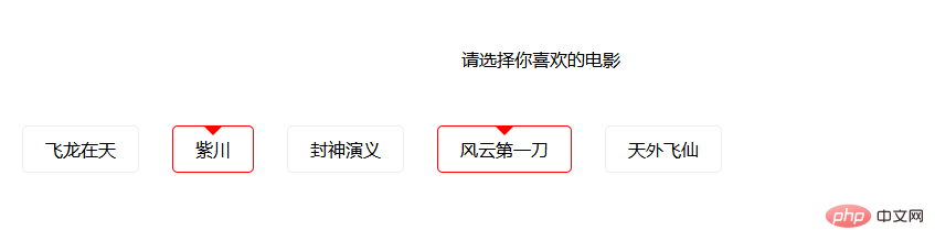
这样,就实现了使用class 属性控制箭头的方式,当需要选中时,给li 元素加上一个active class 属性即可,当不需要时,就去除active class 属性。
以上是css中怎么设置三角形的详细内容。更多信息请关注PHP中文网其他相关文章!

热AI工具

Undresser.AI Undress
人工智能驱动的应用程序,用于创建逼真的裸体照片

AI Clothes Remover
用于从照片中去除衣服的在线人工智能工具。

Undress AI Tool
免费脱衣服图片

Clothoff.io
AI脱衣机

AI Hentai Generator
免费生成ai无尽的。

热门文章
热工具

记事本++7.3.1
好用且免费的代码编辑器

SublimeText3汉化版
中文版,非常好用

禅工作室 13.0.1
功能强大的PHP集成开发环境

Dreamweaver CS6
视觉化网页开发工具

SublimeText3 Mac版
神级代码编辑软件(SublimeText3)


 vue中placeholder是什么意思
May 07, 2024 am 09:57 AM
vue中placeholder是什么意思
May 07, 2024 am 09:57 AM
在 Vue.js 中,placeholder 属性指定输入元素的占位符文本,当用户未输入内容时显示,提供输入提示或示例,提高表单可访问性。其用法为在输入元素中设置 placeholder 属性,并可使用 CSS 自定义外观。最佳实践包括与输入相关、简短清晰、避免默认文本,并考虑可访问性。
 js中span是什么意思
May 06, 2024 am 11:42 AM
js中span是什么意思
May 06, 2024 am 11:42 AM
span 标签可为文本添加样式、属性或行为,用于:添加样式,如颜色、字体大小。设置属性,如 id、class 等。关联行为,如点击、悬停等。标记文本,以便进一步处理或引用。
 js中rem是什么意思
May 06, 2024 am 11:30 AM
js中rem是什么意思
May 06, 2024 am 11:30 AM
CSS 中的 REM 是一种相对于根元素(html)字体大小的相对单位。它具有以下特点:相对根元素字体大小,不受父元素影响。当根元素字体大小改变时,使用 REM 的元素也会相应调整。可用于任何 CSS 属性。使用 REM 的优点包括:响应性:保持不同设备和屏幕大小上的文本可读性。一致性:确保整个网站字体大小一致。可扩展性:通过调整根元素字体大小轻松更改全局字体大小。
 vue中引入图片的方法
May 02, 2024 pm 10:48 PM
vue中引入图片的方法
May 02, 2024 pm 10:48 PM
Vue 中引入图片有五种方法:通过 URL、require 函数、静态文件、v-bind 指令和 CSS 背景图片。可以在 Vue 的计算属性或侦听器中处理动态图片,并使用打包工具优化图片加载。确保路径正确,否则会显示加载错误。
 js中什么是节点
May 07, 2024 pm 09:06 PM
js中什么是节点
May 07, 2024 pm 09:06 PM
节点是 JavaScript DOM 中表示 HTML 元素的实体。它们代表页面中的特定元素,可用于访问和操作该元素。常见的节点类型包括元素节点、文本节点、注释节点和文档节点。通过 DOM 方法(如 getElementById()),可以访问节点并对其进行操作,包括修改属性、添加/移除子节点、插入/替换节点和克隆节点。节点遍历有助于在 DOM 结构中导航。节点在动态创建页面内容、事件处理、动画和数据绑定方面非常有用。
 浏览器插件是什么语言写的
May 08, 2024 pm 09:36 PM
浏览器插件是什么语言写的
May 08, 2024 pm 09:36 PM
浏览器插件通常使用以下语言编写:前端语言:JavaScript、HTML、CSS后端语言:C++、Rust、WebAssembly其他语言:Python、Java
 vscode怎么设置未知属性 vscode设置未知属性方法
May 09, 2024 pm 02:43 PM
vscode怎么设置未知属性 vscode设置未知属性方法
May 09, 2024 pm 02:43 PM
1.首先,打开左下角的设置图标,点击settings选项2.随后,在跳转的窗口中找到css栏目3.最后,将unknownproperties菜单中的下拉选项改为error按钮即可
 vue中的ref和id是干什么的
May 02, 2024 pm 08:42 PM
vue中的ref和id是干什么的
May 02, 2024 pm 08:42 PM
Vue.js 中,ref 用于 JavaScript 引用 DOM 元素(可访问子组件和 DOM 元素本身),而 id 用于设置 HTML id 属性(可用于 CSS 样式、HTML 标记和 JavaScript 查找)。
