

深入浅析了解CSS中定位布局的细节

本篇文章给大家带来了css定位布局的相关知识,下面我们就来看一下什么是相对定位、绝对定位以及固定定位不同的元素性质与用途等知识,希望对大家有帮助。
1. 相对定位
1.1) 什么是相对定位
相对定位:盒子可以根据自己原来的位置进行位置调整(通过位置描述词实现)。
位置描述词:
left: 向右移动; right 向左移动;top 向下移动;bottom 向上移动
(当里面值为负数的时候,往相反方向移动)
举个例子:
原来:
<!DOCTYPE html><html lang="en"><head>
    <meta charset="UTF-8">
    <meta http-equiv="X-UA-Compatible" content="IE=edge">
    <meta name="viewport" content="width=device-width, initial-scale=1.0">
    <title>相对定位</title>
    <style>
        * {
            margin: 0;
            padding: 0;
        }

        p {
            width: 500px;
            height: 500px;
            border: 1px solid #000;
            margin: 50px auto;
        }

        p {
            width: 100px;
            height: 100px;
            background-color: lightblue;
            position: relative;
            top: 50px;
            left: 50px;
        }
    </style></head><body>
    <p>
    	<p></p>
</p></body></html>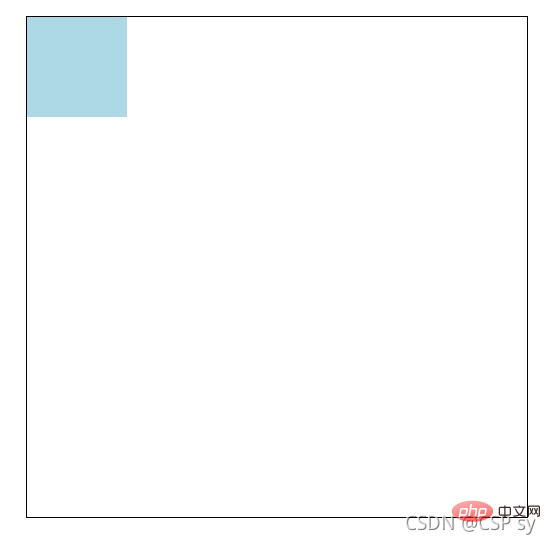 <br/>将 p 设置成相对定位:
p {
    width: 100px;
    height: 100px;
    background-color: lightblue;
    position: relative;
    top: 50px;
    left: 50px;}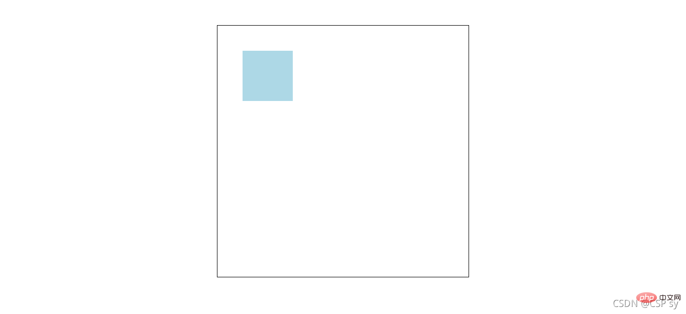
1.2)相对定位的性质与用途
性质
- 相对定位的元素,本质上仍在原来的位置,只不过在新的地方渲染出现,不会对页面其它元素产生影响。
用途
- 用来微调元素位置
- 相对定位的盒子可以用来做绝对定位的参考盒子
举个例子:
<!DOCTYPE html><html lang="en"><head>
    <meta charset="UTF-8">
    <meta http-equiv="X-UA-Compatible" content="IE=edge">
    <meta name="viewport" content="width=device-width, initial-scale=1.0">
    <title>相对定位</title>
    <style>
        * {
            margin: 0;
            padding: 0;
        }

        nav {
            width: 780px;
            height: 50px;
            margin: 40px auto;
        }

        nav ul {
            list-style: none;
        }

        nav ul li {
            float: left;
            width: 156px;
            height: 50px;
            line-height: 50px;
            text-align: center;
        }

        nav ul li a {
            display: block;
            width: 156px;
            height: 50px;
            background-color: lightcyan;
            color: #000;
            text-decoration: none;
        }

        nav ul li a:hover {
            border-top: 3px solid red;
        }
    </style></head><body>
    <nav>
        <ul>
            <li>
                <a href="#">导航一</a>
            </li>
            <li>
                <a href="#">导航二</a>
            </li>
            <li>
                <a href="#">导航三</a>
            </li>
            <li>
                <a href="#">导航四</a>
            </li>
            <li>
                <a href="#">导航五</a>
            </li>
        </ul>
</nav></body></html>这个时候效果是这样:<br/>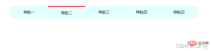 <br/> 会发现鼠标悬浮在上面的时候,导航那一块区域都会下沉<br/> 我们给它设置了相对定位并微调之后:
nav ul li a:hover {
    border-top: 3px solid red;
    position: relative;
top: -3px;}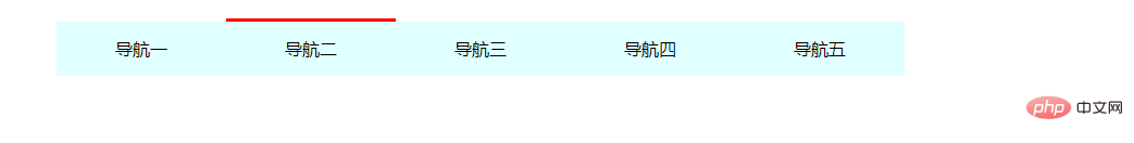 <br/> 这样就可以解决刚刚的问题了
2. 绝对定位
2.1) 什么是绝对定位
绝对定位:盒子以坐标进行位置描述,拥有自己绝对位置。
绝对定位的参考盒子:<br/> 绝对定位的盒子会以自己的祖先元素中,离自己最近的拥有定位属性的盒子,当做基准点。
这个盒子通常是相对定位的,所以也被称作 “子绝父相”。
位置描述词:<br/> left:到左边的距离;right:到右边的距离;top:到上边的距离;bottom:到下边的距离
举个例子:
<!DOCTYPE html><html lang="en"><head>
    <meta charset="UTF-8">
    <meta http-equiv="X-UA-Compatible" content="IE=edge">
    <meta name="viewport" content="width=device-width, initial-scale=1.0">
    <title>绝对定位</title>
    <style>
        * {
            margin: 0;
            padding: 0;
        }

        .box {
            position: absolute;
            width: 500px;
            height: 300px;
            left: 200px;
            top: 100px;
            background-color: antiquewhite;
        }
    </style></head><body>
    <p class="box">
</p></body></html>2.2)绝对定位的性质与用途
绝对定位的盒子垂直居中:
.box {
	position: absolute;
	top: 50%;
margin-top: -自己高度一半;}绝对定位的盒子水平居中:
.box {
	position: absolute;
	left: 50%;
margin-left: -自己宽度一半;}- 堆叠顺序 z-index 属性
设置绝对定位元素的压叠顺序.<br/> 是一个没有单位的正整数,数值大的能够压住数值小的(即数值大的显示在上层)
举个例子:
<!DOCTYPE html><html lang="en"><head>
    <meta charset="UTF-8">
    <meta http-equiv="X-UA-Compatible" content="IE=edge">
    <meta name="viewport" content="width=device-width, initial-scale=1.0">
    <title>绝对定位</title>
    <style>
        * {
            margin: 0;
            padding: 0;
        }

        .box1 {
            width: 300px;
            height: 300px;
            position: absolute;
            left: 100px;
            top: 100px;
            background-color: antiquewhite;
        }

        .box2 {
            width: 300px;
            height: 300px;
            position: absolute;
            left: 200px;
            top: 200px;
            background-color: lightblue;
        }
    </style></head><body>
    <p class="box1"></p>
<p class="box2"></p></body></html>此时效果如下:<br/>
<br/>
这个时候我们想让box1显示在上层,就设置一个z-index 属性。<br/>
.box1 {
    width: 300px;
    height: 300px;
    position: absolute;
    left: 100px;
    top: 100px;
    background-color: antiquewhite;
    z-index: 100;}.box2 {
    width: 300px;
    height: 300px;
    position: absolute;
    left: 200px;
    top: 200px;
    background-color: lightblue;
z-index: 1;}看看效果:<br/>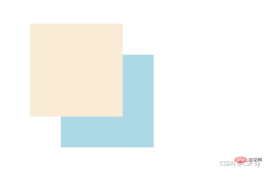
- 用途
绝对定位用来“压盖”,“遮罩”的效果<br/> 可以结合 CSS 精灵使用<br/> 可以结合 JS 实现一些动画
3. 固定定位
3.1) 什么是固定定位
固定定位:不管页面如何滚动,它永远以页面为参考点,固定在那里。
位置描述词:<br/> left:到左边的距离;right:到右边的距离;top:到上边的距离;bottom:到下边的距离
.box {
	position: fixed;
	top: 100px;
left: 100px;}3.2)固定定位的性质与用途
可以用来实现一些元素要一直浮现在当前窗口前,比如浏览一个页面时的返回顶部按钮,会一直出现在当前页面的某个位置
举个例子:
<!DOCTYPE html><html lang="en"><head>
    <meta charset="UTF-8">
    <meta http-equiv="X-UA-Compatible" content="IE=edge">
    <meta name="viewport" content="width=device-width, initial-scale=1.0">
    <title>固定定位</title>
    <style>
        * {
            margin: 0;
            padding: 0;
        }

        .box {
            position: fixed;
            bottom: 20px;
            right: 20px;
            width: 40px;
            height: 40px;

            text-align: center;
            line-height: 40px;
            border-radius: 50%;
            background-color: rgba(78, 209, 226, 0.5);

            cursor: pointer;
            font-size: 24px;
        }
    </style></head><body>
    <a class="box">^</a>
    <p>
        <img src="https://dummyimage.com/600x400/00bcd4/fff" alt="">
    </p>
    <p>
        <img src="https://dummyimage.com/600x400/00bcd4/fff" alt="">
    </p>
    <p>
        <img src="https://dummyimage.com/600x400/00bcd4/fff" alt="">
</p></body></html>效果如下:
当页面到下方时,右下角返回顶部的按钮位置不变。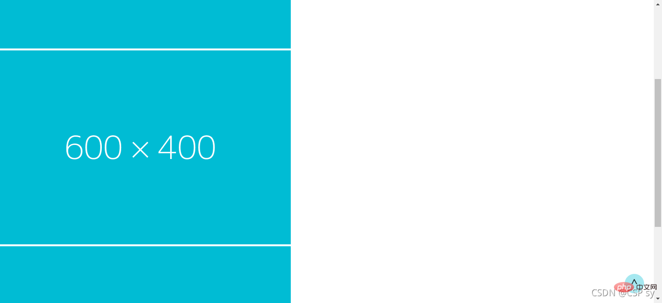
大家感兴趣的话,可以继续访问:css视频教程。
以上是深入浅析了解CSS中定位布局的细节的详细内容。更多信息请关注PHP中文网其他相关文章!

热AI工具

Undresser.AI Undress
人工智能驱动的应用程序,用于创建逼真的裸体照片

AI Clothes Remover
用于从照片中去除衣服的在线人工智能工具。

Undress AI Tool
免费脱衣服图片

Clothoff.io
AI脱衣机

AI Hentai Generator
免费生成ai无尽的。

热门文章
热工具

记事本++7.3.1
好用且免费的代码编辑器

SublimeText3汉化版
中文版,非常好用

禅工作室 13.0.1
功能强大的PHP集成开发环境

Dreamweaver CS6
视觉化网页开发工具

SublimeText3 Mac版
神级代码编辑软件(SublimeText3)
热门话题


 bootstrap按钮怎么用
Apr 07, 2025 pm 03:09 PM
bootstrap按钮怎么用
Apr 07, 2025 pm 03:09 PM
如何使用 Bootstrap 按钮?引入 Bootstrap CSS创建按钮元素并添加 Bootstrap 按钮类添加按钮文本
 bootstrap怎么调整大小
Apr 07, 2025 pm 03:18 PM
bootstrap怎么调整大小
Apr 07, 2025 pm 03:18 PM
要调整 Bootstrap 中元素大小,可以使用尺寸类,具体包括:调整宽度:.col-、.w-、.mw-调整高度:.h-、.min-h-、.max-h-
 bootstrap怎么设置框架
Apr 07, 2025 pm 03:27 PM
bootstrap怎么设置框架
Apr 07, 2025 pm 03:27 PM
要设置 Bootstrap 框架,需要按照以下步骤:1. 通过 CDN 引用 Bootstrap 文件;2. 下载文件并将其托管在自己的服务器上;3. 在 HTML 中包含 Bootstrap 文件;4. 根据需要编译 Sass/Less;5. 导入定制文件(可选)。设置完成后,即可使用 Bootstrap 的网格系统、组件和样式创建响应式网站和应用程序。
 bootstrap怎么插入图片
Apr 07, 2025 pm 03:30 PM
bootstrap怎么插入图片
Apr 07, 2025 pm 03:30 PM
在 Bootstrap 中插入图片有以下几种方法:直接插入图片,使用 HTML 的 img 标签。使用 Bootstrap 图像组件,可以提供响应式图片和更多样式。设置图片大小,使用 img-fluid 类可以使图片自适应。设置边框,使用 img-bordered 类。设置圆角,使用 img-rounded 类。设置阴影,使用 shadow 类。调整图片大小和位置,使用 CSS 样式。使用背景图片,使用 background-image CSS 属性。
 bootstrap日期怎么验证
Apr 07, 2025 pm 03:06 PM
bootstrap日期怎么验证
Apr 07, 2025 pm 03:06 PM
在 Bootstrap 中验证日期,需遵循以下步骤:引入必需的脚本和样式;初始化日期选择器组件;设置 data-bv-date 属性以启用验证;配置验证规则(如日期格式、错误消息等);集成 Bootstrap 验证框架,并在表单提交时自动验证日期输入。
 bootstrap怎么写分割线
Apr 07, 2025 pm 03:12 PM
bootstrap怎么写分割线
Apr 07, 2025 pm 03:12 PM
创建 Bootstrap 分割线有两种方法:使用 标签,可创建水平分割线。使用 CSS border 属性,可创建自定义样式的分割线。
 bootstrap怎么看日期
Apr 07, 2025 pm 03:03 PM
bootstrap怎么看日期
Apr 07, 2025 pm 03:03 PM
答案:可以使用 Bootstrap 的日期选择器组件在页面中查看日期。步骤:引入 Bootstrap 框架。在 HTML 中创建日期选择器输入框。Bootstrap 将自动为选择器添加样式。使用 JavaScript 获取选定的日期。
 bootstrap导航栏怎么设置
Apr 07, 2025 pm 01:51 PM
bootstrap导航栏怎么设置
Apr 07, 2025 pm 01:51 PM
Bootstrap 提供了设置导航栏的简单指南:引入 Bootstrap 库创建导航栏容器添加品牌标识创建导航链接添加其他元素(可选)调整样式(可选)
