

css3如何让盒子水平居中

css3让盒子水平居中的方法:1、使用margin属性,给盒子元素添加“margin: 0 auto;”样式即可水平居中;2、利用flex弹性布局来实现水平居中;3、利用position和transform属性实现水平居中。
本教程操作环境:windows7系统、CSS3&&HTML5版、Dell G3电脑。
在CSS中如何让盒子水平居中是很常见的面试题,盒子居中是相对于父元素来说的,因此我们让盒子居中时,往往采用嵌套的方式,让父盒子套着子盒子 。
在父子盒子嵌套下,让子盒子居中的方式:
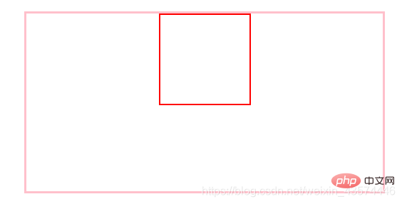
第一种方法:margin: 0 auto,使用边框,但是margin使用会影响其他盒子的使用,不太推荐使用;
第二种方法:position, 使用定位,子绝父相,再left:50%,margin-left:负的盒子宽度的一半,这是最常用的方法;
第三种方法:flex,弹性布局,让子盒子居中,但是样式要写在父盒子中,display:flex,just-content:center;
第四种方法:在position基础上,把margin-left换成CSS3中的transform:translate(-50px);
-
第五种方法:在position的基础上,只保留子绝父相,然后在子盒子中加上margin:auto、left:0、right:0;
补充:在第五种方法上,加上top:0,bottom:0,可以实现垂直和水平都居中
<div id="father">
    <div id="son"></div>
</div><style>
#father{
width: 400px;
height: 200px;
border: 3px solid pink;
}
#son{
width: 100px;
height: 100px;
border: 2px solid red;
}
</style>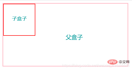
使用margin实现水平居中:
<style>
#father{
    width: 400px;
    height: 200px;
    border: 3px solid pink;
    margin: 30px auto; /* 让父元素相对于body居中 */
}
#son{
    width: 100px;
    height: 100px;
    border: 2px solid red;
    margin: 0 auto;/* 让子元素相对于father居中 */
}
</style>使用定位,子绝父相,再left:50%,margin-left:负的盒子宽度的一半:
<style>
#father{
    width: 400px;
    height: 200px;
    border: 3px solid pink;
    margin: 0 auto;
    position: relative;
}
#son{
    width: 100px;
    height: 100px;
    border: 2px solid red;
    position: absolute;
    left: 50%;
    margin-left: -50px;
}
</style>flex,弹性布局,让子盒子居中,但是样式要写在父盒子中:
<style>
#father{
    width: 400px;
    height: 200px;
    border: 3px solid pink;
    margin: 0 auto;
    display: flex;
    justify-content: center;
}
#son{
    width: 100px;
    height: 100px;
    border: 2px solid red;
}
</style>在position的基础上,只保留子绝父相,然后在子盒子中加上margin:auto、left:0、right:0:
<style>
#father{
    width: 400px;
    height: 200px;
    border: 3px solid pink;
    margin: 0 auto;
    position: relative;
}
#son{
    width: 100px;
    height: 100px;
    border: 2px solid red;
    position: absolute;
    margin: auto;
    left: 0;
    right: 0;
}
</style>以上几种方法都可以实现盒子的水平居中,如果大家有其它优(奇)秀(葩)方法,欢迎交流鸭!
第五种方法补充:再加上top:0,bottom:0可以实现水平和垂直都居中 :
<style>
#father{
    width: 400px;
    height: 200px;
    border: 3px solid pink;
    margin: 0 auto;
    position: relative;
}
#son{
    width: 100px;
    height: 100px;
    border: 2px solid red;
    position: absolute;
    margin: auto;
    left: 0;
    right: 0;
    top: 0;
    bottom: 0;
}
</style>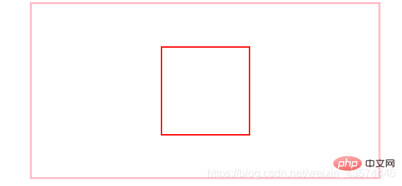
(学习视频分享:css视频教程)
以上是css3如何让盒子水平居中的详细内容。更多信息请关注PHP中文网其他相关文章!

热AI工具

Undresser.AI Undress
人工智能驱动的应用程序,用于创建逼真的裸体照片

AI Clothes Remover
用于从照片中去除衣服的在线人工智能工具。

Undress AI Tool
免费脱衣服图片

Clothoff.io
AI脱衣机

AI Hentai Generator
免费生成ai无尽的。

热门文章
热工具

记事本++7.3.1
好用且免费的代码编辑器

SublimeText3汉化版
中文版,非常好用

禅工作室 13.0.1
功能强大的PHP集成开发环境

Dreamweaver CS6
视觉化网页开发工具

SublimeText3 Mac版
神级代码编辑软件(SublimeText3)
热门话题


 bootstrap怎么插入图片
Apr 07, 2025 pm 03:30 PM
bootstrap怎么插入图片
Apr 07, 2025 pm 03:30 PM
在 Bootstrap 中插入图片有以下几种方法:直接插入图片,使用 HTML 的 img 标签。使用 Bootstrap 图像组件,可以提供响应式图片和更多样式。设置图片大小,使用 img-fluid 类可以使图片自适应。设置边框,使用 img-bordered 类。设置圆角,使用 img-rounded 类。设置阴影,使用 shadow 类。调整图片大小和位置,使用 CSS 样式。使用背景图片,使用 background-image CSS 属性。
 bootstrap怎么设置框架
Apr 07, 2025 pm 03:27 PM
bootstrap怎么设置框架
Apr 07, 2025 pm 03:27 PM
要设置 Bootstrap 框架,需要按照以下步骤:1. 通过 CDN 引用 Bootstrap 文件;2. 下载文件并将其托管在自己的服务器上;3. 在 HTML 中包含 Bootstrap 文件;4. 根据需要编译 Sass/Less;5. 导入定制文件(可选)。设置完成后,即可使用 Bootstrap 的网格系统、组件和样式创建响应式网站和应用程序。
 bootstrap按钮怎么用
Apr 07, 2025 pm 03:09 PM
bootstrap按钮怎么用
Apr 07, 2025 pm 03:09 PM
如何使用 Bootstrap 按钮?引入 Bootstrap CSS创建按钮元素并添加 Bootstrap 按钮类添加按钮文本
 bootstrap怎么写分割线
Apr 07, 2025 pm 03:12 PM
bootstrap怎么写分割线
Apr 07, 2025 pm 03:12 PM
创建 Bootstrap 分割线有两种方法:使用 标签,可创建水平分割线。使用 CSS border 属性,可创建自定义样式的分割线。
 bootstrap怎么调整大小
Apr 07, 2025 pm 03:18 PM
bootstrap怎么调整大小
Apr 07, 2025 pm 03:18 PM
要调整 Bootstrap 中元素大小,可以使用尺寸类,具体包括:调整宽度:.col-、.w-、.mw-调整高度:.h-、.min-h-、.max-h-
 bootstrap怎么看日期
Apr 07, 2025 pm 03:03 PM
bootstrap怎么看日期
Apr 07, 2025 pm 03:03 PM
答案:可以使用 Bootstrap 的日期选择器组件在页面中查看日期。步骤:引入 Bootstrap 框架。在 HTML 中创建日期选择器输入框。Bootstrap 将自动为选择器添加样式。使用 JavaScript 获取选定的日期。
 HTML,CSS和JavaScript的角色:核心职责
Apr 08, 2025 pm 07:05 PM
HTML,CSS和JavaScript的角色:核心职责
Apr 08, 2025 pm 07:05 PM
HTML定义网页结构,CSS负责样式和布局,JavaScript赋予动态交互。三者在网页开发中各司其职,共同构建丰富多彩的网站。
 vue中怎么用bootstrap
Apr 07, 2025 pm 11:33 PM
vue中怎么用bootstrap
Apr 07, 2025 pm 11:33 PM
在 Vue.js 中使用 Bootstrap 分为五个步骤:安装 Bootstrap。在 main.js 中导入 Bootstrap。直接在模板中使用 Bootstrap 组件。可选:自定义样式。可选:使用插件。
