 Web Front-end
 H5 Tutorial
 In just five steps, you can use HTML5/CSS3 to quickly create sticky note effects (pictures)_html5 tutorial tips
In just five steps, you can use HTML5/CSS3 to quickly create sticky note effects (pictures)_html5 tutorial tips
What this article will show you is how to use HTML5/CSS3 to create an HTML page with a sticky note effect in just 5 steps. The rendering is as follows:
(Note: The text in the picture is purely fabricated and is for funny purposes. , any similarity is purely coincidental, thank you! )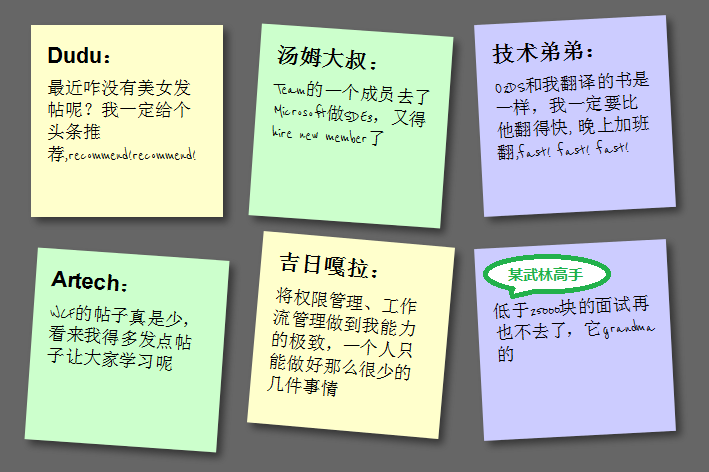
Note: This effect can be seen in Safari, Chrome, Firefox and Opera. Due to incomplete support for HTML5, IE No visible effect.
Step 1: Create basic HTML and squares
First add the basic HTML structure and build the basic square, the code is as follows:
-
Dudu :
Why haven’t there been any beautiful women posting recently? I will definitely recommend a headline, recommend!recommend!
-
< ;h2>Uncle Tom:A member of the Team went to Microsoft to work on SDE3, and he had to hire a new member
-
Technical brother:
O2DS is the same book I translated, I must be faster than him. I will work overtime at night, fast! fast! fast!
-
Jiri Gala:
Make permission management and workflow management to the extreme of my ability. One person can only do so few things
< li>
A certain martial arts master:
I will never go to an interview for less than 25,000 yuan again, it’s grandma
Add an href connection to each note, mainly to support keyboard access , the CSS code is as follows:
}
body{
font-family:arial,sans-serif;
font-size:100%;
margin:3em ;
background:#666;
color:#fff;
}
h2,p{
font-size:100%;
font-weight:normal;
}
ul,li{
list-style:none;
}
ul{
overflow:hidden;
padding:3em;
}
ul li a {
text-decoration:none;
color:#000;
background:#ffc;
display:block;
height:10em;
width:10em;
padding:1em;
}
ul li{
margin:1em;
float:left;
}
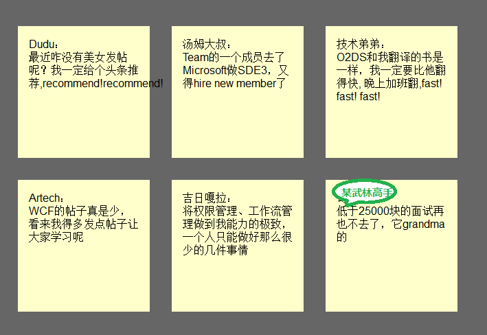
The effect is as follows:
Step 2: Shadow and handwritten cursive
In this step, we want to achieve the shadow effect of the square and change the font to cursive (English only). Since Google provides Font API support, we It can be used directly. First add a call to the Google API:
Then set to reference this font:
font-weight: bold;
padding-bottom: 10px;
}
ul li p
{
font-family: "Reenie Beanie" ,arial,sans-serif,Microsoft Yahei;
font-size: 110%;
}
Regarding shadows, since each browser does not fully support it, it needs to be handled separately. The code is as follows:
ul li a
{
text-decoration: none;
color: #000;
background: #ffc;
display: block;
height: 10em;
width: 10em;
padding: 1em; /* Firefox */
-moz-box-shadow: 5px 5px 7px rgba(33,33,33 ,1); /* Safari Chrome */
-webkit-box-shadow: 5px 5px 7px rgba(33,33,33,.7); /* Opera */
box-shadow: 5px 5px 7px rgba(33,33,33,.7);
}
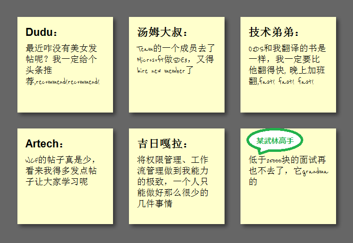
The effect is as follows:
Step 3: Tilt the square
In order to tilt the square , we need to add the following code in li->a:
ul li a{
-webkit-transform:rotate(-6deg);
-o-transform:rotate(-6deg);
-moz-transform:rotate(-6deg) ;
}
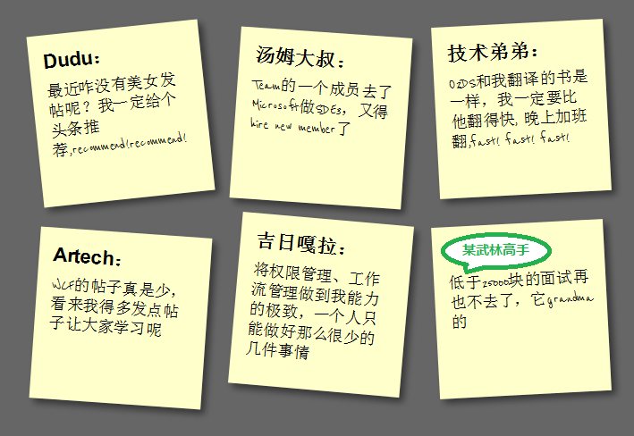
But in order to make the squares tilt randomly instead of all tilting, we need to use the new CSS3 selector to tilt the squares by 4 degrees every 2 and every 3 Each tilt has negative 3 deg, and every 6 tilts have 5 deg:
ul li:nth-child(even) a{
-o-transform:rotate(4deg);
-webkit-transform:rotate(4deg);
-moz-transform :rotate(4deg);
position:relative;
top:5px;
}
ul li:nth-child(3n) a{
-o-transform:rotate(-3deg );
-webkit-transform:rotate(-3deg);
-moz-transform:rotate(-3deg);
position:relative;
top:-5px;
}
ul li:nth-child(5n) a{
-o-transform:rotate(5deg);
-webkit-transform:rotate(5deg);
-moz-transform:rotate(5deg );
position:relative;
top:-10px;
}
The effect is as follows:
Step 4: Hover and Focus Zoom square
To achieve the zoom effect during hover and focus, we need to add the following code:
ul li a:hover,ul li a:focus{
-moz-box-shadow:10px 10px 7px rgba(0,0,0,.7 );
-webkit-box-shadow: 10px 10px 7px rgba(0,0,0,.7);
box-shadow:10px 10px 7px rgba(0,0,0,.7);
-webkit-transform: scale(1.25);
-moz-transform: scale(1.25);
-o-transform: scale(1.25);
position:relative;
z- index:5;
}
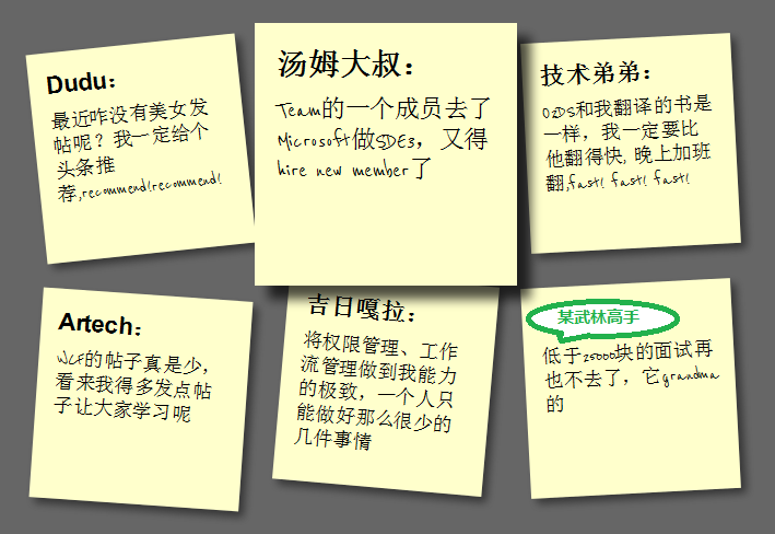
Step 5: Smooth transition and add color
The special effects in step 4 look a bit stiff. We can add Transition to achieve the effect of smooth animation. In addition, the color is relatively single. We can set different colors. First add Transition in ul->li->a:
-moz-transition:-moz-transform .15s linear;
-o-transition:-o-transform .15s linear;
-webkit-transition :-webkit-transform .15s linear;
Then define different colors in even and 3n:
ul li:nth-child(even) a{
-o-transform:rotate(4deg);
-webkit- transform:rotate(4deg);
-moz-transform:rotate(4deg);
position:relative;
top:5px;
background:#cfc;
}
ul li:nth-child(3n) a{
-o-transform:rotate(-3deg);
-webkit-transform:rotate(-3deg);
-moz-transform:rotate(-3deg );
position:relative;
top:-5px;
background:#ccf;
}

Summary
At this point, we have used the basic features of HTML5 and CSS3 to create a pretty good sticky note effect. HTML5/CSS3 is indeed very It is powerful. If you add some advanced features, such as combining it with JavaScript, you can achieve even more awesome effects. You can see this from the HTML5 Lab series of articles that Dang Knight Brick has given you.
Also: The text in the picture is purely fabricated. Any similarity is purely coincidental. Thank you!

Hot AI Tools

Undresser.AI Undress
AI-powered app for creating realistic nude photos

AI Clothes Remover
Online AI tool for removing clothes from photos.

Undress AI Tool
Undress images for free

Clothoff.io
AI clothes remover

AI Hentai Generator
Generate AI Hentai for free.

Hot Article

Hot Tools

Notepad++7.3.1
Easy-to-use and free code editor

SublimeText3 Chinese version
Chinese version, very easy to use

Zend Studio 13.0.1
Powerful PHP integrated development environment

Dreamweaver CS6
Visual web development tools

SublimeText3 Mac version
God-level code editing software (SublimeText3)

Hot Topics
 1376
1376
 52
52
 How do I use viewport meta tags to control page scaling on mobile devices?
Mar 13, 2025 pm 08:00 PM
The article discusses using viewport meta tags to control page scaling on mobile devices, focusing on settings like width and initial-scale for optimal responsiveness and performance.Character count: 159
 How to run the h5 project
Apr 06, 2025 pm 12:21 PM
Running the H5 project requires the following steps: installing necessary tools such as web server, Node.js, development tools, etc. Build a development environment, create project folders, initialize projects, and write code. Start the development server and run the command using the command line. Preview the project in your browser and enter the development server URL. Publish projects, optimize code, deploy projects, and set up web server configuration.
 How do I handle user location privacy and permissions with the Geolocation API?
Mar 18, 2025 pm 02:16 PM
The article discusses managing user location privacy and permissions using the Geolocation API, emphasizing best practices for requesting permissions, ensuring data security, and complying with privacy laws.
 How do I use the HTML5 Page Visibility API to detect when a page is visible?
Mar 13, 2025 pm 07:51 PM
The article discusses using the HTML5 Page Visibility API to detect page visibility, improve user experience, and optimize resource usage. Key aspects include pausing media, reducing CPU load, and managing analytics based on visibility changes.
 How do I use the HTML5 Drag and Drop API for interactive user interfaces?
Mar 18, 2025 pm 02:17 PM
The article explains how to use the HTML5 Drag and Drop API to create interactive user interfaces, detailing steps to make elements draggable, handle key events, and enhance user experience with custom feedback. It also discusses common pitfalls to a
 Does H5 page production require continuous maintenance?
Apr 05, 2025 pm 11:27 PM
The H5 page needs to be maintained continuously, because of factors such as code vulnerabilities, browser compatibility, performance optimization, security updates and user experience improvements. Effective maintenance methods include establishing a complete testing system, using version control tools, regularly monitoring page performance, collecting user feedback and formulating maintenance plans.
 What exactly does H5 page production mean?
Apr 06, 2025 am 07:18 AM
H5 page production refers to the creation of cross-platform compatible web pages using technologies such as HTML5, CSS3 and JavaScript. Its core lies in the browser's parsing code, rendering structure, style and interactive functions. Common technologies include animation effects, responsive design, and data interaction. To avoid errors, developers should be debugged; performance optimization and best practices include image format optimization, request reduction and code specifications, etc. to improve loading speed and code quality.
 How do I use the HTML5 WebSockets API for bidirectional communication between client and server?
Mar 12, 2025 pm 03:20 PM
This article explains the HTML5 WebSockets API for real-time, bidirectional client-server communication. It details client-side (JavaScript) and server-side (Python/Flask) implementations, addressing challenges like scalability, state management, an


