
 Effets spéciaux JS
Effets spéciaux CSS3
Chat à effets spéciaux CSS3 accroché à la chaîne se balançant à gauche et à droite
Effets spéciaux JS
Effets spéciaux CSS3
Chat à effets spéciaux CSS3 accroché à la chaîne se balançant à gauche et à droite
Chat à effets spéciaux CSS3 accroché à la chaîne se balançant à gauche et à droite

Chat à effets spéciaux CSS3 accroché à la chaîne se balançant à gauche et à droite
Le chat à effets spéciaux CSS3 accroché à la chaîne se balançant à gauche et à droite est un effet de balancement animé réalisé avec CSS3.
<tête>
<meta charset="utf-8">
<title>css3猫挂在线球上左右摇摆动画特效</title>
<style>
.all-wrap {
-webkit-animation : bob 7s cubique-bézier(0.5, 0, 0.5, 1) infini les deux ;
animation : bob 7s cubique-bézier (0,5, 0, 0,5, 1) infini les deux ;
}
.tous {
haut : 10rem ;
à gauche : calc(50% - 2,5rem);
position : absolue ;
largeur : 5rem;
hauteur : 5rem;
-webkit-transform-origin : centre -20rem;
transformation-origine : centre -20rem;
-webkit-animation : swing 7s cubique-bézier (0,5, 0, 0,5, 1) infini les deux ;
animation : swing 7s cubique-bézier (0,5, 0, 0,5, 1) infini les deux ;
}
.tous :avant {
hauteur : 20rem;
largeur : 2 px ;
couleur d'arrière-plan : #DB242A ;
à gauche : calc(50% - 1px);
en bas : 20rem ;
}
.fil {
position : absolue ;
haut : 0 ;
gauche : 0;
largeur : 80px ;
hauteur : 80px ;
rayon de bordure : 50 % ;
image d'arrière-plan : -webkit-radial-gradient (en haut à gauche, cercle, #e97c7f, #db242a 50 %, #af1d22) ;
image d'arrière-plan : dégradé radial (cercle en haut à gauche, #e97c7f, #db242a 50%, #af1d22);
indice z : 1 ;
}
.yarn : avant, .yarn : après {
position : absolue ;
largeur : 20 px ;
hauteur : 20px ;
rayon de bordure : 50 % ;
couleur de fond : blanc ;
haut : -1px ;
}
.fil:avant {
à gauche : calc(50% + 7px);
couleur d'arrière-plan : #b1bce6;
}
.yarn :après {
à droite : calc(50% + 7px);
couleur d'arrière-plan : #D5E8F8 ;
}
.cat-wrap {
position : absolue ;
haut : 0 ;
à gauche : calc(50% - 45px);
largeur : 90px ;
hauteur : 130px ;
-webkit-animation : oscillation inversée 7s cubique-bézier (0,5, 0, 0,5, 1) infini les deux ;
animation : oscillation inversée 7s cubique-bézier (0,5, 0, 0,5, 1) infini les deux ;
-webkit-transform-origin : en haut au centre ;
transform-origin : en haut au centre ;
}
.cat {
position : absolue ;
haut : 0 ;
gauche : 0;
largeur : 100 % ;
hauteur : 100% ;
-webkit-animation : swing 7s 0.2s infini les deux ;
animation : swing 7s 0,2s infini les deux ;
-webkit-transform-origin : en haut au centre ;
transform-origin : en haut au centre ;
}
.cat-supérieur {
position : absolue ;
haut : 0 ;
gauche : 0;
largeur : 100 % ;
hauteur : 100% ;
-webkit-transform-origin : en haut au centre ;
transform-origin : en haut au centre ;
indice z : 1 ;
}
.cat-upper .cat-leg {
position : absolue ;
largeur : 20 px ;
hauteur : 100% ;
couleur de fond : blanc ;
indice z : -1 ;
image d'arrière-plan : -webkit-linear-gradient (gauche, #D5E8F8, #D5E8F8 20 %, #8B9BD9) ;
image d'arrière-plan : dégradé linéaire (à droite, #D5E8F8, #D5E8F8 20 %, #8B9BD9) ;
}
.cat-upper .cat-leg:nth-child(1) {
bordure-radius supérieur-gauche : 100px ;
gauche : 10px ;
}
.cat-upper .cat-leg:nth-child(1):après {
gauche : 50% ;
}
.cat-upper .cat-leg:nth-child(2) {
bordure en haut à gauche : 0 ;
bordure en haut à droite : 100 px ;
à droite : 10 px ;
}
.cat-upper .cat-leg:nth-child(2):après {
à droite : 50 % ;
}
.cat-inférieur-wrap {
hauteur : 90% ;
largeur : 100 % ;
position : absolue ;
haut : 100 % ;
largeur : 75px ;
à gauche : calc(50% - 37,5px);
-webkit-animation : swing inversé 7s 0,2s infini les deux ;
animation : swing inversé 7s 0,2s infini les deux ;
-webkit-transform-origin : en haut au centre ;
transform-origin : en haut au centre ;
}
.cat-inférieur {
position : absolue ;
haut : 0 ;
gauche : 0;
largeur : 100 % ;
hauteur : 100% ;
-webkit-animation : swing 7s 0.5s infini les deux ;
animation : swing 7s 0,5s infini les deux ;
-webkit-transform-origin : en haut au centre ;
transform-origin : en haut au centre ;
}
.cat-inférieur : après {
position : absolue ;
haut : 0 ;
gauche : 0;
largeur : 100 % ;
hauteur : 100% ;
rayon de bordure : 100 px ;
image d'arrière-plan : -webkit-radial-gradient (10px 50px, cercle, #ffffff, #ffffff 40%, #d5e8f8 65%, #8b9bd9);
image d'arrière-plan : dégradé radial (cercle à 10 px 50 px, #ffffff, #ffffff 40 %, #d5e8f8 65 %, #8b9bd9) ;
indice z : 1 ;
}
.cat-inférieur .cat-leg, .cat-inférieur .cat-paw {
indice z : -1 ;
position : absolue ;
hauteur : 20px ;
largeur : 20 px ;
-webkit-animation : swing-leg 7s 0.3s infini les deux ;
animation : jambe oscillante 7s 0,3s infinie les deux ;
indice z : 1 ;
-webkit-transform-origin : en haut au centre ;
transform-origin : en haut au centre ;
bordure en haut à gauche : 20px ;
bordure en haut à droite : 20px ;
image d'arrière-plan : -webkit-linear-gradient (gauche, blanc, #D5E8F8, #8B9BD9) ;
image d'arrière-plan : dégradé linéaire (à droite, blanc, #D5E8F8, #8B9BD9) ;
}
.cat-inférieur > .cat-leg {
en bas : 20 px ;
}
.cat-inférieur > .cat-leg .cat-leg {
haut : 25% ;
}
.cat-inférieur > .cat-leg + .cat-leg {
à droite : 0 ;
}
.cat-inférieur .cat-patte {
haut : 50 % ;
rayon de bordure : 50 % ;
couleur d'arrière-plan : #fff;
}
.cat-inférieur .cat-tail {
position : absolue ;
hauteur : 15px ;
largeur : 10px ;
-webkit-animation : swing-tail 7s cubique-bézier (0,5, 0, 0,5, 1) infini les deux ;
animation : swing-tail 7s cubique-bézier (0,5, 0, 0,5, 1) infini les deux ;
-webkit-transform-origin : en haut au centre ;
transform-origin : en haut au centre ;
indice z : 0;
image d'arrière-plan : -webkit-linear-gradient (gauche, blanc, #D5E8F8, #8B9BD9) ;
image d'arrière-plan : dégradé linéaire (à droite, blanc, #D5E8F8, #8B9BD9) ;
bordure-bas-gauche-radius : 10px ;
bordure en bas à droite : 10px ;
}
.cat-inférieur .cat-tail > .queue de chat {
haut : 50 % ;
}
.cat-inférieur > .queue de chat {
à gauche : calc(50% - 5px);
haut : 95 % ;
}
.tête de chat {
largeur : 90px ;
hauteur : 90px ;
image d'arrière-plan : -webkit-radial-gradient (10px 10px, cercle, #ffffff, #ffffff 40%, #d5e8f8 65%, #8b9bd9);
image d'arrière-plan : dégradé radial (cercle à 10px 10px, #ffffff, #ffffff 40%, #d5e8f8 65%, #8b9bd9);
rayon de bordure : 50 % ;
en haut : calc(100% - 45px);
}
.face-de-chat {
position : absolue ;
haut : 0 ;
gauche : 0;
hauteur : 100% ;
largeur : 100 % ;
-webkit-animation : face 7s cubique-bézier(0.5, 0, 0.5, 1) infini les deux ;
animation : face 7s cubique-bézier(0,5, 0, 0,5, 1) infini les deux ;
-webkit-transform-style : préserver-3d ;
style de transformation : préserver-3d ;
-webkit-perspective : 100px ;
perspective : 100 px ;
}
.oreilles de chat {
position : absolue ;
haut : 0 ;
gauche : 0;
hauteur : 50% ;
largeur : 100 % ;
indice z : -1 ;
}
.cat-oreille {
largeur : 20 px ;
hauteur : 100% ;
position : absolue ;
rayon de bordure : 5 px ;
haut : -10px ;
}
.cat-ear:premier-enfant {
gauche : 0;
-webkit-transform-origin : en haut à gauche ;
transform-origin : en haut à gauche ;
-webkit-transform : skewY(40deg);
transformation : skewY(40deg);
couleur de fond : blanc ;
}
.cat-ear:premier-enfant:avant {
gauche : 0;
rayon de bordure en haut à droite : 50 % ;
bordure en bas à droite : 50 % ;
couleur d'arrière-plan : #D7EBFB ;
}
.cat-ear:dernier-enfant {
à droite : 0 ;
-webkit-transform-origin : en haut à droite ;
transform-origin : en haut à droite ;
-webkit-transform : skewY(-40deg);
transformation : skewY(-40deg);
couleur d'arrière-plan : #d1e6f7;
}
.cat-ear:dernier-enfant:avant {
à droite : 0 ;
bordure-radius supérieur-gauche : 50 % ;
bordure-bas-gauche-rayon : 50 % ;
couleur d'arrière-plan : #e0f0fc;
}
.cat-ear:avant {
largeur : 60% ;
hauteur : 100% ;
haut : 10px ;
position : absolue ;
couleur d'arrière-plan : #fff;
}
.yeux de chat {
position : absolue ;
haut : 50 % ;
largeur : 100 % ;
hauteur : 6px ;
-webkit-animation : clignotement 7s étape-fin infinie les deux ;
animation : clignotement 7s étape-fin infinie les deux ;
}
.cat-eyes : avant, .cat-eyes : après {
position : absolue ;
hauteur : 6px ;
largeur : 6 px ;
rayon de bordure : 50 % ;
couleur d'arrière-plan : #4B4D75 ;
}
.cat-eyes :avant {
gauche : 20px ;
}
.cat-eyes : après {
à droite : 20 px ;
}
.cat-bouche {
position : absolue ;
largeur : 12px ;
hauteur : 8px ;
couleur d'arrière-plan : #4B4D75 ;
haut : 60 % ;
à gauche : calc(50% - 6px);
bordure en haut à gauche : 50 % 30 % ;
bordure en haut à droite : 50 % 30 % ;
bordure en bas à gauche : 50 % 70 % ;
bordure en bas à droite : 50 % 70 % ;
-webkit-transform : translateZ(10px);
transformer : traduireZ(10px);
}
.cat-mouth:avant, .cat-mouth:après {
position : absolue ;
largeur : 90% ;
hauteur : 100% ;
bordure : 2px solide #9FA2CB ;
haut : 80 % ;
rayon de bordure : 100 px ;
couleur de la bordure supérieure : transparent ;
indice z : -1 ;
}
.cat-mouth:avant {
couleur de la bordure gauche : transparent ;
à droite : calc(50% - 1px);
-webkit-transform-origin : en haut à droite ;
transform-origin : en haut à droite ;
-webkit-transform : rotation (10 deg);
transformation : rotation (10 deg);
}
.cat-mouth:après {
border-right-color : transparent ;
à gauche : calc(50% - 1px);
-webkit-transform-origin : en haut à gauche ;
transform-origin : en haut à gauche ;
-webkit-transform : rotation (-10 deg);
transformation : rotation (-10 deg);
}
.chat-moustaches {
largeur : 50% ;
hauteur : 8px ;
position : absolue ;
bas : 25 % ;
gauche : 25% ;
-webkit-transform-style : préserver-3d ;
style de transformation : préserver-3d ;
-webkit-perspective : 60px ;
perspective : 60 px ;
}
.cat-moustaches : avant, .cat-moustaches : après {
position : absolue ;
hauteur : 100% ;
largeur : 30% ;
bordure : 2px solide #9FA2CB ;
bordure gauche : aucune ;
frontière droite : aucune ;
}
.cat-moustaches : avant {
à droite : 100 % ;
-webkit-transform-origin : centre droit ;
transformation-origine : centre droit ;
-webkit-transform : rotationY(70deg) rotationZ(-10deg);
transformation : rotationY(70deg) rotationZ(-10deg);
}
.cat-moustaches : après {
gauche : 100% ;
-webkit-transform-origin : centre gauche ;
transform-origin : centre gauche ;
-webkit-transform : rotationY(-70deg) rotationZ(10deg);
transformation : rotationY(-70deg) rotationZ(10deg);
}
@-webkit-keyframes bob {
0% {
-webkit-transform : translateY(0.4rem);
transformer : traduireY(0.4rem);
}
6,25% {
-webkit-transform : traduireY(-0.4rem);
transformer : traduireY(-0.4rem);
}
12,5% {
-webkit-transform : translateY(0.4rem);
transformer : traduireY(0.4rem);
}
18,75% {
-webkit-transform : traduireY(-0.4rem);
transformer : traduireY(-0.4rem);
}
25% {
-webkit-transform : translateY(0.4rem);
transformer : traduireY(0.4rem);
}
31,25% {
-webkit-transform : traduireY(-0.4rem);
transformer : traduireY(-0.4rem);
}
37,5% {
-webkit-transform : translateY(0.4rem);
transformer : traduireY(0.4rem);
}
43,75% {
-webkit-transform : traduireY(-0.4rem);
transformer : traduireY(-0.4rem);
}
50 % {
-webkit-transform : translateY(0.4rem);
transformer : traduireY(0.4rem);
}
56,25% {
-webkit-transform : traduireY(-0.4rem);
transformer : traduireY(-0.4rem);
}
62,5% {
-webkit-transform : translateY(0.4rem);
transformer : traduireY(0.4rem);
}
68,75% {
-webkit-transform : traduireY(-0.4rem);
transformer : traduireY(-0.4rem);
}
75 % {
-webkit-transform : translateY(0.4rem);
transformer : traduireY(0.4rem);
}
81,25% {
-webkit-transform : traduireY(-0.4rem);
transformer : traduireY(-0.4rem);
}
87,5% {
-webkit-transform : translateY(0.4rem);
transformer : traduireY(0.4rem);
}
93,75% {
-webkit-transform : traduireY(-0.4rem);
transformer : traduireY(-0.4rem);
}
100% {
-webkit-transform : translateY(0.4rem);
transformer : traduireY(0.4rem);
}
}
@keyframes bob {
0% {
-webkit-transform : translateY(0.4rem);
transformer : traduireY(0.4rem);
}
6,25% {
-webkit-transform : traduireY(-0.4rem);
transformer : traduireY(-0.4rem);
}
12,5% {
-webkit-transform : translateY(0.4rem);
transformer : traduireY(0.4rem);
}
18,75% {
-webkit-transform : traduireY(-0.4rem);
transformer : traduireY(-0.4rem);
}
25% {
-webkit-transform : translateY(0.4rem);
transformer : traduireY(0.4rem);
}
31,25% {
-webkit-transform : traduireY(-0.4rem);
transformer : traduireY(-0.4rem);
}
37,5% {
-webkit-transform : translateY(0.4rem);
transformer : traduireY(0.4rem);
}
43,75% {
-webkit-transform : traduireY(-0.4rem);
transformer : traduireY(-0.4rem);
}
50 % {
-webkit-transform : translateY(0.4rem);
transformer : traduireY(0.4rem);
}
56,25% {
-webkit-transform : traduireY(-0.4rem);
transformer : traduireY(-0.4rem);
}
62,5% {
-webkit-transform : translateY(0.4rem);
transformer : traduireY(0.4rem);
}
68,75% {
-webkit-transform : traduireY(-0.4rem);
transformer : traduireY(-0.4rem);
}
75 % {
-webkit-transform : translateY(0.4rem);
transformer : traduireY(0.4rem);
}
81,25% {
-webkit-transform : traduireY(-0.4rem);
transformer : traduireY(-0.4rem);
}
87,5% {
-webkit-transform : translateY(0.4rem);
transformer : traduireY(0.4rem);
}
93,75% {
-webkit-transform : traduireY(-0.4rem);
transformer : traduireY(-0.4rem);
}
100% {
-webkit-transform : translateY(0.4rem);
transformer : traduireY(0.4rem);
}
}
@-webkit-keyframes swing {
0% {
-webkit-transform : rotation(5deg);
transformation : rotation (5 degrés);
}
12,5% {
-webkit-transform : rotation (-10 deg);
transformation : rotation (-10 deg);
}
25% {
-webkit-transform : rotation (10 deg);
transformation : rotation (10 deg);
}
37,5% {
-webkit-transform : rotation (-15 deg);
transformation : rotation (-15 deg);
}
50 % {
-webkit-transform : rotation(23deg);
transformation : rotation (23 deg);
}
62,5% {
-webkit-transform : rotation(-23deg);
transformation : rotation (-23 deg);
}
75 % {
-webkit-transform : rotation (15 deg);
transformation : rotation (15 deg);
}
87,5% {
-webkit-transform : rotation (-10 deg);
transformation : rotation (-10 deg);
}
100% {
-webkit-transform : rotation(5deg);
transformation : rotation (5 degrés);
}
}
@keyframes balance {
0% {
-webkit-transform : rotation(5deg);
transformation : rotation (5 degrés);
}
12,5% {
-webkit-transform : rotation (-10 deg);
transformation : rotation (-10 deg);
}
25% {
-webkit-transform : rotation (10 deg);
transformation : rotation (10 deg);
}
37,5% {
-webkit-transform : rotation (-15 deg);
transformation : rotation (-15 deg);
}
50 % {
-webkit-transform : rotation(23deg);
transformation : rotation (23 deg);
}
62,5% {
-webkit-transform : rotation(-23deg);
transformation : rotation (-23 deg);
}
75 % {
-webkit-transform : rotation (15 deg);
transformation : rotation (15 deg);
}
87,5% {
-webkit-transform : rotation (-10 deg);
transformation : rotation (-10 deg);
}
100% {
-webkit-transform : rotation(5deg);
transformation : rotation (5 degrés);
}
}
@-webkit-keyframes jambe pivotante {
0% {
-webkit-transform : rotation (0,5 deg);
transformation : rotation (0,5 deg);
}
12,5% {
-webkit-transform : rotation(-1deg);
transformation : rotation (-1deg);
}
25% {
-webkit-transform : rotation(1deg);
transformation : rotation (1deg);
}
37,5% {
-webkit-transform : rotation (-1,5 degrés);
transformation : rotation (-1,5 degrés);
}
50 % {
-webkit-transform : rotation (2,3 degrés);
transformation : rotation (2,3 degrés);
}
62,5% {
-webkit-transform : rotation (-2,3 degrés);
transformation : rotation (-2,3 degrés);
}
75 % {
-webkit-transform : rotation (1,5 deg);
transformation : rotation (1,5 deg);
}
87,5% {
-webkit-transform : rotation(-1deg);
transformation : rotation (-1deg);
}
100% {
-webkit-transform : rotation (0,5 deg);
transformation : rotation (0,5 deg);
}
}
@keyframes jambe pivotante {
0% {
-webkit-transform : rotation (0,5 deg);
transformation : rotation (0,5 deg);
}
12,5% {
-webkit-transform : rotation(-1deg);
transformation : rotation (-1deg);
}
25% {
-webkit-transform : rotation(1deg);
transformation : rotation (1deg);
}
37,5% {
-webkit-transform : rotation (-1,5 degrés);
transformation : rotation (-1,5 degrés);
}
50 % {
-webkit-transform : rotation (2,3 degrés);
transformation : rotation (2,3 degrés);
}
62,5% {
-webkit-transform : rotation (-2,3 degrés);
transformation : rotation (-2,3 degrés);
}
75 % {
-webkit-transform : rotation (1,5 deg);
transformation : rotation (1,5 deg);
}
87,5% {
-webkit-transform : rotation(-1deg);
transformation : rotation (-1deg);
}
100% {
-webkit-transform : rotation (0,5 deg);
transformation : rotation (0,5 deg);
}
}
@-webkit-keyframes swing-tail {
0% {
-webkit-transform : rotation(-2deg);
transformer : rotation(-2deg);
}
12,5% {
-webkit-transform : rotation(4deg);
transformation : rotation (4deg);
}
25% {
-webkit-transform : rotation(-4deg);
transformation : rotation (-4deg);
}
37,5% {
-webkit-transform : rotation(6deg);
transformation : rotation (6 degrés);
}
50 % {
-webkit-transform : rotation (-9,2 deg);
transformation : rotation (-9,2 deg);
}
62,5% {
-webkit-transform : rotation (9,2 degrés);
transformation : rotation (9,2 degrés);
}
75 % {
-webkit-transform : rotation(-6deg);
transformation : rotation (-6 deg);
}
87,5% {
-webkit-transform : rotation(4deg);
transformation : rotation (4deg);
}
100% {
-webkit-transform : rotation(-2deg);
transformer : rotation(-2deg);
}
}
@keyframes swing-tail {
0% {
-webkit-transform : rotation(-2deg);
transformer : rotation(-2deg);
}
12,5% {
-webkit-transform : rotation(4deg);
transformation : rotation (4deg);
}
25% {
-webkit-transform : rotation(-4deg);
transformation : rotation (-4deg);
}
37,5% {
-webkit-transform : rotation(6deg);
transformation : rotation (6 degrés);
}
50 % {
-webkit-transform : rotation (-9,2 degrés);
transformation : rotation (-9,2 deg);
}
62,5% {
-webkit-transform : rotation (9,2 degrés);
transformation : rotation (9,2 degrés);
}
75 % {
-webkit-transform : rotation(-6deg);
transformation : rotation (-6 deg);
}
87,5% {
-webkit-transform : rotation(4deg);
transformation : rotation (4deg);
}
100% {
-webkit-transform : rotation(-2deg);
transformer : rotation(-2deg);
}
}
@-webkit-keyframes reverse-swing {
0% {
-webkit-transform : rotation(-5deg);
transformation : rotation (-5 deg);
}
12,5% {
-webkit-transform : rotation (10 deg);
transformation : rotation (10 deg);
}
25% {
-webkit-transform : rotation (-10 deg);
transformation : rotation (-10 deg);
}
37,5% {
-webkit-transform : rotation (15 deg);
transformation : rotation (15 deg);
}
50 % {
-webkit-transform : rotation(-23deg);
transformation : rotation (-23 deg);
}
62,5% {
-webkit-transform : rotation(23deg);
transformation : rotation (23 deg);
}
75 % {
-webkit-transform : rotation (-15 deg);
transformation : rotation (-15 deg);
}
87,5% {
-webkit-transform : rotation (10 deg);
transformation : rotation (10 deg);
}
100% {
-webkit-transform : rotation(-5deg);
transformation : rotation (-5 deg);
}
}
@keyframes reverse-swing {
0% {
-webkit-transform : rotation(-5deg);
transformation : rotation (-5 deg);
}
12,5% {
-webkit-transform : rotation (10 deg);
transformation : rotation (10 deg);
}
25% {
-webkit-transform : rotation (-10 deg);
transformation : rotation (-10 deg);
}
37,5% {
-webkit-transform : rotation (15 deg);
transformation : rotation (15 deg);
}
50 % {
-webkit-transform : rotation(-23deg);
transformation : rotation (-23 deg);
}
62,5% {
-webkit-transform : rotation(23deg);
transformation : rotation (23 deg);
}
75 % {
-webkit-transform : rotation (-15 deg);
transformation : rotation (-15 deg);
}
87,5% {
-webkit-transform : rotation (10 deg);
transformation : rotation (10 deg);
}
100% {
-webkit-transform : rotation(-5deg);
transformation : rotation (-5 deg);
}
}
@-webkit-keyframes visage {
0% {
-webkit-transform : translateX(-2.5px);
transformer : traduireX(-2,5px);
}
12,5% {
-webkit-transform : translateX(5px);
transformer : translateX(5px);
}
25% {
-webkit-transform : translateX(-5px);
transformer : traduireX(-5px);
}
37,5% {
-webkit-transform : translateX(7.5px);
transformer : translateX(7.5px);
}
50 % {
-webkit-transform : translateX(-11.5px);
transformer : traduireX(-11,5px);
}
62,5% {
-webkit-transform : translateX(11.5px);
transformer : translateX(11.5px);
}
75 % {
-webkit-transform : translateX(-7.5px);
transformer : traduireX(-7,5px);
}
87,5% {
-webkit-transform : translateX(5px);
transformer : translateX(5px);
}
100% {
-webkit-transform : translateX(-2.5px);
transformer : traduireX(-2,5px);
}
}
@keyframes visage {
0% {
-webkit-transform : translateX(-2.5px);
transformer : traduireX(-2,5px);
}
12,5% {
-webkit-transform : translateX(5px);
transformer : translateX(5px);
}
25% {
-webkit-transform : translateX(-5px);
transformer : traduireX(-5px);
}
37,5% {
-webkit-transform : translateX(7.5px);
transformer : translateX(7.5px);
}
50 % {
-webkit-transform : translateX(-11.5px);
transformer : traduireX(-11,5px);
}
62,5% {
-webkit-transform : translateX(11.5px);
transformer : translateX(11.5px);
}
75 % {
-webkit-transform : translateX(-7.5px);
transformer : traduireX(-7,5px);
}
87,5% {
-webkit-transform : translateX(5px);
transformer : translateX(5px);
}
100% {
-webkit-transform : translateX(-2.5px);
transformer : traduireX(-2,5px);
}
}
@-webkit-keyframes fondu en entrée {
de {
opacité : 0;
}
à {
opacité : 1;
}
}
@keyframes fondu en entrée {
de {
opacité : 0;
}
à {
opacité : 1;
}
}
@-webkit-keyframes clignotent {
de, à, 10 %, 25 %, 80 % {
-webkit-transform : scaleY(1);
transformation : scaleY(1);
}
8 %, 23 %, 78 % {
-webkit-transform : scaleY(0.1);
transformation : scaleY(0.1);
}
}
@keyframes clignotent {
de, à, 10 %, 25 %, 80 % {
-webkit-transform : scaleY(1);
transformation : scaleY(1);
}
8 %, 23 %, 78 % {
-webkit-transform : scaleY(0.1);
transformation : scaleY(0.1);
}
}
corps, html {
hauteur : 100% ;
largeur : 100 % ;
marge : 0;
remplissage : 0 ;
couleur d'arrière-plan : #1F1F3C ;
débordement : caché ;
}
*, *:avant, *:après {
dimensionnement de la boîte : border-box ;
position : relative ;
-webkit-animation-timing-function : cubique-bézier(0.5, 0, 0.5, 1);
fonction de synchronisation d'animation : cubique-bézier (0,5, 0, 0,5, 1);
-webkit-animation-fill-mode : les deux ;
animation-fill-mode : les deux ;
}
*:avant, *:après {
contenu : '';
affichage : bloc ;
}
Toutes les ressources de ce site proviennent d'internautes ou sont réimprimées par les principaux sites de téléchargement. Veuillez vérifier vous-même l'intégrité du logiciel ! Toutes les ressources de ce site sont uniquement à titre de référence d'apprentissage. Merci de ne pas les utiliser à des fins commerciales. Sinon, vous serez responsable de toutes les conséquences ! En cas d'infraction, veuillez nous contacter pour la supprimer. Coordonnées : admin@php.cn
Article connexe
 Organisation d'effets spéciaux courants sur des pages Web : Avancé
23 Dec 2016
L'auteur a accumulé de nombreux effets spéciaux Web merveilleux et pratiques au fil du temps. Presque tous ces effets spéciaux sont des effets spéciaux de pages Web couramment utilisés. Je vais maintenant vous présenter ces effets spéciaux organisés et modifiés en trois niveaux. Chapitre avancé 1. différentes périodes
 Organiser des effets spéciaux courants sur des pages Web : niveau élémentaire
23 Dec 2016
L'auteur a accumulé de nombreux effets spéciaux Web merveilleux et pratiques au fil du temps. Presque tous ces effets spéciaux sont des effets spéciaux de pages Web couramment utilisés. Je vais maintenant vous présenter ces effets spéciaux organisés et modifiés en trois niveaux. Niveau élémentaire 1. Laisse les mots continuer
 Organiser des effets spéciaux courants sur des pages Web : niveau intermédiaire
23 Dec 2016
L'auteur a accumulé de nombreux effets spéciaux Web merveilleux et pratiques au fil du temps. Presque tous ces effets spéciaux sont des effets spéciaux de pages Web couramment utilisés. Je vais maintenant vous présenter ces effets spéciaux organisés et modifiés en trois niveaux. Niveau intermédiaire 1. compte à rebours des vacances
 Une appréciation graphique et textuelle de 8 superbes effets spéciaux d'animation de texte HTML5
06 Mar 2017
Le texte est l’âme des pages Web. Il y a longtemps, quelqu’un a inventé de nombreuses belles polices informatiques, qui donnaient aux pages Web des styles différents. Avec l'émergence du HTML5 et du CSS3, nous pouvons personnaliser le texte. Dans certaines situations, lorsque cela est nécessaire, nous pouvons même utiliser HTML5 pour animer le texte. Cet article partage 8 très beaux effets spéciaux d'animation de texte HTML5, j'espère qu'il pourra être utilisé comme référence pour vous. 1. Animation de texte pliable et retourné 3D CSS3 Aujourd'hui, nous allons partager une application d'effets spéciaux de texte CSS3. Elle est similaire aux effets de texte HTML5/CSS3 partagés auparavant. Il s'agit également d'une animation de texte pliée et retournée 3D CSS3. .
 Comment puis-je créer un effet de fondu à l'aide de transitions CSS3 ?
28 Oct 2024
Transitions CSS3 : obtention d'effets de fondu En CSS3, les transitions offrent un outil puissant pour créer des effets visuels dynamiques. Parmi ces effets, il y a...
 Animation CSS3 (1) : 5 effets d'animation préchargés
17 Feb 2017
Animation CSS3 (1) : 5 effets d'animation préchargés
 Un ensemble d'effets spéciaux d'animation de déformation d'icône de hamburger cool
19 Jan 2017
Hamburgers est une bibliothèque d'animation CSS3 d'effets spéciaux d'animation de déformation d'icône de hamburger super cool. Cet ensemble d'animations d'icônes de hamburger comprend 18 effets d'animation de déformation de hamburger différents. Vous pouvez également personnaliser votre propre animation de déformation d'icône de hamburger via des fichiers Sass.
 effet d'invite de petite icône CSS3
20 Feb 2017
Cet article présente les effets d'invite de petites icônes CSS3
 Utiliser les effets d'animation à chargement plat CSS3
13 Mar 2017
Cet article utilise les effets d'animation à chargement plat CSS3


Outils chauds Tags

Hot Tools
Le texte CSS est combiné dans un effet spécial d'animation en forme de cœur
Le texte CSS est combiné dans un effet spécial d'animation en forme de cœur
Effets spéciaux d'animation de fleurs d'expression CSS3 SVG
L'effet spécial d'animation de fleur de confession SS3 SVG est un effet spécial d'animation pour la Saint-Valentin.
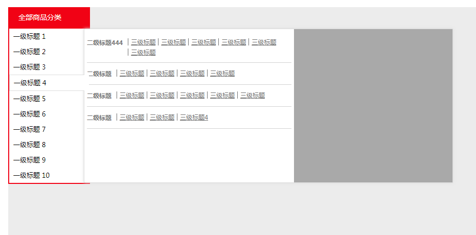
Les sites Web des centres commerciaux CSS utilisent couramment le code du menu de navigation déroulant de la catégorie de gauche
Les sites Web des centres commerciaux CSS utilisent couramment le code du menu de navigation déroulant de la catégorie de gauche

jQuery+CSS3 Effet d'amour pour la Saint-Valentin
jQuery + CSS3 Valentine's Day Love Special Effect est un effet spécial d'animation de cœur oscillant suspendu pour la Saint-Valentin.
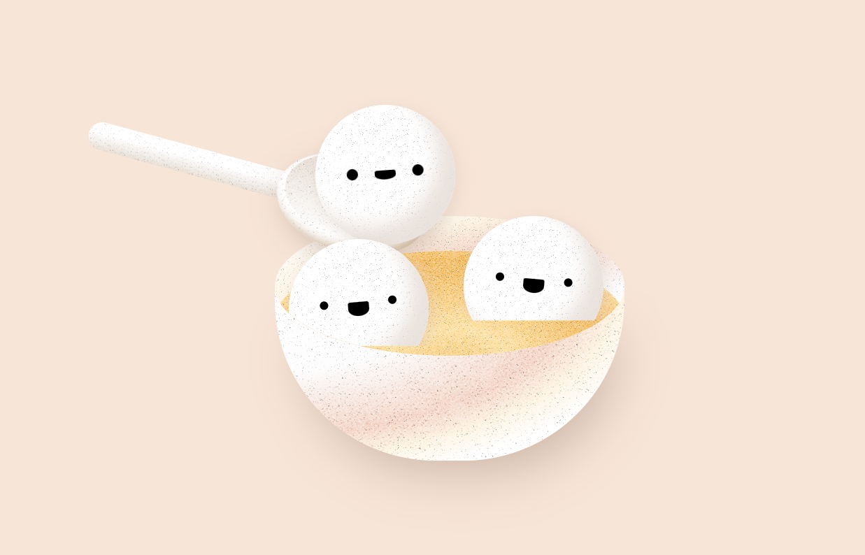
cuillère css3 ramassant des effets spéciaux d'animation de boulettes de riz gluant
Un bol d'expression mignonne de boulettes de riz gluant, une cuillère ramassant des effets spéciaux d'animation de boulettes de riz gluant