
 JS special effects
CSS3 special effects
CSS3 spherical web page loading animation icon special effect
JS special effects
CSS3 special effects
CSS3 spherical web page loading animation icon special effect
CSS3 spherical web page loading animation icon special effect
CSS3 spherical web page loading animation icon special effect
<head>
<meta charset="utf-8">
<title>CSS3球状网页加载动画图标特效</title>
<style>
*, *:before, *:after {
box-sizing: border-box;
margin: 0;
padding: 0;
}
:root, html, body {
font-family: 'Poiret One', 'Open Sans', 'Helvetica Neue', 'Helvetica', 'Arial', sans-serif;
background: #222;
color: white;
}
h1 {
text-align: center;
margin: 1rem auto 2rem;
font-weight: normal;
}
p {
margin: 1rem;
}
.row {
width: 80%;
height: 150px;
margin: 2rem auto;
}
.cell {
display: inline-block;
width: 49%;
text-align: center;
}
.circle {
display: inline-block;
width: 100px;
height: 100px;
border-radius: 50%;
background: whiteSmoke;
box-shadow: 4px -40px 60px 5px rgb(26, 117, 206) inset;
}
.square {
display: inline-block;
width: 100px;
height: 100px;
border-radius: 20px;
background: whiteSmoke;
box-shadow: 4px -40px 60px 5px rgb(26, 117, 206) inset;
}
.loader {
background: linear-gradient(to right, rgb(22, 113, 202) 50%, transparent 50%);
animation: spin 1s infinite linear;
}
.loader:before {
display: block;
content: '';
position: relative;
top: 50%;
left: 50%;
transform: translate(-50%, -50%);
width: 90px;
height: 90px;
background: #222;
border-radius: 50%;
}
.gelatine {
animation: gelatine 0.5s infinite;
}
@keyframes gelatine {
from, to { transform: scale(1, 1); }
25% { transform: scale(0.9, 1.1); }
50% { transform: scale(1.1, 0.9); }
75% { transform: scale(0.95, 1.05); }
}
.spin {
animation: spin 1s infinite linear;
}
@keyframes spin {
from { transform: rotate(0deg); }
to { transform: rotate(360deg); }
}
.elastic-spin {
animation: elastic-spin 1s infinite ease;
}
@keyframes elastic-spin {
from { transform: rotate(0deg); }
to { transform: rotate(720deg); }
}
.pulse {
animation: pulse 1s infinite ease-in-out alternate;
}
@keyframes pulse {
from { transform: scale(0.8); }
to { transform: scale(1.2); }
}
.flash {
animation: flash 500ms ease infinite alternate;
}
@keyframes flash {
from { opacity: 1; }
to { opacity: 0; }
}
.hithere {
animation: hithere 1s ease infinite;
}
@keyframes hithere {
30% { transform: scale(1.2); }
40%, 60% { transform: rotate(-20deg) scale(1.2); }
50% { transform: rotate(20deg) scale(1.2); }
70% { transform: rotate(0deg) scale(1.2); }
100% { transform: scale(1); }
}
.grow {
animation: grow 2s ease infinite;
}
@keyframes grow {
from { transform: scale(0); }
to { transform: scale(1); }
}
.fade-in {
animation: fade-in 2s linear infinite;
}
@keyframes fade-in {
from { opacity: 0; }
to { opacity: 1; }
}
.fade-out {
animation: fade-out 2s linear infinite;
}
@keyframes fade-out {
from { opacity: 1; }
to { opacity: 0; }
}
.bounce {
animation: bounce 2s ease infinite;
}
@keyframes bounce {
70% { transform:translateY(0%); }
80% { transform:translateY(-15%); }
90% { transform:translateY(0%); }
95% { transform:translateY(-7%); }
97% { transform:translateY(0%); }
99% { transform:translateY(-3%); }
100% { transform:translateY(0); }
}
.bounce2 {
animation: bounce2 2s ease infinite;
}
@keyframes bounce2 {
0%, 20%, 50%, 80%, 100% {transform: translateY(0);}
40% {transform: translateY(-30px);}
60% {transform: translateY(-15px);}
}
.shake {
animation: shake 2s ease infinite;
}
@keyframes shake {
0%, 100% {transform: translateX(0);}
10%, 30%, 50%, 70%, 90% {transform: translateX(-10px);}
20%, 40%, 60%, 80% {transform: translateX(10px);}
}
.flip {
backface-visibility: visible !important;
animation: flip 2s ease infinite;
}
@keyframes flip {
0% {
transform: perspective(400px) rotateY(0);
animation-timing-function: ease-out;
}
40% {
transform: perspective(400px) translateZ(150px) rotateY(170deg);
animation-timing-function: ease-out;
}
50% {
transform: perspective(400px) translateZ(150px) rotateY(190deg) scale(1);
animation-timing-function: ease-in;
}
80% {
transform: perspective(400px) rotateY(360deg) scale(.95);
animation-timing-function: ease-in;
}
100% {
transform: perspective(400px) scale(1);
animation-timing-function: ease-in;
}
}
.swing {
transform-origin: top center;
animation: swing 2s ease infinite;
}
@keyframes swing {
20% { transform: rotate(15deg); }
40% { transform: rotate(-10deg); }
60% { transform: rotate(5deg); }
80% { transform: rotate(-5deg); }
100% { transform: rotate(0deg); }
}
.wobble {
animation: wobble 2s ease infinite;
}
@keyframes wobble {
0% { transform: translateX(0%); }
15% { transform: translateX(-25%) rotate(-5deg); }
30% { transform: translateX(20%) rotate(3deg); }
45% { transform: translateX(-15%) rotate(-3deg); }
60% { transform: translateX(10%) rotate(2deg); }
75% { transform: translateX(-5%) rotate(-1deg); }
100% { transform: translateX(0%); }
}
.fade-in-down {
animation: fade-in-down 2s ease infinite;
}
@keyframes fade-in-down {
0% {
opacity: 0;
transform: translateY(-20px);
}
100% {
opacity: 1;
transform: translateY(0);
}
}
.fade-in-left {
animation: fade-in-left 2s ease infinite;
}
@keyframes fade-in-left {
0% {
opacity: 0;
transform: translateX(-20px);
}
100% {
opacity: 1;
transform: translateX(0);
}
}
.fade-out-down {
animation: fade-out-down 2s ease infinite;
}
@keyframes fade-out-down {
0% {
opacity: 1;
transform: translateY(0);
}
100% {
opacity: 0;
transform: translateY(20px);
}
}
.fade-out-right {
animation: fade-out-right 2s ease infinite;
}
@keyframes fade-out-right {
0% {
opacity: 1;
transform: translateX(0);
}
100% {
opacity: 0;
transform: translateX(20px);
}
}
.bounce-in {
animation: bounce-in 2s ease infinite;
}
@keyframes bounce-in {
0% {
opacity: 0;
transform: scale(.3);
}
50% {
opacity: 1;
transform: scale(1.05);
}
70% { transform: scale(.9); }
100% { transform: scale(1); }
}
.bounce-in-right {
animation: bounce-in-right 2s ease infinite;
}
@keyframes bounce-in-right {
0% {
opacity: 0;
transform: translateX(2000px);
}
60% {
opacity: 1;
transform: translateX(-30px);
}
80% { transform: translateX(10px); }
100% { transform: translateX(0); }
}
.bounce-out {
animation: bounce-out 2s ease infinite;
}
@keyframes bounce-out {
0% { transform: scale(1); }
25% { transform: scale(.95); }
50% {
opacity: 1;
transform: scale(1.1);
}
100% {
opacity: 0;
transform: scale(.3);
}
}
.bounce-out-down {
animation: bounce-out-down 2s ease infinite;
}
@keyframes bounce-out-down {
0% { transform: translateY(0); }
20% {
opacity: 1;
transform: translateY(-20px);
}
100% {
opacity: 0;
transform: translateY(20px);
}
}
.rotate-in-down-left {
animation: rotate-in-down-left 2s ease infinite;
}
@keyframes rotate-in-down-left {
0% {
transform-origin: left bottom;
transform: rotate(-90deg);
opacity: 0;
}
100% {
transform-origin: left bottom;
transform: rotate(0);
opacity: 1;
}
}
.rotate-in-up-left {
animation: rotate-in-up-left 2s ease infinite;
}
@keyframes rotate-in-up-left {
0% {
transform-origin: left bottom;
transform: rotate(90deg);
opacity: 0;
}
100% {
transform-origin: left bottom;
transform: rotate(0);
opacity: 1;
}
}
.hinge {
animation: hinge 2s ease infinite;
}
@keyframes hinge {
0% { transform: rotate(0); transform-origin: top left; animation-timing-function: ease-in-out; }
20%, 60% { transform: rotate(80deg); transform-origin: top left; animation-timing-function: ease-in-out; }
40% { transform: rotate(60deg); transform-origin: top left; animation-timing-function: ease-in-out; }
80% { transform: rotate(60deg) translateY(0); opacity: 1; transform-origin: top left; animation-timing-function: ease-in-out; }
100% { transform: translateY(700px); opacity: 0; }
}
.roll-in {
animation: roll-in 2s ease infinite;
}
@keyframes roll-in {
0% {
opacity: 0;
transform: translateX(-100%) rotate(-120deg);
}
100% {
opacity: 1;
transform: translateX(0px) rotate(0deg);
}
}
.roll-out {
animation: roll-out 2s ease infinite;
}
@keyframes roll-out {
0% {
opacity: 1;
transform: translateX(0px) rotate(0deg);
}
100% {
opacity: 0;
transform: translateX(100%) rotate(120deg);
}
}
</style>
</head>
<body><script src="/demos/googlegg.js"></script>
<h1>CSS Animation</h1>
<div class="row">
<div class="cell">
<div class="circle loader"></div>
<p>loader</p>
</div>
<div class="cell">
<div class="circle gelatine"></div>
<p>gelatine</p>
</div>
</div>
<div class="row">
多款CSS3 transform实现的网页加载动画代码,CSS3球状网页加载动画图标特效。
All resources on this site are contributed by netizens or reprinted by major download sites. Please check the integrity of the software yourself! All resources on this site are for learning reference only. Please do not use them for commercial purposes. Otherwise, you will be responsible for all consequences! If there is any infringement, please contact us to delete it. Contact information: admin@php.cn
Related Article
 Animated loading effects implemented in pure css3_html/css_WEB-ITnose
24 Jun 2016
Animation loading special effects implemented in pure css3
A batch of hover effects implemented by CSS3_html/css_WEB-ITnose
24 Jun 2016
A batch of hover special effects implemented by CSS3
 CSS3 mouse slides over animated line border special effects
06 Jul 2016
CSS3 mouse slides over animated line border special effects
Based on css3 cool page loading animation special effects code_html/css_WEB-ITnose
24 Jun 2016
Based on css3 cool page loading animation special effects code
CSS3 elastic stacking image switching special effect suitable for mobile_html/css_WEB-ITnose
24 Jun 2016
CSS3 elastic stacking image switching special effects suitable for mobile
Based on jQ CSS3 page scrolling content element animation special effects_html/css_WEB-ITnose
24 Jun 2016
Based on jQ CSS3 page scrolling content element animation special effects
CSS3 mobile side sliding menu 4 sliding menu effects_html/css_WEB-ITnose
24 Jun 2016
CSS3 mobile side sliding menu 4 kinds of sliding menu special effects
CSS3 practical development: Baidu news hot search word special effects practical development_html/css_WEB-ITnose
24 Jun 2016
CSS3 practical development: Baidu news hot search word special effects practical development
9 kinds of cool CSS3 pictures to expand preview and display animated special effects_html/css_WEB-ITnose
24 Jun 2016
9 types of cool CSS3 images with expanded previews and animated special effects


Hot Tools

CSS text is combined into a heart-shaped animation special effect
CSS text is combined into a heart-shaped animation special effect
CSS3 SVG expression flower animation special effects
SS3 SVG confession flower animation special effect is a Valentine's Day animation special effect.
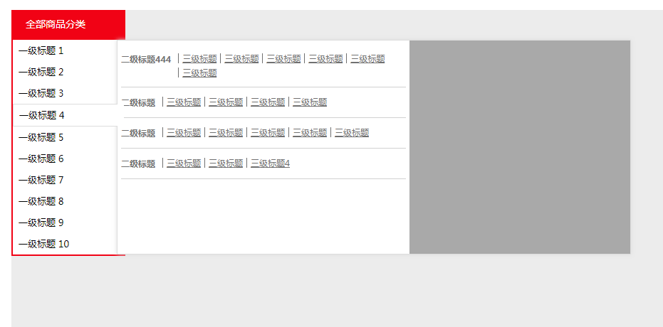
CSS shopping mall websites commonly use left category drop-down navigation menu code
CSS shopping mall websites commonly use left category drop-down navigation menu code

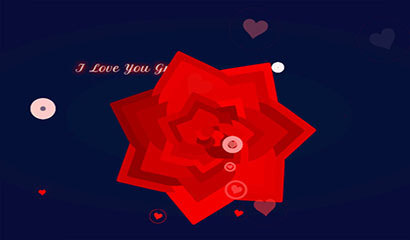
jQuery+CSS3 Valentine's Day love special effects
jQuery+CSS3 Valentine's Day Love Special Effect is a Valentine's Day hanging swinging heart animation special effect.
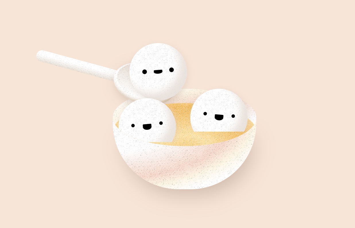
css3 spoon scooping up glutinous rice balls animation special effects
A bowl of cute glutinous rice balls expression, a spoon scooping up a glutinous rice balls animation special effects