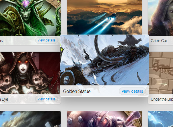
CSS3 picture album three-dimensional shadow effect
CSS3 picture album three-dimensional shadow effect
All resources on this site are contributed by netizens or reprinted by major download sites. Please check the integrity of the software yourself! All resources on this site are for learning reference only. Please do not use them for commercial purposes. Otherwise, you will be responsible for all consequences! If there is any infringement, please contact us to delete it. Contact information: admin@php.cn
Related Article
 CSS3 JQUERY page scrolling effect code_html/css_WEB-ITnose
24 Jun 2016
CSS3 JQUERY page scrolling effects code
 58 jQuery simulated CSS3 transition page switching effects_html/css_WEB-ITnose
24 Jun 2016
58 jQuery simulated CSS3 transition page switching effects
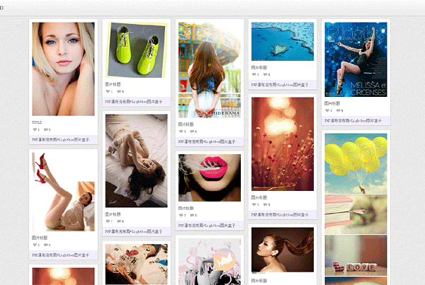 jquery waterfall flow LightBox picture box special effects
06 Jul 2016
jquery waterfall flow LightBox picture box special effects
 10 jQuery Cool Menu Effect Plugins
01 Mar 2025
10 cool jQuery menu special effects plug-ins to improve website user experience! We have shared many jQuery navigation menu plugins, and now we bring you 10 more amazing jQuery menu effects plugins. Enjoy it! Related readings: - 10 dazzling jQuery navigation menus - 15 excellent jQuery navigation menus Right-click menu This plugin is very easy to use and compact, allowing you to create right-click menus. Source Code Demo 2. jQuery Multi-level Menu – FX CSS Menu with Submenu 100% CSS menu, visual effects provided by jQuery. Only use Javascript to implement special effects. Fully compatible with cross-browser, package
 8 Cool jQuery Animation Effects Tutorials
26 Feb 2025
jQuery animation effect tutorial: Say goodbye to Flash animation and embrace the era of jQuery animation! In the past, animation effects on websites usually rely on Flash. But now, with jQuery, you can easily create various animation effects. The following are some jQuery animation effects tutorials to help you start your journey of painting! Related readings: 10 CSS3 and jQuery loading animation solutions 3D JavaScript animation—three.js JQuery animation feed display imitating Foursquare This tutorial will show you how to easily create an RSS scrolling subtitle effect using jQuery. Source Code Demo jQue
 How to Maintain jQuery Mouseover Effects in ASP.NET UpdatePanels?
03 Dec 2024
jQuery $(document).ready and UpdatePanels: A Refined LookWhen utilizing jQuery to apply mouseover effects to elements within an UpdatePanel, the...
 10 Amazing Image Effects using jQuery
10 Mar 2025
Ten amazing jQuery image effects plugins to inject fashion into your website! With these jQuery image effects plugins, you can easily convert ordinary images on your website, enhance image effects, create galleries, scrollers, and make your website look new! Image segmentation effects combined with CSS and jQuery This tutorial will create an image segmentation effect. It's similar to a sliding door effect, where the image slides left or right, showing the text behind it, but the difference is that the effect looks like the image is split in half, one moves to the left and the other moves to the right. Source jQuery Image Distortion Script ImageWarp adds interesting twist effects to selected images on the page
 20 jQuery Plugins to Create Animating Image Effects
25 Feb 2025
This article showcases 20 jQuery plugins for creating stunning animated image effects on websites and blogs. These plugins offer a variety of effects, from subtle transitions to complex, eye-catching animations, potentially boosting visitor engageme
 10 Magicial jQuery Text Effect Plugins
07 Mar 2025
10 magical jQuery text special effects plugins to make your website stand out! jQuery is not only used for menus and animation effects. With jQuery, you can also create attractive text effects and cleverly use text to communicate effectively with users. Through this collection, you can create text gradients, text fly-in effects, text glows, and more. Enjoy it! Codename Rainbows We use some JavaScript and CSS magic to apply a two-color gradient for any text. Shadows and highlights can also be applied. This is especially effective in large websites or dynamic content, as it is impractical to create images for each instance in these cases. source jQuer


Hot Tools

jQuery2019 Valentine's Day Confession Fireworks Animation Special Effects
A very popular jQuery Valentine's Day confession fireworks animation special effect on Douyin, suitable for programmers and technical geeks to express their love to the girl they love. No matter you choose to be willing or not, you have to agree in the end.

layui responsive animated login interface template
layui responsive animated login interface template

520 Valentine's Day confession web animation special effects
jQuery Valentine's Day Confession Animation, 520 Confession Background Animation

Cool system login page
Cool system login page
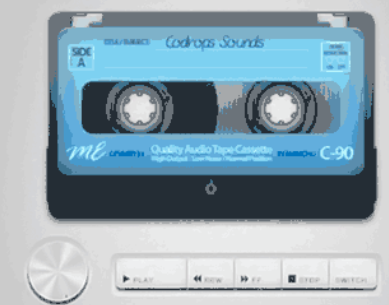
HTML5 tape music player-CASSETTE PLAYER
HTML5 tape music player-CASSETTE PLAYER


