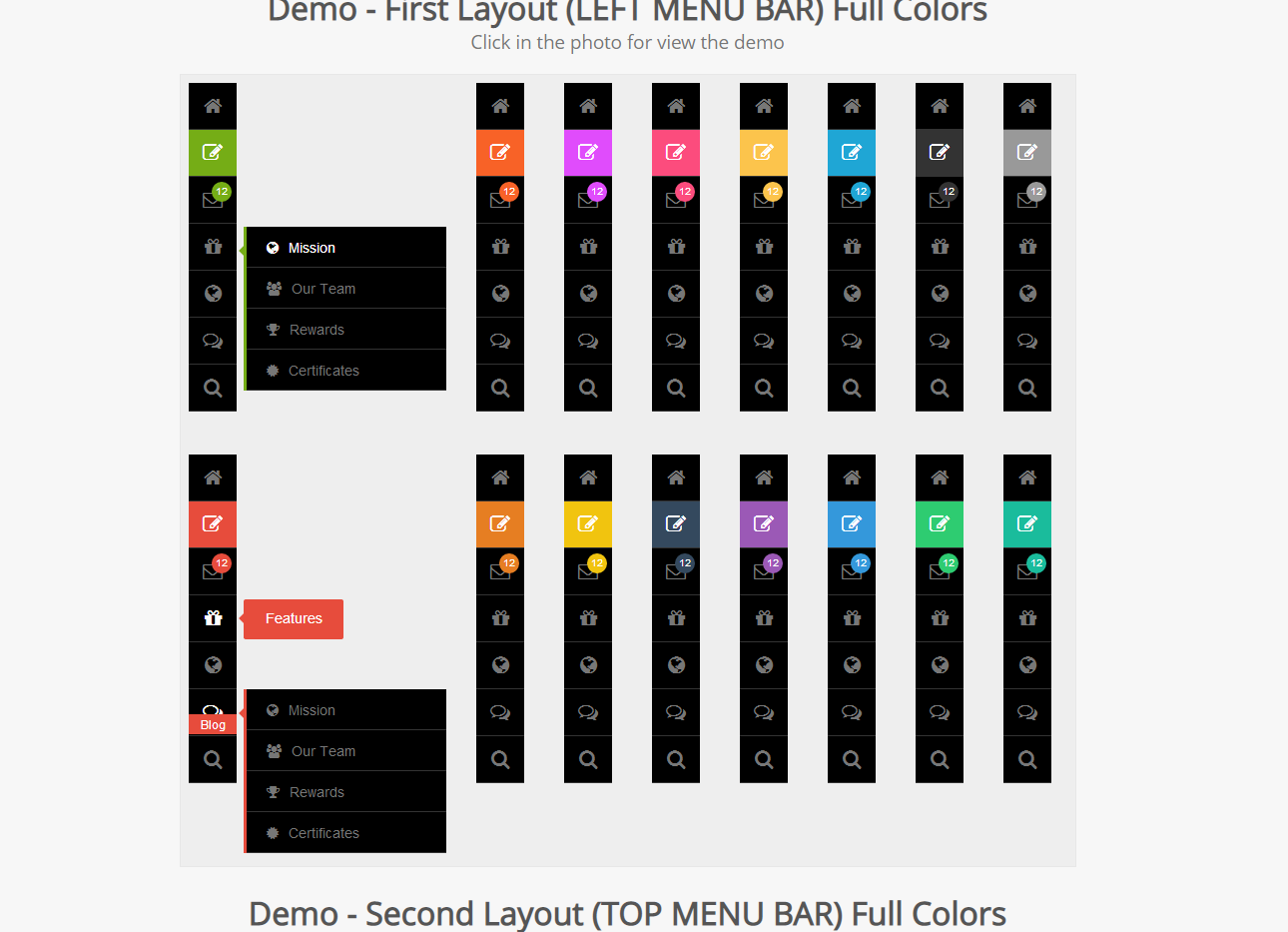
Responsive dark hover navigation menu
In a responsive Web page, a responsive navigation menu is very important. Today I have collected and compiled some dark mode responsive hover navigation menus for you to share with you. I hope it can be useful to everyone. help.
All resources on this site are contributed by netizens or reprinted by major download sites. Please check the integrity of the software yourself! All resources on this site are for learning reference only. Please do not use them for commercial purposes. Otherwise, you will be responsible for all consequences! If there is any infringement, please contact us to delete it. Contact information: admin@php.cn
Related Article
 Making a Sliding Side Navigation Menu for Responsive Designs
01 Mar 2025
This tutorial shows you how to build a responsive expandable side navigation menu using JavaScript and CSS. The final result is a sleek, modern menu. Here's a live demo: 1. HTML Structure: Start by adding the HTML for the side menu: × About
 Pure css to implement Magicline Navigation (underline animated navigation menu)_html/css_WEB-ITnose
24 Jun 2016
Pure css to implement Magicline Navigation (underline animated navigation menu)
 Why Does My Bootstrap 3 Collapsed Navigation Stay Open After Clicking Menu Links?
16 Nov 2024
Bootstrap 3's Collapsed Navigation Remains Open after Clicking Menu LinksIn a typical Bootstrap 3 navigation setup, clicking on menu links in a...
 Navigation secondary menu positioning problem_html/css_WEB-ITnose
24 Jun 2016
Navigation secondary menu positioning problem
 Pure div css secondary navigation menu_html/css_WEB-ITnose
24 Jun 2016
Pure div css secondary navigation menu
 Super beautiful DIV CSS navigation menu_html/css_WEB-ITnose
24 Jun 2016
Super beautiful DIV CSS navigation menu


Hot Tools

Black left navigation management panel ui special effects
Native js css3 is used to create a black and practical left-hand category navigation management panel with icon text vertical navigation menu ui layout. Suitable for: functional and backend management UI website templates.

jQuery left drop-down navigation menu background frame template
jQuery creates a vertical drop-down navigation bar on the left and an embedded iframe navigation menu background page template.

js-realize expandable hidden navigation menu button special effects
Simple and practical expandable hidden navigation menu button js special effects code download. The feature of this menu is that the menu can be expanded when the button is clicked. When expanded, it has flexible animation effects, which is quite cool. Menu items are small icons. Of course, you can also use icons combined with text. Since the hidden/expanded method is relatively space-saving, this menu can be applied to mobile devices.

Interactive liquid navigation tab bar
A super popular HTML+CSS interactive liquid navigation tab bar with a very beautiful and concise design


