
current location:Home > Technical Articles > Web Front-end
- Direction:
- All web3.0 Backend Development Web Front-end Database Operation and Maintenance Development Tools PHP Framework Daily Programming WeChat Applet Common Problem Other Tech CMS Tutorial Java System Tutorial Computer Tutorials Hardware Tutorial Mobile Tutorial Software Tutorial Mobile Game Tutorial
- Classify:


-

- ECharts drift chart: how to show data drift trends
- ECharts Drift Chart: Displaying Data Drift Trends Introduction: Data visualization is an important means of data analysis, and ECharts, as an excellent open source visualization library, provides us with a wealth of data display methods. This article will introduce the use of driftchart in ECharts to help readers master how to display data drift trends. 1. What is a drift graph? A drift chart is a visual chart that can present the drift trend of data. It clearly displays the moving paths of multiple points in a coordinate system.
- JS Tutorial . echarts 1297 2023-12-18 09:09:52
-

- How to use ECharts and Java interfaces to implement various types of statistical charts
- How to use ECharts and Java interfaces to implement various types of statistical charts. With the advent of the big data era, data analysis and visualization have become important tools and technologies. Statistical charts are one of the common forms of data visualization, which can visually display the distribution, trend, correlation and other information of data. ECharts is an open source chart library based on JavaScript, with powerful data visualization capabilities and rich chart types. As a programming language widely used in back-end development, Java also has many mature
- javaTutorial . echarts 694 2023-12-18 09:06:55
-

- ECharts word cloud chart: how to display data keywords
- ECharts word cloud chart: How to display data keywords requires specific code examples Introduction: With the advent of the big data era, an important issue we face is how to effectively extract useful information from massive data. Keyword extraction is one of the commonly used methods. When displaying keywords, word cloud diagrams are a very intuitive and artistic way that allow people to quickly understand the characteristics of the data and the importance of keywords at a glance. This article will introduce how to use ECharts to display word cloud diagrams and provide
- JS Tutorial . echarts 1475 2023-12-18 09:00:27
-

- How to use calendar charts to display time data in ECharts
- How to use calendar charts to display time data in ECharts ECharts (Baidu’s open source JavaScript chart library) is a powerful and easy-to-use data visualization tool. It offers a variety of chart types, including line charts, bar charts, pie charts, and more. The calendar chart is a very distinctive and practical chart type in ECharts, which can be used to display time-related data. This article will introduce how to use calendar charts in ECharts and provide specific code examples. First, you need to use
- JS Tutorial . echarts 1786 2023-12-18 08:52:06
-

- ECharts chart optimization: how to improve rendering performance
- ECharts chart optimization: How to improve rendering performance Introduction: ECharts is a powerful data visualization library that can help developers create a variety of beautiful charts. However, when the amount of data is huge, chart rendering performance can become a challenge. This article will help you improve the rendering performance of ECharts charts by providing specific code examples and introducing some optimization techniques. 1. Data processing optimization: Data filtering: If the amount of data in the chart is too large, you can filter the data to display only the necessary data. For example, you can
- JS Tutorial . echarts 1695 2023-12-18 08:49:15
-

- Steps to draw dashboard using ECharts and Python interface
- The steps to draw a dashboard using ECharts and Python interface require specific code examples. Summary: ECharts is an excellent data visualization tool that can easily perform data processing and graphics drawing through the Python interface. This article will introduce the specific steps to draw a dashboard using ECharts and Python interface, and provide sample code. Keywords: ECharts, Python interface, dashboard, data visualization Introduction Dashboard is a commonly used form of data visualization, which uses
- Python Tutorial . echarts 1445 2023-12-18 08:40:02
-

- How to add animation effects in ECharts
- ECharts is an open source visualization chart library based on JavaScript. It provides a variety of chart types and interactive functions and is widely used in the field of data visualization. Compared with static charts, dynamic charts are more vivid and intuitive and can better show changes and trends in data. Therefore, adding animation effects in ECharts can enhance the attractiveness and readability of charts, while also being more in line with the aesthetic needs of modern users. This article will introduce how to add animation effects in ECharts and provide specific code examples
- JS Tutorial . echarts 2156 2023-12-18 08:18:32
-

- How to use funnel rose chart to display data proportion and conversion rate in ECharts
- Overview of how to use the funnel rose chart to display data proportion and conversion rate in ECharts: The funnel rose chart is a commonly used data visualization chart that can clearly display the data proportion and conversion rate. In ECharts, we can easily achieve the display effect of funnel rose chart through simple data processing and configuration. This article will introduce how to use the funnel rose chart in ECharts to display data proportion and conversion rate, and provide corresponding code examples. Step 1: Prepare the data First, we need to prepare the data to be displayed
- JS Tutorial . echarts 1463 2023-12-18 08:10:10
-

- ECharts Sankey Rose Chart: How to show data flow and proportion
- ECharts Sankey Rose Chart: How to display data flow and proportion, specific code examples are required. With the advent of the big data era, data analysis and visualization have become important tools. As a powerful visualization library, ECharts provides a variety of chart types, one of which is the Sankey Rose chart. The Sankey Rose diagram is suitable for displaying data flow and proportion relationships in multiple dimensions. This article will introduce the basic concepts and usage of Sankey Rose Chart, and give specific code examples. The basic concept of the Sankey Rose Chart The Sankey Rose Chart is a special kind of radar
- JS Tutorial . echarts 971 2023-12-17 23:21:37
-

- Teach you how to easily draw various statistical charts using ECharts and golang
- Teach you how to use ECharts and golang to easily draw various statistical charts Introduction: In the field of data visualization, ECharts is a very popular JavaScript chart library. It provides a rich and powerful API that can draw various types of statistical charts. As an efficient and concise programming language, golang can also be used to generate data and be combined with ECharts to draw charts. This article will be based on examples and teach you how to use ECharts and golang light
- Golang . echarts 1107 2023-12-17 23:10:16
-

- How to generate interactive statistical charts through the php interface and ECharts
- How to generate interactive statistical charts through the PHP interface and ECharts Introduction: In data visualization, statistical charts are a very effective way to display data. ECharts is a powerful open source JavaScript chart library that supports multiple chart types and rich interactive functions. This article will introduce how to generate interactive statistical charts through the combination of PHP interface and ECharts. 1. Install ECharts. First, we need to introduce E into the project.
- PHP Tutorial . echarts 1192 2023-12-18 06:00:02
-

- ECharts and golang technical guide: secrets for creating various statistical charts
- ECharts and golang technical guide: secrets for creating various statistical charts. With the development of the Internet and the advent of the big data era, data visualization has become an important tool. ECharts and golang have become commonly used data visualization tools and programming languages for many developers. This article will introduce how to use ECharts and golang to create various statistical charts, and provide specific code examples. 1. Introduction to ECharts ECharts is an open source developed by Baidu
- Golang . echarts 926 2023-12-17 23:00:56
-

- How to implement data filtering and sorting of statistical charts through ECharts and php interfaces
- How to implement data filtering and sorting of statistical charts through ECharts and PHP interfaces. In the field of modern data analysis and visualization, ECharts, as a powerful JavaScript chart library, has been widely used in various data visualization projects. At the same time, PHP, as a popular server-side programming language, can be combined with ECharts to provide convenient solutions for filtering and sorting data. This article will introduce how to use ECharts and PHP interfaces to implement statistical charts.
- PHP Tutorial . echarts 934 2023-12-17 22:56:01
-

- Use ECharts and golang to create diverse statistical charts
- Use ECharts and Golang to create diverse statistical charts Summary: This article introduces how to use ECharts and Golang to create diverse statistical charts. By combining the powerful data visualization capabilities of ECharts and the efficient processing capabilities of Golang, we can easily create various types of statistical charts. This article will use specific code examples to demonstrate how to use ECharts and Golang to implement bar charts, line charts, and pie charts. 1. Background and introduction Statistical charts are data analysis
- Golang . echarts 645 2023-12-17 22:52:43
-

- How to combine ECharts and php interface to realize dynamic data display of statistical charts
- Introduction to how to combine ECharts and PHP interfaces to realize dynamic data display of statistical charts: With the development of Internet technology, data visualization plays an important role in various fields. ECharts is a powerful data visualization library that can help us quickly create various types of charts. PHP is a popular server-side scripting language that can be used to handle data requests and build interfaces. Combining ECharts and PHP interfaces, we can realize dynamic data display of statistical charts and easily implement charts.
- PHP Tutorial . echarts 1227 2023-12-17 22:44:02
Recommended Articles

Tool Recommendations

jQuery enterprise message form contact code
jQuery enterprise message form contact code is a simple and practical enterprise message form and contact us introduction page code.
form button
2024-02-29

HTML5 MP3 music box playback effects
HTML5 MP3 music box playback special effect is an mp3 music player based on HTML5 css3 to create cute music box emoticons and click the switch button.
Player special effects
2024-02-29

HTML5 cool particle animation navigation menu special effects
HTML5 cool particle animation navigation menu special effect is a special effect that changes color when the navigation menu is hovered by the mouse.
Menu navigation
2024-02-29
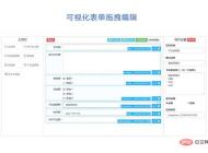
jQuery visual form drag and drop editing code
jQuery visual form drag and drop editing code is a visual form based on jQuery and bootstrap framework.
form button
2024-02-29

Organic fruit and vegetable supplier web template Bootstrap5
An organic fruit and vegetable supplier web template-Bootstrap5
Bootstrap template
2023-02-03
Bootstrap3 multifunctional data information background management responsive web page template-Novus
Bootstrap3 multifunctional data information background management responsive web page template-Novus
backend template
2023-02-02

Real estate resource service platform web page template Bootstrap5
Real estate resource service platform web page template Bootstrap5
Bootstrap template
2023-02-02

Simple resume information web template Bootstrap4
Simple resume information web template Bootstrap4
Bootstrap template
2023-02-02

Cute summer elements vector material (EPS PNG)
This is a cute summer element vector material, including the sun, sun hat, coconut tree, bikini, airplane, watermelon, ice cream, ice cream, cold drink, swimming ring, flip-flops, pineapple, conch, shell, starfish, crab, Lemons, sunscreen, sunglasses, etc., the materials are provided in EPS and PNG formats, including JPG previews.
PNG material
2024-05-09

Four red 2023 graduation badges vector material (AI EPS PNG)
This is a red 2023 graduation badge vector material, four in total, available in AI, EPS and PNG formats, including JPG preview.
PNG material
2024-02-29

Singing bird and cart filled with flowers design spring banner vector material (AI EPS)
This is a spring banner vector material designed with singing birds and a cart full of flowers. It is available in AI and EPS formats, including JPG preview.
banner picture
2024-02-29

Golden graduation cap vector material (EPS PNG)
This is a golden graduation cap vector material, available in EPS and PNG formats, including JPG preview.
PNG material
2024-02-27

Home Decor Cleaning and Repair Service Company Website Template
Home Decoration Cleaning and Maintenance Service Company Website Template is a website template download suitable for promotional websites that provide home decoration, cleaning, maintenance and other service organizations. Tip: This template calls the Google font library, and the page may open slowly.
Front-end template
2024-05-09

Fresh color personal resume guide page template
Fresh color matching personal job application resume guide page template is a personal job search resume work display guide page web template download suitable for fresh color matching style. Tip: This template calls the Google font library, and the page may open slowly.
Front-end template
2024-02-29
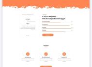
Designer Creative Job Resume Web Template
Designer Creative Job Resume Web Template is a downloadable web template for personal job resume display suitable for various designer positions. Tip: This template calls the Google font library, and the page may open slowly.
Front-end template
2024-02-28

Modern engineering construction company website template
The modern engineering and construction company website template is a downloadable website template suitable for promotion of the engineering and construction service industry. Tip: This template calls the Google font library, and the page may open slowly.
Front-end template
2024-02-28

