
current location:Home > Technical Articles > Web Front-end
- Direction:
- All web3.0 Backend Development Web Front-end Database Operation and Maintenance Development Tools PHP Framework Common Problem Other Tech CMS Tutorial Java System Tutorial Computer Tutorials Hardware Tutorial Mobile Tutorial Software Tutorial Mobile Game Tutorial
- Classify:


-

- ECharts and golang tutorial: Practical tips for making various statistical charts
- ECharts and golang tutorial: Practical tips for making various statistical charts, specific code examples are required Introduction In the field of data analysis and visualization, statistical charts are very important tools. They can transform complex data into intuitive, easy-to-understand forms, helping us better understand and analyze data. ECharts is a powerful open source JavaScript charting library, and golang is an easy-to-use and efficient programming language. Combining the two, we can more efficiently produce various
- Golang . echarts 1240 2023-12-17 21:15:43
-
- How to generate a map using ECharts in Python
- How to use ECharts to generate a map in Python Maps are a visual way to intuitively display geographical information, and Python, as a powerful programming language, provides a wealth of data processing and visualization tools. Among them, ECharts is a popular data visualization library that supports map drawing and display through Python. This article will introduce how to use Python and ECharts to generate maps, and give specific code examples. 1. To install the ECharts library, use EChar
- Python Tutorial . echarts 1528 2023-12-17 21:09:46
-
- Expert Tutorial: Draw Stunning Statistical Charts Using ECharts and Golang
- With the further deepening of data analysis, the need for data visualization is becoming more and more important. ECharts is an open source data visualization library that helps users create beautiful, efficient, and interactive charts. Golang is an efficient programming language that is widely used in the evolving big data scenario because of its outstanding concurrency performance and maintainability. This article will introduce how to use ECharts and golang to draw stunning statistical charts, and provide specific code examples. The first step is to install ECha
- Golang . echarts 1328 2023-12-17 21:09:44
-
- How to draw a funnel chart using ECharts in Python
- How to use ECharts to draw a funnel chart in Python Introduction: ECharts is an open source chart library developed by Baidu, which provides a rich range of chart types and powerful data visualization capabilities. A funnel chart is one of the commonly used chart types used to display a series of data at different stages. The width of the funnel chart gradually shrinks or expands depending on the data. This article will introduce how to use the ECharts library to draw a funnel chart in Python and provide corresponding code examples. Step 1: Install ECharts library
- Python Tutorial . echarts 1454 2023-12-17 21:06:58
-
- Steps to draw a funnel chart using ECharts and Python interface
- Steps to draw a funnel chart using ECharts and Python interfaces A funnel chart is a visual chart used to display multiple stages of data. It is usually used to represent the conversion rate or quantity ratio of each stage in a process. Before using ECharts and Python interfaces to draw funnel charts, you need to install the corresponding libraries and plug-ins, and then follow the steps below. Step 1: Install the necessary libraries and plug-ins. Before using ECharts and Python interfaces to draw funnel charts, you need to ensure that the corresponding libraries have been installed.
- Python Tutorial . echarts 1158 2023-12-17 21:06:47
-
- ECharts and golang tutorial: Practical tips for making multi-category statistical charts
- ECharts and golang tutorial: Practical tips for making multi-category statistical charts, specific code examples are required In terms of data visualization, charts are very practical. ECharts is a powerful open source visualization chart library, and golang is an efficient programming language that can be used for data analysis and chart production. This article will introduce how to use ECharts and golang to create various types of charts, including line charts, bar charts, scatter charts, pie charts, etc. Line chart A line chart is a classic statistical chart
- Golang . echarts 967 2023-12-17 20:06:42
-
- WebSocket and JavaScript: key technologies for real-time public opinion monitoring
- WebSocket and JavaScript: Key Technologies for Real-time Public Opinion Monitoring Introduction: With the rapid development of social media, public opinion monitoring has become one of the important tasks for enterprises and governments. One of the key technologies for real-time public opinion monitoring is the combined application of WebSocket and JavaScript. WebSocket is a network communication protocol that can provide real-time two-way communication, and JavaScript is an important language for front-end development, allowing web pages to communicate with WebSocket.
- JS Tutorial . echarts 1596 2023-12-17 19:29:25
-
- How to generate word cloud graph using ECharts and Python interface
- How to use ECharts and Python interfaces to generate word cloud diagrams Introduction: With the advent of the big data era, data visualization has become an indispensable part of data analysis. As a common data visualization method, word cloud graph has unique advantages in displaying the distribution and correlation of hot words in text data. This article will introduce how to use ECharts and Python interfaces to generate word cloud diagrams, and provide specific code examples. 1. Preparation: Before starting, we need to install ECharts and Pyth
- Python Tutorial . echarts 1008 2023-12-17 19:24:09
-
- How to draw a bubble chart using ECharts in Python
- How to use ECharts to draw bubble charts in Python ECharts is a data visualization library based on JavaScript. It provides a variety of chart types, including bar charts, line charts, pie charts, etc. In ECharts, bubble chart is a commonly used chart type, which can show the distribution of data through dots of different sizes. This article will introduce in detail how to use ECharts to draw bubble charts in Python and provide specific code examples. Step 1: Install necessary libraries and
- Python Tutorial . echarts 2076 2023-12-17 19:17:59
-
- How to draw a funnel chart using ECharts and Python interface
- Method of drawing funnel chart using ECharts and Python interface In data visualization, funnel chart (FunnelChart) is widely used to describe the quantitative changes between different stages or parts in a process. The funnel chart can clearly represent the quantitative differences and conversion rates between each stage, helping us better understand the trends and patterns behind the data. In this article, we will introduce how to use ECharts and Python interfaces to draw funnel charts, and give specific code examples. first
- Python Tutorial . echarts 973 2023-12-17 19:06:45
-
- How to use php interface and ECharts to realize data visualization statistical chart
- Introduction to how to use PHP interface and ECharts to implement data visualization charts. In web applications, data visualization charts are very important for displaying and analyzing large amounts of data. This article will introduce how to use the PHP interface and ECharts library to implement data visualization statistical charts, and provide readers with specific code examples. Prerequisites Before starting, we need to ensure that the following prerequisites are met: The PHP runtime environment is installed. A database is built on the server to store data and has readable data tables.
- PHP Tutorial . echarts 919 2023-12-17 18:02:01
-
- How to use ECharts and Java interface to implement chart linkage statistical analysis
- How to use ECharts and Java interfaces to implement chart linkage statistical analysis ECharts is a JavaScript-based visual chart library that can help us easily create a variety of charts, such as line charts, bar charts, pie charts, etc. Java is a very popular programming language that is widely used in enterprise applications. In this article, we will introduce how to use ECharts and Java interfaces to implement chart linkage statistical analysis. 1. Prerequisite knowledge Before studying this article, you need to
- javaTutorial . echarts 908 2023-12-17 17:50:20
-
- How to use php interface and ECharts to implement data filtering and filtering of statistical charts
- How to use the PHP interface and ECharts to implement data screening and filtering of statistical charts requires specific code examples. In data visualization, using statistical charts is a common way to display data. In practical applications, data often needs to be screened and filtered to meet different needs. The PHP interface and ECharts are two widely used tools through which data filtering and filtering of statistical charts can be implemented. The following will use an example to demonstrate how to use the PHP interface and ECharts implementation
- PHP Tutorial . echarts 1061 2023-12-17 17:40:01
-
- How to use ECharts and php interface to implement data caching and updating of statistical charts
- How to use ECharts and php interfaces to implement data caching and updating of statistical charts. In web applications, statistical charts are often used to display data analysis results. ECharts is a popular open source JavaScript charting library that can help us create various types of interactive statistical charts. However, fetching data directly from the database and rendering charts may cause performance issues when the amount of data is very large or the data is updated frequently. In order to solve this problem, we can use the php interface to implement statistical charts
- PHP Tutorial . echarts 1128 2023-12-17 17:38:02
-
- How to generate stacked area plots using ECharts and Python interface
- How to generate stacked area charts using ECharts and Python interface ECharts is an open source visualization library based on JavaScript that can help us create interactive and beautiful charts. Using ECharts' Python interface, we can use Python code to generate various types of charts, including stacked area charts. This article will introduce how to use ECharts and Python interfaces to generate stacked area charts, and give specific code examples. Preparations First,
- Python Tutorial . echarts 986 2023-12-17 17:12:56


Recommended Articles

Tool Recommendations

jQuery enterprise message form contact code
jQuery enterprise message form contact code is a simple and practical enterprise message form and contact us introduction page code.
form button
2024-02-29

HTML5 MP3 music box playback effects
HTML5 MP3 music box playback special effect is an mp3 music player based on HTML5 css3 to create cute music box emoticons and click the switch button.
Player special effects
2024-02-29
HTML5 cool particle animation navigation menu special effects
HTML5 cool particle animation navigation menu special effect is a special effect that changes color when the navigation menu is hovered by the mouse.
Menu navigation
2024-02-29
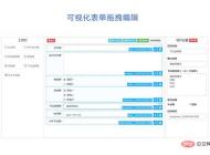
jQuery visual form drag and drop editing code
jQuery visual form drag and drop editing code is a visual form based on jQuery and bootstrap framework.
form button
2024-02-29

Organic fruit and vegetable supplier web template Bootstrap5
An organic fruit and vegetable supplier web template-Bootstrap5
Bootstrap template
2023-02-03
Bootstrap3 multifunctional data information background management responsive web page template-Novus
Bootstrap3 multifunctional data information background management responsive web page template-Novus
backend template
2023-02-02

Real estate resource service platform web page template Bootstrap5
Real estate resource service platform web page template Bootstrap5
Bootstrap template
2023-02-02

Simple resume information web template Bootstrap4
Simple resume information web template Bootstrap4
Bootstrap template
2023-02-02

Cute summer elements vector material (EPS PNG)
This is a cute summer element vector material, including the sun, sun hat, coconut tree, bikini, airplane, watermelon, ice cream, ice cream, cold drink, swimming ring, flip-flops, pineapple, conch, shell, starfish, crab, Lemons, sunscreen, sunglasses, etc., the materials are provided in EPS and PNG formats, including JPG previews.
PNG material
2024-05-09

Four red 2023 graduation badges vector material (AI EPS PNG)
This is a red 2023 graduation badge vector material, four in total, available in AI, EPS and PNG formats, including JPG preview.
PNG material
2024-02-29
Singing bird and cart filled with flowers design spring banner vector material (AI EPS)
This is a spring banner vector material designed with singing birds and a cart full of flowers. It is available in AI and EPS formats, including JPG preview.
banner picture
2024-02-29

Golden graduation cap vector material (EPS PNG)
This is a golden graduation cap vector material, available in EPS and PNG formats, including JPG preview.
PNG material
2024-02-27

Home Decor Cleaning and Repair Service Company Website Template
Home Decoration Cleaning and Maintenance Service Company Website Template is a website template download suitable for promotional websites that provide home decoration, cleaning, maintenance and other service organizations. Tip: This template calls the Google font library, and the page may open slowly.
Front-end template
2024-05-09

Fresh color personal resume guide page template
Fresh color matching personal job application resume guide page template is a personal job search resume work display guide page web template download suitable for fresh color matching style. Tip: This template calls the Google font library, and the page may open slowly.
Front-end template
2024-02-29
Designer Creative Job Resume Web Template
Designer Creative Job Resume Web Template is a downloadable web template for personal job resume display suitable for various designer positions. Tip: This template calls the Google font library, and the page may open slowly.
Front-end template
2024-02-28

Modern engineering construction company website template
The modern engineering and construction company website template is a downloadable website template suitable for promotion of the engineering and construction service industry. Tip: This template calls the Google font library, and the page may open slowly.
Front-end template
2024-02-28

